
Preface
WebIQ is a HMI/SCADA Toolbox for industrial use on machines or digitized production environments, e.g. to operate and visualize machines or to log and display historical data etc. The system is based on 100% HTML5 web technology and consists of a runtime environment (WebIQ Server), which is needed to display the HMI project in a standard web browser on the target device, and the development environment (e.g. laptop computer with WebIQ Designer), which is intended to develop the HMI project.
HMI projects can be created and edited by using the HTML drag-and-drop layout editor of WebIQ Designer. HMI Projects and layouts can be created utilizing about 60 standard widgets. WebIQ supports fully responsive design and allows previewing for different target systems, e.g. smartphone, tablet, stationary panels with different resolutions and orientations.
With WebIQ Designer you can also create own widgets (composite widgets) and templates and thus create application-related libraries. Fully custom widgets can also be created or UI elements adapted from popular HTML frameworks and used within WebIQ.
For international use or for localization, texts, fonts and units can be switched within the HMI project at runtime.
All widgets and layouts can be easily adapted to customer-specific requirements using the Styling Cockpit or the CSS3 Editor, e.g. to obtain a specific CI design or design template for an individually designed HMI.
Custom logic functions and UI actions can be integrated into the HMI system via the integrated JavaScript editor.
Most important, non-HTML experts can create Web HMI Projects through the WebIQ Designer graphical design tool and all this allows a much easier entry into web-based visualization.
Important Notes
The manual contains relevant information on the use and operation of the WebIQ Visualization System. This manual is intended for technically qualified users who have experience in creating user interfaces for machines or systems.
The manual is provided online and always in the latest available version. Smart HMI reserves the right to make adjustments and additions to the manual at any time.
|
Access To Online Documentation We recommend that users of WebIQ are provided with access to the online version of the manual at their workplace. However, the documentation can also be used offline; to download, use the "save as" function, which is offered by right-clicking in most of the current browsers. |
Security Information
The security of the HMI is the responsibility of the organization or person who puts the HMI into operation. They must secure the network, in particular the communication between the data source/PLC and WebIQ Server, or between WebIQ Designer and the Web Client, in such a way that access or manipulation from outside is not possible. This includes the use of sufficiently secure passwords and adequate encryption, especially when using WLAN routes within the network. Passwords should be updated regularly. Transfer of information via the public Internet should be avoided. If this is necessary, appropriate security measures must be taken into account (use of a firewall, VPN tunnel, etc.). All measures taken must correspond to the current state of technology.
|
Encryption WebIQ has the possibility to encrypt the transfer path between WebIQ Designer and web client using the TLS-specification (TLS = Transport Layer Security). By default, TLS encryption is not enabled. It is the responsibility of the organization or person who puts the HMI into operation to enable TLS encryption. Note: This product includes software developed by the OpenSSL Project for use in the OpenSSL Toolkit. (http://www.openssl.org/) |
1. Introduction
1.1. What Is WebIQ?
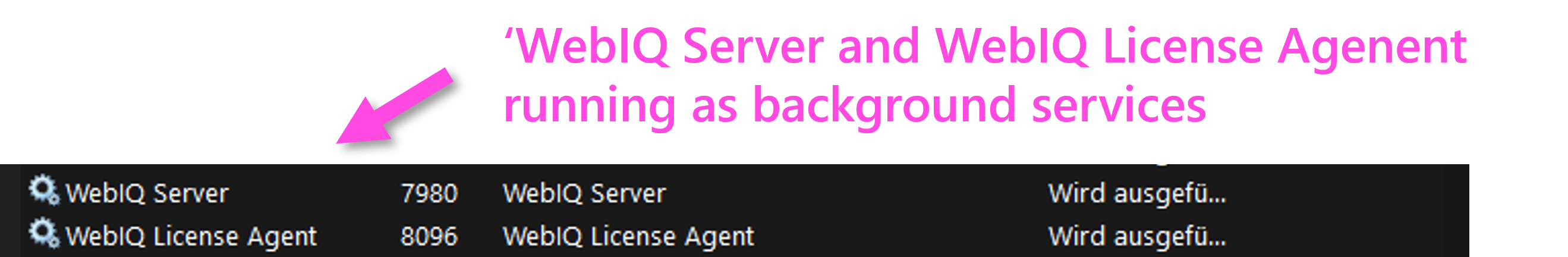
WebIQ is the HMI/SCADA system developed by Smart HMI which offers all the advantages of individual web HMIs for various devices and screen resolutions. WebIQ consists of a development version, called WebIQ Designer, and a runtime version, called WebIQ Runtime. Both versions are based on WebIQ Server, which is a web server with HMI/SCADA capabilities, which is installed as a system service and running in the background.
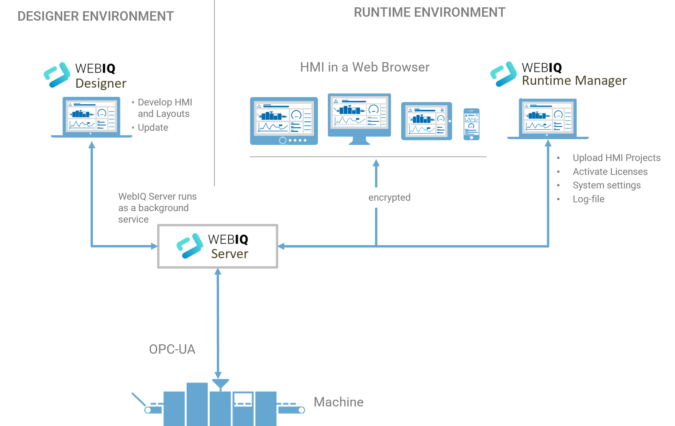
1.2. Runtime Environment
For a runtime system it is sufficient to install WebIQ Server on the target system on which the HMI is to be run in productive operation. After installation, a regular web browser can be used for accessing the system settings and license activation for the runtime version (WebIQ Runtime Manager).
This gives the on-site user, e.g. during commissioning or maintenance, full access to the WebIQ system without having to install another tool.
To start WebIQ Runtime Manager enter the following URL:
http(s)://<localhost>:10123 (for local access) or
http(s)://<ip-addr>:10123 (for remote access) in your browser.
Please note that you can only use HTTPS after you have set up a corresponding listener and installed the TLS certificate and key correctly.
|
The WebIQ Runtime Manager is the configuration tool for the runtime system. It includes all the necessary functions for commissioning and maintenance:
The WebIQ Runtime Manager can be accessed through http(s)://localhost:10123 or http(s)://<ip-addr>:10123 in a browser on the network. |
1.3. WebIQ Designer Environment
WebIQ Designer is the tool for developing and testing HMI/SCADA projects. The user can create and edit HMI projects, parameterize all HMI functions as well as using a drag&drop editor for layouting and navigating the user interface.
All system settings and configuration of the licenses are included here, so access via the WebIQ Runtime Manager is not necessary.
In addition, WebIQ Designer includes a Package Manager, which can be used to carry out system updates and install customer-specific packages. WebIQ Designer also includes a code editor that can be used for adding and editing JavaScript code or editing your own CSS classes.
|
WebIQ Designer is the engineering program to create and maintain modern web HMIs without web knowledge. WebIQ Designer is a desktop application and includes the following functions:
|
1.4. Installation
A unified installer is available for both versions, which can be used to select whether only WebIQ Server (runtime) or the complete package (WebIQ Server and WebIQ Designer) shall be installed.
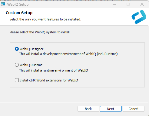
Figure 2. Full installation with WebIQ Designer and WebIQ Server
|
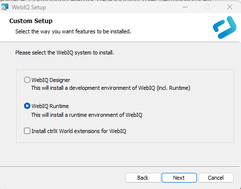
Figure 3. Runtime target installation: install only WebIQ Server
|
|
Choose the option 'Install ctrlX World extensions for WebIQ' if you want to use the Bosch Rexroth license system for the PC version of WebIQ. Please note that these are only available in the 64 bit version of WebIQ. |
|
For installing the WebIQ runtime system on LINUX target systems, see our instructions in the documentation section of our website (accessible only if you are logged in) |
1.5. Setting Up WebIQ Designer
After installing WebIQ on your Windows system you will find the following new icon for WebIQ Designer on your desktop:
WebIQ Server has been started as a System Service for Windows and is running in the background. This service is automatically started each time you start your Windows system. Another Windows service named WebIQ License Agent is also started automatically after installation and is responsible for the WebIQ license management.
You can access these programs e.g. on a Windows computer by starting the Task Manager and then opening the 'Services' tab.
1.6. Activation of WebIQ Designer Licenses (Including 30-Days-Free-Trial License)
After downloading and starting WebIQ Designer for the first time you are automatically taken to the license activation form. Choose Online Activation and enter your license key, preferably via copy & paste. Then the license information will be displayed, and you can select the license with the "Plus" button and then confirm the license activation and installation.
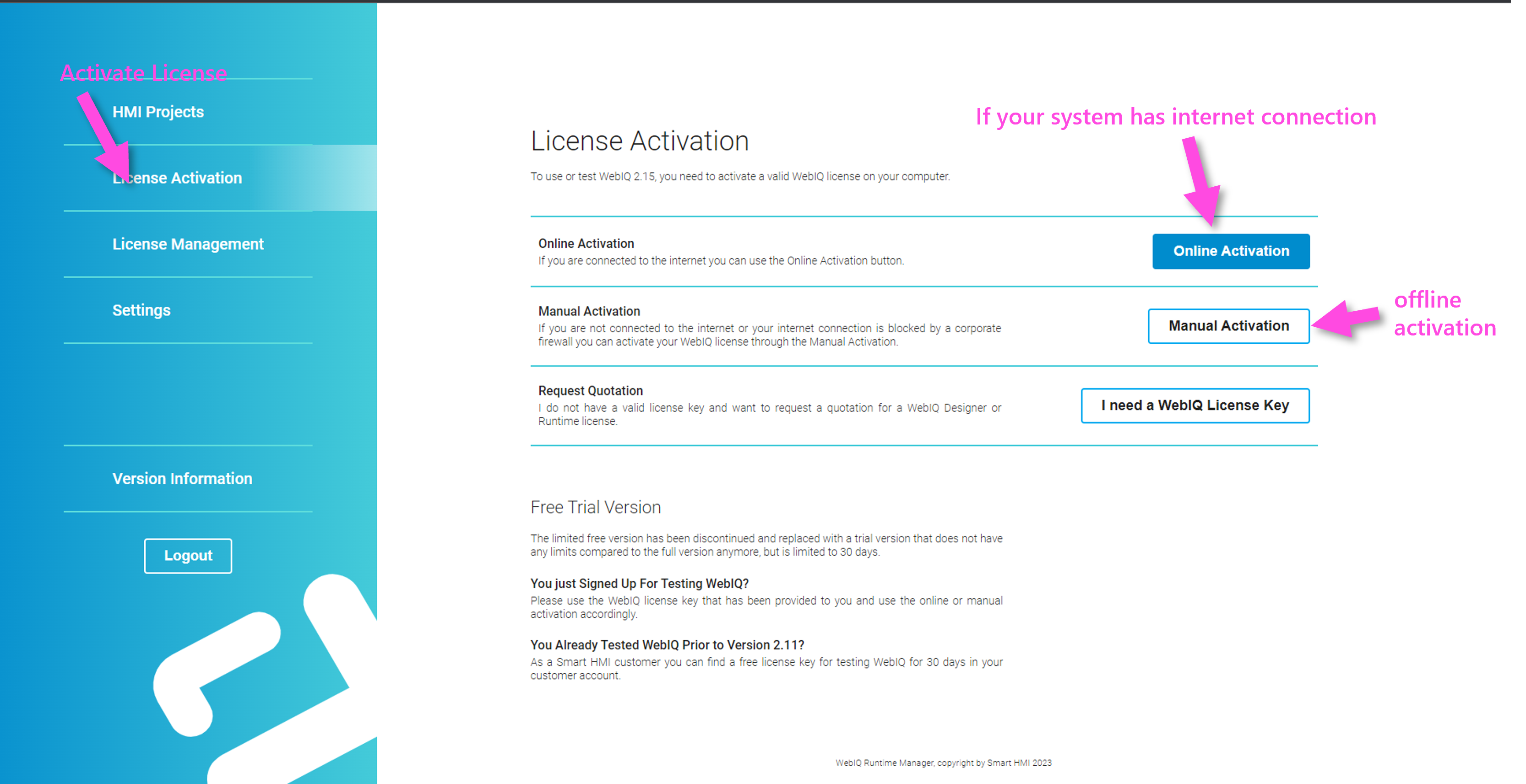
Figure 6. License Activation Form
|
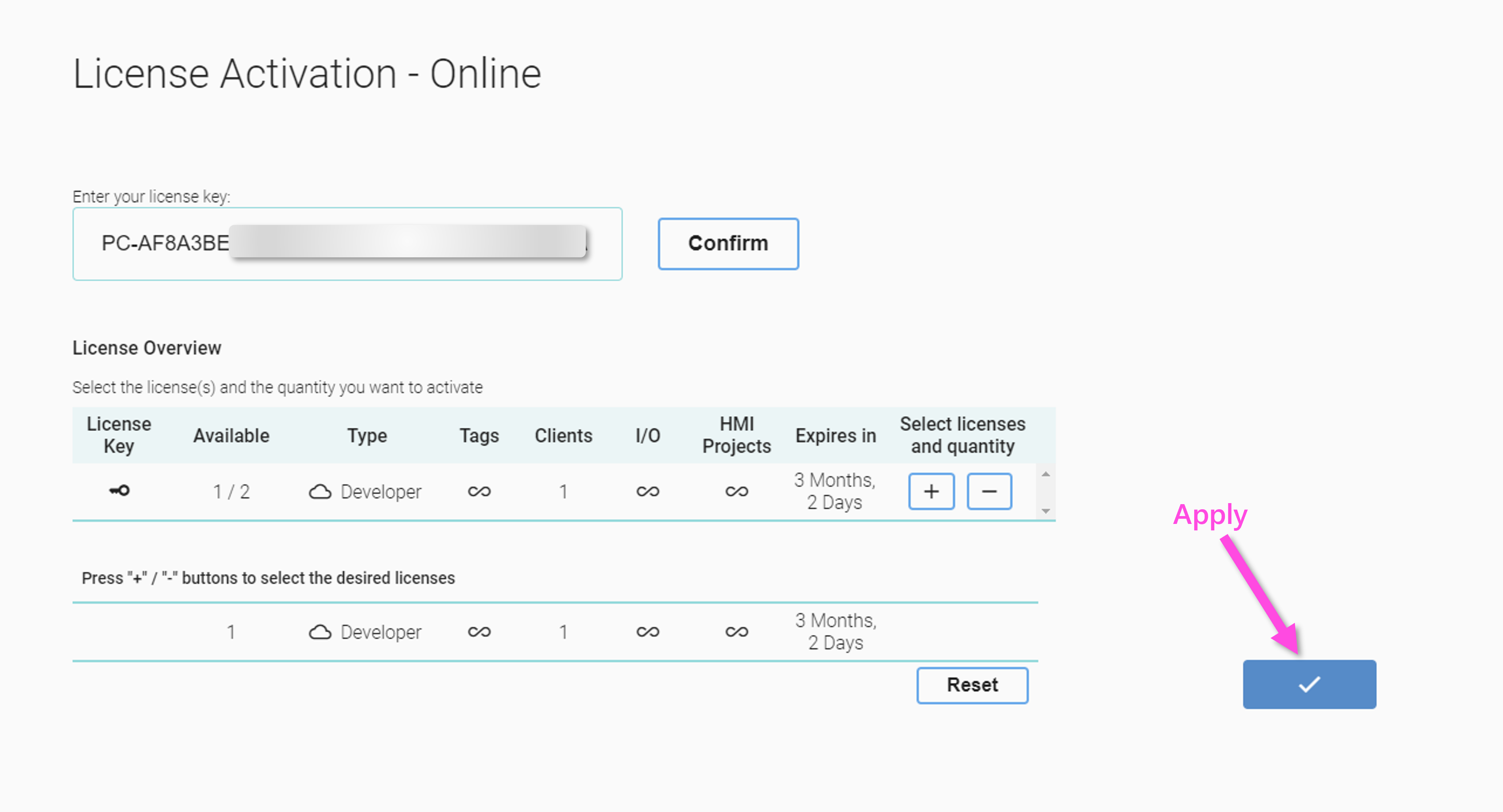
Figure 7. Select License with 'Plus' Button and Apply License
|
Done, now the license should be activated and WebIQ Designer is ready.
|
Once a license has been activated, it remains valid even if WebIQ is updated. |
1.7. Setting Up Runtime and Deploying HMI Projects
After you have created your first HMI project with WebIQ, you want to copy it to the target device and access it from there via a browser. You need a {app-name runtime license with the corresponding number of tags (process data points).
|
With a WebIQ Designer license, HMI projects can be created, edited and tested. There are no limits regarding the number of tags, clients or IO handlers. The project can also be displayed in a browser for testing, but is time-limited to 30 minutes after which the connection will be closed, but can be reopened automatically be reloading the HMI in the browser. For use in a production environment, a separate runtime license must be purchased and activated in order to operate the HMI permanently on a target system. Runtime licenses are graded according to the number of tags that can be used, the number of simultaneous client connections and the number of OPC-UA connections (IO handlers). |
1.7.1. Installing A Runtime System
To prepare your target system, you can execute the WebIQ Installer and select the 'Runtime' option to install WebIQ Server. If you have a Linux, Raspberry Pi or other target system, please refer to the relevant how-tos for installation in the documentation section. The runtime license should then be activated; there are also corresponding manuals for this in the documentation area.
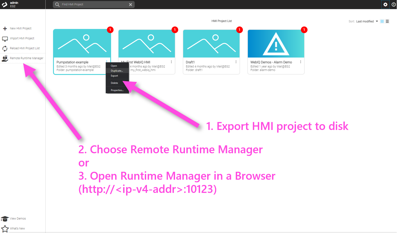
1.7.2. Exporting An HMI Project from WebIQ Designer
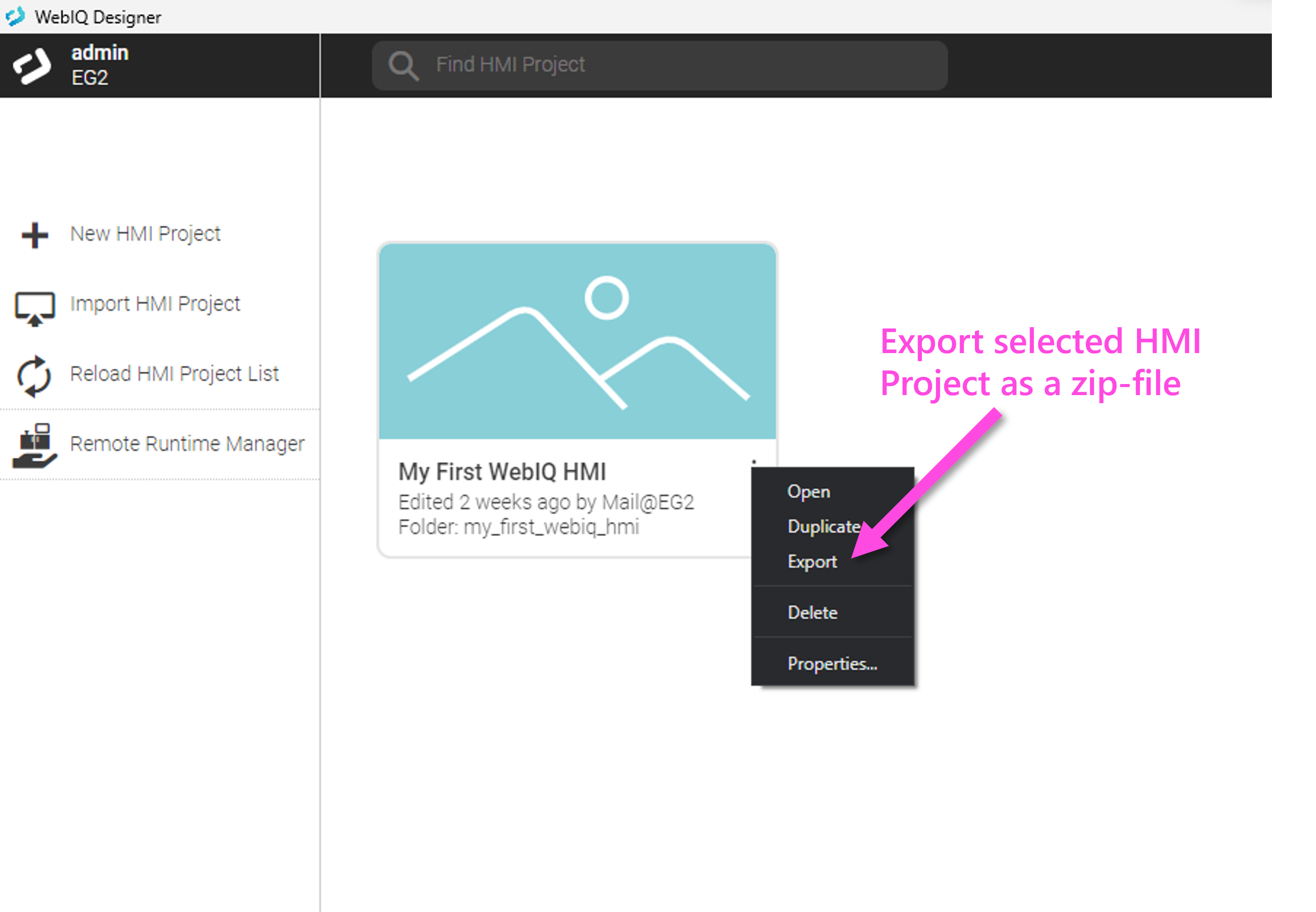
After you have created and tested an HMI project with WebIQ Designer, you can export it from the Project List page and then transport it to the target system. The exported HMI project is a zip archive that can be transferred to the target system via a USB stick, network or email, for example.
1.7.3. Opening WebIQ Runtime Manager
-
If your target system is on the same network as your development PC, you can connect to the target system through the 'Remote Runtime Manager' button on the left side inside WebIQ Designer (WebIQ Runtime Manager).
-
Alternatively: Open a web browser on the target system and access the local WebIQ Runtime Manager by entering the URL http://localhost:10123 in the browser’s address bar and press Enter. For more information see chapter WebIQ Runtime Manager.
Then follow the instructions in chapter WebIQ Runtime Manager to upload and start the HMI project.
1.7.4. Uploading, Starting And Opening The HMI In A Browser
After transferring and starting the HMI project, you can access it both locally ('localhost') and remotely via a browser. The URL for this is
`http://localhost:10123/<folder-name>` or `http://<ip-v4-addr>:10123/<foldername>`
|
The folder name that has been specified when creating the HMI project will be used for the URL and not the project name, which might contain special characters that are not supported in URLs. |
1.7.5. HMI Login
After opening the HMI in the browser, you will see the login page for entering user name and password that were defined when creating the HMI project (see also HMI Project-Specific Settings ("App Setting") or Creating a HMI Project).
After logging in with the chosen user name (e.g. admin) and password (e.g. 123) you can now see your HMI running in your browser.
|
The credentials "name" and "password" are dependent on the HMI project, not to be confused with the system user credentials that are used for WebIQ Runtime Manager (see also HMI Project-Specific Settings ("App Setting") or Creating a HMI Project). |
1.8. WebIQ Update
You can update WebIQ by simply running the installer with the new version. All existing folder structures and all activated licenses will be retained by following this procedure.
You can only see that a project needs to be updated through the red 'Update' bullet in the project list.
This happens automatically when you load the project, e.g. by clicking on the project tile or the context menu, the package manager automatically appears with the note that the project needs to be updated:
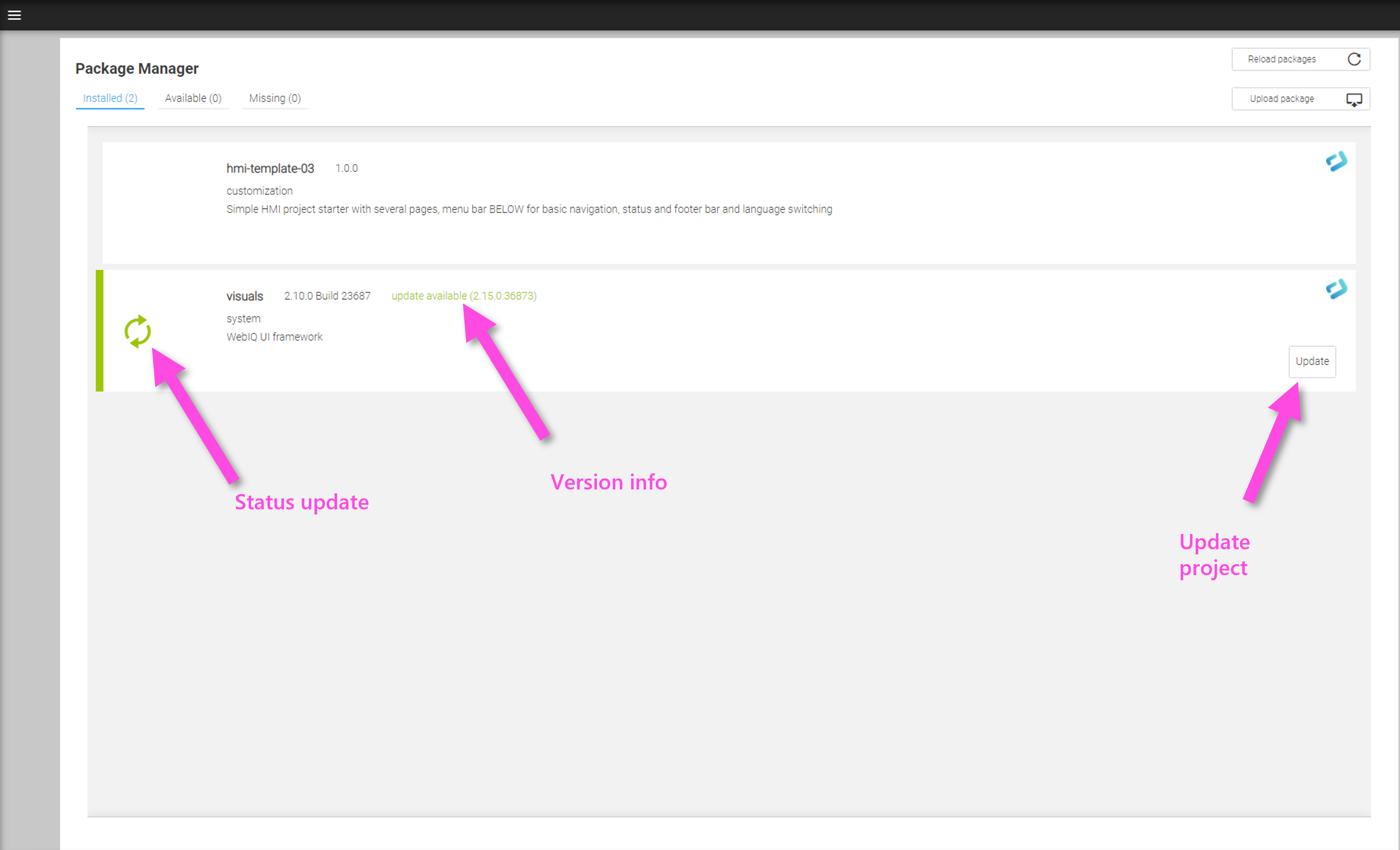
Update the project and then store it back to the project directory by publishing the HMI project again. If necessary, the updated project must then be transferred back to the runtime target system (see Exporting An HMI Project from WebIQ Designer).
|
WebIQ Designer and WebIQ Server should always have the same version number. Projects can always be updated to a later WebIQ version, but not the other way round. If you want to keep the old project status, copy the project first (e.g. by 'Publish a copy', Loading and Publishing HMI Projects). |
|
To install multiple different versions of WebIQ on your system, see the documentation 'Multiple Instances of WebIQ Designer at the Same Time' in the documentation section of our website. |
1.9. WebIQ Folder Structure
1.9.1. Project repository
All HMI projects you have created or imported with WebIQ Designer are stored by default in the %PROGRAMDATA\WebIQ\WebIQ Projects directory on your computer. They are independent of the user and are therefore available at the system level.
1.9.2. WebIQ Designer Working Directory
When a WebIQ Designer instance is started, it creates a local working directory in the Windows user data area (%APPDATA%). All data is in the directory %APPDATA%\webiq-designer.
Within this directory you find the
/workspace directory |
HMI project which is currently loaded |
/ packages |
HMI packages |
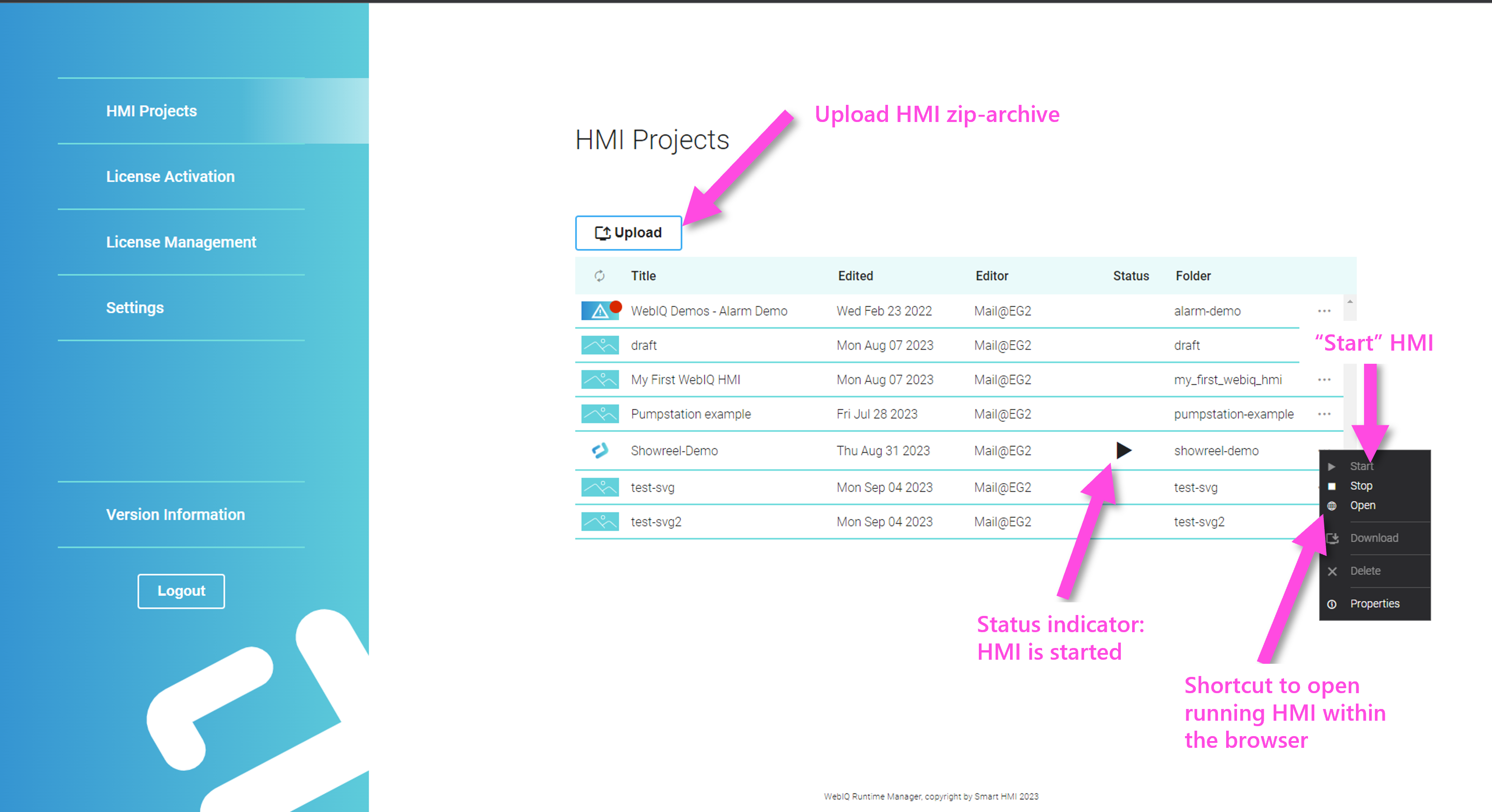
2. Project List
This chapter describes the Project List that you see automatically after starting WebIQ Designer. All existing HMI projects are displayed as tiles in the Project List and can be edited, started, etc. and new projects can be created.
2.1. Managing HMI Projects with WebIQ Designer
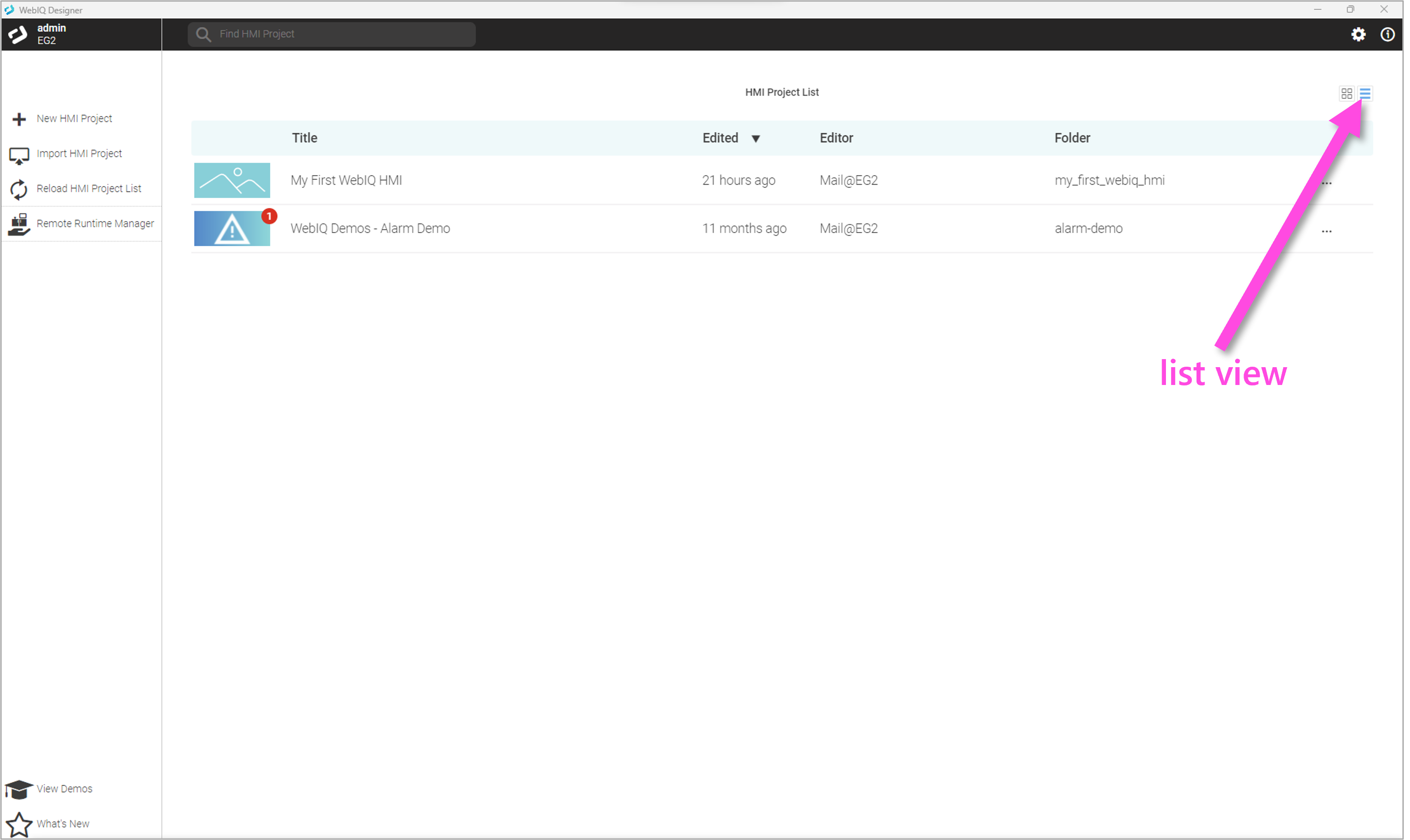
The project list makes all saved HMI projects available as tiles or in list form. From here, HMI projects can be loaded and numerous editing functions are available.
WebIQ demo projects can also be accessed online from here and viewed live, downloaded for explanation and edited ("look and learn").
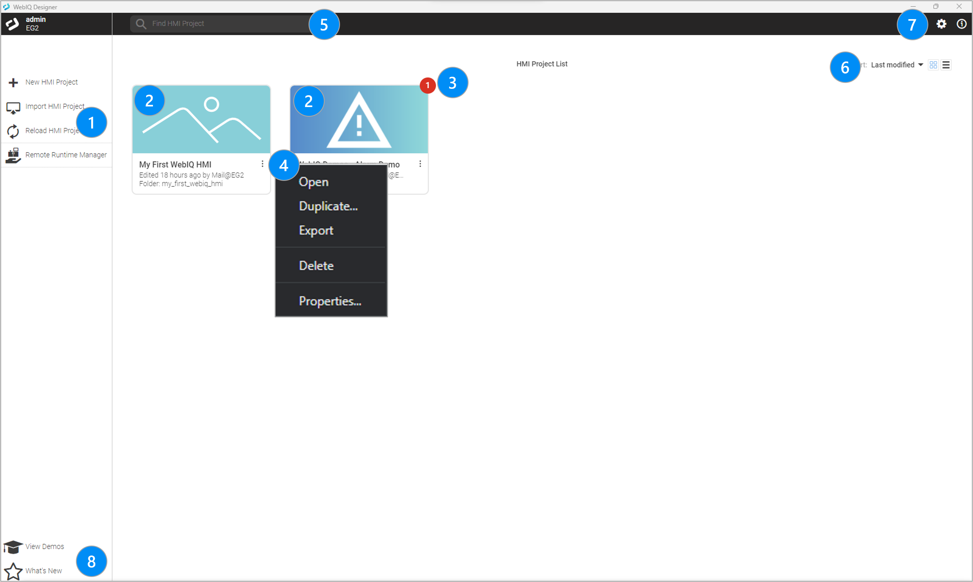
LEGEND
-
Functions Create, Import (from zip archive), Reload Project List (update if manual changes were made in the project directory) and Manage remote Runtime target systems (see Shortcut to Remote Runtime Systems On The Local Network)
-
Project Tiles with preview image (optional), project name, project folder, last edited date, open context menu
-
Display update status, the number indicates how many packages in the HMI project have to be updated. When updating WebIQ, the 'visuals' package, which is part of HMI projects, must be updated. When you load the project, you will automatically be taken to the Package Manager, where you can simply update the project and then save it in the new version (Publish).
-
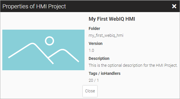
Context menu with Open (same as clicking on the tile), Duplicate project, Export (as zip archive), Delete or show more Properties
-
Search filter field
-
Select tile/list view, sort order
-
'Settings' and 'About' screen
-
Online demo projects and latest news
2.2. Loading and Publishing HMI Projects
When you load an HMI project with WebIQ Designer from the Project List by clicking on the project tile or by choosing 'Open' in the context menu, it is downloaded from WebIQ Server and then copied into the local workspace directory of WebIQ Designer and will be edited there (%APPDATA%\webiq-designer\workspace).
Then the Layout Manager will open with the project preview and the HMI can be created and tested.
After you have designed your HMI project with WebIQ Designer and tested it in the preview or preview browser, you want to save it permanently and display it on the runtime environment. To do this, you must first publish the project by returning to the project list.
LEGEND
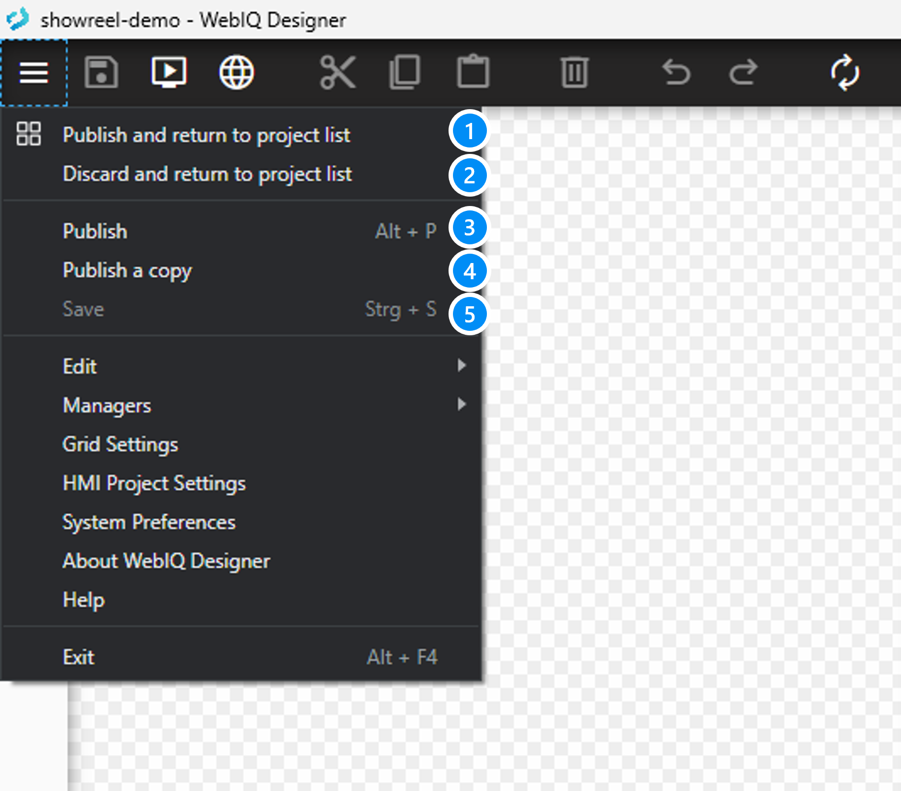
-
"Publish and return to project list" saves the contents of the WebIQ Designer workspace directory back to the project repository and stores the HMI project permanently. Then you will be taken back to the project list.
-
"Discard and return to project list" discards the content of the WebIQ Designer workspace. Be careful, this action cannot be undone, all changes you made in the Layout Manager will be lost. Then you will be taken back to the project list.
-
"Publish" uploads the contents of the WebIQ Designer workspace directory back to the project directory but stays in the Layout Manager. This action can be used as an interim backup for your development work. 'Alt-P' can be used as a keyboard shortcut.
-
"Publish a copy" uploads the contents of the WebIQ Designer workspace directory back to the project directory under a different project name but stays in the Layout Manager. This action can be used as an interim backup for your development work to store different versions during the development. Or choose an HMI project as a template and store it under a different name. To edit the newly copied HMI Project, you must then close the current one (e.g. via Discard) and then reopen the new one through the project list.
-
"Save" the "Save" button in the Layout Manager only stores the workspace folder to disk. When exiting WebIQ Designer or shutting down your computer, the changes will also be saved automatically. That’s why you don’t normally need to use the 'Save' function. In addition, the undo history will be cleared on 'Save'.
|
You need to 'Publish' the HMI project from your WebIQ Designer session to store it permanently! The "Save" button in the Layout Manager only stores the workspace folder to disk. When exiting WebIQ Designer or shutting down your computer, the changes will also be saved automatically. That’s why you don’t normally need to use the 'Save' function. In addition, the undo history will be cleared on 'Save'. |
2.3. Deleting an HMI Project
An HMI Project can be deleted by choosing 'Delete' in the context menu. WebIQ Designer will display a warning message and ask for confirmation, then the HMI project will be irretrievably deleted.
2.4. Creating a HMI Project
You can create a new HMI project by clicking on the button  on the left edge of the Project List.
The dialog "New Project" appears and here you can define all settings of your new HMI project.
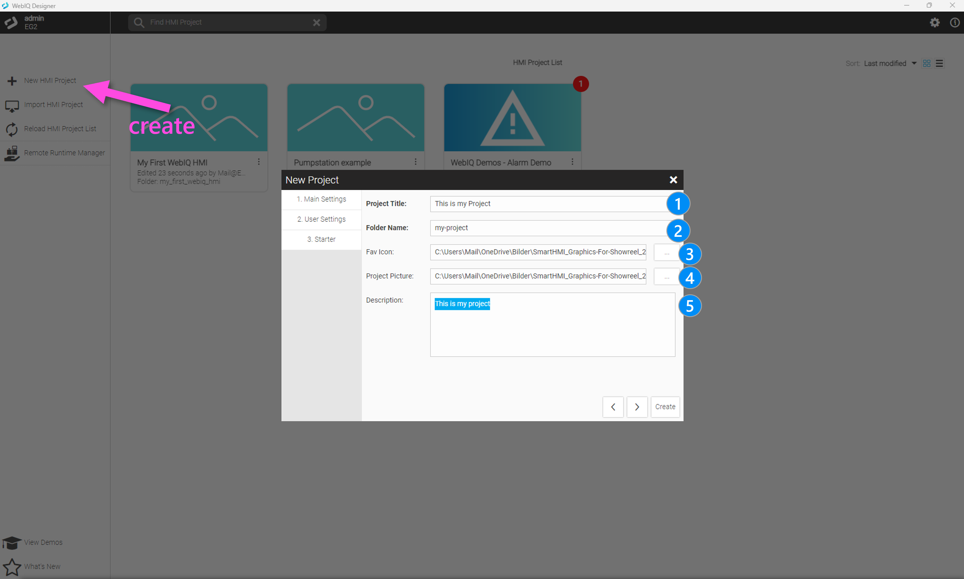
The dialog allows you to define the following settings:
2.4.1. Step 1: Main Settings (Mandatory)
-
Project Title Name of your HMI project (mandatory input, UTF-8 characters are possible)
-
Folder Name Name of the folder within the project directory where the HMI project will be stored (mandatory input, must be a valid path & filename)
-
Fav Icon upload an image file which is used as favicon (not yet supported by the current version of WebIQ)
-
App Picture: upload an image file which visually represents your HMI project within the project tile (optional)
-
Description: Optional multiline input of an HMI project’s description (optional, all UTF-8 characters are allowed)
|
Project Title, App Picture and Description can be changed later in the project via the 'HMI Project Settings' menu |
2.4.2. Step 2: User Settings (Mandatory)
Here, you have to specify an initial credentials for the HMI project.
-
Username: Name of the user (mandatory input)
-
Password: Password for this user (mandatory input)
-
Repeat Password: Repetition of the password (mandatory input)
|
To run the web HMI it is necessary to create at least one user account. |
2.4.3. Step 3: Choosing An HMI Starter Template (Optional)
Optionally, you can select an HMI start project (template) here. WebIQ contains ready-made starters, but you can also store your own templates here, see the documentation 'How To Create A Starter App (App Template)'.
| Name | Description | Template Image |
|---|---|---|
app-starter |
Simple starter template with a basic navigation |
|
hmi-template-01 |
Starter template with
|
|
hmi-template-02 |
Start template as above, only the navigation bar on bottom |
|
hmi-template-03 |
Start template as above, only the navigation bar on the left |
|
|
You can create you own HMI Starter Templates, see the documentation area 'How To Create A Starter App (App Template)' on our website (login required) |
2.5. Importing/Exporting HMI Projects
WebIQ exports and imports HMI projects as zip archives, which then can be copied and distributed to other computers.
-
Import any valid HMI project into the project directory (and project list implicitly) by clicking on the "import" icon in the left bar.
-
Export an HMI project from the context menu of the project tile
2.6. Reloading The Project List
Reload project list, can be used after manual modification in the 'WebIQ Projects' directory, e.g. if you have manually copied an HMI project to the Project Repository (Project repository).
2.7. Remote Runtime Manager
Optionally you can discover and connect to a remote runtime target system within your local network. This functionality is a convenient shortcut to directly discover and connect to remote runtime systems.
For more information refer to Shortcut to Remote Runtime Systems On The Local Network (shortcut) and WebIQ Runtime Manager (functionality). :doctype: article
3. Layout Manager
If you have loaded an HMI project via the project list (see Loading and Publishing HMI Projects), you will be taken to the Layout Manager, where you can develop and test the HMI using the integrated drag-and-drop editor and parameter dialogs (managers). In addition to project processing, the layout editor also contains preview functions through an integrated preview and via the system’s default browser or also by using a remote browser through the network.
3.1. Layout Manager Functions
The Layout Manager consists of an integrated 'Preview' browser-window that shows all widgets and the current layout of the HMI (WYSIWYG - What You See Is What You Get). There are also numerous parameter dialogs on the side edges, which will be explained in the following.
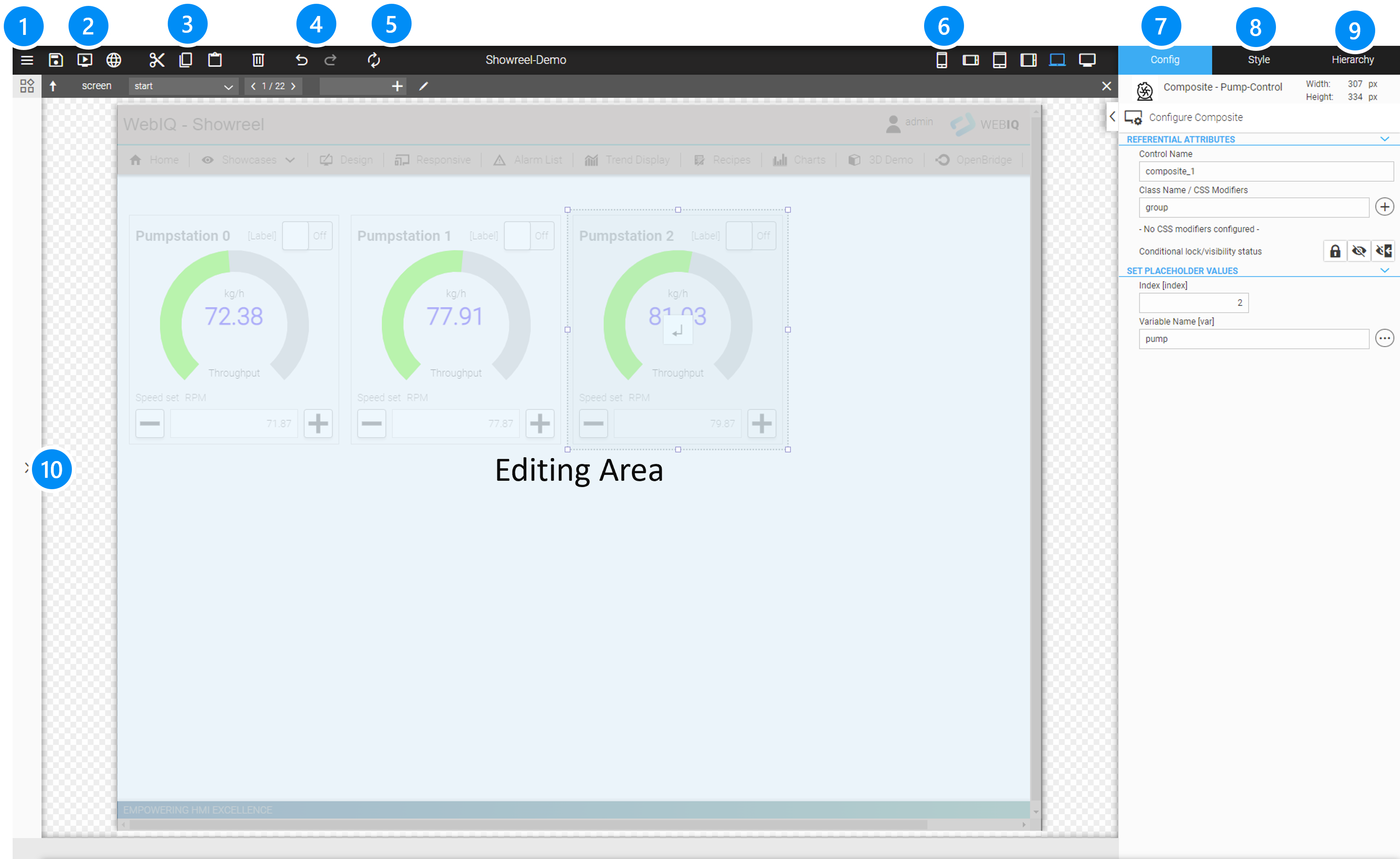
LEGEND
-
Publish or Publish and close, go back to Project List, Preferences and About Screen
-
Store, Fast Preview and Preview in standard web browser
-
Cut/ Copy/ Paste
-
Undo/ Redo Buttons
-
Refresh Project view inside the editor
-
Select different screen sizes (responsive inspection)
-
Configuration Cockpit (Widget specific configuration parameter)
-
Style Cockpit (Layout and Styling Options of the selected Widget)
-
Hierarchy Cockpit (shows layout Hierarchy)
-
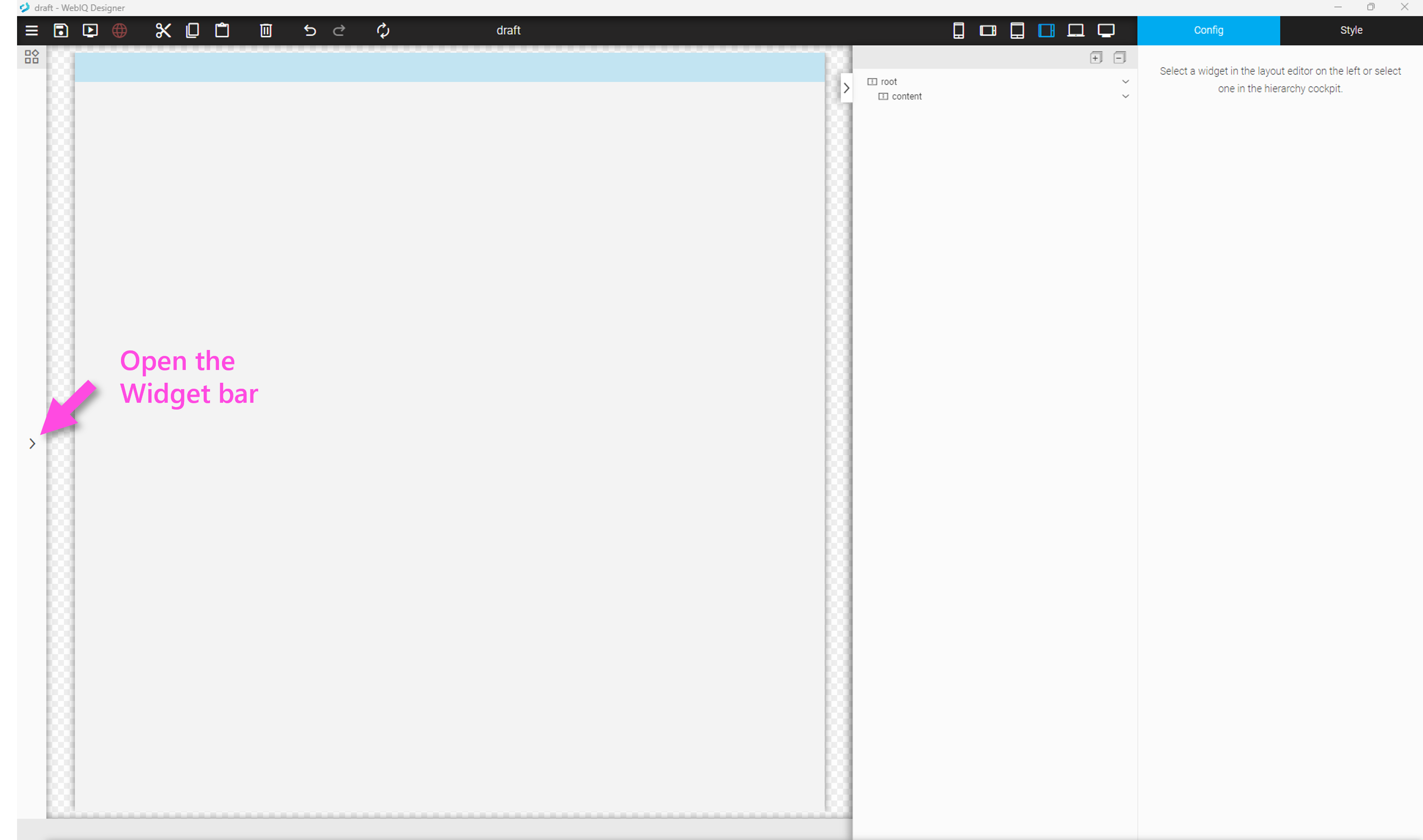
Open/Close Widget List
In general, all operator interactions are locked within the HMI editor, since the interactions are intended for editing the layout. If you want to test the interactions, switch to the preview (see Preview Window or Preview in a browser).
3.2. Expand and pin Hierarchy Cockpit
To view your HMI cockpits for configuration and styles and in the Hierarchy Cockpit with elements hierarchy at the same time, click on the tab (a) and the hierarchy will be expanded and be permanently visible. This makes it easier to get an overview of more complex HMI projects, but has the disadvantage might be that a part of the HMI editor will then be covered (depending on your screen resolution).
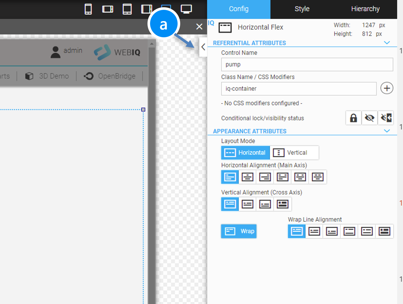
Figure 19. Click on the arrow icon
|
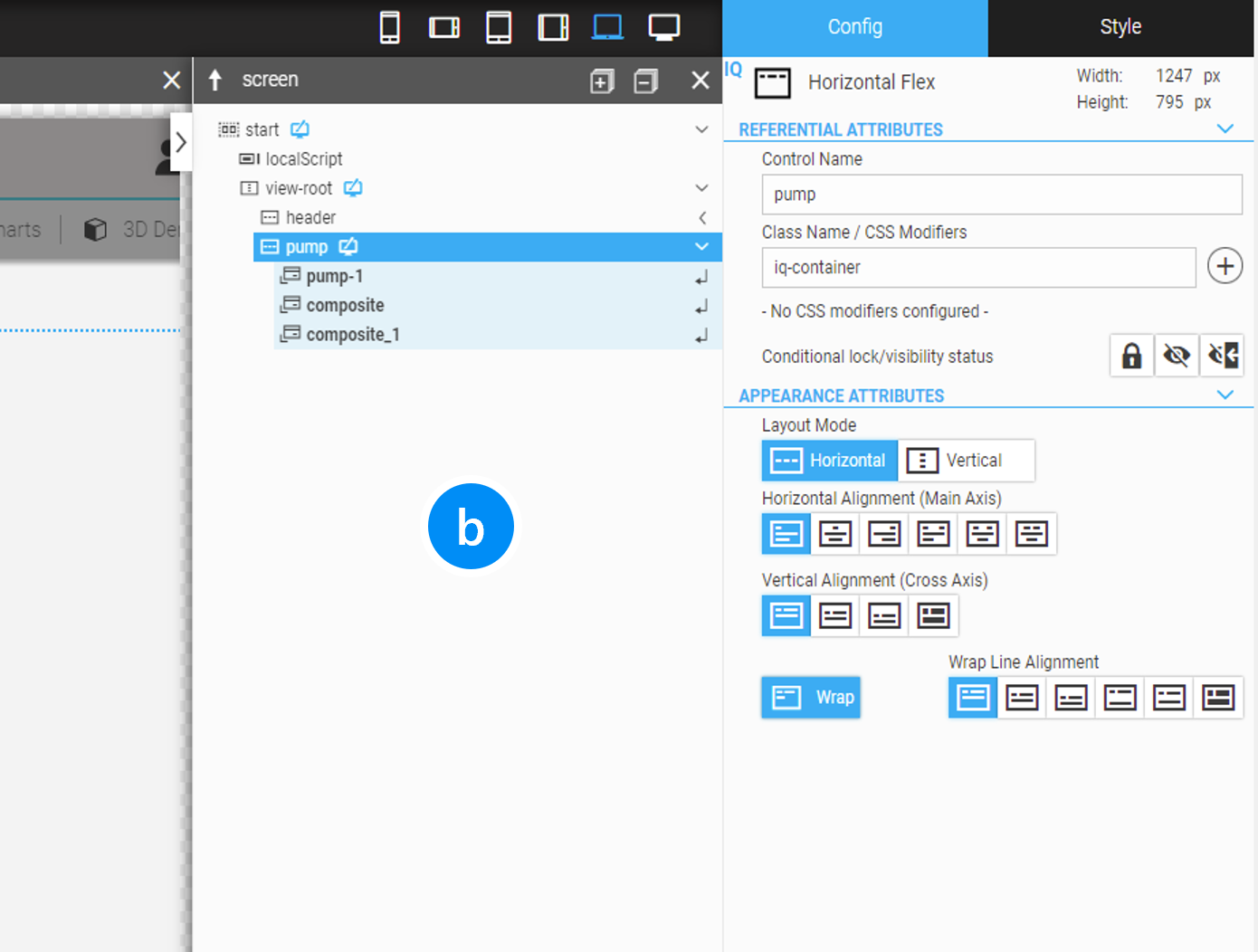
Figure 20. Hierarchy Cockpit is expanded
|
|
You have to find out in your practical work which mode is the better for your work, with or without an expanded hierarchy view. |
3.3. Layout Hierarchy
An essential component for the layout in the WebIQ Designer is the Hierarchy Cockpit on the right, which can also be permanently expanded as shown in the previous chapter.
The hierarchy cockpit shows the current tree of the layout, which corresponds to the hierarchy of the widgets in the HTML code. Widgets can be inserted into the Hierarchy Cockpit or, equivalently, directly into the graphical layout and then follow the position rules of the parent container, so-called container layout, when displaying them. For detailed information of 'container layout' see chapter Layouting Your HMI With Containers.
|
WebIQ works with 'container layouts', which are used in web technology and which, in contrast to pixel-oriented layouts, enable very flexible, resolution-independent responsive HMIs. |
For the sake of clarity, the Hierarchy Cockpit only shows the content of the current page or the current overlay dialog. Further information about creating multiple views and dialogs can be found in the Creating HMIs With Multiple Views and Overlays chapter.
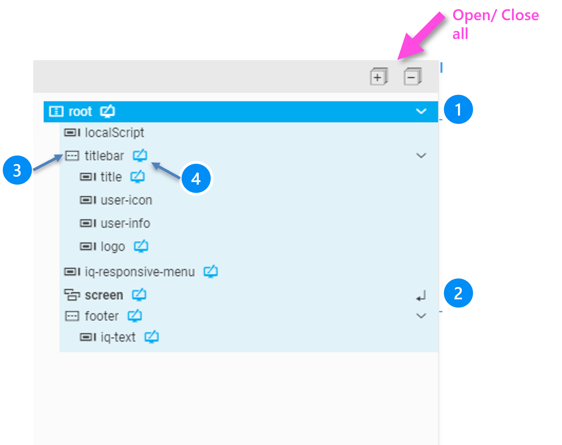
LEGEND
-
Collapse/expand the container
-
Display a sub-element. Double-clicking or pressing the Enter key when this element is selected opens the subview. You can also click on the system to open the subview.
-
Icon for type of the widget
-
Marker is set as soon as at least 1 style setting has been set, e.g. width, height, color etc.
Overview of the used icon type icons:
Icon |
Description |
|
Horizontal container |
|
Vertical container |
|
Any functional widgets |
|
Panel widget Screen, Swipe-panel, Tab-control |
|
Overlay widget Dialog, Popup, Swipe panel |
|
View widget (root of any screen page) |
3.3.1. Multiselect
It is possible to select multiple widgets and entire container groups at the same time. As usual in Windows, this is done by simultaneously pressing the Shift key (marking areas) or by pressing the Ctrl key (marking individual elements).
Select Widget Groups can be moved, copy/pasted, exported/imported, but editing is not possible in the Config or Style Cockpit.
3.4. Saving, Previewing Inside WebIQ Designer and in a Browser
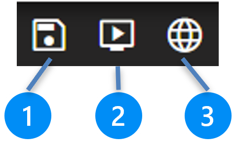
LEGEND
-
Saves the current layout into the internal WebIQ Designer workspace to disk. The undo buffer is reset after this action, so no more undo actions can be performed.
| The 'Save' functionality stores the computers memory to the workspace folder of the disk, it does not store the HMI project! |
-
Shows the fast preview of the HMI Project. Here you can see how your HMI looks in a window and you can test all interactions such as navigation, inputs, etc.
-
If you press this button, your HMI project will be displayed directly in your computer’s standard browser. However, you can also display the HMI project in a remote browser via your network at any time by entering the following URL:
http://<ipv4-addr>:10124
10124 is the default port that WebIQ Designer preview server operates on. If you change it (see WebIQ Designer Settings) you have to adjust it here accordingly.
The 'Preview in a Browser' feature allows you to preview your HMI on the target device in the target browser at the same time as editing your HMI project with WebIQ Designer. This is very useful, since you can test your work results directly on the target system after each processing step.
To see the latest version after editing in WebIQ Designer, it is sufficient to press the F5 key to reload the browser view. It is not necessary to save the HMI project beforehand.
|
Browser preview mode is not intended for productive use. Therefore, the preview mode will be reloaded after 30 minutes. |
3.5. Layout Editor Cut, Copy, Paste, Delete
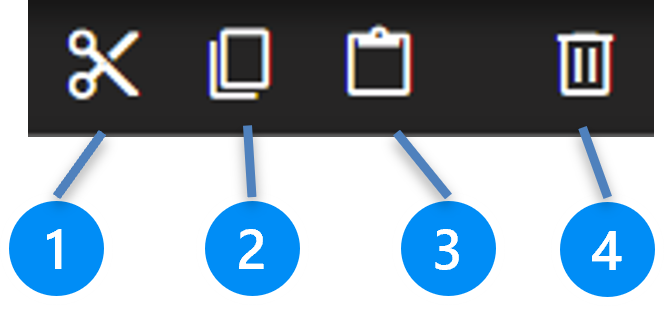
LEGEND
-
Cuts the selected Widget or Container
-
Copies the selected Widget or Container to the Clipboard
-
Pastes the Clipboard into the selected container. If you try to copy content from the clipboard to another widget, that content will be copied to the next container above.
-
Deletes the selected Widget or Container
3.6. Layout Editor Undo/Redo
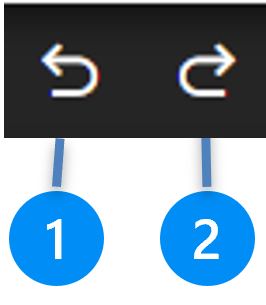
LEGEND
-
Undo previous input
-
Redo previous input
| After Saving the HMI Project, the undo/redo buffer is cleared |
3.7. Layout Editor Refresh

LEGEND
-
Refreshes the integrated HMI Editor browser window
Used for defined resetting after errors or unforeseen behaviour.
3.8. Layout Editor Preview for Different Layout Sizes (Responsive Design)

Used to preview different device classes or resolutions. Here, the view of a special device class, e.g. smartphone portrait, can be simulated in the HMI editor (see chapter Device Specific Styling).
3.9. Layout Manager Commands and Shortcuts
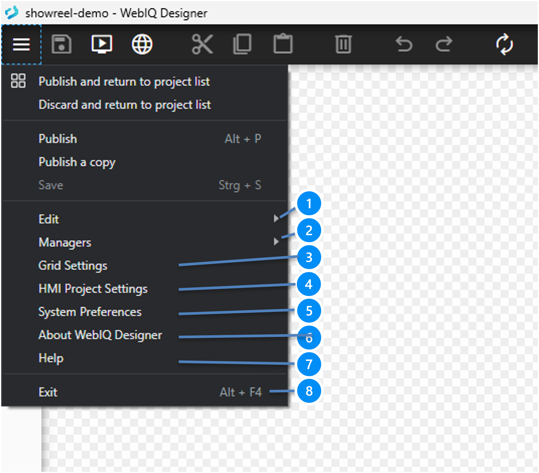
LEGEND
-
Edit section with clipboard commands and keyboard shortcuts
-
Managers Section for backend functions and Package Manager, see Manager Functions
-
Grid settings for free position mode, a grid size in x- and y-direction can be set for free position mode and grid units in Style Cockpit
-
HMI Project Settings, see HMI Project-Specific Settings ("App Setting")
-
System preferences ([WebIQ-Designer-Settings])
-
About Screen
-
Link to this Manual (Help Screen)
-
Exit WebIQ Designer. On exit, the content of the currently loaded workspace will be saved and the undo-buffer cleared but the current project remains in the workspace until you close it with "Publish" or "Discard"
|
For the upper part of the menu see Loading and Publishing HMI Projects |
3.10. Manager Functions
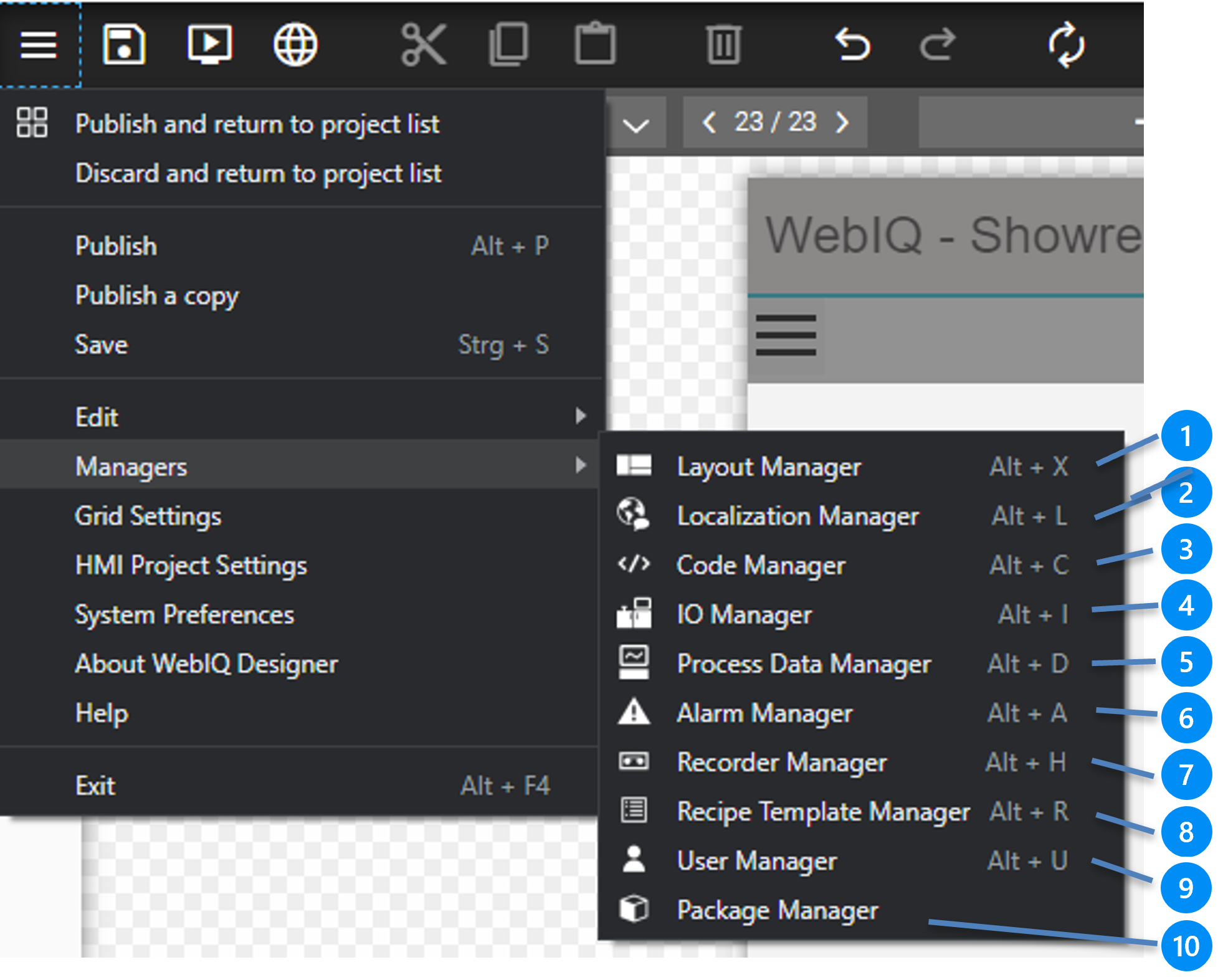
-
Back to Layout Manager (Alt-X)
-
Localization Manager with localization texts and languages (Alt-L), see Localization
-
Code Manager (JavaScript and CSS3 code), see Integrated Code Editor for JavaScript and CSS3
-
IO Manager, add and edit IO Handler, e.g. OPC-UA connection and see the connection status (see IO Handler (OPC-UA) )
-
Process Data Manager, manage Process Data (Tags), Structures, internal variables (Virtual Items), Methods (see Process Data Manager and following
-
Alarm Manager, define and edit alarm messages (see Use Alarms And Alarm Lists)
-
Recorder Manager, defines and edits recorder (datalogger), add items to recorder, define trends (see Data Recorder And Trend Display)
-
Recipe Template Manager, define and edit Recipe Templates (see Recipes Manager And Recipe Widgets)
-
User Manager, Edit User, Usergroups and Accessgroups (see Managing Users And Access Groups)
-
Package Manager Package Manager
3.11. HMI Project-Specific Settings ("App Setting")
All project-specific settings can be made here:
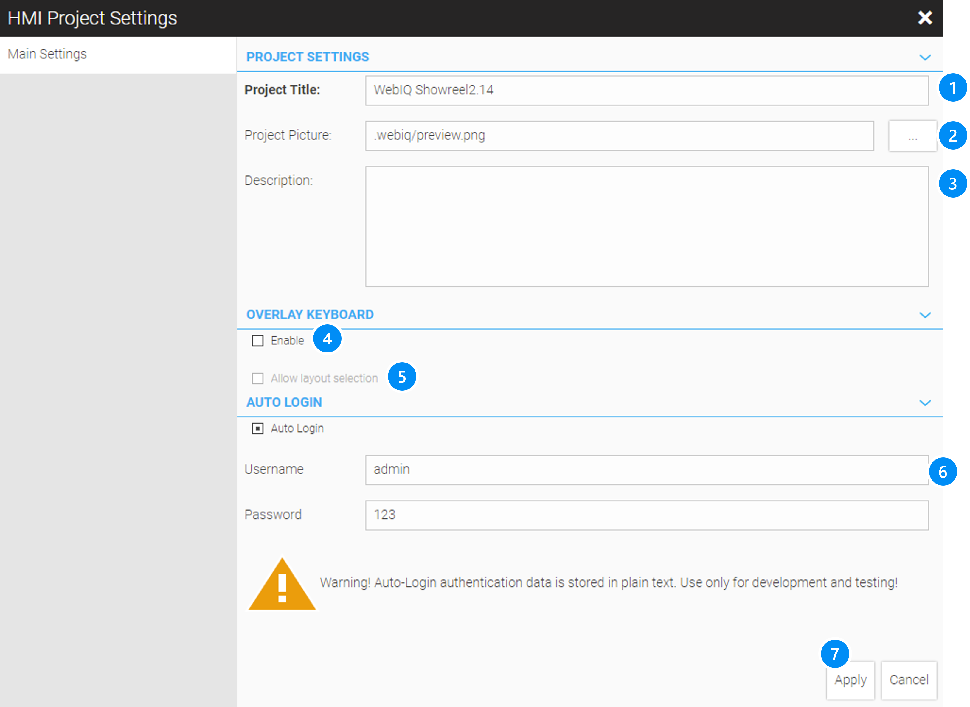
LEGEND
-
Project title, which is displayed in the project list
-
Project picture, which is displayed in the project list
-
Description (only for documentation)
-
Checkbox: Shows an alphanumeric keyboard for all input fields on focus (except input widgets, where 'Numpad Enabled' has been selected)
-
Checkbox: Allows selection of the locale layout on the keyboard, when selected.
-
Checkbox Auto-login and credentials: Skip login screen and load the HMI screen immediately.
4. Using Widgets
|
Refer to the chapter Integrated Widgets (Visuals), to get a detailed list of available widgets and their configuration. |
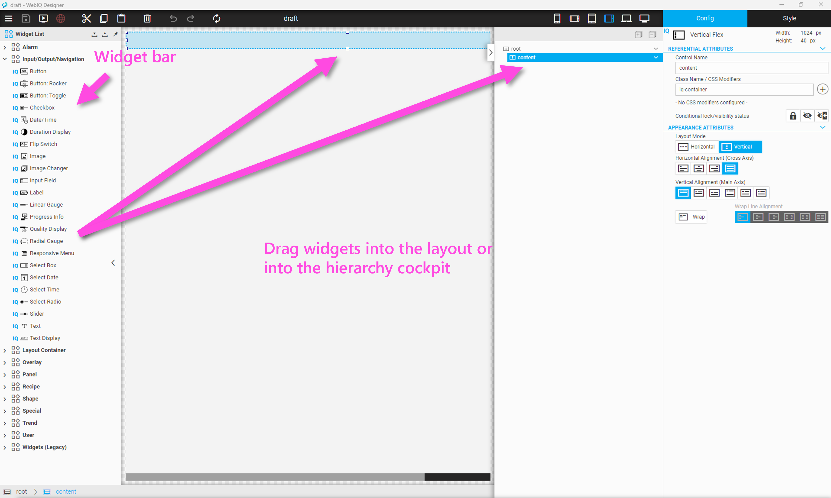
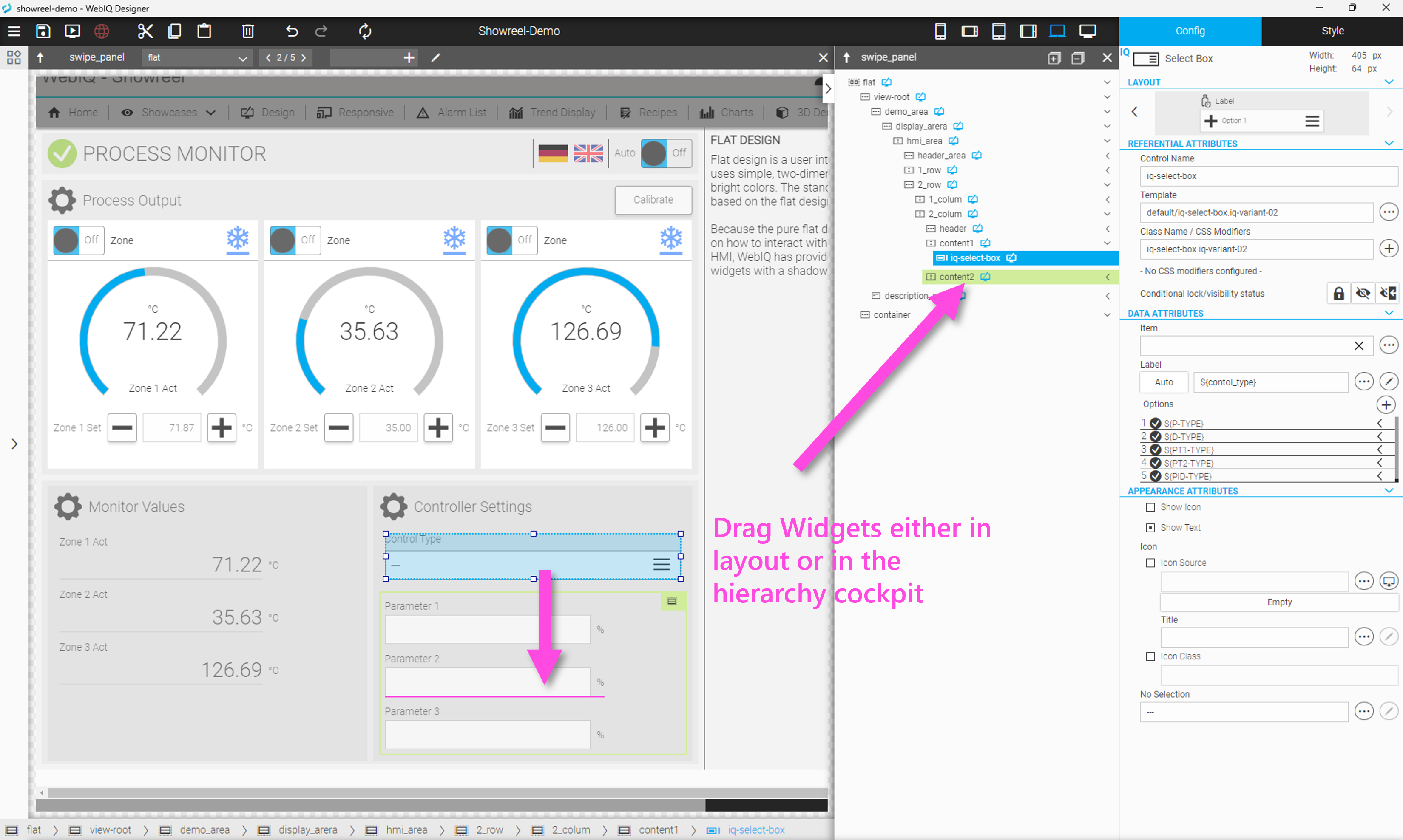
4.1. Inserting Widgets
To create a layout with the drag-and-drop editor, open the widget bar and drag the widget symbol either directly into the layout or into the hierarchy cockpit. The markings in the layout and hierarchy cockpit are linked.
4.2. Configuring or Styling a Widget or a Container
Click on the Config Cockpit tab (top right corner) to display the configuration settings of the selected widget. Each widget has its own configuration.
Click on the Style Cockpit (second tab on top right corner) to display the style settings of the selected widget. Style settings are
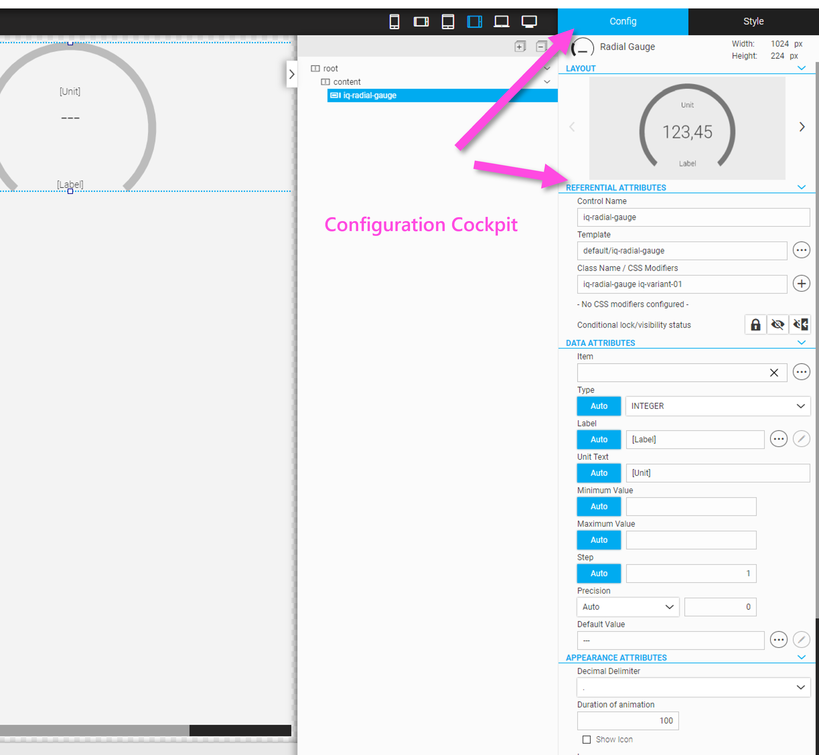
Figure 27. Configuration cockpit for selected widget
|
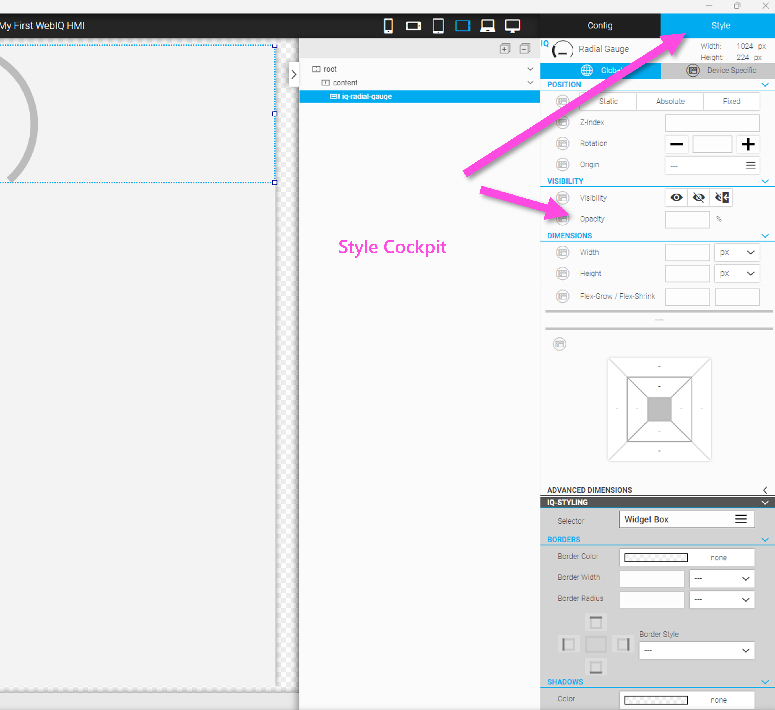
Figure 28. Styling cockpit for selected widget
|
4.3. Moving a Widget Inside the HMI Layout
At some point you’ll probably want to change the order of widgets within a container, or move a widget from one container to another. To do this, you can use the drag-and-drop function of the HMI editor as well as the drag-and-drop function within the hierarchy cockpit.
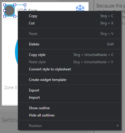
4.4. Context Menu of a Widget
Select any element (widget, container, panel, …) in the hierarchy cockpit and open the context menu by right-clicking. In addition to Copy/Paste/Cut/Delete you will find other functions there:
4.5. Cutting, Copying, Pasting and Deleting a Widget
Cut (keyboard shortcut: Ctrl + X):
Select any element (widget, container, panel,…) in the layout editor or hierarchy cockpit, click the icon  or use the keyboard shortcut Ctrl + X in order to cut the selected widget into the clipboard.
Copy (keyboard shortcut: Ctrl + C):
Select any element (widget, container, panel,…) in the layout editor or hierarchy cockpit, click the icon  or use the keyboard shortcut Ctrl + C in order to copy the selected widget into the clipboard.
Paste (keyboard shortcut: Ctrl + V)
Select any element (widget, container, panel,…) in the layout editor or hierarchy cockpit, click the icon  or use the keyboard shortcut Ctrl + V in order to paste the content from the clipboard after the position of the currently selected widget.
Delete (keyboard shortcut: DEL):
Select any element (widget, container, panel,…) in the layout editor or hierarchy cockpit, click the icon  or use the key DEL to delete the selected widget.
4.6. Copy style, paste style, convert style to stylesheet
Copy style (keyboard shortcut Ctrl+Shift+C): Copies all stylings of the Style Cockpit of the selected widget to the clipboard. If no style settings are made, the 'copy style' entry in the context menu is greyed out.
Paste style (keyboard shortcut Ctrl+Shift+V): Applies all style settings from the clipboard to the style of the selected widget.
|
Only style settings from widgets of the same type can be pasted. For example, if you copied the style setting from a 'Button' and then selected a widget of type 'checkbox', the 'Paste style' entry in the context menu will be greyed out. Using multiselect, i.e. selecting several widgets in the hierarchy while holding down the Shift or Ctrl key, styles can be pasted for several widgets at the same time, as long as all widgets have the same type. |
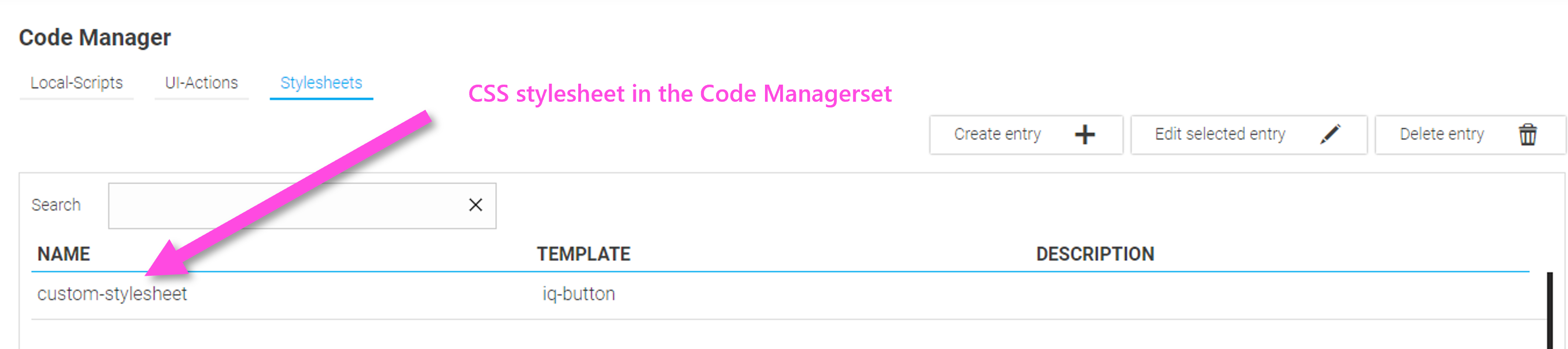
Convert style to stylesheet (no keyboard shortcut): Applies all style settings from the clipboard to a CSS stylesheet file and applies it to the widget.
Using 'Convert style to stylesheet', all settings from the widget’s Layout Cockpit are translated into a CSS stylesheet. Then all individual style settings of the widget are removed and replaced by the style class:
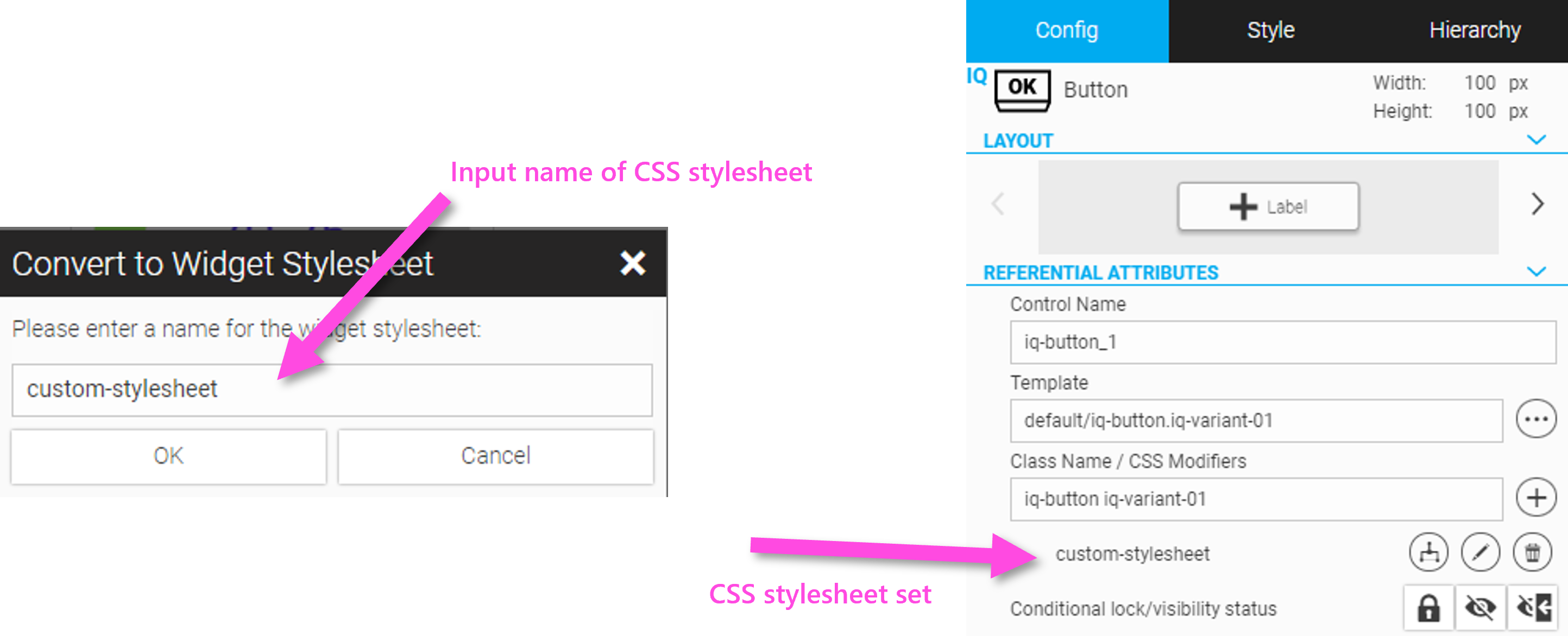
The CSS stylesheet is also available via the Code Manager under 'Stylersheets' and can be further edited there.
|
All styling information that is entered via the Style Cockpit is adopted into the HTML layout as so-called inline styling. If you need recurring styling, e.g. when implementing a style guide or something similar, it makes sense to write the style settings in a CSS class and assign it to the widget. This has the advantage that these style classes can also be changed later and the changes apply to all instances. It also helps the browser when rendering if recurring style settings are only set once via the CSS class, which results in improved performance. The browser only needs to read and interpret the CSS class once and can apply the result to the widgets many times. |
4.7. Export/Import
You can export a widget or even a container with multiple widgets in order to reimport them into the same project at a different position in the hierarchy or into another project. The exported content will be saved with the file extension .webiqlayout and is a ZIP archive of the exported layout hierarchy.
Conversely, the exported part can be reinserted anywhere in the layout hierarchy.
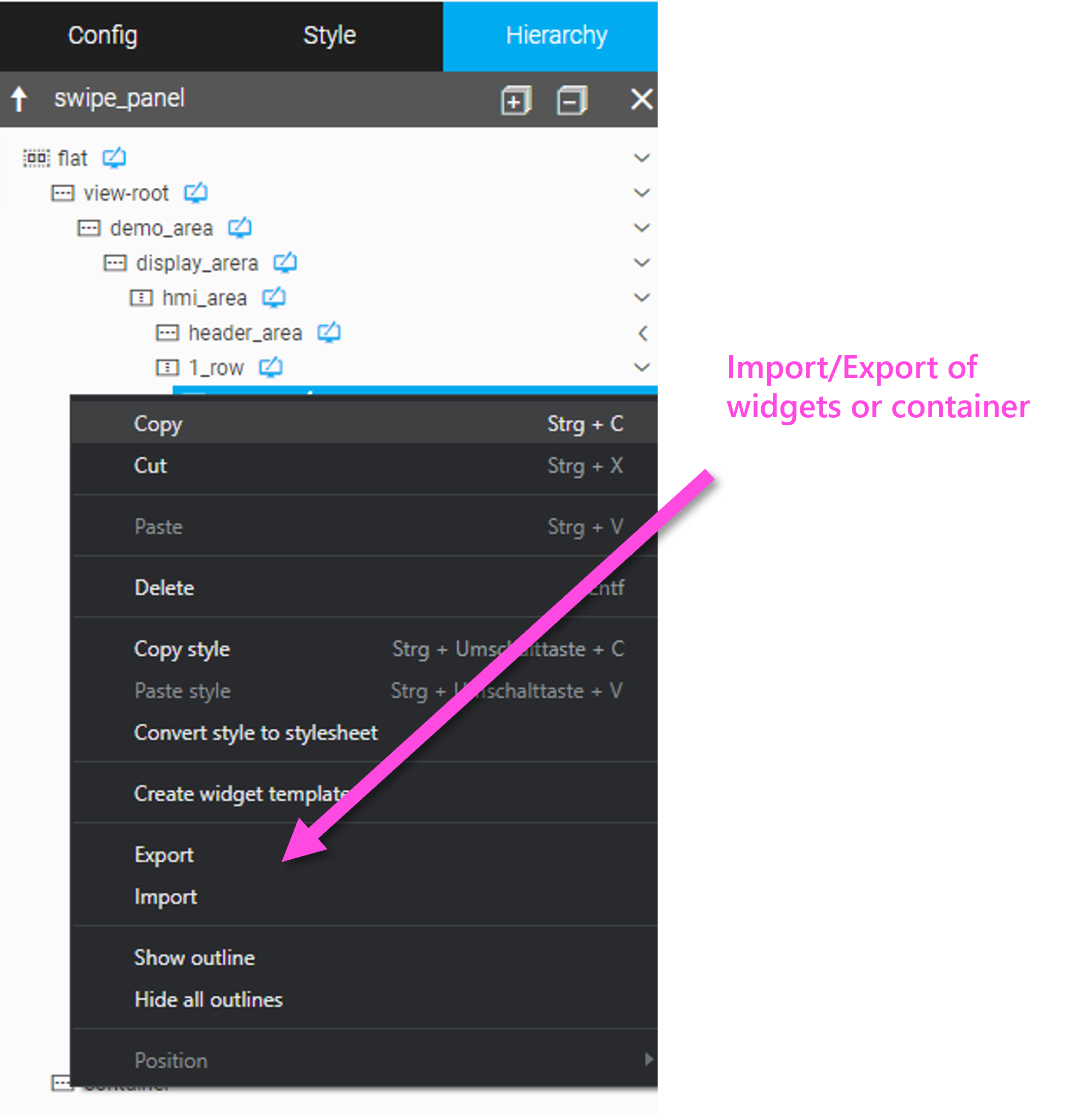
Show/Hide Outline of a Widget or a Container
For testing and to support more complex layout structures - especially when developing HMI projects with responsive design - the edge of the widget or container can be marked with an outline. The function for marking (Show Outline) or for hiding (Hide Outline) is also available in the context menu.
|
The outlines will be removed when publishing and closing the HMI project. |
5. Description of WebIQ Widgets
The following chapter provides an overview of all widgets included in WebIQ (Package "Visuals") by default and their configuration.
5.1. Introduction
WebIQ offers more than 60 standard widgets. Included are common UI widgets such as buttons, selection boxes etc. and also output widgets like gauges and value displays. Also, very extensive widgets - which we call application patterns - like an alarm list, a trend display and a recipe editor, which are required in many HMI applications, are part of the WebIQ system by default. This ensures cost efficiency and a short time-to-market, because they are completely predefined solutions which you simply insert and configure.
All widgets of WebIQ are web widgets which have been optimized for use in industrial applications and touch screen operations.
The widgets are included in the system package "visuals", which is installed by default. All widgets of WebIQ are web widgets which have been optimized for the use in industrial applications and for touch screen operation.
For more information about working with packages see Package Manager.
5.2. Widget List
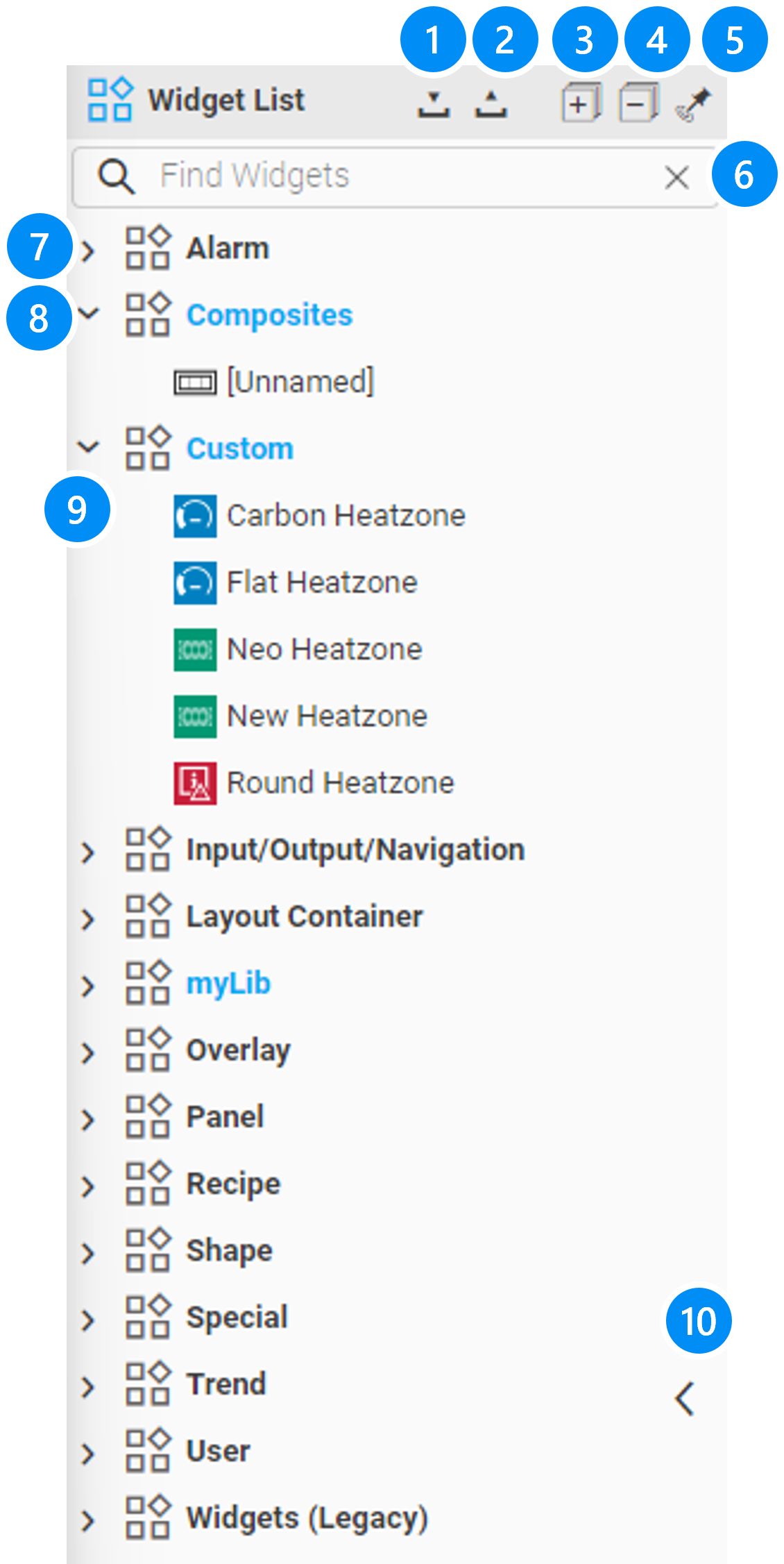
LEGEND
-
Import one or more Widget Templates and Composites incl. resources
-
Export one or more Widget Templates and Composites incl. resources
-
Expand all categories
-
Collapse all categories
-
Pin Widget list
-
Search bar to filter widgets by name
-
Widget category
-
Custom category (blue)
-
Widget
-
Open/close handle (Widget List)
)* Due to backwards compatibility, deprecated widgets as well as widgets which have been replaced by new versions will be delivered under the category "Widgets (Legacy)".
The widgets are grouped in categories as follows:
Category |
Description |
Alarm |
Alarm List and Alarm Info Widgets |
Composites, Custom |
Custom categories, if defined |
Input/Output/Navigation |
All Widgets to display or editing values |
Layout Container |
Layout containers to define flexible HMI layout |
Overlay |
Widgets to create overlays, such as Dialogs, Popups, Slide-Ins |
Panel |
Widgets to create multi-page content with different views such as Screen Panel, Swipe Panel, Tab Panel |
Recipe |
Widget to handle recipes |
Shapes |
Widgets to create geometric forms |
Special |
all other special widgets i.e. Composites, heartbeat,… |
Trend |
Widgets to display trends |
User |
Widget to handle User management from inside the HMI |
Widgets (Legacy) |
Deprecated widgets which have been included for compatibility reasons |
|
Additional categories can be defined in the widget list for your own widgets, e.g. widget templates, Composites or by loading packages with custom widgets. These categories are written in blue to make them easier to distinguish. |
5.3. Widget Configuration: Config Cockpit
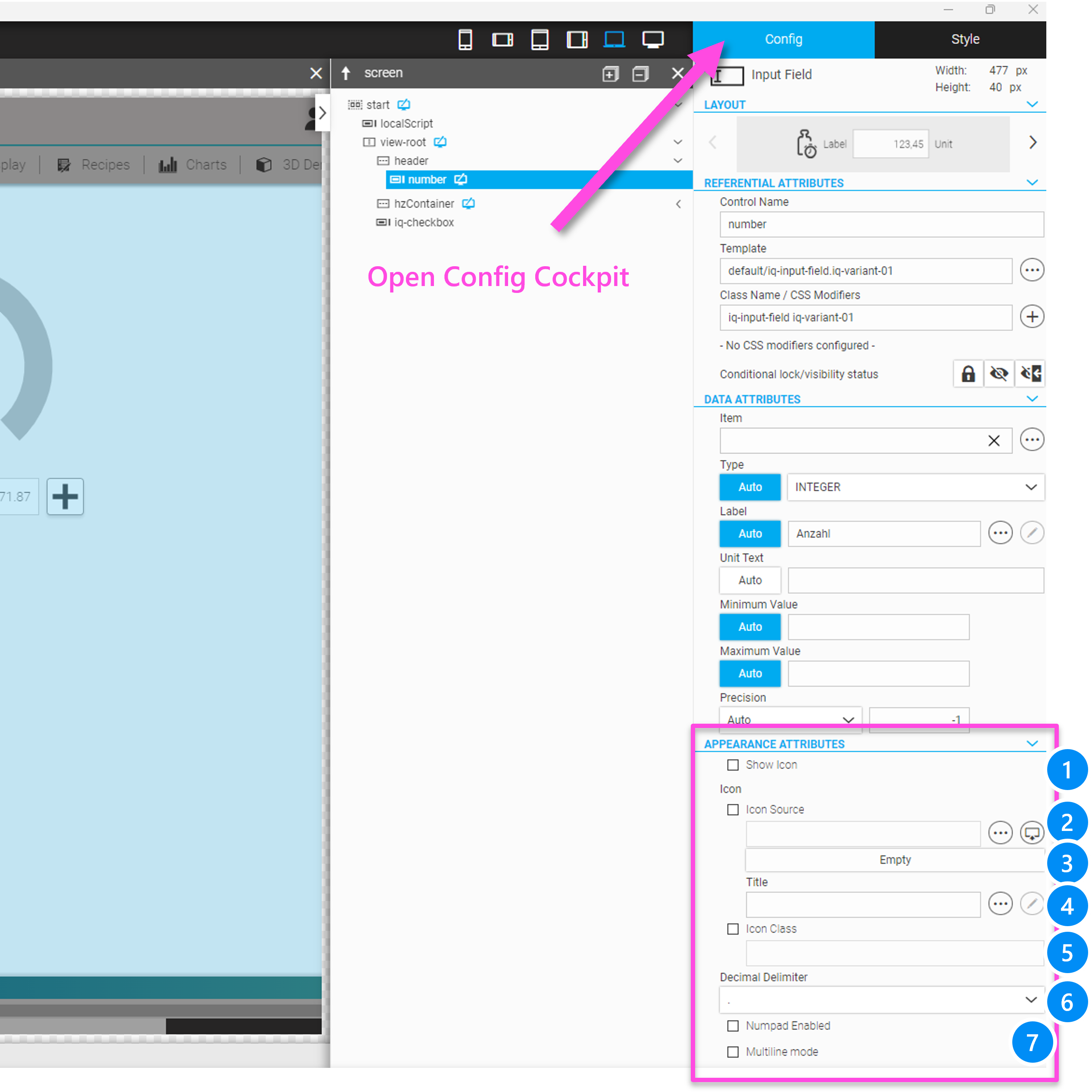
The following section shows how to configure a widget using anIQ Input Field widget as an example. An overview of the configuration parameters of all widgets can be found in the widget reference here.
5.3.1. Widget Configuration Referential Attributes
If you select the Config Cockpit, all configuration options for the selected widget will be displayed and can be edited. Except for the upper area - which is standardized for all widgets - each widget has individual configuration settings.
A complete list of all widgets and their configuration options can be found in chapter widgets of this manual.
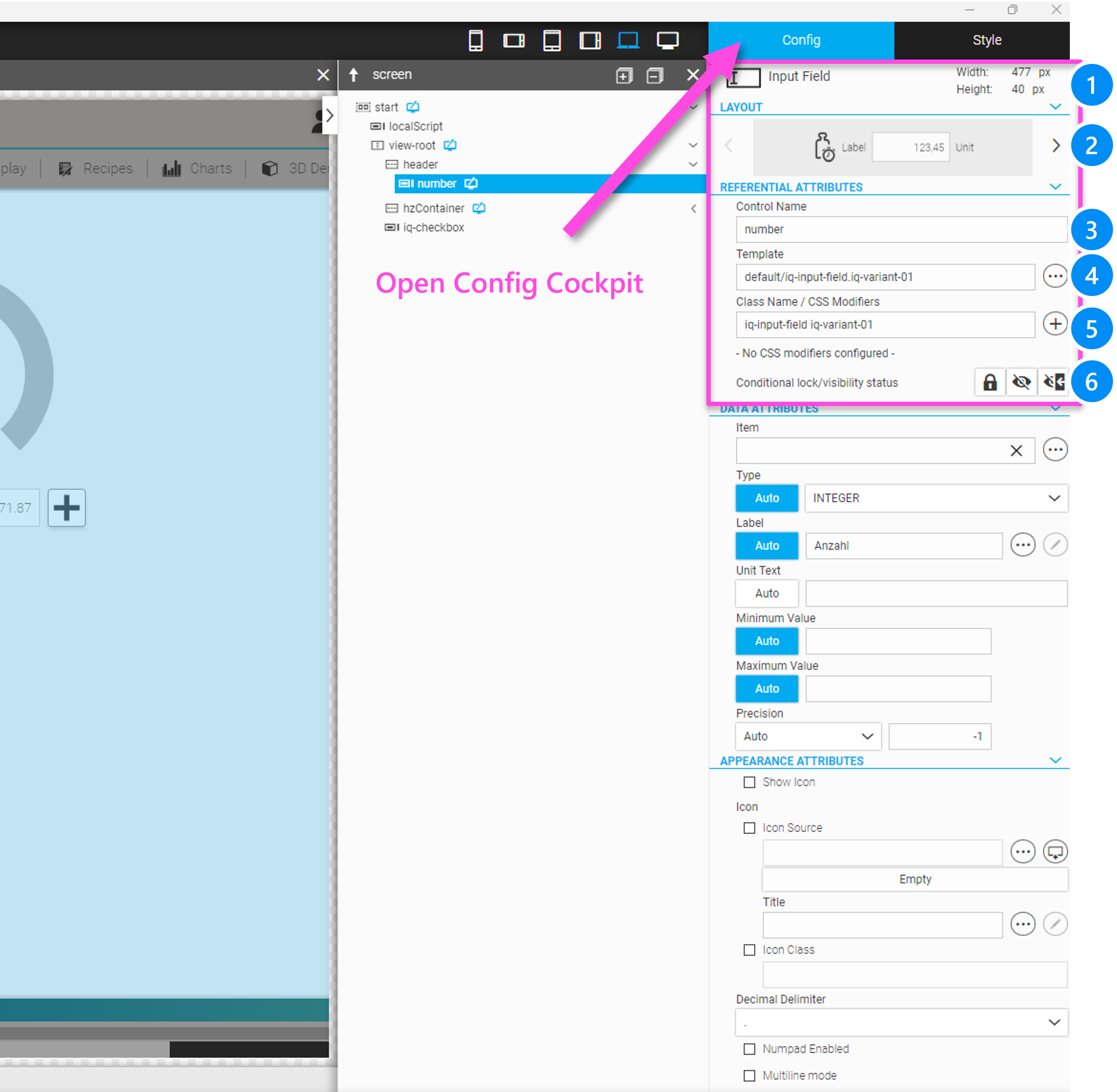
LEGEND
-
Info field, shows the name and dimensions in px of the widget
-
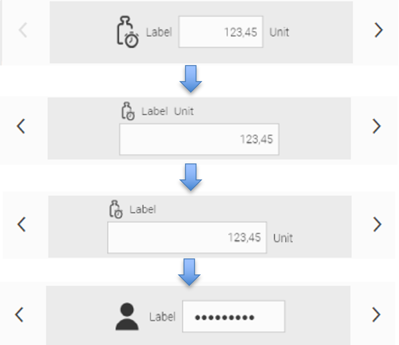
Layout Variants Choose a layout variant of the widget (if available)
-
Control name: Name of the widget, use alphanumeric characters 'a-z', 'A-Z, '0-9' or '_' , '-'
-
Widget Template, HTML templates for the widget can be stored here. Should not normally be changed
-
Class Name/ CSS Modifier, CSS class names for the widget. It is possible to enter additional CSS class names in this field separated by a space (deprecated, the CSS classes should preferably be added via the CSS modifiers). With the "+" button, additional CSS classes (CSS modifiers) can be added via a selection dialog. This is the recommended way for adding CSS classes statically or dynamically, i.e. depending on conditions. More information about the condition dialog can be found here.
|
The original classes in the Class Name field and the template reference should not be changed unless you want to change the structure of the widget with custom variants. But you need special knowledge of the internal structure and functionality of the corresponding widgets. |
-
Select the hide/invisible or lock conditional attributes. The condition dialog can refer to a specific value or condition from the tags/items, or be dependent on a user group. More information about the condition dialog can be found here.
5.3.2. Widget Configuration Data Attributes
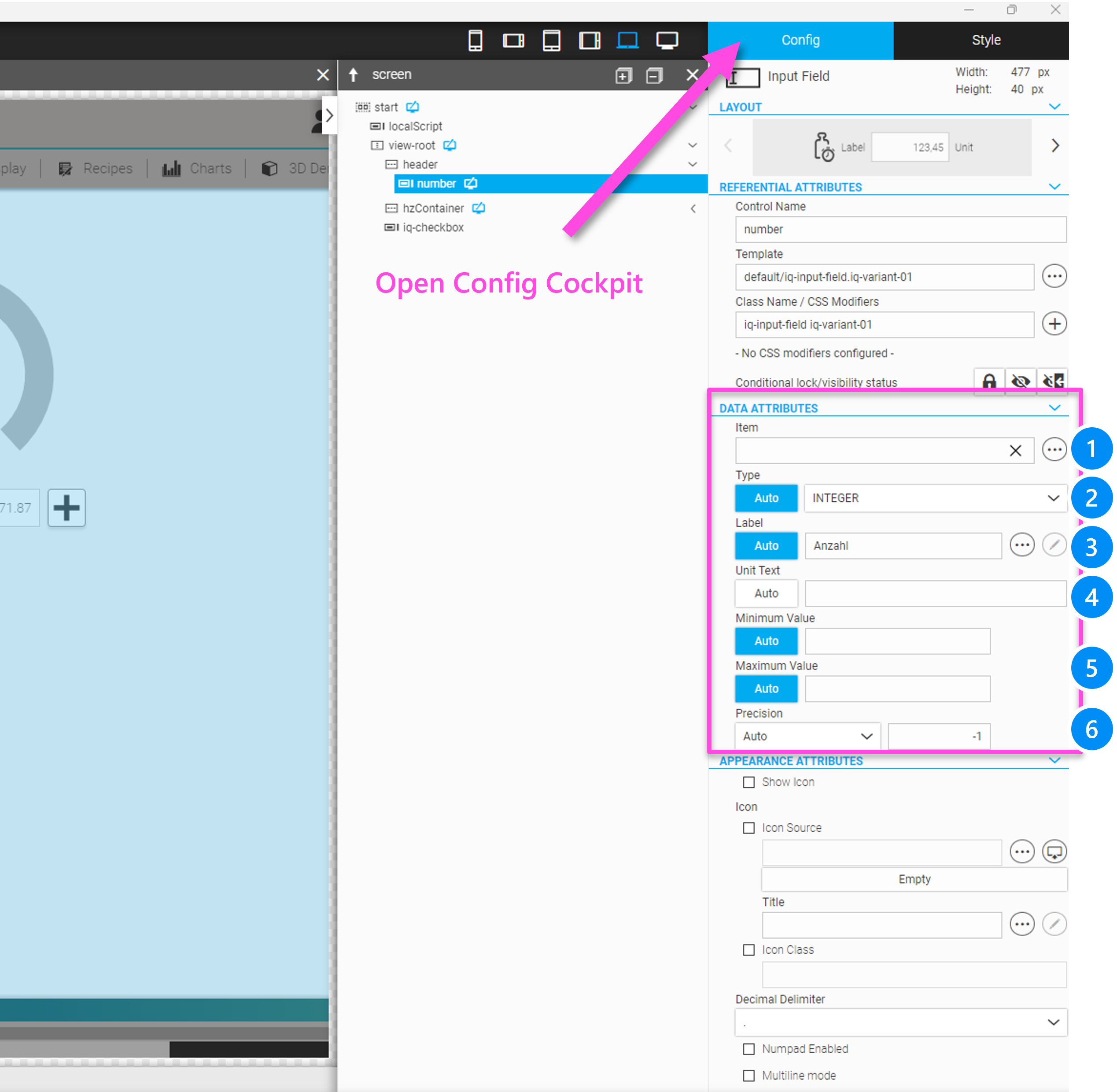
-
Item/Tag Refers to the name of the item (process variable) that will be bound to the widget instance. The items/tags can be selected through a filter selection (search bar) that displays and selects the filtered results as you type, or alternatively by opening an overlay dialog for item/tag selection by clicking on the 3-dot icon on the right.
|
By entering with the search bar function, you can only select process variables, but not virtual items. To enter virtual items, you must enter them via the overlay dialog box. 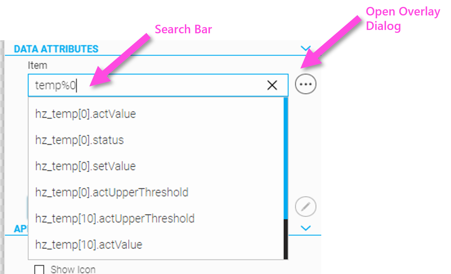
Figure 39. Selecting item/ tag with intelligent search bar
|
|
The search bar filters all items or tags that contain the specified string. The following wildcard characters can also be used:
|
-
Type Defines the input type (Boolean, Integer, Float, String, Structure) of the widget. "Auto" means that the widget receives its type from the definition of the assigned tag/item.
-
Label Defines the label of the widget. "Auto" means that the widget receives its label from the definition of the assigned tag/item.
-
Unit Defines the label of the widget. "Auto" means that the widget receives its unit from the definition of the assigned tag/item.
-
Minimum-/ Maximum Value Defines the lower or upper bound of the displayed value range. "Auto" means that the widget receives its minimum from the definition of the assigned tag/item.
Step Defines the step width of discrete values. "Auto" means that the widget receives its step size from the definition of the assigned tag/item.
Precision Defines the displayed precision (number of digits) for numeric values. "Auto" means that the widget receives its precision from the definition of the assigned tag/item.
|
For information, how to define these "Auto"-attributes to the items/tags, refer to the section HMI attributes in process data definition. For minimum/maximum values process variables (items/tags) can also be used . |
APPEARANCE ATTRIBUTES
-
Show Icon Defines whether an optional icon for the widget will be displayed or not.
-
Icon Source Defines the icon source by a file dialog. The user can choose whether to import an icon from the file system
 or to choose an icon which is already included in the HMI project
  . Usually the icon is imported on first use and can be referenced directly from inside the project directory for all subsequent uses, i.e. for images in /pics/custom.
 -
Title Defines the title (alternative text) for the icon (is not supported with the IQ Input Field widget).
-
Icon Class Defines the icon class when using an icon font (deprecated and not supported anymore)
-
Decimal Delimiter Defines the decimal delimiter for the widget. Here the selection is currently '.' or ',' possible.
-
Numpad Enabled If this option is set, the numeric input system widget "Numpad" will be shown when this widget receives the focus, i.e. when you click on the field. The attributes' min and max values are used as input limits.
-
Multiline Mode If this option is set, the widget also allows multi-line inputs and displays.
5.4. Overview of All Widgets
The following tables give you an overview of widgets which are shipped with WebIQ by default. The overview is organized by
-
-
Buttons
-
Input Widgets
-
Output + Display Widgets
-
-
Navigation + (Multi-)View Widgets
-
Menus/ Navigation
-
Panels
-
Overlays
-
|
Most widgets are marked with an 'IQ' prefix. This means that these widgets have an area in the Style Cockpit to make direct style changes (IQ styling) |
5.4.1. Basic Widgets
| ICON | NAME | CATEGORY | DESCRIPTION | VARIANTS | |||||||||||||
|---|---|---|---|---|---|---|---|---|---|---|---|---|---|---|---|---|---|
BUTTONS |
|||||||||||||||||
|
IQ Button |
Widgets |
The user can trigger a variety of different functions with the IQ Button, such as accepting input, starting processes in the controller, calling up a view, confirming an alarm, etc. The function is triggered by a click (on-click), when the key is pressed (on-press), when the key is released (on-release) or when the key is held (on-while-pressed). |
|
3 |
||||||||||||
Example 1. more about variants, configuration and styling
LAYOUT VARIANTS
CONFIGURATION REFERENTIAL ATTRIBUTES
DATA ATTRIBUTES
APPEARANCE ATTRIBUTES
UI ACTIONS
MONOFLOP
BEHAVIOUR ATTRIBUTES
PRE-DEFINED CSS-MODIFIER see [css-modifiers]
STYLEABLE ELEMENTS see Manual Styling (IQ-Styling)
|
|||||||||||||||||
|
IQ Button Toggle |
Widgets |
The user can use the IQ Toggle button to toggle between two values, such as on/off or open/close. |
|
4 |
||||||||||||
Example 2. more about variants, configuration and styling
LAYOUT VARIANTS
CONFIGURATION REFERENTIAL ATTRIBUTES
DATA ATTRIBUTES
APPEARANCE ATTRIBUTES: GENERAL
APPEARANCE ATTRIBUTES: ON-STAGE
APPEARANCE ATTRIBUTES: OFF-STAGE
BEHAVIOUR ATTRIBUTES
PRE-DEFINED CSS-MODIFIER see [css-modifiers]
STYLEABLE ELEMENTS see Manual Styling (IQ-Styling)
|
|||||||||||||||||
|
IQ Flip Switch |
Widgets |
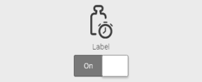
With the IQ Flip Switch the user can enable or disable a function. |
|
3 |
||||||||||||
Example 3. more about variants, configuration and styling
LAYOUT VARIANTS
CONFIGURATION REFERENTIAL ATTRIBUTES
DATA ATTRIBUTES
APPEARANCE ATTRIBUTES
BEHAVIOUR ATTRIBUTES
PRE-DEFINED CSS-MODIFIER see [css-modifiers]
STYLEABLE ELEMENTS see Manual Styling (IQ-Styling)
|
|||||||||||||||||
INPUT WIDGETS |
|||||||||||||||||
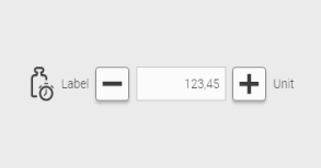
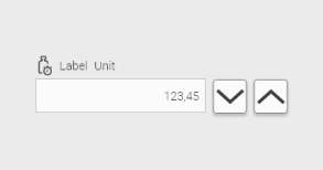
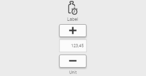
|
IQ Button Rocker |
Widgets |
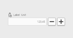
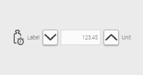
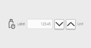
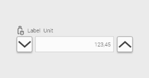
The user can use the IQ Rocker Button to enter a (numeric) value directly into the input field, or he can use the two buttons to incrementally increase or decrease the value in the input field. |
|
10 |
||||||||||||
Example 4. more about variants, configuration and styling
LAYOUT VARIANTS
CONFIGURATION REFERENTIAL ATTRIBUTES
DATA ATTRIBUTES
APPEARANCE ATTRIBUTES
BEHAVIOUR ATTRIBUTES
PRE-DEFINED CSS-MODIFIER see [css-modifiers]
STYLEABLE ELEMENTS see Manual Styling (IQ-Styling)
|
|||||||||||||||||
|
IQ Checkbox |
Widgets |
With the IQ Checkbox the user can activate or deactivate a parameter of a function. |
|
3 |
||||||||||||
Example 5. more about variants, configuration and styling
LAYOUT VARIANTS
CONFIGURATION REFERENTIAL ATTRIBUTES
DATA ATTRIBUTES
APPEARANCE ATTRIBUTES
BEHAVIOUR ATTRIBUTES
PRE-DEFINED CSS-MODIFIER see [css-modifiers]
STYLEABLE ELEMENTS see Manual Styling (IQ-Styling)
|
|||||||||||||||||
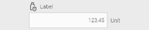
|
IQ Input Field |
Widgets |
In the IQ Input Field the user enters numeric or alphanumeric data. |
|
5 |
||||||||||||
Example 6. more about variants, configuration and styling
LAYOUT VARIANTS
CONFIGURATION REFERENTIAL ATTRIBUTES
DATA ATTRIBUTES
APPEARANCE ATTRIBUTES
PRE-DEFINED CSS-MODIFIER see [css-modifiers]
STYLEABLE ELEMENTS see Manual Styling (IQ-Styling)
|
|||||||||||||||||
|
IQ Select Box |
Widgets |
In the IQ Select Box the user can select a single entry from a set of predefined choices. |
|
2 |
||||||||||||
Example 7. more about variants, configuration and styling
LAYOUT VARIANTS
CONFIGURATION REFERENTIAL ATTRIBUTES
DATA ATTRIBUTES
APPEARANCE ATTRIBUTES
PRE-DEFINED CSS-MODIFIER see [css-modifiers]
STYLEABLE ELEMENTS see Manual Styling (IQ-Styling)
|
|||||||||||||||||
|
IQ Select Date |
Widgets |
In the IQ Select Date the user can select a date from a calendar display. |
|
2 |
||||||||||||
Example 8. more about variants, configuration and styling
LAYOUT VARIANTS
CONFIGURATION REFERENTIAL ATTRIBUTES
DATA ATTRIBUTES
APPEARANCE ATTRIBUTES
BEHAVIOUR ATTRIBUTES
PRE-DEFINED CSS-MODIFIER see [css-modifiers]
STYLEABLE ELEMENTS see Manual Styling (IQ-Styling)
|
|||||||||||||||||
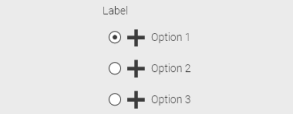
|
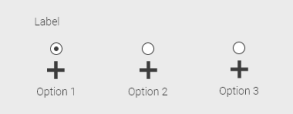
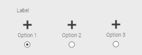
IQ Select Radio |
Widgets |
With the IQ Select Radio the user selects exactly one option from several possible options (at least two). It is always one option selected by default. |
|
3 |
||||||||||||
Example 9. more about variants, configuration and styling
LAYOUT VARIANTS
CONFIGURATION REFERENTIAL ATTRIBUTES
DATA ATTRIBUTES
APPEARANCE ATTRIBUTES
PRE-DEFINED CSS-MODIFIER see [css-modifiers]
STYLEABLE ELEMENTS see Manual Styling (IQ-Styling)
|
|||||||||||||||||
|
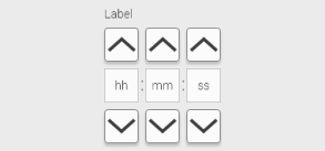
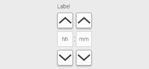
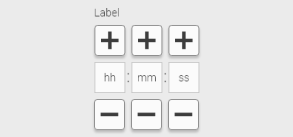
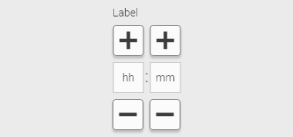
IQ Select Time |
Widgets |
With the help of IQ Time Select the user can set a time. The setting can be accurate to the minute or to the second. |
|
4 |
||||||||||||
Example 10. more about variants, configuration and styling
LAYOUT VARIANTS
CONFIGURATION REFERENTIAL ATTRIBUTES
DATA ATTRIBUTES
APPEARANCE ATTRIBUTES
PRE-DEFINED CSS-MODIFIER see [css-modifiers]
STYLEABLE ELEMENTS see Manual Styling (IQ-Styling)
|
|||||||||||||||||
|
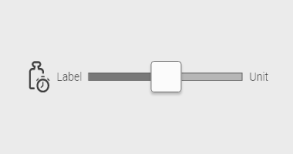
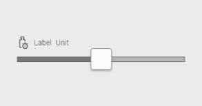
IQ Slider |
Widgets |
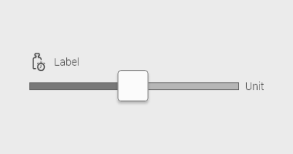
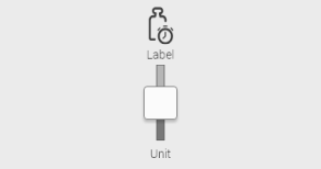
With the help of the IQ Slider the user sets a (numerical) value. The slider displays the value range of the value graphically and the user can set the value "by feel" (increase value a little, decrease value a little) without having to enter an exact value. |
|
4 |
||||||||||||
Example 11. more about variants, configuration and styling
LAYOUT VARIANTS
CONFIGURATION REFERENTIAL ATTRIBUTES
DATA ATTRIBUTES
APPEARANCE ATTRIBUTES
BEHAVIOUR ATTRIBUTES
PRE-DEFINED CSS-MODIFIER see [css-modifiers]
STYLEABLE ELEMENTS see Manual Styling (IQ-Styling)
|
|||||||||||||||||
OUTPUT + DISPLAY WIDGETS |
|||||||||||||||||
|
IQ Date/Time |
Widgets |
The IQ Date/Time displays the value of a variable as date and/or time. The output format can be set. |
|
1 |
||||||||||||
Example 12. more about variants, configuration and styling
LAYOUT VARIANTS
CONFIGURATION REFERENTIAL ATTRIBUTES
DATA ATTRIBUTES
APPEARANCE ATTRIBUTES
PRE-DEFINED CSS-MODIFIER see [css-modifiers]
STYLEABLE ELEMENTS see Manual Styling (IQ-Styling)
|
|||||||||||||||||
|
IQ Duration Display |
Widgets |
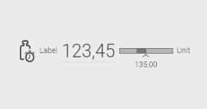
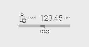
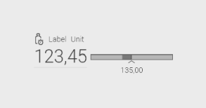
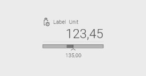
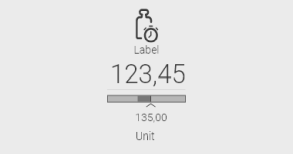
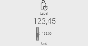
The IQ Duration Display shows the elapsed time of a process. It shows how much time (Current Time) of a total time (Target Time) has passed. |
|
1 |
||||||||||||
Example 13. more about variants, configuration and styling
LAYOUT VARIANTS
CONFIGURATION REFERENTIAL ATTRIBUTES
DATA ATTRIBUTES
BEHAVIOUR ATTRIBUTES
PRE-DEFINED CSS-MODIFIER see [css-modifiers]
STYLEABLE ELEMENTS see Manual Styling (IQ-Styling)
|
|||||||||||||||||
|
IQ Heartbeat |
Widgets |
The IQ Heartbeat shows whether a connection to the control system is currently active. The heartbeat is displayed graphically as an icon. |
|
3 |
||||||||||||
Example 14. more about variants, configuration and styling
LAYOUT VARIANTS
CONFIGURATION REFERENTIAL ATTRIBUTES
CONNECTION MONITORING PLC → HMI
CONNECTION MONITORING HMI → PLC
APPEARANCE ATTRIBUTES
PRE-DEFINED CSS-MODIFIER see [css-modifiers]
STYLEABLE ELEMENTS see Manual Styling (IQ-Styling)
|
|||||||||||||||||
|
IQ Image |
Widgets |
The IQ Image shows any image. Different formats (gif, jpg, png or svg) can be used. |
|
1 |
||||||||||||
Example 15. more about variants, configuration and styling
LAYOUT VARIANTS
CONFIGURATION REFERENTIAL ATTRIBUTES
APPEARANCE ATTRIBUTES
UI ACTIONS: ONCLICK
PRE-DEFINED CSS-MODIFIER see [css-modifiers]
STYLEABLE ELEMENTS see Manual Styling (IQ-Styling)
|
|||||||||||||||||
|
IQ Image Changer |
Widgets |
The IQ Image Changer displays different images depending on a process variable. A simple example is the display of a graphic with a green LED if everything is ok, a graphic with a red LED if there is an error and a graphic with a switched off LED if the corresponding function has been deactivated. |
|
1 |
||||||||||||
Example 16. more about variants, configuration and styling
LAYOUT VARIANTS
CONFIGURATION REFERENTIAL ATTRIBUTES
DATA ATTRIBUTES
APPEARANCE ATTRIBUTES
UI ACTIONS: ONCLICK
PRE-DEFINED CSS-MODIFIER see [css-modifiers]
STYLEABLE ELEMENTS see Manual Styling (IQ-Styling)
|
|||||||||||||||||
|
IQ Label |
Widgets |
The IQ Label displays the value of a process variable as text. |
|
1 |
||||||||||||
Example 17. more about variants, configuration and styling
LAYOUT VARIANTS
CONFIGURATION REFERENTIAL ATTRIBUTES
DATA ATTRIBUTES
APPEARANCE ATTRIBUTES
PRE-DEFINED CSS-MODIFIER see [css-modifiers]
STYLEABLE ELEMENTS see Manual Styling (IQ-Styling)
|
|||||||||||||||||
|
IQ Linear Gauge |
Widgets |
The IQ Linear Gauge displays a value on a linear scale. |
|
6 |
||||||||||||
Example 18. more about variants, configuration and styling
LAYOUT VARIANTS
CONFIGURATION REFERENTIAL ATTRIBUTES
DATA ATTRIBUTES
APPEARANCE ATTRIBUTES
PRE-DEFINED CSS-MODIFIER see [css-modifiers]
STYLEABLE ELEMENTS see Manual Styling (IQ-Styling)
|
|||||||||||||||||
|
IQ Progress Info |
Widgets |
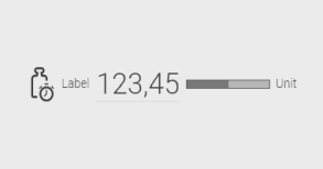
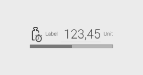
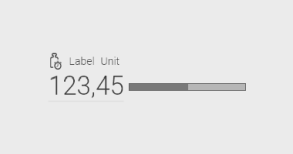
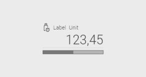
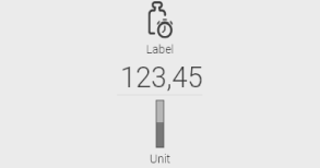
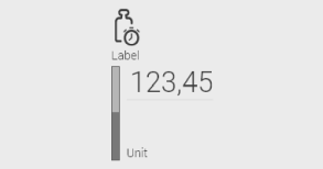
The IQ Progress Info shows the progress of a process compared to a target value. |
|
3 |
||||||||||||
Example 19. more about variants, configuration and styling
LAYOUT VARIANTS
CONFIGURATION REFERENTIAL ATTRIBUTES
DATA ATTRIBUTES
APPEARANCE ATTRIBUTES
PRE-DEFINED CSS-MODIFIER see [css-modifiers]
STYLEABLE ELEMENTS see Manual Styling (IQ-Styling)
|
|||||||||||||||||
|
IQ Quality Display |
Widgets |
The IQ Quality Display shows on a scale the actual value compared to the specified target value. |
|
6 |
||||||||||||
Example 20. more about variants, configuration and styling
LAYOUT VARIANTS
CONFIGURATION REFERENTIAL ATTRIBUTES
DATA ATTRIBUTES
APPEARANCE ATTRIBUTES
PRE-DEFINED CSS-MODIFIER see [css-modifiers]
STYLEABLE ELEMENTS see Manual Styling (IQ-Styling)
|
|||||||||||||||||
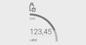
|
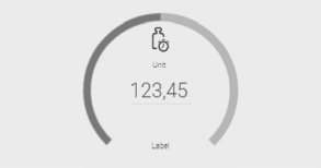
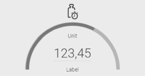
IQ Radial Gauge |
Widgets |
The IQ Radial Gauge displays a value on a curved scale. |
|
3 |
||||||||||||
Example 21. more about variants, configuration and styling
LAYOUT VARIANTS
CONFIGURATION REFERENTIAL ATTRIBUTES
DATA ATTRIBUTES
APPEARANCE ATTRIBUTES
ARC SETTINGS
PRE-DEFINED CSS-MODIFIER see [css-modifiers]
STYLEABLE ELEMENTS see Manual Styling (IQ-Styling)
|
|||||||||||||||||
|
IQ Text |
Widgets |
The IQ Text displays textual information. Within the text, values of process variables can also be displayed. |
|
1 |
||||||||||||
Example 22. more about variants, configuration and styling
LAYOUT VARIANTS
CONFIGURATION REFERENTIAL ATTRIBUTES
DATA ATTRIBUTES
PRE-DEFINED CSS-MODIFIER see [css-modifiers]
STYLEABLE ELEMENTS see Manual Styling (IQ-Styling)
|
|||||||||||||||||
|
IQ Text Display |
Widgets |
The IQ Text Display shows the current actual value of a process variable |
|
3 |
||||||||||||
Example 23. more about variants, configuration and styling
LAYOUT VARIANTS
CONFIGURATION REFERENTIAL ATTRIBUTES
DATA ATTRIBUTES
APPEARANCE ATTRIBUTES
PRE-DEFINED CSS-MODIFIER see [css-modifiers]
STYLEABLE ELEMENTS see Manual Styling (IQ-Styling)
|
|||||||||||||||||


5.4.2. Navigation + (Multi-)View Widgets
| ICON | NAME | CATEGORY | DESCRIPTION | VARIANTS | |||||
|---|---|---|---|---|---|---|---|---|---|
MENUS/ Navigation |
|||||||||
|
IQ Responsive Menu |
Widgets |
The Responsive Menu creates a hierarchical menu which can be used to navigate to different areas of the HMI. The Responsive Menu is able to adapt automatically to small and large displays (see Use Responsive Menu). |
|
4 |
||||
Example 24. more about variants, configuration and styling
LAYOUT VARIANTS
CONFIGURATION REFERENTIAL ATTRIBUTES
DATA ATTRIBUTES Menu Structure Defines the structure of the menu by adding menu items to it. The IQ Responsive Menu contains three types of menu items:
For menu entries, separators and sections you can define a (localizable) label. In addition, you can specify an icon for each menu entry and section, which will be displayed in front of the label. You can also select any UI action for the menu item (for details on UI actions, see Using UI-Actions).
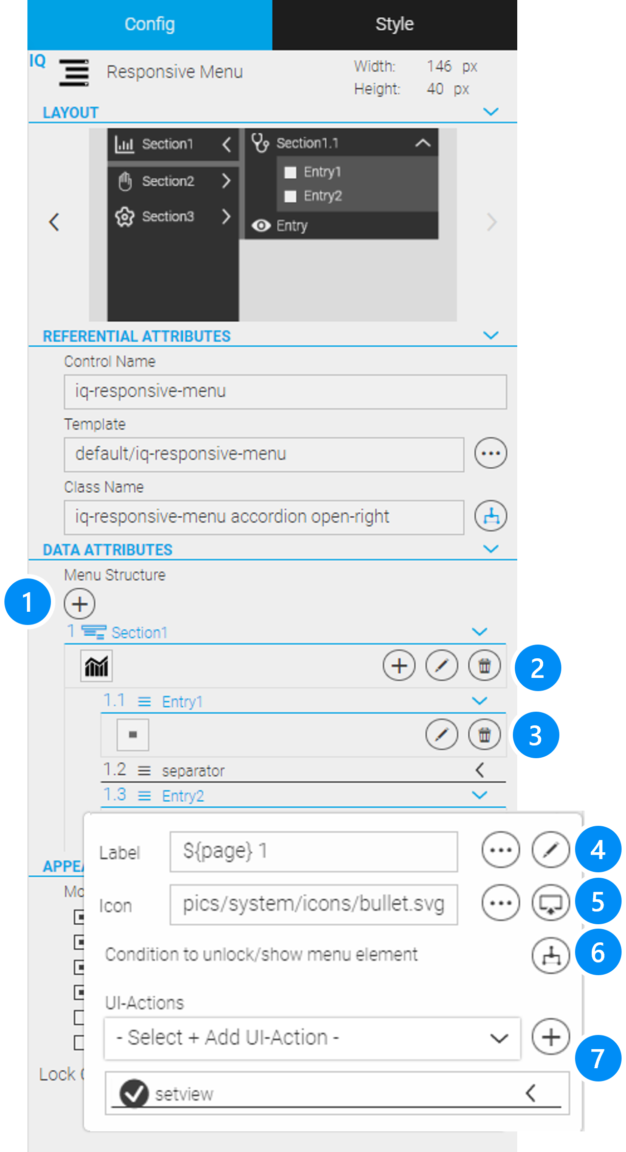
Figure 41. Configuration Of A Menu Entry For Setview
APPEARANCE ATTRIBUTES
PRE-DEFINED CSS-MODIFIER see [css-modifiers]
STYLEABLE ELEMENTS see Manual Styling (IQ-Styling)
|
|||||||||
PANELS |
|||||||||
|
IQ Screen Panel |
Panels |
The Screen Panel allows the creation of web HMIs or dialogs with multiple views. The user can navigate between the views using the Responsive Menu or special navigation buttons. |
|
1 |
||||
Example 25. more about configuration and styling
CONFIGURATION REFERENTIAL ATTRIBUTES
DATA ATTRIBUTES
BEHAVIOUR ATTRIBUTES
PRE-DEFINED CSS-MODIFIER see [css-modifiers]
STYLEABLE ELEMENTS see Manual Styling (IQ-Styling)
|
|||||||||
|
IQ Swipe Panel |
Panels |
The Swipe Panel also allows the creation of web HMIs or dialogs with multiple views. Besides the Responsive Menus or Navigation Buttons, the user can navigate between the views with a swipe gesture. |
|
1 |
||||
Example 26. more about configuration and styling
CONFIGURATION REFERENTIAL ATTRIBUTES
DATA ATTRIBUTES
APPEARANCE ATTRIBUTES
BEHAVIOUR ATTRIBUTES
PRE-DEFINED CSS-MODIFIER see [css-modifiers]
STYLEABLE ELEMENTS see Manual Styling (IQ-Styling)
|
|||||||||
|
IQ Tab Panel |
Panels |
The Tab Panel also allows you to create web HMIs or dialogs with multiple views. The views are distributed on different tabs. |
|
1 |
||||
Example 27. more about configuration and styling
CONFIGURATION REFERENTIAL ATTRIBUTES
DATA ATTRIBUTES
APPEARANCE ATTRIBUTES
BEHAVIOUR ATTRIBUTES
PRE-DEFINED CSS-MODIFIER see [css-modifiers]
STYLEABLE ELEMENTS see Manual Styling (IQ-Styling)
|
|||||||||
OVERLAYS |
|||||||||
|
IQ Dialog Box |
Overlays |
As the name suggests, a Dialog Box is used to initiate a modal (sub-)dialog with the user. The Dialog Box is an area that is displayed above the web HMI (overlay) and has the appearance of a dialog window. Usually the dialog in the Dialog Box is closed with "OK" or "Apply" or when the user cancels the dialog. |
|
1 |
||||
Example 28. more about configuration and styling
CONFIGURATION REFERENTIAL ATTRIBUTES
APPEARANCE ATTRIBUTES
BEHAVIOUR ATTRIBUTES
PRE-DEFINED CSS-MODIFIER see [css-modifiers]
STYLEABLE ELEMENTS see Manual Styling (IQ-Styling)
|
|||||||||
|
IQ Popup Menu |
Overlays |
The Popup Menu briefly displays information or functions above the web HMI. The user can select an appropriate function or close the Popup Menu by touching anywhere. |
|
1 |
||||
Example 29. more about configuration and styling
CONFIGURATION REFERENTIAL ATTRIBUTES
BEHAVIOUR ATTRIBUTES
PRE-DEFINED CSS-MODIFIER see [css-modifiers]
STYLEABLE ELEMENTS see Manual Styling (IQ-Styling)
|
|||||||||
|
IQ Slide In |
Overlays |
The Slide In displays information or functions on an area that is - as the name suggests - slid in from the side of the web HMI. The user can select an appropriate function or close the Slide In by touching anywhere else. |
|
1 |
||||
Example 30. more about configuration and styling
CONFIGURATION REFERENTIAL ATTRIBUTES
BEHAVIOUR ATTRIBUTES
PRE-DEFINED CSS-MODIFIER see [css-modifiers]
STYLEABLE ELEMENTS see Manual Styling (IQ-Styling)
|
|||||||||
5.4.3. Layout Containers
| ICON | NAME | CATEGORY | DESCRIPTION | VARIANTS | |
|---|---|---|---|---|---|
|
IQ Horizontal Flex Container |
Layout Containers |
The Horizontal Flex Container automatically distributes all widgets that are placed in it in horizontal direction with or without wrapping. |
|
1 |
Example 31. more about variants, configuration and styling
CONFIGURATION REFERENTIAL ATTRIBUTES
APPEARANCE ATTRIBUTES
PRE-DEFINED CSS-MODIFIER see [css-modifiers]
STYLEABLE ELEMENTS see Manual Styling (IQ-Styling)
|
|||||
|
IQ Vertical Flex Container |
Layout Containers |
The Vertical Flex Container automatically distributes all widgets that are placed in it in vertical direction with or without wrapping. |
|
1 |
Example 32. more about configuration and styling
CONFIGURATION REFERENTIAL ATTRIBUTES
APPEARANCE ATTRIBUTES
PRE-DEFINED CSS-MODIFIER see [css-modifiers]
STYLEABLE ELEMENTS see Manual Styling (IQ-Styling)
|
|||||
1) All the smart layout containers only work for widgets which have no position method or the position method "Static" configured.
5.4.4. Alarm Widgets
| ICON | NAME | CATEGORY | DESCRIPTION | VARIANTS | |||||
|---|---|---|---|---|---|---|---|---|---|
|
IQ Alarm Info |
Widgets |
The Alarm Info cycles through all currently active alarms and the number of current alarms in a compact way. |
|
4 |
||||
Example 33. more about variants, configuration and styling
LAYOUT VARIANTS
CONFIGURATION REFERENTIAL ATTRIBUTES
APPEARANCE ATTRIBUTES
BEHAVIOUR ATTRIBUTES
PRE-DEFINED CSS-MODIFIER see [css-modifiers]
STYLEABLE ELEMENTS see Manual Styling (IQ-Styling)
|
|||||||||
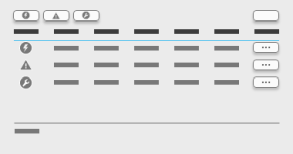
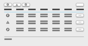
|
IQ Alarm List |
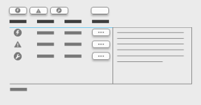
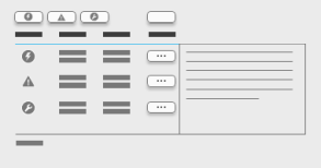
Widgets |
The Alarm List shows currently active and historic alarms. The list can be filtered and sorted. |
|
4 |
||||
Example 34. more about variants, configuration and styling
LAYOUT VARIANTS
CONFIGURATION REFERENTIAL ATTRIBUTES
APPEARANCE ATTRIBUTES
BEHAVIOUR ATTRIBUTES
PRE-DEFINED CSS-MODIFIER see [css-modifiers]
STYLEABLE ELEMENTS see Manual Styling (IQ-Styling)
|
|||||||||


5.4.5. Recipe Widgets
| ICON | NAME | CATEGORY | DESCRIPTION | VARIANTS | |
|---|---|---|---|---|---|
|
Recipe Controller |
Widgets |
The Recipe Controller is a bar with buttons that provide the user with the most important functions for applying, managing and editing recipes. |
1 |
|
Example 35. more about configuration and styling
CONFIGURATION REFERENTIAL ATTRIBUTES
DATA ATTRIBUTES
APPEARANCE ATTRIBUTES
PRE-DEFINED CSS-MODIFIER see [css-modifiers]
STYLEABLE ELEMENTS see Manual Styling (IQ-Styling)
|
|||||
|
Recipe Edit |
Widgets |
This Recipe Edit gives the user the option to edit a recipe. The widget displays all metadata as well as the process values of a recipe in tabular form. |
1 |
|
Example 36. more about configuration and styling
CONFIGURATION REFERENTIAL ATTRIBUTES
DATA ATTRIBUTES
APPEARANCE ATTRIBUTES
ATTRIBUTES
Example: Definition of recipe values with Select Box selection Inside a LocalScript which you assign to this widget you can define the recipe values for each item - this will show a select box for this item instead of a normal input field. So for creating a selection for each item you have to create an entry PRE-DEFINED CSS-MODIFIER see [css-modifiers]
STYLEABLE ELEMENTS see Manual Styling (IQ-Styling)
|
|||||
|
Recipe List |
Widgets |
The Recipe List displays the currently available recipes. |
1 |
|
Example 37. more about configuration and styling
CONFIGURATION REFERENTIAL ATTRIBUTES
DATA ATTRIBUTES
PRE-DEFINED CSS-MODIFIER see [css-modifiers]
STYLEABLE ELEMENTS see Manual Styling (IQ-Styling)
|
|||||
5.4.6. Trend Widgets
| ICON | NAME | CATEGORY | DESCRIPTION | VARIANTS | |
|---|---|---|---|---|---|
|
IQ Trend Display |
Trend |
The Trend Widget visualizes process variable values over time as recorded by the data recorder. Both current and the historical values can be displayed |
1 |
|
Example 38. more about configuration and styling
CONFIGURATION REFERENTIAL ATTRIBUTES
DATA ATTRIBUTES
BEHAVIOUR ATTRIBUTES
ADVANCED - CURVE STYLES
MISCELLANEOUS
PRE-DEFINED CSS-MODIFIER see [css-modifiers]
STYLEABLE ELEMENTS see Manual Styling (IQ-Styling)
|
|||||
|
IQ Trend Legend |
Trend |
The Trend Legend shows labels for the displayed trend curves. |
1 |
|
Example 39. more about configuration and styling
CONFIGURATION REFERENTIAL ATTRIBUTES
DATA ATTRIBUTES
APPEARANCE ATTRIBUTES
PRE-DEFINED CSS-MODIFIER see [css-modifiers]
STYLEABLE ELEMENTS see Manual Styling (IQ-Styling)
|
|||||
|
Trend Live |
Trend |
Trend Live provides two buttons for switching between live mode (play button) and historical trend values display (pause button). |
1 |
|
Example 40. more about configuration and styling
CONFIGURATION REFERENTIAL ATTRIBUTES
DATA ATTRIBUTES
APPEARANCE ATTRIBUTES
PRE-DEFINED CSS-MODIFIER see [css-modifiers]
STYLEABLE ELEMENTS see Manual Styling (IQ-Styling)
|
|||||
|
IQ Trend Select |
Trend |
Trend Select allows the user to select the desired recorded process values to be displayed in the Trend Display and for configuring the type of display. |
1 |
|
Example 41. more about configuration and styling
CONFIGURATION REFERENTIAL ATTRIBUTES
DATA ATTRIBUTES
APPEARANCE ATTRIBUTES
CUSTOMIZATION
PRE-DEFINED CSS-MODIFIER see [css-modifiers]
STYLEABLE ELEMENTS see Manual Styling (IQ-Styling)
|
|||||
|
IQ Trend Time |
Trend |
Trend Time provides functions to select specific time periods for visualization in the Trend Display (enter date/time and scaling of the time axis). |
1 |
|
Example 42. more about configuration and styling
CONFIGURATION REFERENTIAL ATTRIBUTES
DATA ATTRIBUTES
APPEARANCE ATTRIBUTES
PRE-DEFINED CSS-MODIFIER see [css-modifiers]
STYLEABLE ELEMENTS see Manual Styling (IQ-Styling)
|
|||||
|
IQ Trend Zoom |
Trend |
Trend Zoom provides two buttons to zoom in or out of the trend. |
1 |
|
Example 43. more about configuration and styling
CONFIGURATION REFERENTIAL ATTRIBUTES
DATA ATTRIBUTES
APPEARANCE ATTRIBUTES
PRE-DEFINED CSS-MODIFIER see [css-modifiers]
STYLEABLE ELEMENTS see Manual Styling (IQ-Styling)
|
|||||
5.4.7. User Management Widgets
| ICON | NAME | CATEGORY | DESCRIPTION | VARIANTS | |||||
|---|---|---|---|---|---|---|---|---|---|
|
IQ User Controller |
Widgets |
User Controller is a bar with buttons that provide an admin user with the most important functions for managing and editing users which can use the web HMI. |
|
2 |
||||
Example 44. more about variants, configuration and styling
LAYOUT VARIANTS
CONFIGURATION REFERENTIAL ATTRIBUTES
DATA ATTRIBUTES
APPEARANCE ATTRIBUTES
PRE-DEFINED CSS-MODIFIER see [css-modifiers]
STYLEABLE ELEMENTS see Manual Styling (IQ-Styling)
|
|||||||||
|
IQ User Info |
Widgets |
User Info displays some information about the currently logged-in user. |
|
1 |
||||
Example 45. more about variants, configuration and styling
LAYOUT VARIANTS
CONFIGURATION REFERENTIAL ATTRIBUTES
APPEARANCE ATTRIBUTES
BEHAVIOUR ATTRIBUTES
PRE-DEFINED CSS-MODIFIER see [css-modifiers]
STYLEABLE ELEMENTS see Manual Styling (IQ-Styling)
|
|||||||||
|
IQ User List |
Widgets |
User List contains a list of all users available in the web HMI. |
|
1 |
||||
Example 46. more about variants, configuration and styling
LAYOUT VARIANTS
CONFIGURATION REFERENTIAL ATTRIBUTES
DATA ATTRIBUTES
APPEARANCE ATTRIBUTES
PRE-DEFINED CSS-MODIFIER see [css-modifiers]
STYLEABLE ELEMENTS see Manual Styling (IQ-Styling)
|
|||||||||
|
IQ User Select |
Widgets |
User Select allows the admin user to search and select a desired user from the users available in the HMI. User Select works as a selection box with auto-completion so that the desired user can be found easily. |
|
2 |
||||
Example 47. more about variants, configuration and styling
LAYOUT VARIANTS
CONFIGURATION REFERENTIAL ATTRIBUTES
DATA ATTRIBUTES
APPEARANCE ATTRIBUTES
PRE-DEFINED CSS-MODIFIER see [css-modifiers]
STYLEABLE ELEMENTS see Manual Styling (IQ-Styling)**
|
|||||||||

5.4.8. Shape Widgets
All Shapes have the same properties
CONFIGURATION
REFERENTIAL ATTRIBUTES
-
Control Name, Class Name
DATA ATTRIBUTES
-
Rotation Defines the rotation of the shape within the widget box
-
Scale Defines the scaling of the shape within the widget box
PRE-DEFINED CSS-MODIFIER see [css-modifiers]
-
hidden
-
invisible
STYLEABLE ELEMENTS see Manual Styling (IQ-Styling)**
-
Widget Box
-
Shape
| ICON | NAME | CATEGORY | DESCRIPTION | VARIANTS | |
|---|---|---|---|---|---|
|
IQ Ellipse |
Shapes |
IQ Ellipse allows the creation of a filled or non-filled circle or ellipse. |
|
1 |
|
IQ Triangle |
Shapes |
IQ Triangle allows the creation of a filled or non-filled triangle. |
|
1 |
|
IQ Rectangle |
Shapes |
IQ Rectangle allows the creation of a filled or non-filled square or rectangle. |
|
1 |
|
IQ Pentagon |
Shapes |
IQ Pentagon allows the creation of a filled or non-filled pentagon. |
|
1 |
|
IQ Hexagon |
Shapes |
IQ Hexagon allows the creation of a filled or non-filled hexagon. |
|
1 |
|
IQ Octagon |
Shapes |
IQ Octagon allows the creation of a filled or non-filled octagon. |
|
1 |
|
IQ Left Arrow |
Shapes |
IQ Left Arrow allows the creation of a filled or non-filled left arrow. |
|
1 |
|
IQ Right Arrow |
Shapes |
IQ Right Arrow allows the creation of a filled or non-filled right arrow. |
|
1 |
5.4.9. Special Widgets
| ICON | NAME | CATEGORY | DESCRIPTION | VARIANTS | |
|---|---|---|---|---|---|
|
Widgets |
The composite widget combines several standard widgets into a new (custom) widget. You can use a composite widget just like a normal widget. |
1 |
||
Example 48. more about configuration and styling
CONFIGURATION
REFERENTIAL ATTRIBUTES
PRE-DEFINED CSS-MODIFIER see [css-modifiers]
STYLEABLE ELEMENTS see Manual Styling (IQ-Styling)
|
|||||
|
HTML |
Widgets |
The HTML widget allows arbitrary HTML to be injected into the HMI. |
1 |
|
Example 49. more about configuration
CONFIGURATION REFERENTIAL ATTRIBUTES
DATA ATTRIBUTES
PRE-DEFINED CSS-MODIFIER see [css-modifiers]
STYLEABLE ELEMENTS see Manual Styling (IQ-Styling)
|
|||||
|
iFrame |
Widgets |
The iFrame widget is a container that displays content from other web sites. |
1 |
|
Example 50. more about configuration
CONFIGURATION REFERENTIAL ATTRIBUTES
DATA ATTRIBUTES
PRE-DEFINED CSS-MODIFIER see [css-modifiers]
STYLEABLE ELEMENTS see Manual Styling (IQ-Styling)
|
|||||
|
Numpad |
The Numpad will be displayed for input of numeric values. This widget will not be displayed in the Widget List. Instead, you can define in the corresponding input widgets whether the Numpad should be enabled. If it has been enabled, it will be shown automatically if needed. |
1 |
||
Example 51. more about configuration
CONFIGURATION
PRE-DEFINED CSS-MODIFIER
STYLEABLE ELEMENTS
|
|||||
|
Alphanumerical Keyboard |
The Alphanumeric Keyboard will be displayed during text input (name, password, etc.). This widget will not be displayed in the Widget List. Instead, you can define in the HMI Project Settings whether the keyboard of the operating system or the Alphanumeric Keyboard of WebIQ should be displayed. If the Alphanumeric Keyboard of WebIQ has been enabled there, it will be shown automatically if required. (see also chapter HMI Project settings to enable the Alphanumerical Keyboard) |
1 |
||
Example 52. more about configuration
CONFIGURATION You can define different alphanumeric keyboards for the localizations. The configuration of each keyboard is stored within a separate .json-file in the folder json/locale/keyboard/. You can find details about this in the WebIQ online documentation. PRE-DEFINED CSS-MODIFIER
STYLEABLE ELEMENTS
|
|||||
|
Local Script |
Widgets |
LocalScript isn’t a real widget. It will not show any content in the HMI. LocalScript contains JavaScript code to be executed as soon as the parent container of the LocalScript is shown in the browser. For more information see chapter Integrated JavaScript Editor |
1 |
|
Example 53. more about configuration
CONFIGURATION REFERENTIAL ATTRIBUTES
DATA ATTRIBUTES
PRE-DEFINED CSS-MODIFIER
STYLEABLE ELEMENTS see Manual Styling (IQ-Styling)
|
|||||
5.5. Widget Anatomy & Grid
The IQ Widgets are all based on an 8 x 8 pixel grid. This greatly simplifies the alignment of the widgets with each other.
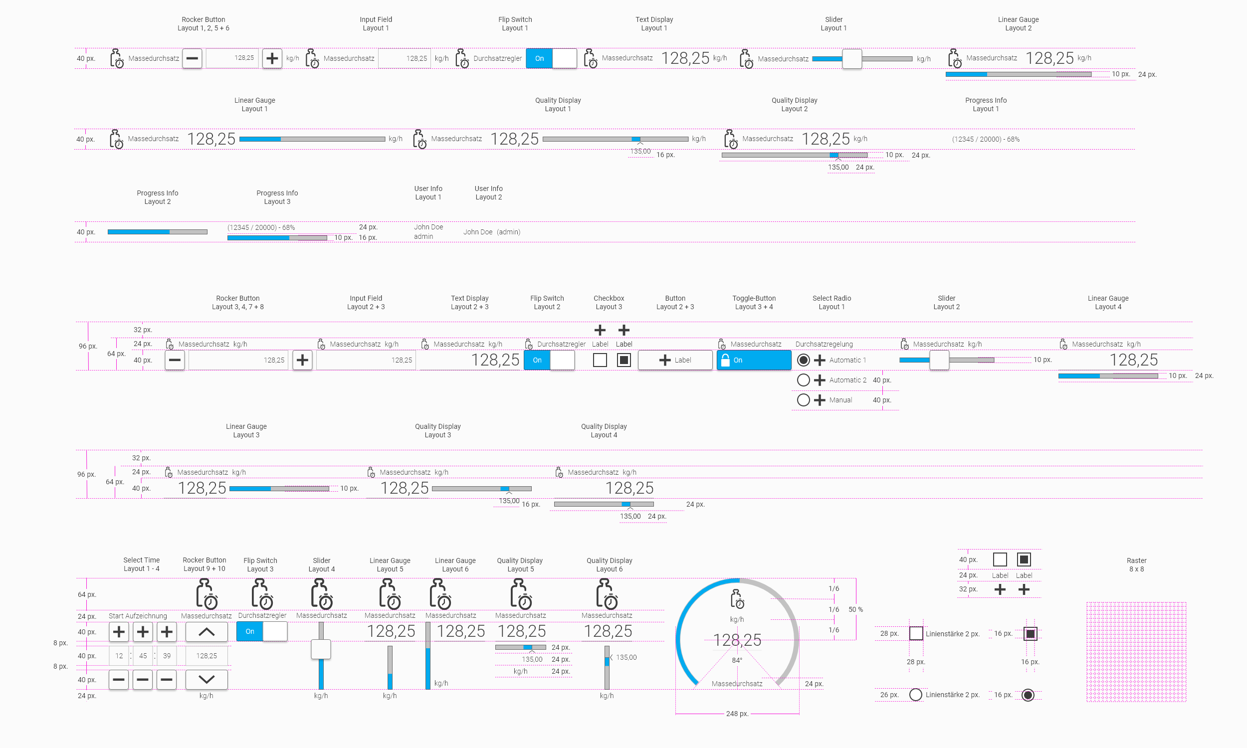
6. Layouting Your HMI With Containers
This chapter describes in detail how you can layout screen pages within WebIQ Designer.
6.1. Pixel vs. Container Layout
Traditional visualization systems place widgets on a screen at a pixel-based position. The position of a widget is usually defined by an X/Y coordinate or by distances from the edges of the screen. This approach has been established for many years. It results in a fixed layout that is optimized for exactly one screen size and orientation.
With web technology and the requirement to develop HMIs for different screen sizes and orientations (Responsive Design), a new layout technique for defining screen layouts was established, the so-called Container Layouts. This uses containers to help to create complex layouts in a simple and easy way. For example the screen areas are divided into containers which contain sub-containers or widgets. The container properties, e.g. horizontal, vertical, center, wrap etc., determine how the elements inside a container in it behave.
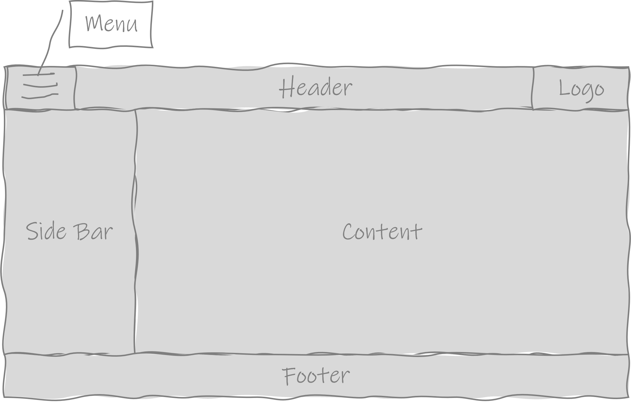
WebIQ supports both variants, pixel-oriented layout and working with layout containers (default), so that the user can decide on a case-by-case basis which layout method to use:
| Layout | Advantage | Disadvantage |
|---|---|---|
Pixel |
Easy to learn, established for most users |
Only suitable for fixed resolutions, adjustments require manual rearranging of the widgets |
Container |
Responsive design possible, efficient layout and automatic rearrangement of widgets |
usually unfamiliar, has to be learned first |
|
Container-based layout is usually unfamiliar, but offers many advantages once the user has learned it. WebIQ prefers the container-based layout due to its many benefits. Further information and tutorials about the container-based layout used in WebIQ can be found on the internet |
6.2. Container-Based Layouts
Container layouts are a new, powerful method for designing complex layouts, e.g. in multi-page applications, according to certain rules. The working principle is to design the layout using the properties of the container, e.g. if a container has the "vertical" property, all the elements in it are arranged below each other. If it has the "horizontal" property, the elements are displayed next to each other. Containers can also have the flex-grow or flex-shrink property, then they adjust their size, i.e. height or width, according to the available space.
Working with layout containers is initially unfamiliar and new for the user. However, one quickly recognizes the advantages and the layout design turns out to be faster and more direct in the end, especially when changes or extensions have to be made.
|
It can be helpful to create a small sketch (wireframe) of your screen beforehand and draw the nested layout containers there (see Example wireframe of an HMI structured with containers). You should also name your layout containers in a useful (semantic) manner in order to get a good overview in the layout hierarchy (see field "Control Name" in the configuration cockpit of the respective container). |
6.2.1. Configuring Layout Containers
WebIQ uses CSS flexbox containers with the orientation 'horizontal' or 'vertical', i.e. the elements in it align accordingly. This direction is called the "Main Axis". The opposite direction, i.e. vertical in a 'Horizontal Flex-Container', is called 'Cross-Axis'
After inserting a container from the widget bar into the layout, all relevant parameters will be shown in the Configuration Cockpit on the right side:
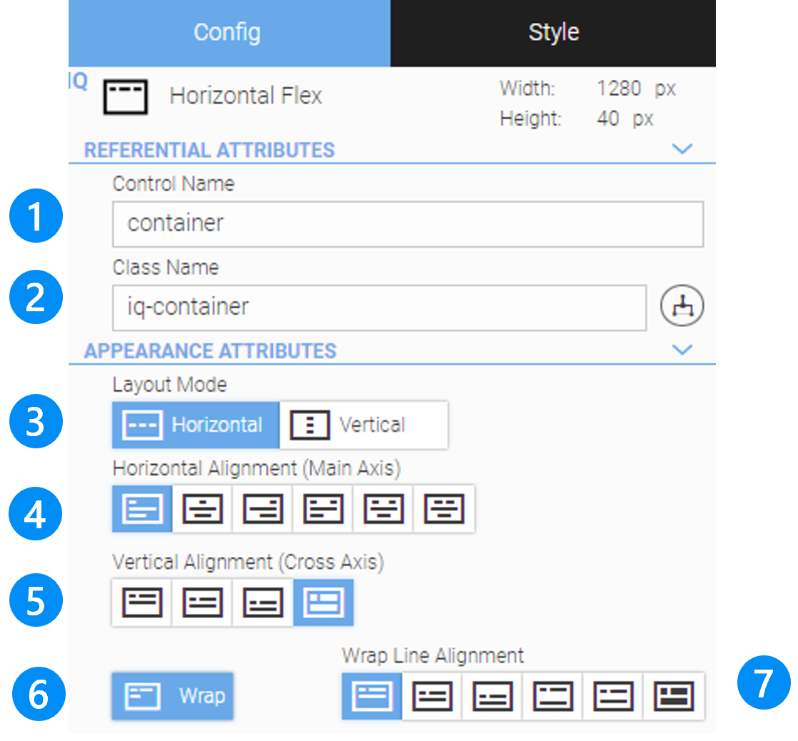
The Configuration Cockpit of the Layout Container contains the following information and functions.
LEGEND
-
Name of the widget instance (you can choose it freely, no spaces and special characters, only letters, numbers, dashes and underscores)
-
Class name of the layout container (recommendation: do not change anything here)
-
Basic layout mode (direction) of the container (horizontal or vertical)
-
Setting of the alignment along the main axis (default: left, see Alignment Along Cross Axis)
-
Setting of the alignment along the cross axis (default: stretch, see Alignment Along Cross Axis)
-
Switch for enabling wrapping (see Wrapping)
-
Settings for alignment within the wrap lines (disabled in case of no wrapping)
All settings are described in detail below.
6.2.2. Horizontal and Vertical Containers
The container-based layout is based on the nesting of horizontal and vertical containers. This alignment is called 'Main Axis':
MAIN AXIS DIRECTION |
MAIN AXIS DIRECTION |
Horizontal: All child elements are placed horizontally |
Vertical: Child elements are placed vertically. |
|
|
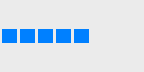
|
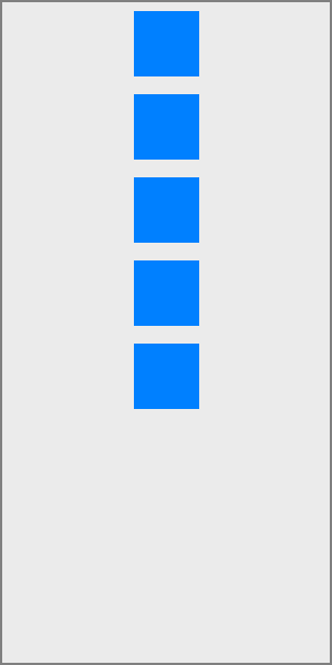
|
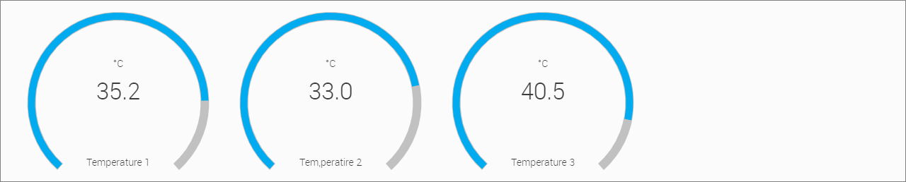
|
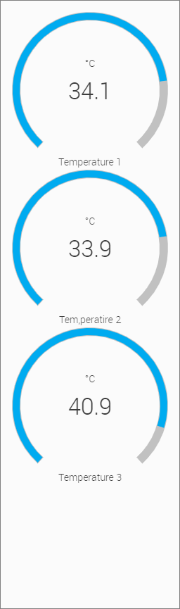
|


6.2.3. Alignment Along Main Axis
This defines the horizontal or vertical alignment along the main axis. It helps distribute extra free space leftover when either all widgts on a line have a fixed size or have reached their maximum size.
MAIN AXIS: HORIZONTAL DIRECTION |
MAIN AXIS: VERTICAL DIRECTION |
Left: Widgets are packed from the left side of the main axis. |
Top: Widgets are packed from the top of the main axis. |
|
|
|
|
|
Right: Widgets are packed from the right side of the main axis. |
Bottom: Widgets are packed from the bottom of the main axis. |
|
|
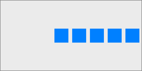
|
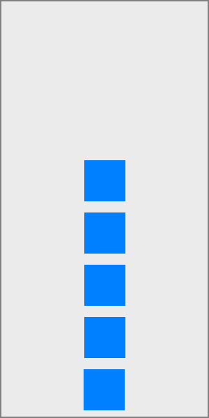
|
Center: Widgets are centered along the direction of the main axis. |
Middle: Widgets are middled along the direction of the main axis. |
|
|
|
|
Space Between: Widgets are distributed evenly in the line or column; first Widget is on the start, last Widget on end. |
|
|
|
|
|
Space Around: Widgets are distributed evenly in the line or column with equal space around them. Note that visually the spaces aren’t equal, since all the Widgets have equal space on both sides. The first Widget will have one unit of space against the Container edge, but two units of space between the next Widget because that next Widget has its own spacing that applies. |
|
|
|
|
|
Space Evenly: Widgets are distributed so that the spacing between any two Widgets (and the space to the edges) is equal. |
|
|
|
|
|


|
It may happen that alignment along the main axis has no effect. This happens when
|
6.2.4. Alignment Along Cross Axis
This defines the default behaviour for how Widgets are laid out along the cross axis on the current line direction. Think of it as the vertical or horizontal alignment along the cross-axis (perpendicular to the main-axis).
MAIN AXIS: HORIZONTAL DIRECTION |
MAIN AXIS: VERTICAL DIRECTION |
Top: Widgets are placed at the top of the cross axis. |
Left: Widgets are placed at the left side of the cross axis. |
|
|
|
|
Bottom: Widgets are placed at the bottom of the cross axis. |
Right: Widgets are placed at the right side of the cross axis. |
|
|
|
|
Middle: Widgets are middled along the direction of the cross axis. |
Center: Widgets are centered along the direction of the cross axis. |
|
|

|

|
Stretch: Stretch the Widgets in order to fill the layout Container (still respect min-width/max-width). |
|
|
|
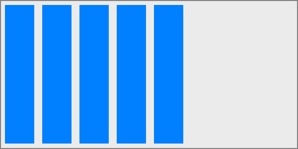
|
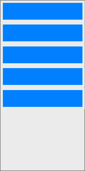
|


|
It may happen that alignment along the cross axis has no effect. This happens when wrapping is activated and the Widgets have all the same height or width. Use Wrap Line Alignment instead. |
6.2.5. Wrapping
By default, a layout container tries to fit all widgets in one row. You can change this and use the wrap option to have the widgets wrap as needed.
I.e. if there is not enough space in a row or column for all child elements, the next element is placed in the next row/column.
If the elements have different heights or widths, the behaviour within the column/row can be set here using the wrap alignment.
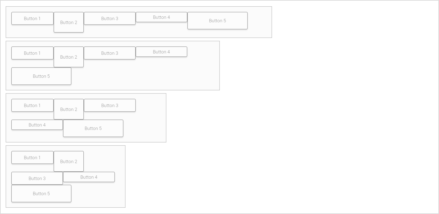
Wrap Line Alignment for the vertical or horizontal alignment of the wrap lines, if you enable "Wrapping":
MAIN AXIS: HORIZONTAL DIRECTION |
MAIN AXIS: VERTICAL DIRECTION |
Top: Wrap lines are placed at the top of the cross axis. |
Left: Wrap lines are placed at the left side of the cross axis. |
|
|
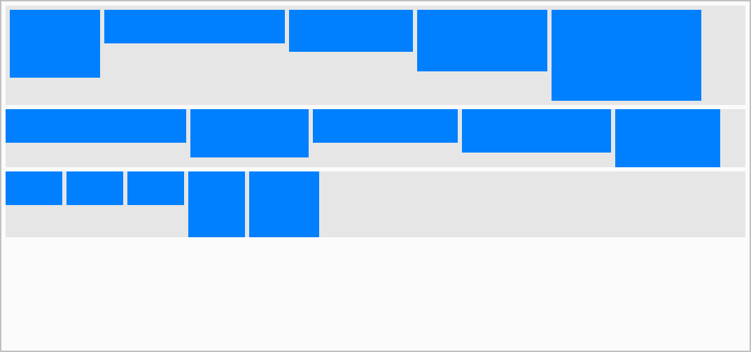
|
|
Bottom: Wrap lines are placed at the bottom of the cross axis. |
Right: Wrap lines are placed at the right side of the cross axis. |
|
|
|
|
Middle: Wrap lines are middled along the direction of the cross axis. |
Center: Wrap lines are centered along the direction of the cross axis. |
|
|
|
|
Space Between: Wrap lines are evenly distributed with first wrap line is on the start, last Widget on end. |
|
|
|
|
|
Space Around: Wrap lines are evenly distributed with equal space around them. |
|
|
|
|
|
Stretch: Stretch the wrap lines in order to fill the overlaying container (still respect min-width/max-width). |
|
|
|
|
|


|
If the 'Wrap' option has been switched on, the child element with the greatest height will determine the entire height of the row for horizontal containers, or the child element with the greatest width will determine the entire column width for vertical containers. |
6.3. Style Cockpit
The styling of Widgets is defined in the Style Cockpit. It distinguishes between
-
Global style settings and
-
Device-specific style settings. Here individual settings can be set for certain device display sizes (responsive design)
The settings are the same, but their effect is different. In the first step, we focus on the global style settings.
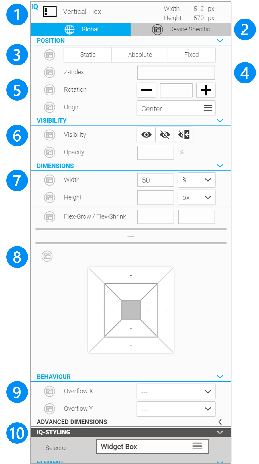
LEGEND
-
Display of the selected widget name, icon and size
-
Switch between global and device-specific style settings (responsive design)
-
Setting of position method
-
Setting of layer index
-
Settings for rotation
-
Settings for visibility and opacity
-
Settings for the dimensions
-
Settings for offset, margin and paddings (Box Model Configurator)
-
Setting for overflow behaviour
-
Setting for the styling (see Style Your HMI)
6.3.1. Info Header
The Info header represents general information about the selected widget:
-
Widget icon, widget type
-
Current width
-
Current height
6.3.2. Global / Device-Specific
Switch that makes the style settings global or device-specific which can be important for responsive design (see Device Specific Styling).
6.3.3. Position Method
Defining the positioning method of the element:
-
Static: Container-based positioning, same as if the position mode is not set.
-
Absolute: Pixel-oriented position mode. The element can be positioned within its parent container.
-
Fixed: Pixel-oriented position mode. The element can be positioned within the entire browser window.
If you choose 'Absolute' or 'Fixed' position mode, the element will be removed from the natural flow of container positioning and all other elements will move forward in position accordingly. The element with the changed position mode slips into the upper left corner and can then be moved using the position handle.For more information see chapter 'Pixel oriented Position Method'.
|
When 'Absolute' or 'Fixed' position mode has been selected, the position pixels in the box model will be displayed as offsets and can be entered as numeric pixel values (see chapter Box-Modell). |
6.3.4. Z-Index
The setting "Z-Index" defines at which level on the z-axis the Widgets are displayed in the HMI and thereby which element may overlap the other. Elements with a large z-index are drawn in the foreground or rather "closer" to the viewer.
6.3.5. Rotation
With Rotation you can set the rotation of the selected Widget. The value is entered in the form of an angle between - 360° and +360°:
-
positive angle: clockwise rotation
-
negative angle: counterclockwise rotation
Under Origin you can define the rotation point.
6.3.6. Visibility
By default a Widget is visible.
 Visible: This setting turns the visibility explicitly on.
 Hidden: This setting hides the element, the space of its position will still be reserved.
 None: Removes the element completely, the space is freed and the other elements in the container-based order will move forward in position accordingly.
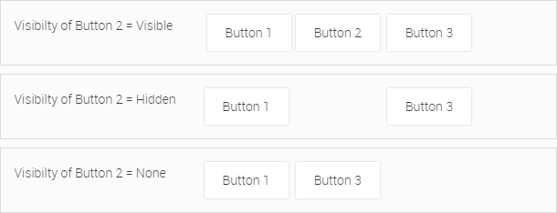
6.3.7. Opacity
This setting adjusts the opacity of the corresponding Widget. The higher the value, the greater the opacity.
6.3.8. Dimension 'Width' and 'Height'
By default the size of a widget is defined automatically, but it is also possible to set the size manually.
You can specify the width and height of a Widget in
-
Grid units (grid)
-
Pixel (px)
-
Percent (%)
-
100 Percent (100%)
The format of the dimension can be selected as soon as you select the relevant input field "Width" or "Height". The unit of the corresponding dimension will be displayed as a dropdown list, which allows you to change it. 100% is a shortcut for entering the value "100" and selecting the unit "%".
|
If you use a relative size for an element you need to make sure that its parent element has a valid size set. Otherwise the relative size settings will not take effect. |
|
Most of the widgets have minimum dimensions in order to avoid display errors. You cannot make the widget smaller than these values. |
6.3.9. Box Model Settings: Offset, Margin, Padding
You can consider all elements like Widgets and Containers as boxes. Essentially you can imagine a Widget Box that wraps around every element (see the illustration below). This model is also commonly known under the name of "CSS box model". It is the direct origin of the Box Model Configurator, a graphical representation for the input of padding, margin and offset.

In WebIQ Designer, the box model configurator is used to set up
-
Paddings
-
Margins
-
Offsets, only displayed in pixel position mode ('Absolute', 'Fixed')
Padding defines an Inner Space and margin defines an Outer Space around the Widget box.
You can edit the values in the box model configurator as follows:
-
The input areas of paddings, margins and offsets are highlighted if you enter the corresponding box with the mouse pointer. In addition, the label is displayed in the upper area of the box model configurator (see the image below).
-
You can enter the value directly if you click on it (see the image below)
-
The value will be automatically inserted for all four directions if you activate the checkbox "Apply to all directions"
|
You can also insert negative values for margins or offsets. |
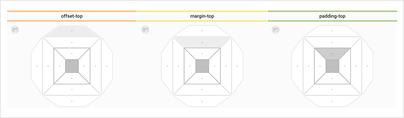
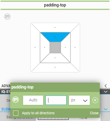
Padding: Padding clears a transparent inner area around the contents of the corresponding widget or container. The padding defines how close content will be displayed to the boundaries of the widget box.
Margin: Margins clear a transparent outer area around the widget box in order to keep other widgets at a distance (see example "Buttons" and "Radial Gauges" above).
|
Margins are not part of the widget or container dimensions. E.g. if you place two containers next to each other, each has a width of 50% and a margin of e.g. 3px for each container, the result is a total width of >100%, exactly 100%(=size of the viewport) + 6px. In contrast, paddings are included in the dimensions of widgets and containers, which makes work a lot easier and more convenient. We therefore recommend using padding for the distance between the elements as far as possible. |
Offset: The offset positions of the top left corner of the widget in its parent container (position 'absolute') or on the screen (position mode 'fixed').
6.3.10. Behaviour
These settings are only available for container widgets and define how the container behaves in case it has a defined height and/or width and its contents flow out of the container (=overflow). There are four overflow behaviour possibilities:
-
Visible - The content which flows out of the Container remains visible.
-
Hidden - The content which flows out of the Container becomes hidden as soon as it crosses the Containers boundaries.
-
Scrollbar - A scrollbar will be displayed - no matter if there is a need for it or not.
-
Auto-Scrollbar - A scrollbar will be displayed if it is necessary. If there are no contents which flow out, no scrollbar will be shown.
|
The scrollbar behaviour is directly based on CSS overflow behaviour. If you add a scrollbar for Overflow Y it usually will not have any effect on Overflow X. Unfortunately this does not work vice versa. If you add a scrollbar for Overflow X this will also automatically trigger a scrollbar for Overflow Y. There is no way to avoid it safely as this is normal CSS behaviour. |
6.3.11. Grow / Shrink
Defines the ability of an element to grow or shrink to fill the remaining space in a container.
All elements within e.g. a horizontal container have a fixed width, either determined by their content or by setting the width attribute in the style cockpit. If a flex or shrink value <>0 is specified for a single element in the container, this element attempts to fill the remaining space in the container by growing or shrinking.
If the grow or shrink attribute has been set in several elements, they will try to fill the available space together in relation to the grow and shrink values.
The same applies to a vertical container with its height.
This behaviour is illustrated by the following examples in a horizontal container:
The behaviour in a horizontal container is as follows: |
Flex-grow = undefined If you have not set any value for "Flex-grow", then the widget will take its (minimum) default size. |
|
With defined Width / Height values If you have entered a value in px for the width or height, then the widget will take exactly this width or height. |
|
Flex-grow = 1 If one or more widgets inside the layout container have “Flex-grow” set to 1, the remaining space in the layout container will be distributed equally to all widgets which have the flex-grow value set. |
|
Flex-grow = 2 or higher If one of the widgets has a value of 2 (or higher), the remaining space would take up twice (or more) as much space as the others (or it will try to, at least). |
|
Width / Height with value + Flex-grow The widget with the width will take exactly this width. The widgets with “Flex-grow” set to 1 will use the remaining space in the layout container. |
|
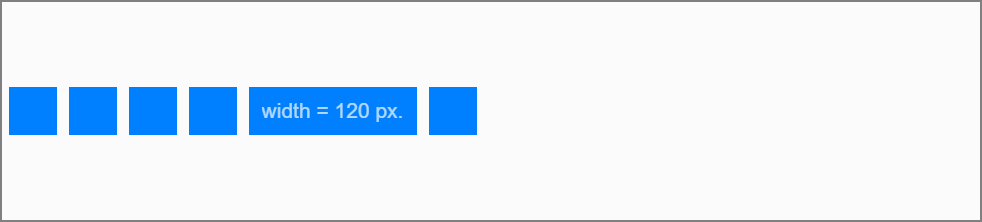
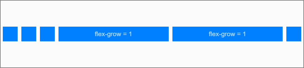
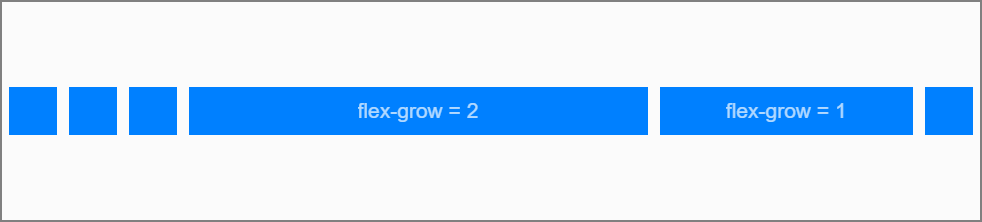
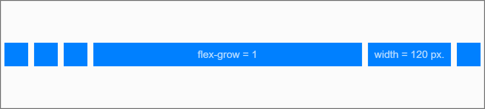
|
The grow or shrink behaviour is very well suited to defining layouts largely independently of the screen resolution. E.g. a screen layout with a header and footer area with a height of 80px, the content area in the middle with Flow=1 ensures that the content area always uses the remaining height. This layout can be displayed on 16:9 as well as on 16:10 screens without leaving a border.
|
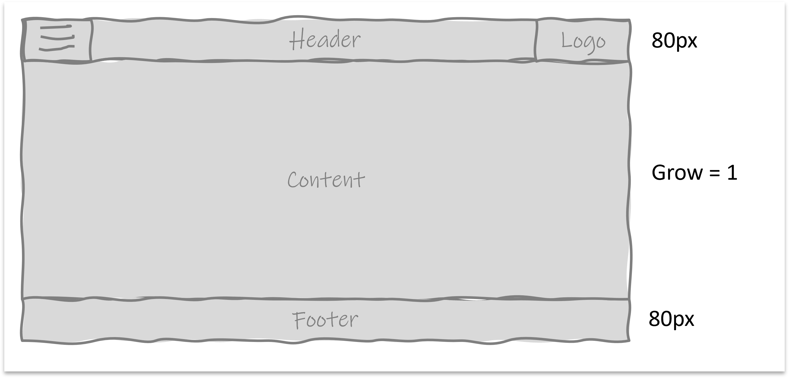
The behaviour for Flex-shrink is the same, except that here the shrink rate is defined.
6.4. Pixel-Oriented Positioning Method
To move an element in pixel-oriented mode, you can use the 'Absolute' or 'Fixed' button in the "Position" area of the Style Cockpit. The individual modes are described below:
6.4.1. Static
Position mode 'Static' is the default mode, i.e. the selected widget will be displayed in the normal HTML flow (see Container-Based Layouts).
6.4.2. Absolute
In 'Absolute' mode, the element can be freely positioned inside its parent container.
In 'Absolute' mode, the element can be freely positioned inside its parent container. The selected element will be removed from the HTML flow and can be freely positioned using a handle in the layout editor. At the same time, the offsets are displayed in the box model of the Style Cockpit and the position values can be entered there alternatively (Illustration of the "Box Model", see box-model)
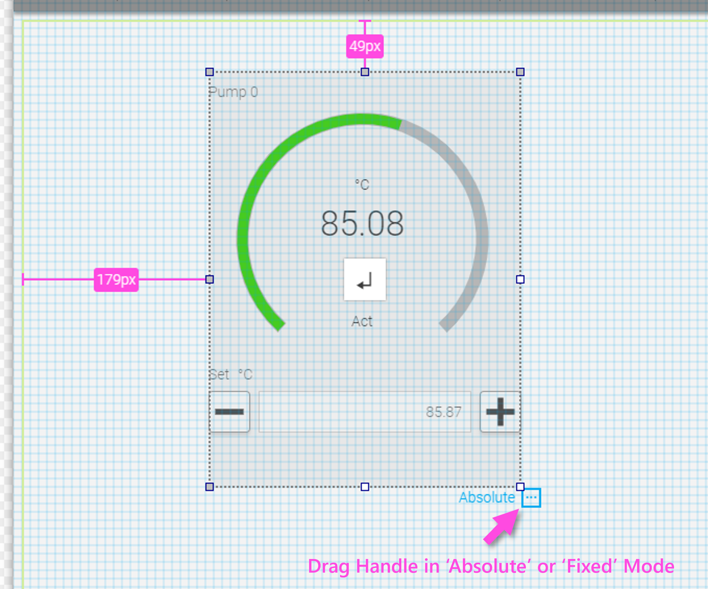
6.4.3. Fixed
Similar to 'Absolute Mode', but the element can be positioned over the entire window.
Caution: This can cause difficulties when creating multi-page applications and switching between pages. We recommend the 'Absolute' mode for the vast majority of use cases where pixel-oriented positioning is required
6.4.4. Context Menu in Pixel-Oriented Modes
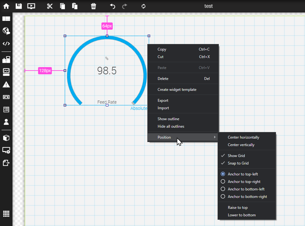
By using the absolute positioning, you are free to define the widget position. Open the context menu of the widget and select the entry "Position". There you can choose one or more of the following options:
| Option | Description |
|---|---|
Center horizontaly |
Widget will be centered horizontally |
Center vertically |
Widget will be centered vertically |
Show Grid |
Enable or disable grid |
Snap to Grid |
Widget snaps according to grid size |
Anchor to top-left |
Sets the zero-point (anchor) of the xy-coordinates to the top left |
Anchor to top-right |
Sets the zero-point (anchor) of the xy-coordinates to the top right |
Anchor to bottom-left |
Sets the zero-point (anchor) of the xy-coordinates to the bottom left |
Anchor to bottom-right |
Sets the zero-point (anchor) of the xy-coordinates to the bottom right |
Raise to top |
Raises the widget towards one layer index to the top |
Lower to bottom |
Lower the widget towards one layer index to the bottom |
6.5. Responsive Design
WebIQ fully supports responsive design which is part of HTML5. This is the technical possibility of adapting the layout of the HMI to the user’s end device with regard of dimension, resolution and display orientation.
To define how an HMI should behave with different resolutions, there are several methods that are individually described below:
6.5.1. Flex Container
Another property of containers is the flex property, i.e. containers can grow or shrink depending on the available screen space (Grow / Shrink, see chapter Grow/ Shrink).
6.5.2. Media Query
As an additional feature, the browser that renders this layout can determine the horizontal width of the displaying device. This determination is called "media query". On this basis different properties of the containers can be set, e.g. they can be reduced or hidden. This technique, which allows the page layout to be fully adapted to different device classes and resolutions, is the core of responsive design.
For further information see section Device Specific Styling.
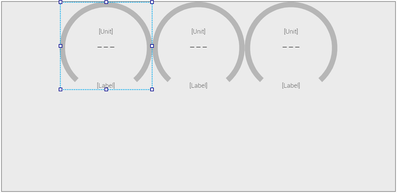
6.6. Device Specific Styling
You can define a device-specific layout for the HMI if you use the target system selector in combination with the switch Global | Device-Specific. Furthermore you can Widget the device-specific settings with the Responsive Inspector.
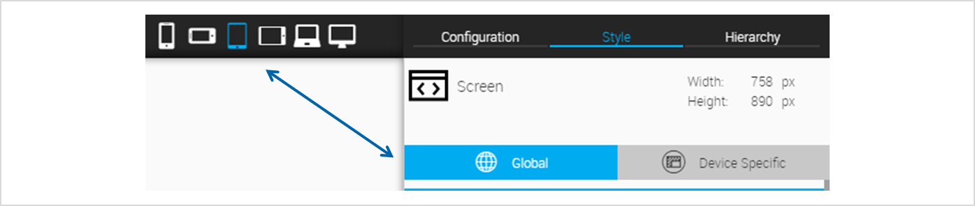
6.6.1. Target System Selector
The Target System Selector allows you to choose a target system in order to verify the responsive design behaviours of your HMI project and in order to define device-specific layouts.
|
In the current version of WebIQ Designer the target systems are predefined and fixed. If you want to create an HMI in a specific, fixed resolution, you should use the width and height settings in the Style Cockpit of the root container of the HMI project. |
| Target System | Icon | Min. Width [px] | Max. Width [px] |
|---|---|---|---|
Mobile |
|
0px |
479px |
Wide Mobile |
|
480px |
767px |
Tablet Portrait |
|
768px |
1023px |
Tablet Landscape |
|
1024px |
1263px |
Wide |
|
1264px |
1919px |
Extra Wide |
|
1920px |
unlimited |
6.6.2. Switch Global | Device-Specific
This switch has the following two settings:
-
Global
-
Device-Specific
 Global
In case of "global" the settings of the Style Cockpit apply equally to all target systems.
 Device-Specific
You can define device-specific style settings when the switch is set to Device Specific. This means that all settings in the Style Cockpit are only applied to the currently selected target system and all larger resolutions. This is also known as the mobile-first approach, i.e. the settings are passed on to all displays with a higher resolution.
The mobile-first approach has become a quasi-standard in web development.
6.6.3. Responsive Inspector
The responsive inspector displays whether there are any device-specific settings for a selected parameter.
The responsive icon is displayed for each parameter in the Style Cockpit. It is highlighted as soon as there is a device-specific setting for that parameter. You can click on the icon and the responsive inspector will be displayed. It indicates which target system(s) has a specific setting. Furthermore it displays the approach: mobile first, the arrows points from left to right.
|
The Reset button deletes all device-specific settings in one step. |

| Label | Meaning |
|---|---|
--- or 'none' |
No setting for the corresponding target system |
bold |
Setting for the corresponding target system |
light-grey |
The setting is inherited from a lower resolution target system |
6.6.4. Examples
If you select the 'View Demos' area in the project list area of WebIQ Designer, you will see a large selection of example HMI projects that you can download and try out with a simple click. In addition to many responsive design examples, you will also find a demo specifically for layouts with responsive layout there.
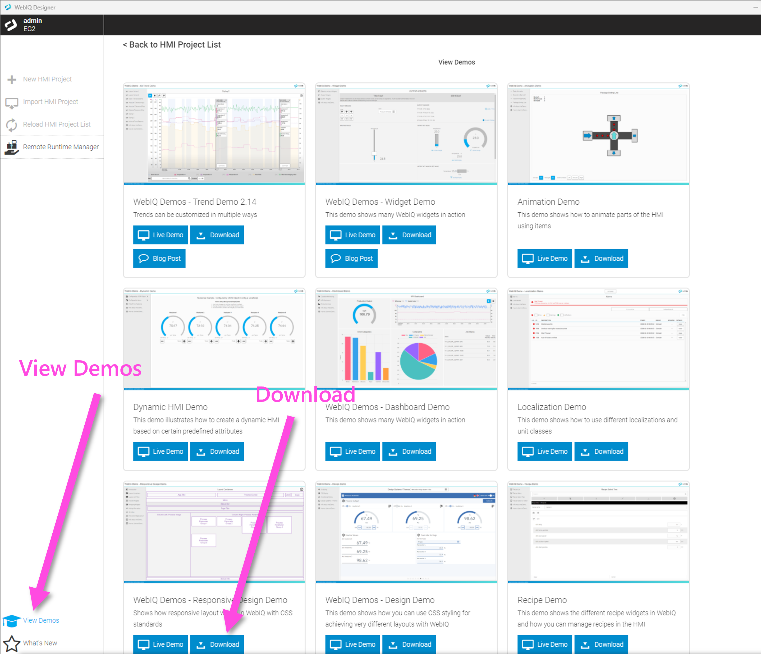
7. Styling Your HMI
This chapter describes in detail how you can style your HMIs within WebIQ Designer.
7.1. How It Works
Each widget of the WebIQ and even each variant of the widgets has its own default style description in form of a CSS stylesheet (CSS = Cascading Style Sheets). The style description is assigned in the field "Class Name" in the configuration cockpit.
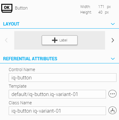
The default style descriptions have a name similar to the widget name. Additionally, the number of the variant is shown in the term (see figure above: the widget "button" with the first variant has the style name "iq-button iq-variant-01").
Manual Styling vs. CSS Modifier / CSS Classes
You can now override the default style of the widgets and redesign it manually by changing individual Style Options (e.g. the background color, font, border, etc.) To do this you have to go to the "IQ-Styling" section in the Style Cockpit and set the appropriate styling options according to your wishes. The possibilities are described in chapter "Manual Styling Options".
Another, more technical way is to create an additional CSS stylesheet, which summarizes all style options for a widget. Since this stylesheet does not describe the complete design of a widget, but only the desired adjustments, it is called a CSS Modifier. This is assigned to the widget as an additional CSS Style Class. These possibilities are documented in chapter "CSS Modifier / CSS Classes".
More information, how to convert manual style settings into a CSS Style Class can be found here.
CSS modifiers or CSS classes can also be displayed conditionally by a rule (Conditional Styling). More information can be found in the chapter "Conditional Styling".
Priority
Important is the priority of the style options. This means: in which order style options will be overwritten?
The rules are
-
Standard Styles are overwritten by CSS modifiers
-
CSS modifiers are overwritten by manual styling
For Example:
-
In standard styling the background color of the button is "white".
-
If you now apply the CSS modifier "OK" to the button, it will overwrite the background color with "green
-
If you now manually set the background color to "Blue", the background color will be overwritten with "Blue".
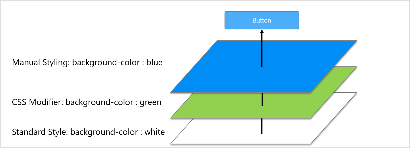
|
You can break this order by creating your own CSS modifier (see above) and adding "!important" to the appropriate style option. We recommend that you don’t use this. |
|
Please make sure that you do not override the style description in the field class name by accident. |
7.2. Manual Styling (IQ-Styling)
You can manually style every instance of a widget in the Style Cockpit. To do this, select the corresponding widget, switch to the style cockpit and move to the section IQ Styling. There you have to select the elements of the widget, which you want to style, in the field "Selector".
Examples for stylable elements:
-
Widget Box: box in which the widget is displayed
-
Label: label of the widget
-
Unit: unit of the widget
-
Icon: icon of the widget
-
Button: if the widget contains buttons
-
Input: if the widget contains input fields
-
Etc.
Widget Box |
Icon |
Label |
Unit |
|

|

|

|
Input |
Buttons |
||

|

|
Below the selector you will find the corresponding styling options, like
-
Background
-
Typography
-
Borders
-
Shadows
-
Etc.
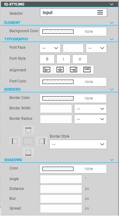
|
Depending on the widget and component, only certain styling options may be available. You have to find it out. |
|
The blue indicator icon shows you for which element you have changed a styling option. In the example above, at least one styling option has been modified for both the button and icon selectors. |
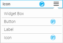
7.3. Delete Style Settings
There is an option to reset the style setting for each area. If you select a field, the cross icon is displayed, which can be used to reset the style settings. If the top element, 'Selector', is deleted, you will be asked whether all style settings for the relevant selector or for all selectors should be deleted.
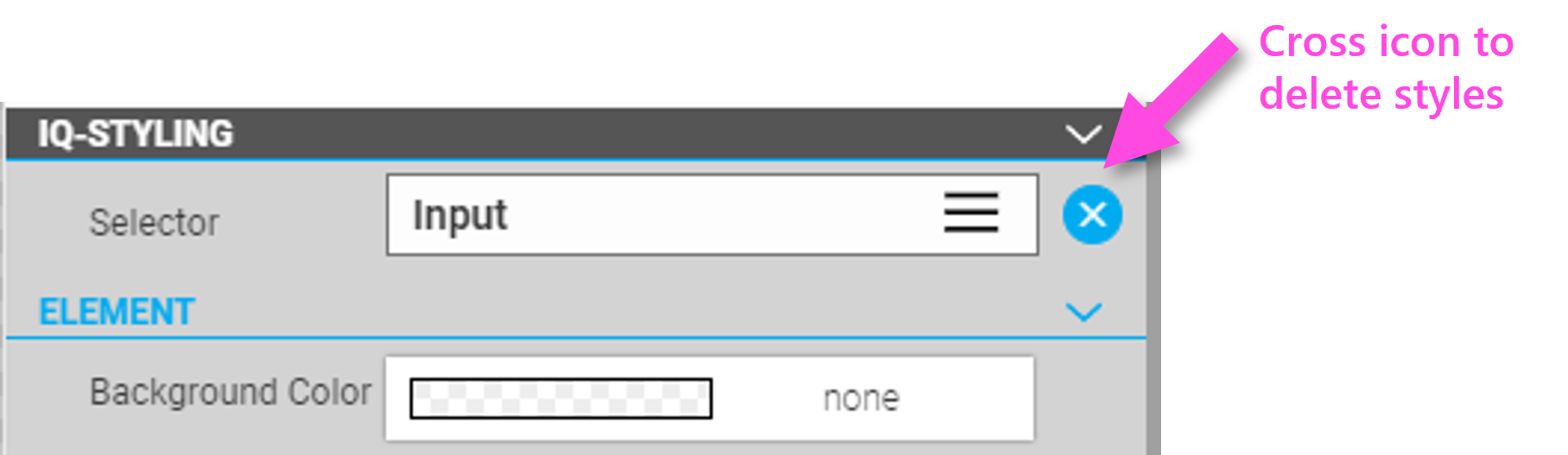
7.4. General/ Element settings
7.4.1. Background Color
Define the background color for the selected component.
You can enter the background color directly as a hex value or use the color picker to select a color.
Additionally you can set a transparency for the background color (0% = no transparency to 100% = full transparency).
7.4.2. Color Gradient
You can set for the background color the following gradients: - linear gradient - radial gradient
At least you have to define two different colors for the gradient. But you can add with the plus button - if needed - more colors including transparency for the gradient. With the Stop position you define the point in the gradient where the color in question is reached in pure form. The following stop positions lead to the graphical example shown below:
| Stop Position | Color |
|---|---|
0% |
Blue |
60% |
White |
80% |
Orange |
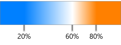
| Stop Position | Color |
|---|---|
0% |
Blue |
40% |
White |
60% |
White |
80% |
Orange |
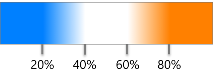
In addition, an angle for the gradient can be defined for the linear gradient.
7.4.3. Width
Define the width of the component, which it occupies in the corresponding widget.
"Auto" means that the component will take the default width as the widget was designed. You can also enter an absolute width in pixels or em, or a relative width in %.
7.5. Typography
7.5.1. Font Face
Define the font type and font size of the component. Default installed fonts are:
-
Roboto (Roboto, -Thin, -Light, -Medium, -Bold, -Black, -Condensed))
-
Cursive
-
Fantasy
-
Monospace
-
Sans Serif
-
Serif
7.5.2. Font Style
Define the font style (bold, italic, underlined) of the component.
7.5.3. Alignment
Define the alignement of the font (left, center, right, justified).
7.5.4. Font Color
Define the font color for the selected component.
7.6. Borders
|
You have to define at least a border color, width and style in order to get a border. |
7.6.1. Border Color
Define the border color for the selected component.
7.6.2. Border Width
Define the border width of the selected component.
7.6.3. Border Radius
Define the border radius of the selected component. This defines the radius at the corners.
7.6.4. Border Position
With this control you define the position of the border (top, left, right, bottom). The control will be available as soon as you defined a border style.
7.6.5. Border Style
Define the border radius of the selected component.
|
|
|
|
|
|
|
|
|


7.7. Shadows
7.7.1. Shadow Color
Define the shadow color for the selected component.
7.7.2. Angle
Define the shadow angle for the selected component (angle orientation see below).
|
|
|
|
|
|
|
|
|


7.7.3. Distance
Define the distance of the shadow in angle direction for the selected component.
7.7.4. Blur
Define how big and how much the shadow has to be blurred, if set to 0 the shadow will be sharp, the higher the number, the more blurred it will be.
|
|
|

7.7.5. Spread
The spread defines the size of the shadow. Positive values increase the size of the shadow, negative values decrease the size. Default is 0.
|
|
|


7.8. Designing your HMI Depending on Conditions or User Roles
This chapter gives you an overview on how you can design your HMI depending on process or configuration variables or user roles. In addition, any CSS styles such as colors, gradients, animations, etc. can be set statically or depending on these conditions.
This allows you to design your HMI dynamically.
7.9. CSS Modifiers
You can find the configuration of the CSS modifiers in the Configuration Cockpit of the widgets, at the top of the "Referential Attributes" area in the third line "Class Name". Here you will find the standard CSS class of the currently selected widget or the selected layout variant:
CSS modifiers are optional CSS classes that are applied to the widgets and which influence the appearance of the widget. You can activate them by entering the CSS modifier in the field "Class Name" delimited by a space character to the original class of the widget or - what we recommend to you - via the "CSS Modifier" dialog, which you can display by clicking the button at the end of the "Class Name" field. Select the appropriate CSS class and insert it with the + button. You can also define a display condition for the CSS modifiers within the CSS Modifier Dialog.
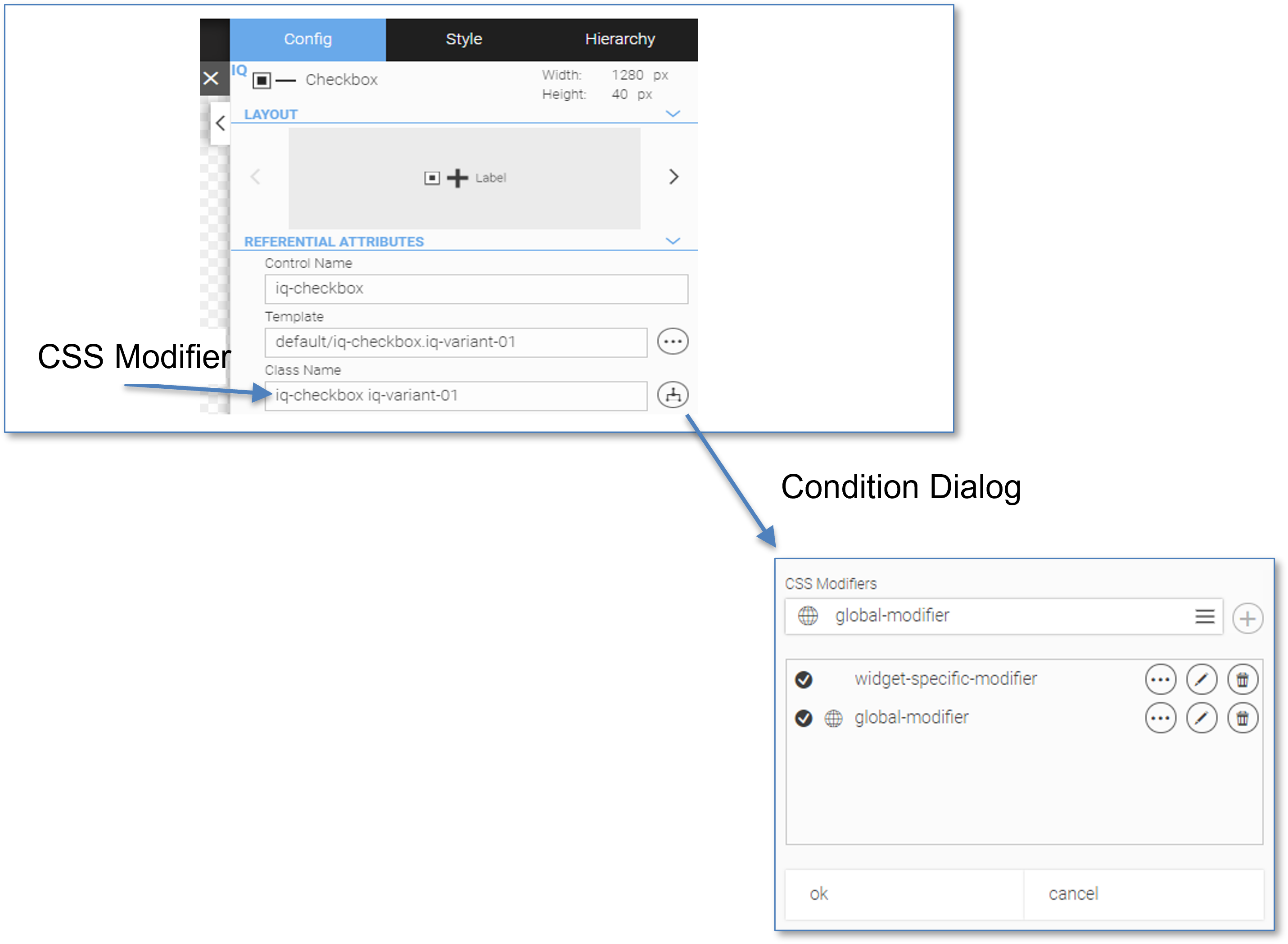
The select box for selecting a CSS class has an autocomplete function so that classes can be found quickly even in larger contexts.
|
The icon |
7.10. Standard CSS Modifiers
The widgets already include some ready-made standard CSS modifiers. The following CSS modifiers are available for most widgets:
-
ok You can use the CSS modifier "ok" to indicate that the status of the widget or process value is ok.
-
warn You can use the CSS modifier "warn" to indicate that an alarm is displayed for the widget or process value.
-
preWarn You can use the CSS modifier "preWarn" to indicate that an alert is displayed for the widget or process value.
-
inverted You can use the CSS modifier "inverted" to place the widget on a dark background.
-
hidden You can use the CSS modifier "hidden" to hide the widget, but keep the space for the widget reserved.
-
invisible You can use the CSS modifier "invisible" to remove the widget, so that other widgets can take this space.
ok |
warn |
preWarn |
inverted |


|


|

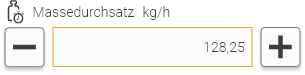

|

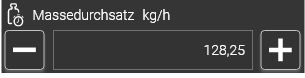
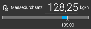
|
hidden |
invisible |
||
- no image - |
- no image - |
The default CSS modifiers are widget specific, additionally available CSS classes that are delivered with WebIQ and which provide a customized look of the widget. To add a specific class to a widget, select the widget and open the configuration cockpit. In the "Referential Attributes" section, search for the option "Class Name".
The "Class Name" input already contains the CSS class name that is currently set. The default CSS modifiers for the warn, preWarn and ok states have the following priority: warn is displayed before preWarn and ok, preWarn is generated before ok, i.e.
| ok | preWarn | warn | Result: displayed state of the widget |
|---|---|---|---|
- |
- |
- |
standard |
|
- |
- |
ok |
- |
|
- |
preWarn |
|
|
- |
preWarn |
- |
- |
|
warn |
|
- |
|
warn |
- |
|
|
warn |
|
|
|
warn |
7.11. Create A CSS Modifier
You can create your own CSS modifier for widgets by using CSS and the integrated Code Manager  . Therefore, please select the Stylesheet tab of the Code Manager. You can just switch to the Code Manager from the Layout Manager. Create a new Style Class by using a generic stylesheet or editting the template of the respective widget. (see Cascading StyleSheets (CSS)).
7.12. Conditional Styling Based on Variables or User Roles.
If you like to add a condition to a CSS class of a widget, open the CSS Modifiers Dialog and click  . You can choose between two types of conditions (Comparison Types):
-
Item Value: the condition is met if the value of an item satisfies the comparison condition.
-
Usergroup: the condition is fulfilled if the logged in user belongs / or doesn’t belong to a certain usergroup
7.12.1. Comparison Type "Item Value"
You have the following options:
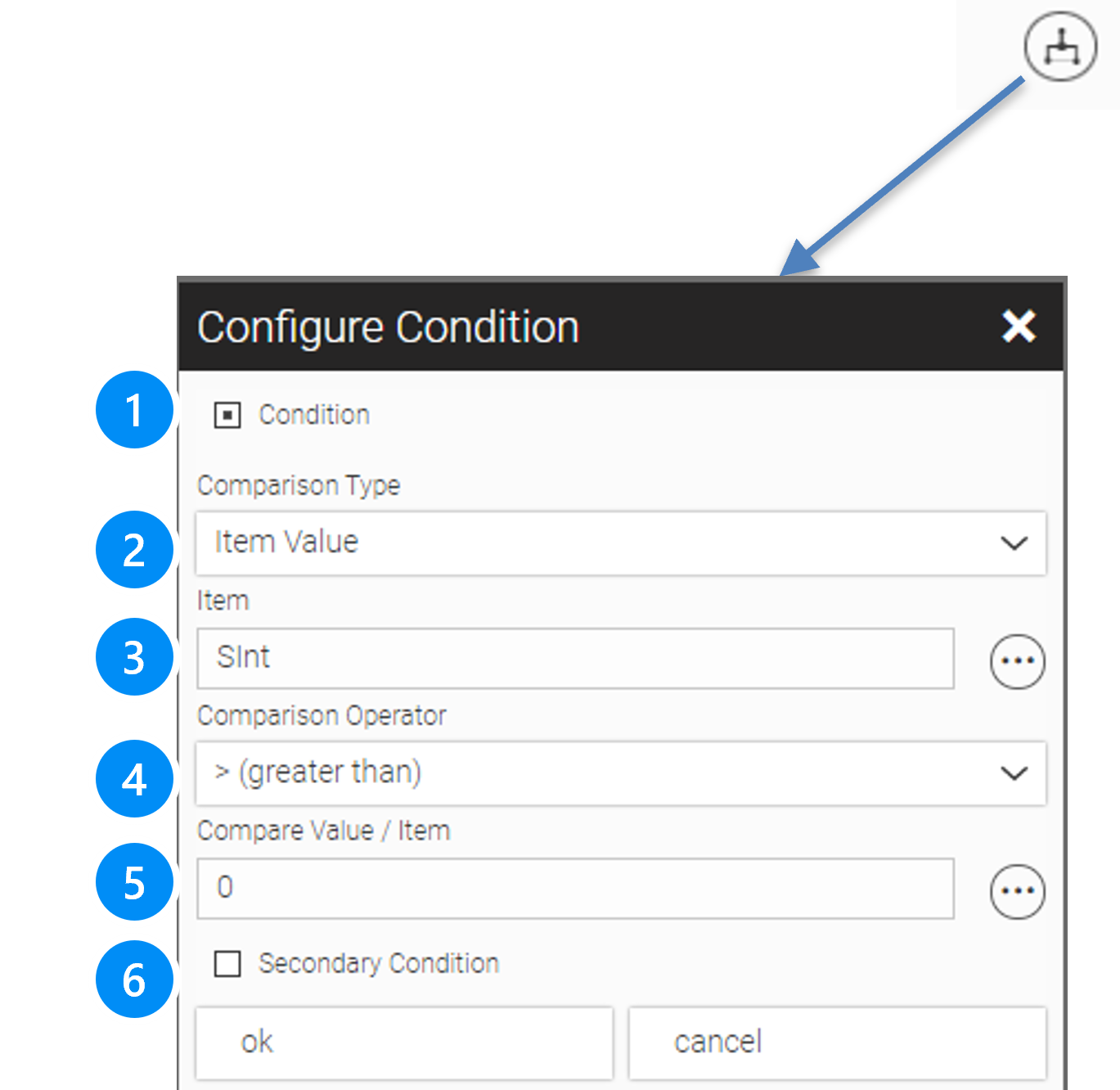
LEGEND
-
Default is "no Condition". Check, if you like to add a condition
-
Select the comparison type ("Tag/ item value" or "Usergroup")
-
Choose an tag/item for which the condition should apply
-
Choose "Compare Operator" of the pull-down menu
-
Enter a comparison value or choose an tag/item of the Process Data Manager
-
Check, if you want to define a second condition
The following Compare Operators are currently available:
-
= equal to
-
<> not equal to
-
> greater than
-
< less than
-
>= greater or equal
-
<= less or equal
-
& bitwise and
-
| bitwise or
-
^ bitwise xor
-
!& bitwise nand
-
!| bitwise nor
|
If you use items of the data type "bool" in the definition of the condition, then note that you use either "0" or "1" (instead of "false" or "true") as compare value. The compare value "true" and "false" does not work here! |
7.12.2. Comparison Type "Usergroup"
You have the following options:
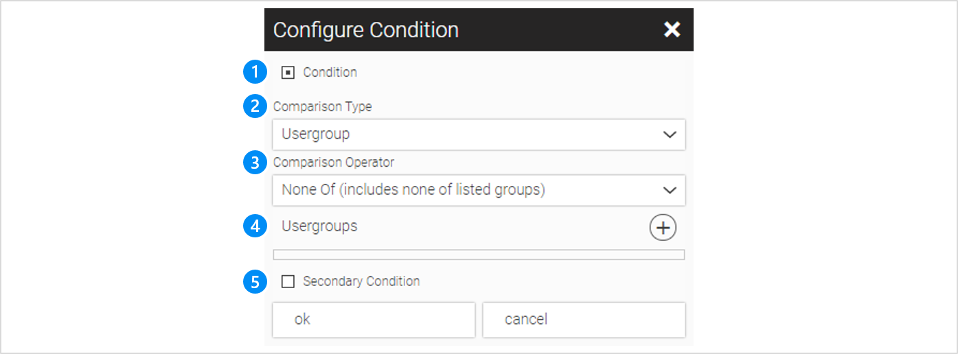
LEGEND 1 Default is "no Condition". Check, if you like to add a condition 2 Select the comparison type ("Item Value" or "Usergroup") 3 Choose "Compare Operator" of the pull-down menu 4 Choose one or more usergroups you want to compare to 5 Check, if you want to define a second condition |
The following Compare Operators are currently available:
-
Any of (includes any of listed uergroups)
-
All of (includes all of listed uergroups)
-
None of (includes none of listed uergroups)
If you return to the Configuration Menu after setting a CSS class, you will probably not notice any change at first glance.
The class name field still includes just the default CSS class but the CSS Modifiers Icon turned blue  .
.
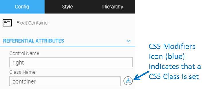
|
If you use items of the data type "bool" in the definition of the condition, then note that you use either "0" or "1" (instead of "false" or "true") as compare value. The compare value "true" and "false" does not work here! |
|
You can use the conditional styling in connection with the standard styles "invisible" or "hidden", to make widgets or even complete contents of containers invisible or to hide them. In this way, for example, several options for a system or machine can be shown or hidden. Areas can also be hidden depending on the user role. |
7.13. Conditional Locking of Widgets or Areas
The same mechanism as for the CSS modifiers can also be used to lock widgets or entire areas of the HMI (containers, views,…). The 'Lock Condition' dialog in the configuration cockpit of the selected widget is used for this. With this, the input or user interaction of the widget can be blocked, the widget is grayed out at the same time. The lock condition can also be applied to containers or other panel widgets to lock all items inside.
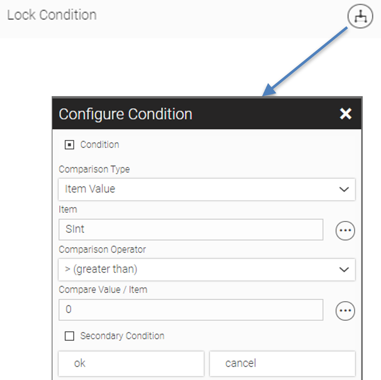
|
If a lock condition is stored, the symbol is displayed in blue. |
8. Creating HMIs With Multiple Views and Overlays
This chapter gives you an overview on how to create multi-page HMIs with the widgets of the 'Panel' category, these are 'Screen widget', 'Tab Panel widget' and 'Swipe Panel widget'.
All these widgets can contain any number of views, which can be toggled using 'ui-actions' ('Setview') or using e.g. the 'Responsive Menu' widget.
8.1. Using Panel Widgets: Screen-, Swipe- and Tab-Panel Widget
Panels are widgets for structuring multi-page HMI layouts. They each have several "views", which are screen pages between which the user can navigate. WebIQ provides the following panel widget types:
Screen Panel: The views are independent and can be navigated by an ui-action of a button etc. or by a 'Responsive Menu' Widget.
Swipe Panel: The same navigation but in addition the views are connected horizontally and you can navigate with a swipe gesture between them.
Tab Panel: The same navigation but in addition the views are represented by tabs, which can be selected by clicking.
|
Alternatively, the pages of all panel widgets can also be switched using the value of a process variable |
8.1.1. Navigation Between Multiple Views
The intention of the panel widgets is to contain the content of several screen pages in views and to switch back and forth (navigate) between them. Alternatively, this can be done by the following actions:
-
Tag/item to select a view
-
Using a 'Responsive Menu' widget see Responsive Menue Widget
-
Using a 'ui-action' 'setview' in multiple widgets, e.g. on-click on buttons, image changer,… see chapter ui-actions
-
Swipe gesture (only in 'Swipe Panel')
-
Using the 'Tabs' of the Tab Panel (only in 'Tab Panel')
8.1.2. Layout Rules Inside Views
The 'Views' inside Panel Widgets are no 'Container Widgets' and work slightly different. They do not automatically resize to fit their content. For this reason it is recommended to insert a layout container below the view in the hierarchy.
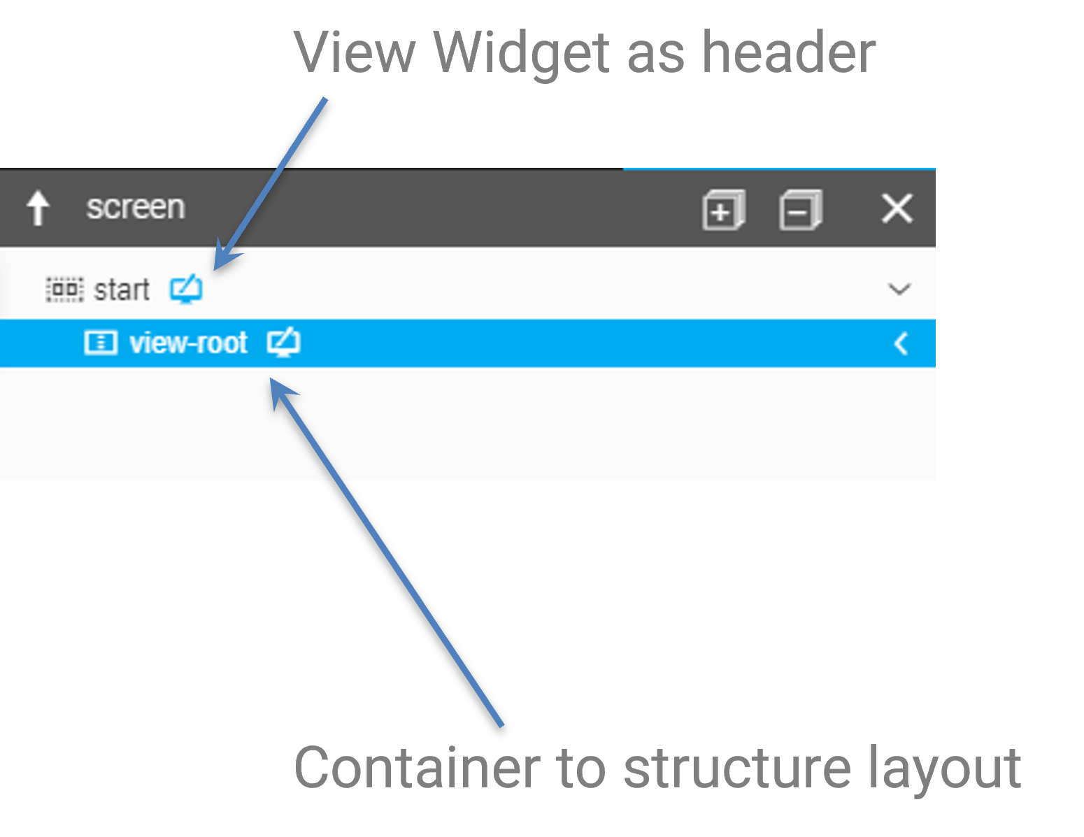
|
In most cases it is then recommended to set the value '100%' for both the view and the container for height and width, so that they use all the available space. |
8.1.3. Working with Panel Widgets
Panel Widgets can be used like normal widgets, they can be selected, dragged, deleted, copy/pasted etc. But they cannot be exported, because the View is not a stand-alone widget but belongs to its parent Panel Widget element.
So in order to export a single view of a panel widget, you have to select an underlying container and export it. The same applies analogously to the import.
Panels Widgets have some additional features concerning creating, configuring and managing different views, which is described in the chapter View Editor
Select: A Panel widget can be selected by clicking on either the widget in the drawing area or by click on the element in the hierarchy.
Enter View Editor: A Panel widget can be opened (View Editor) by clicking on either its "Enter"  button in the Layout Editor or in the Hierarchy Cockpit (right side) or by double-clicking on the element in the Hierarchy Cockpit (see View Editor functions).
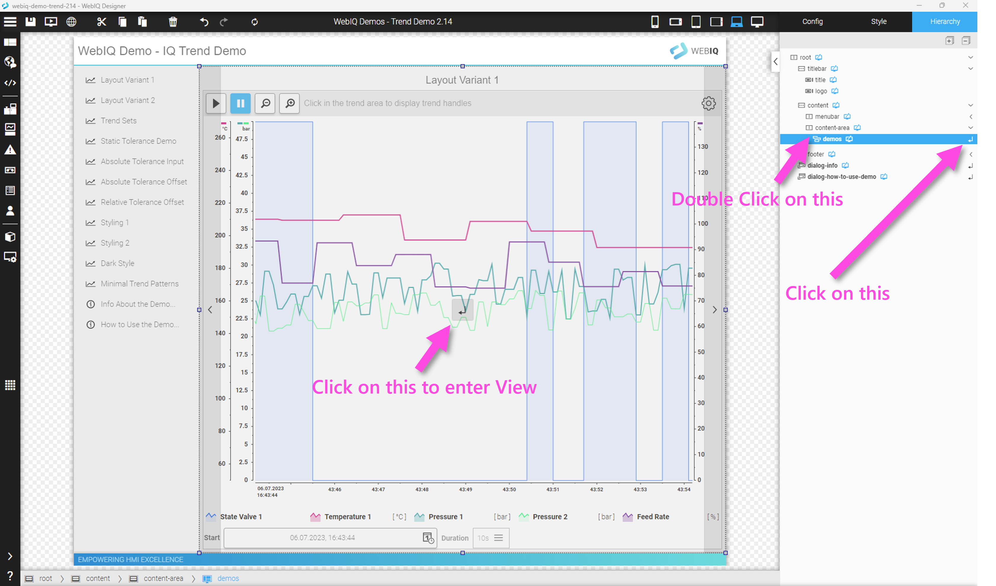
8.1.4. Configuring Panel Widgets
If you have selected a panel widget, the settings can be made in the Config Cockpit on the right side:
Configuring A Screen Widget
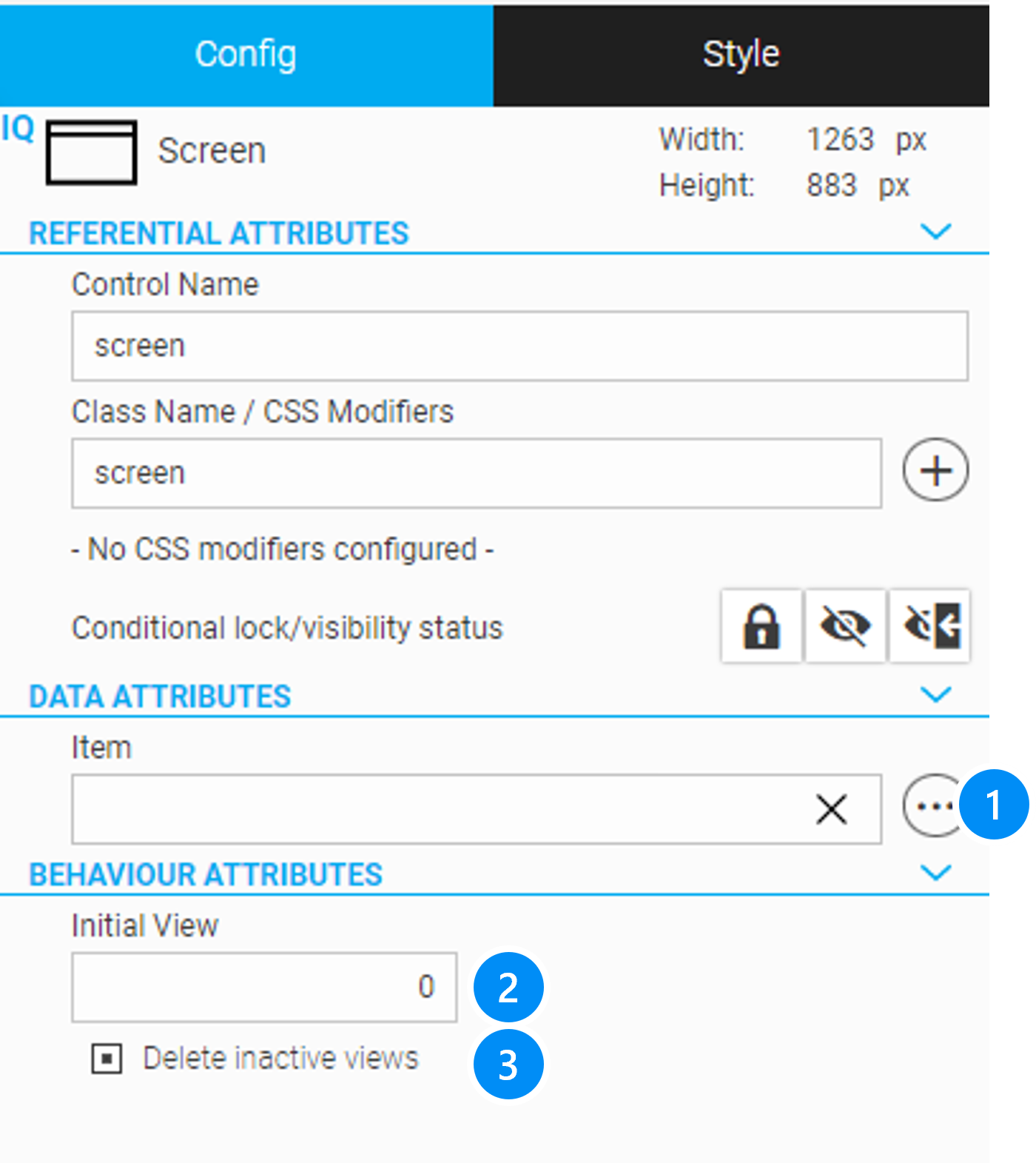
LEGEND
-
Tag/Item to navigate to a view element
-
Initial view if not associated with a tag/item
-
With this option, if you navigate to another view, all elements of the 'old' view are deleted and the tag/item subscriptions of all widgets are deleted. This is the default behaviour and a large number of views can be contained inside one screen widget. If you disable this option, all elements of a view remain in memory and are only deactivated. This means that the loading time for a view that had already been shown and will be shown again will be drastically reduced. It works like a cache.
However, the memory requirement increases accordingly and a browser error can occur if the memory resources of the target system are no longer sufficient.
|
If the 'Delete inactive views' option has been disabled, the memory consumption in the browser can increase significantly and cause errors. |
Configuring A Swipe Panel Widget
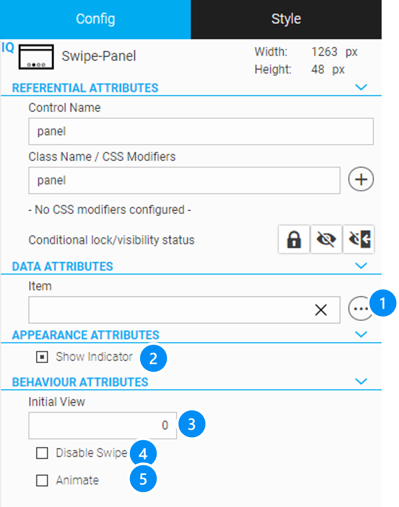
LEGEND
-
Tag/ Item to navigate to a view element
-
Enable/ Disable the swipe panel indicator
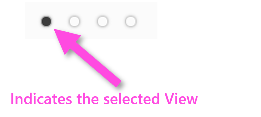
-
Initial view if not associated with a tag/item
-
Disable
With this widget all elements of a view remain in memory and are only deactivated when you move to another view. This causes low loading time for a view that had already been shown, like a cache. However, the memory requirement increases accordingly and browser errors can occur if the memory resources of the target system are no longer sufficient.
|
It is recommended to use the Swipe Panel widget only for a smaller number of views (depending on the memory of the target system, approx. < 20). For a larger number of views, you should use the Screen Widget. |
Configuring A Tab Panel Widget
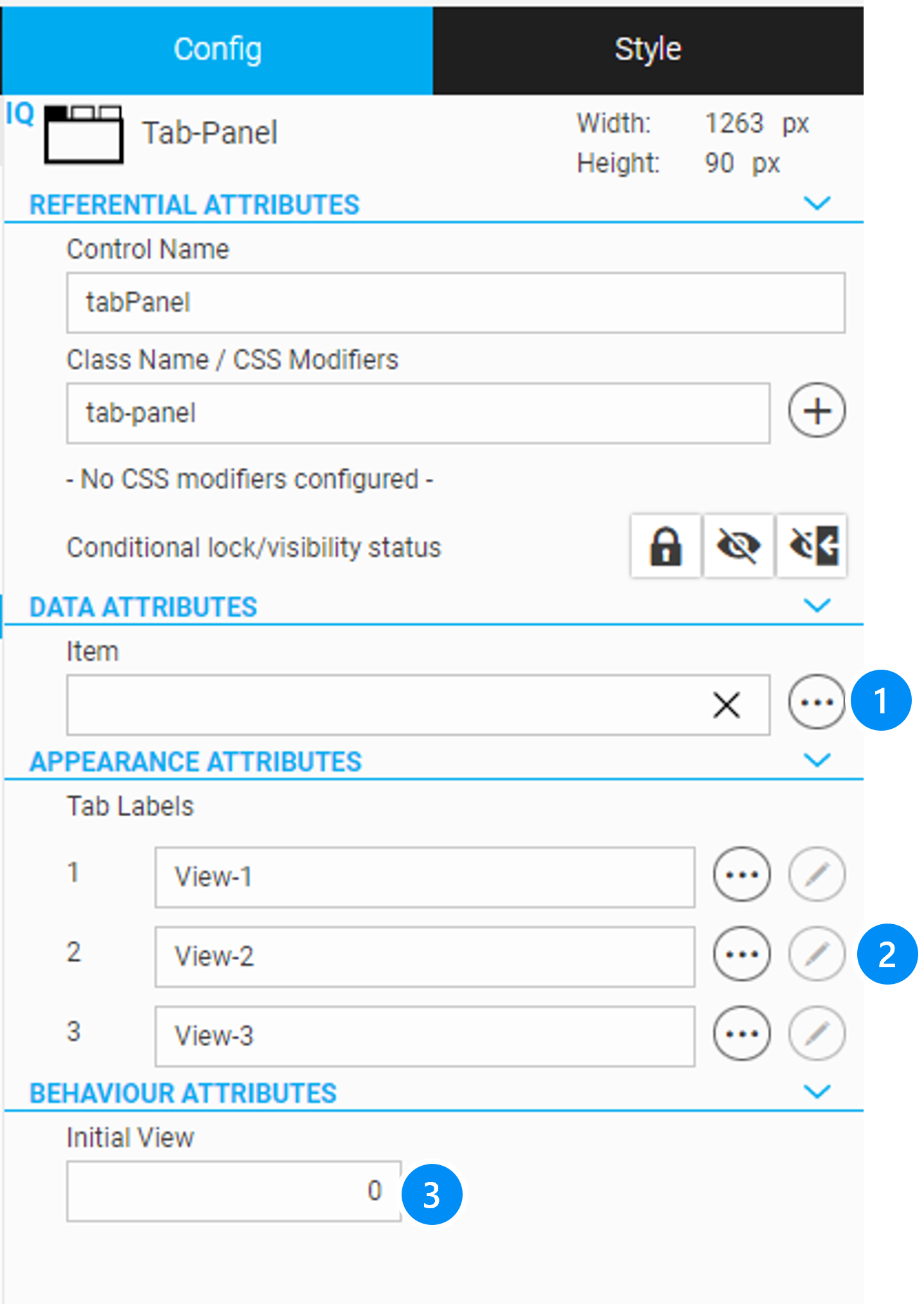
LEGEND
-
Tag/item to navigate to a view element
-
Initial view if not associated with a tag/item
With this widget all elements of a view remain in memory and are only deactivated when you move to another view. This causes low loading time for a view that had already been shown, like a cache. However, the memory requirement increases accordingly and browser errors might occur if the memory resources of the target system are no longer sufficient.
|
It is recommended to use the Tab Panel widget only for a smaller number of views (depending on the memory of the target system, approx. < 20). For a larger number of views, you should use the Screen widget. |
8.1.5. View Editor
A Panel widget can be opened (View Editor) by clicking on either its "Enter" button in the Layout Editor or in the Hierarchy Cockpit (right side) or by double-clicking on the element in the Hierarchy Cockpit.
After a Panel widget has been opened using the method described above, the sub-hierarchy of the current view will be displayed in the Panel widget in the Hierarchy Cockpit.
At the top of the Layout Editor, an additional bar appears that contains functions for managing and editing the views.
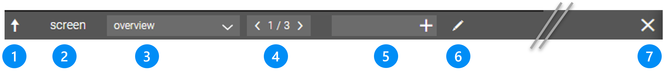
The toolbar contains the following information and functions.
LEGEND
-
Arrow for moving up one level/exiting the View Editor and to return to the parent hierarchy
-
Name of the Panel Widget instance
-
Select box for direct selection of a View
-
Number of the displayed view/total number of views in the panel, Rocker Button to navigate through the views (as an alternative to the select box)
-
Input field "Name of New View" with button "Add View". If you add a view without a name with '+', the view automatically gets a name of the form 'View_xx' and can be renamed at any time.
 .
. -
Button "Open View Manager" (see see View Manager)
-
Button "Close All Levels" and go to the highest level above
|
At the same time, when you navigate to the view editor, the arrow up also appears in the header of the hierarchy cockpit, which can also be used for moving up one level. |
8.1.6. View Manager: Adding, Renaming, Deleting And Rearranging Views
You can display the View Manager if you click on the button "View Manager" in the above View Editor: 
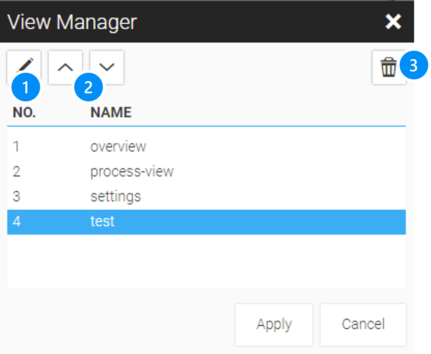
LEGEND*
-
Rename the selected view
-
Move up/down the selected view
-
Delete the selected view
8.2. Using Overlays: Popup, Dialog and Slide-In
The WebIQ widget list contains an 'Overlay' category with widgets that can be overlaid on the current screen. These are:
For this purpose WebIQ offers the following overlay types:
Dialog Box: The dialog box is a temporary window above the HMI that provides information to the user or prompts for input. A dialog box includes at least one Cancel or Close button. It can also contain additional buttons for accepting/processing the input (Apply or OK button).
Slide-In: The slide-in is an area that is temporarily slid in over the HMI and can contain information or input elements.
Popup: The popup is a small area with a few functions or information, which is temporarily pops up above the HMI, such as a pop-up menu.
Overlay widgets can be treated the same as panel widgets, except there is no view switching. To enter the sub-hierarchy, i.e. the content of the 'Overlay Widget', you can click on either its "Enter" button in the Layout Editor or in the Hierarchy Cockpit (right side) or by double-clicking on the element in the Hierarchy Cockpit similar to open the View Editor of a Panel Widget.
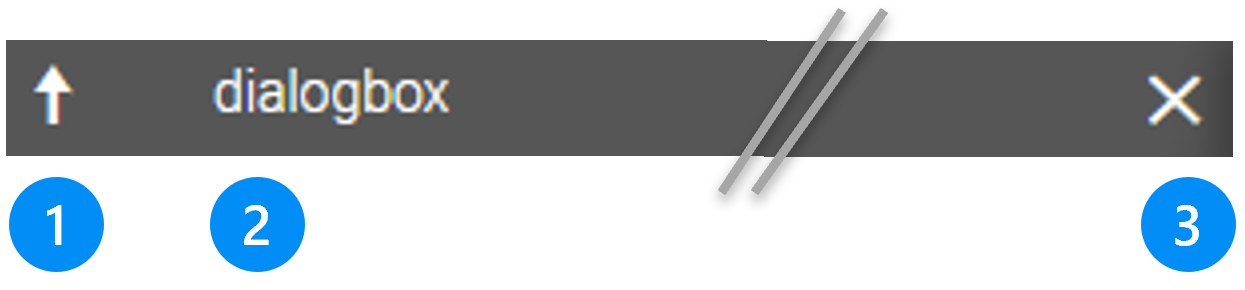
LEGEND
-
Arrow for moving up one level/exiting the View Editor and to return to the parent hierarchy
-
Name of the Overlay Widget instance
-
Button "Close All Levels" and go to the highest level above (this also includes levels of Panel widgets)
8.3. Using The Responsive Menu Navigation Widget
By default, WebIQ offers a very powerful widget that allows you to create a menu for navigation: the IQ Responsive Menu widget. With the IQ Responsive Menu, you can create any hierarchically or vertical sorted menu that allows you to navigate between views.
The name indicates that the menu has already implemented the following sophisticated responsive behaviour:
-
in Standard Mode (mostly useful for larger screen widths) the menu is completely displayed as a horizontal or vertical menu bar.
-
in Mobile Mode (typically used on smaller screens and mobile devices), the menu is reduced to the appearance of a burger menu (icon with three horizontal bars). The full menu is only shown as a slide-in menu when the user clicks / taps on the icon.
You can define in the configuration, from which screen width the IQ Responsive Menu should switch to mobile mode.
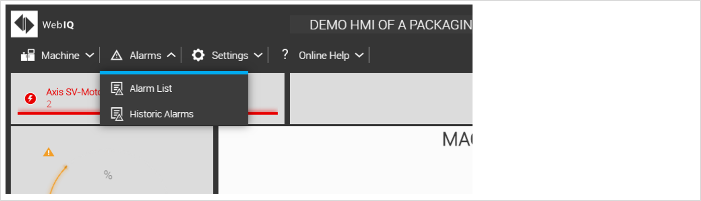
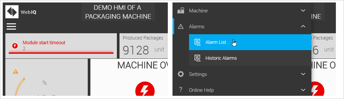
Furthermore, with the IQ Responsive Menu you can choose between different layout variants
| Layout Variant | Description | Image |
|---|---|---|
Horizontal Top Menu Bar |
The menu bar is aligned horizontally. The submenus are vertical pull-down menus, which open from top to bottom. This variant of the horizontal menu is usually used at the top of the screen. |

|
Horizontal Bottom Menu Bar |
The menu bar is horizontally aligned. The submenus are vertical pull-up menus, which open from the bottom to the top. This variant of the horizontal menu is usually used at the bottom of the screen. |

|
Vertical Left Menu Bar |
The menu bar is vertically oriented. The submenus are vertical pull-down menus, which open right from the vertical menu bar. This variant of the vertical menu is usually used on the left edge of the screen. |

|
Vertical Right Menu Bar |
The menu bar is vertical. The submenus are vertical pull-down menus, which open left from the vertical menu bar. This variant of the vertical menu is usually used on the right edge of the screen. |
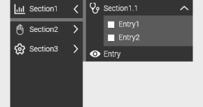
|
|
You can additionally set the mobile mode for each layout variant. |
The IQ Responsive Menu contains three types of menu items:
-
Entry: for creating a menu entry
-
Separator: for creating a non-operable separator between two menu entries (The separator can be used for all levels of the menu. However, it isn’t displayed in the case of an horizontal menu bar on top level)
-
Section: for creating submenus
For menu entries, separators and sections you can define a (localizable) label. In addition, you can specify an icon for each menu entry and section, which will be displayed in front of the label.
You can also select any UI action for the menu item (for details on UI actions, see Use UI actions).
E.g.
-
Select the UI action "setview " if you want to use the menu item to navigate between views in Panel Widgets. This allows to configure which View should be displayed when the corresponding menu item is selected.
-
Select the UI action "dialog " if you want to use the menu item to display a dialog.
-
Select the UI action "slide-in " if you want to use the Overlay Widget Slide-In to display an area with further information or settings.
-
You can also configure any other UI action for the menu item, e.g. Logout (initiates a logout), Setlocale (initiates a language switch), xyz (starts the individual UI action with the name "xyz").
8.3.1. Responsive Menu Configuration
LEGEND
-
Add 'Section' of Menu
-
Add/Edit/Delete 'Entry' inside a 'Section'
-
List of 'Entries', Edit/Delete selected 'Entry'
-
Edit 'Entry': (localizable) Label for the entry
-
Edit Entry: optional icon to show in the entry
-
Edit Entry: optional condition to hide or lock the menu entry depending on a tag/item or depending on usergroup rights get more information about this 'Condition Dialog'
-
Edit Entry: Selection and edit of UI Action (resp. list of UI Actions)
9. Widget Templates And Composite Widgets
9.1. Overview
In this chapter you will learn how to create your own Widget Templates or your own Composite Widgets (Composites) and how to add them to categories of the widget list and then reuse them as your own libraries through importing/exporting.
Widget Templates are configurations of widgets, e.g. parameterized styling and configuration settings that can be saved as templates and reused. Widget templates can be defined by giving a widget name, a category in the widget list and an optional icon.
If a saved Widget Template is instantiated, i.e. inserted in the layout hierarchy, a copy will be inserted. If you change the template later, the instances remain unaffected.
Examples of widget templates:
-
Widgets with their own style, applying style guides
-
e.g. as a shortcut for frequently used configuration settings
A Composite Widget (Composite) is also called a 'faceplate' in some visualization systems and is a group of widgets. The data exchange and the configuration takes place via an interface, which can be defined and edited after creating the Composite.
Composites can be ideally combined with structures and arrays to display machine modules. In contrast to Widget Templates, Composites are objects, i.e. if you change the definition, all instances will also be changed.
9.2. Widget Templates
Widget templates are used, for example, to implement certain styles from a style guide in your own set of widgets or library. You can save the Widget Templates with unique names in categories of your choice and give them optional mnemonic icons.
This is a very simple way for creating custom libraries or for implementing style guides.
|
However, to implement a style guide, the styling of the widget template is based on so-called inline CSS, which overrides the built-in style of WebIQ. If these are used in very large projects, there may be performance implications. In these cases, design and styling should be integrated using so-called packages that contain the styles directly. |
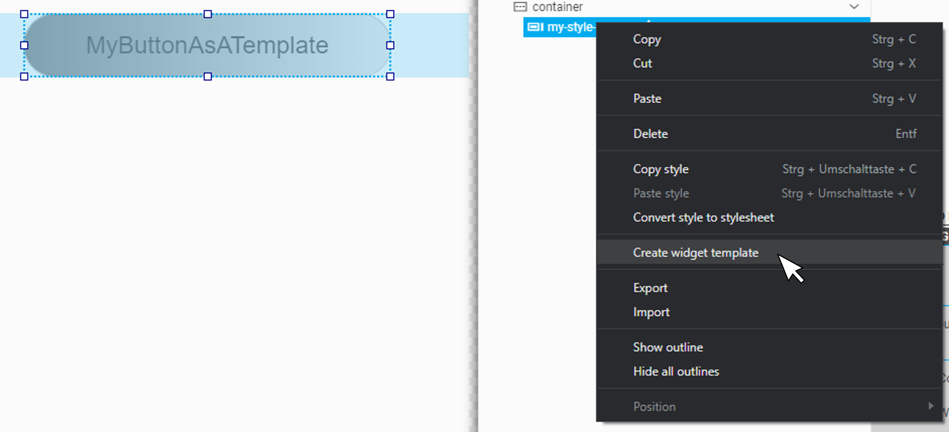
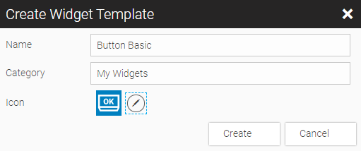
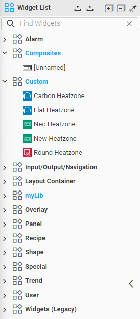
9.2.1. Configure, Delete A Template
Right-click on the template in the widget list if you want to modify, copy to file or delete the template.
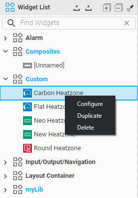
9.3. Composites (Composite Widgets)
Composites, also called a 'faceplate' in some visualization systemss, are groups of widgets. The data exchange and the configuration takes place via an interface, which can be defined and edited after creating the Composites. They consist of the layout, i.e. a group of widgets, which can also contain dialogs or scripts, and a parameterization interface, so that the required parameters can be entered via the configuration cockpit in WebIQ Designer during instantiation.
Composites can be ideally combined with structures and arrays to display machine modules and for binding the necessary data to structured types. In contrast to Widget Templates, Composites are objects, i.e. if you change the definition, all instances will also be changed.
Therefore, they make it possible to support the HMI development of modular machines and systems. The user creates his own libraries with Composites (= modules), which are based on structured variable instances or arrays. Composites can be nested to almost any depth.
For more information on how to import and export Composites and Widget Templates as libraries see Reusing Widget Templates and Composites in Other HMI Projects.
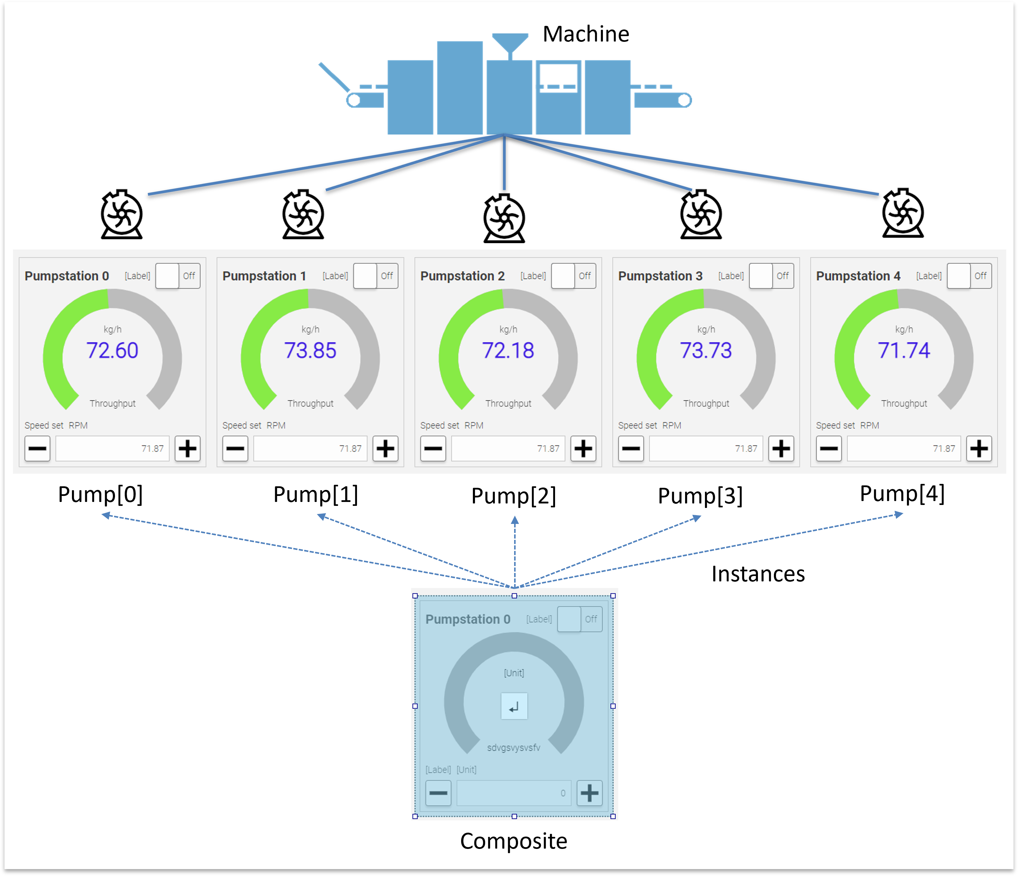
9.3.1. Creating A Composite
To create a new "empty" Composite widget, drag the "Composite" widget from the Widget List into the Layout Editor or into the Hierarchy Cockpit. To edit this "Composite" it is necessary to have at least one instance you can work on.
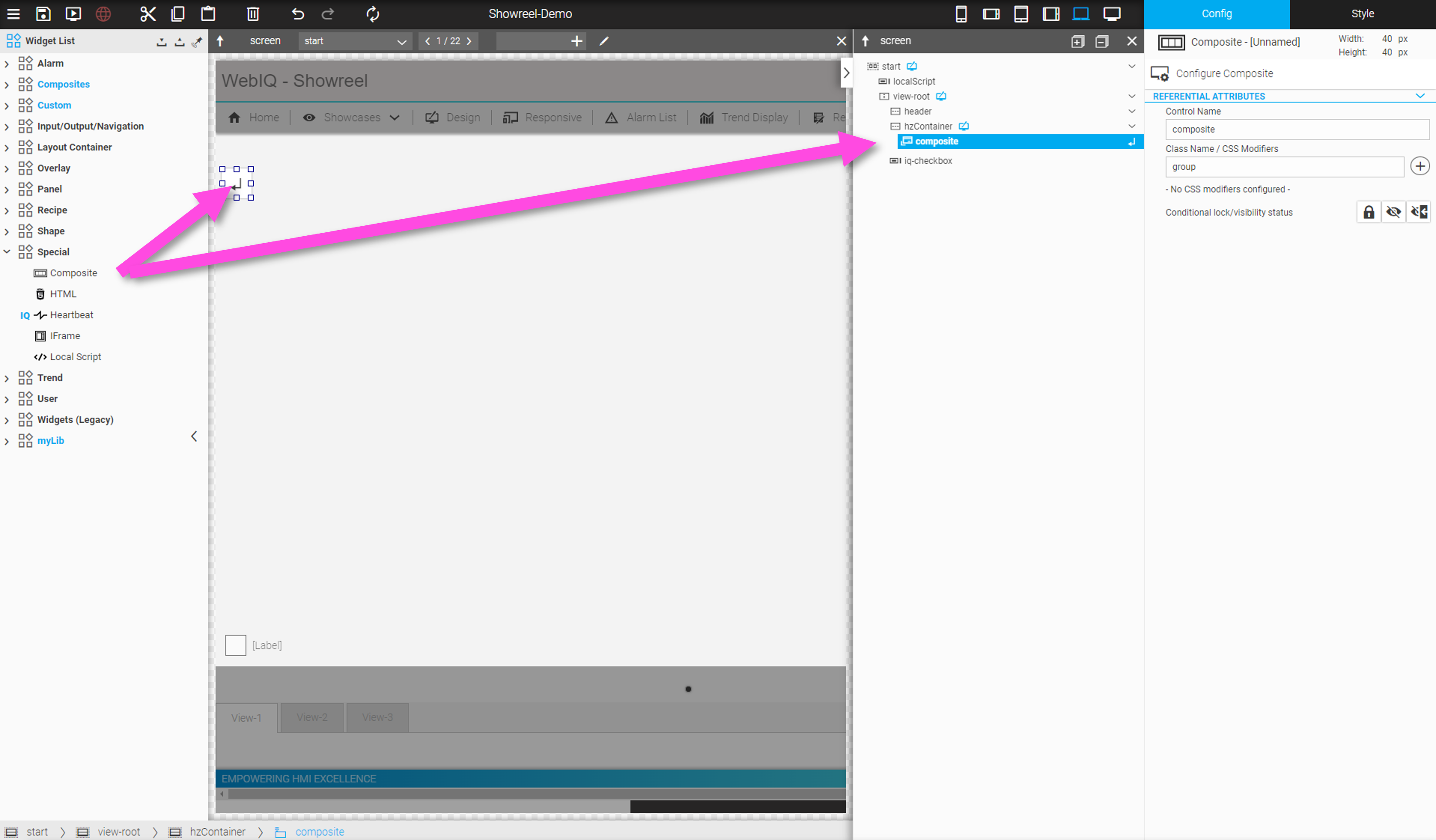
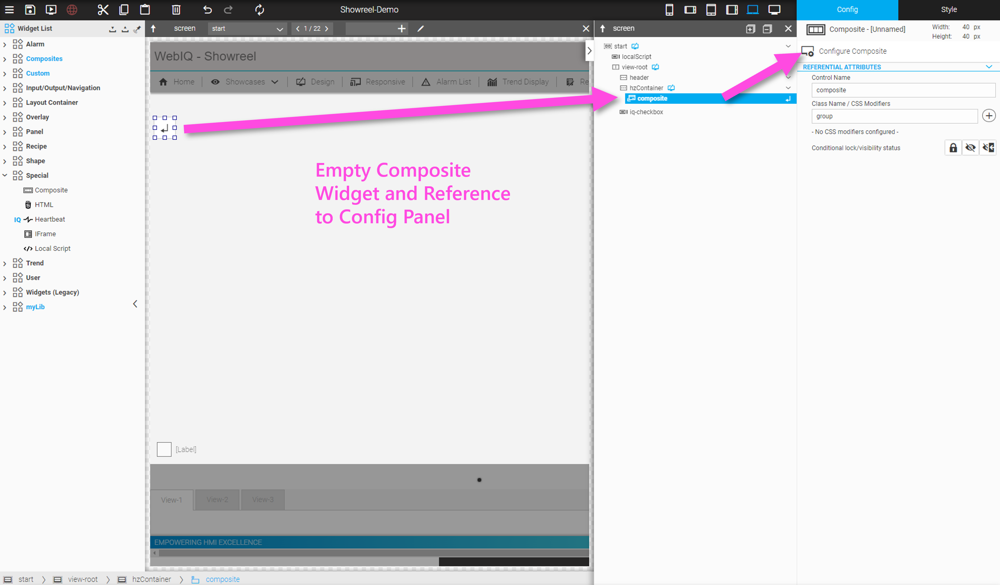
Before editing the content, you have to open the Template Editor (this means sub hierarchy) of the widget by either double-clicking on it in the Hierarchy Cockpit or by selecting the button "Enter" either in the layout section or Hierarchy Cockpit.
The internal hierarchy of the Composite will be visible once you have opened it this way.
At the top of the Layout Editor and also at the top of the Hierarchy Cockpit an additional bar appears that contains functions for managing the Composite.
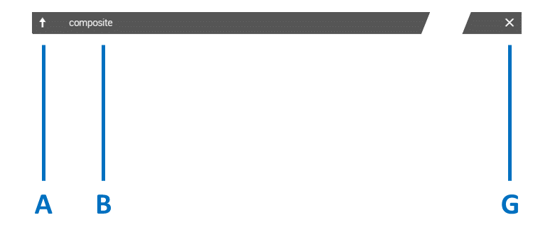
LEGEND
A Arrow to move up one level
B Name of the Composite Widget
G Button "Close Composite Widget" and all nested levels of the Template Editor (go to 'root' level of HMI hierarchy)
Now you are ready to create your Composite using standard widgets and other functionalities of WebIQ and even nest other Composites. Just construct the desired widgets and layout and design it according to your wishes. All functions of WebIQ Designer can be used, including styling, scripts, overlays etc. It is also possible to nest Composites to any depth.
9.3.2. Naming and Saving Composite Widgets
If you have inserted a new Composite, it will be displayed under the name '[Composite-Unnamed]' in the top right corner of the Configuration Cockpit. To save the Composite and assign it to a category in the widget bar, the 'Configure Composite' dialog has to be opened. The name and a category under which it is classified must be specified here. Optionally, an icon can be assigned for better identification in the list.
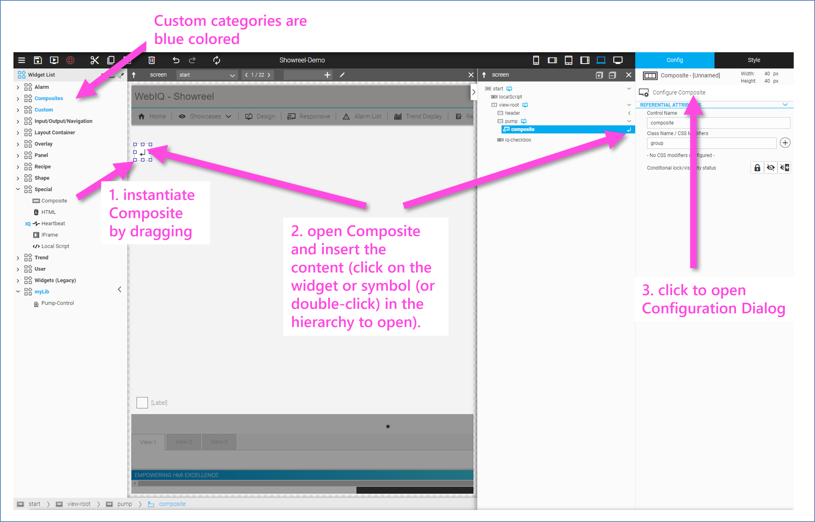
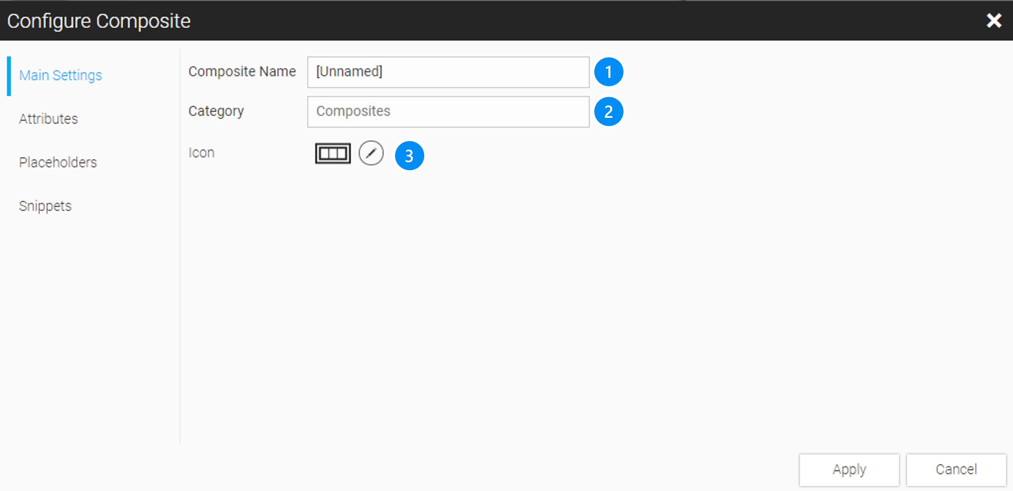
LEGEND
-
Unique Name of the Composite
-
Name of the category. If the category name does not exist, it will be automatically inserted.
|
Customer categories, i.e all except the system widget categories, are marked with blue text in the Widget Bar. If the category already exists, the Composite will be listed there. If the category does not exist yet, it will be created. |
-
Optional: Widget Icon, which is shown in the Widget Bar
Example: 'Pump-Control' Composite Widget
-
Create a "Composite" and add the four widgets 'IQ Text', 'IQ Flip Switch', 'IQ Radial Gauge' and 'IQ Button:Rocker' into the vertical container named 'content'. 'IQ Text' and 'IQ Flip Switch' should be in a horizontal container with 'space-between' configuration option, to align the elements as shown.
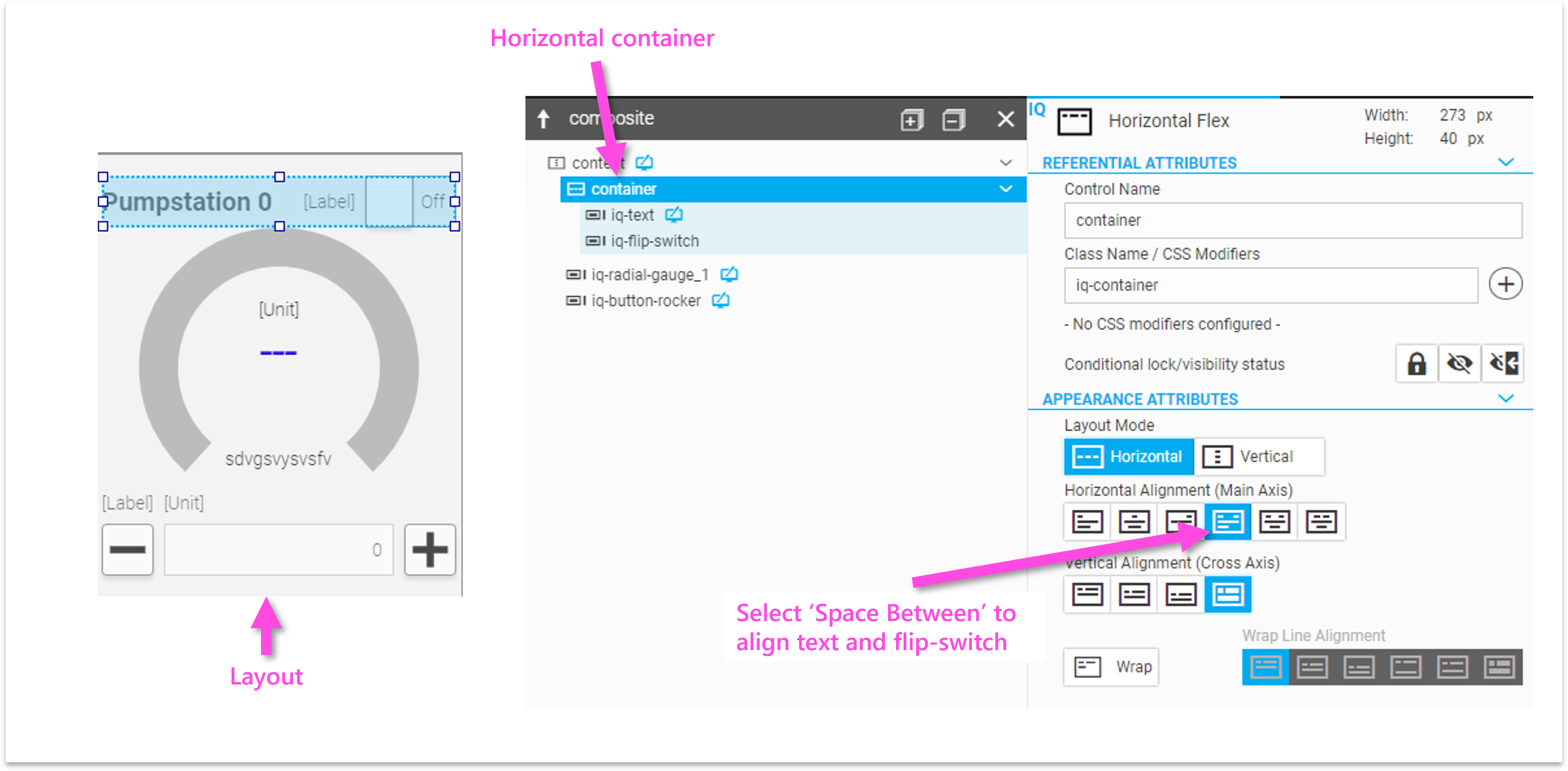
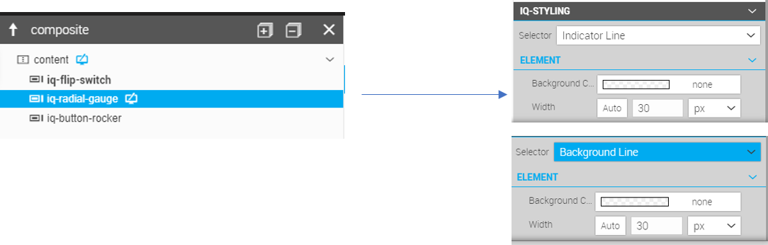
-
Create an array as a variable instance of type 'actSetValue' see Process Data Management
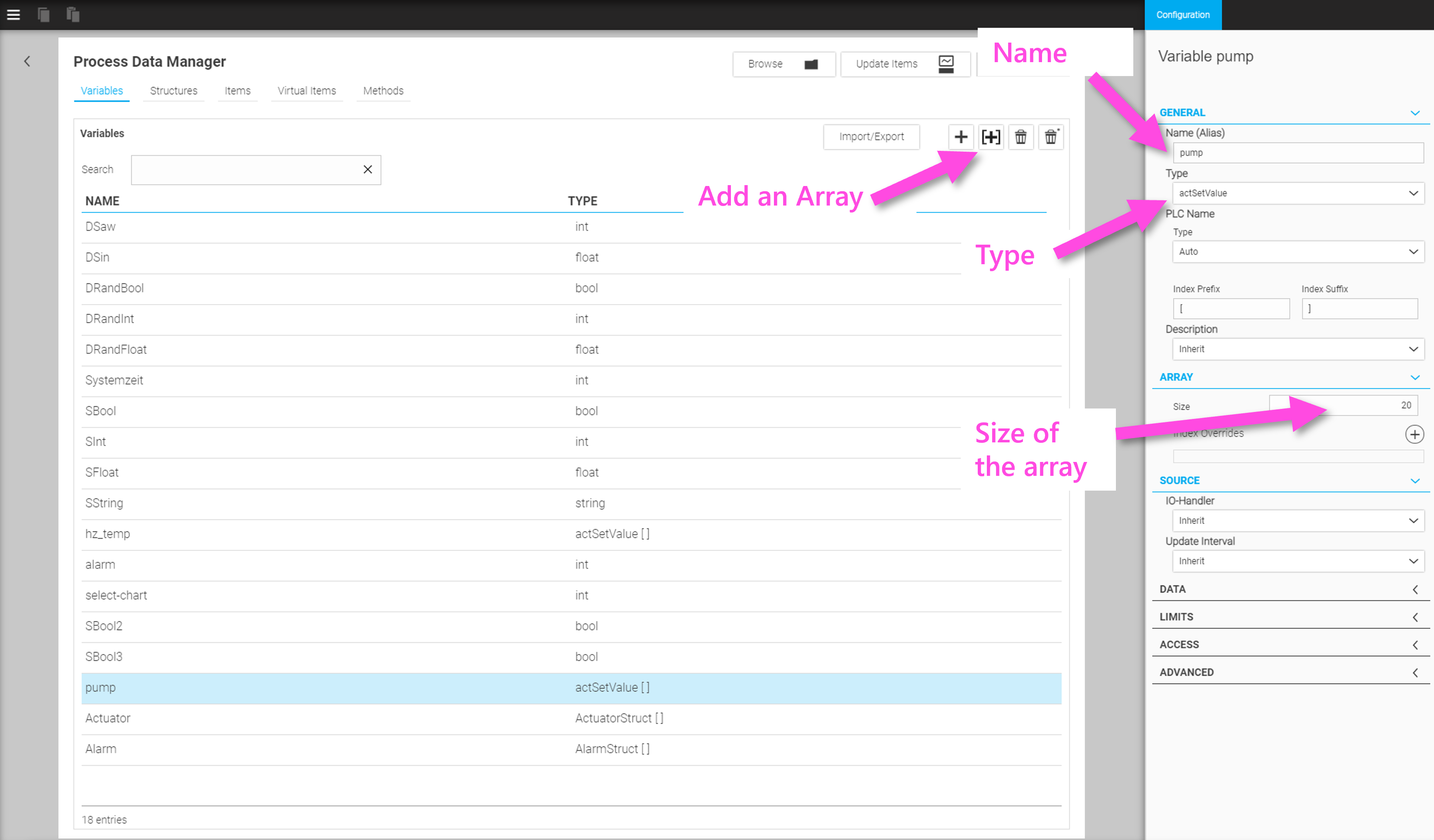
-
Assign the variable to the items attributes of the IQ Flip Switch widget (pump[0].status), IQ Radial Gauge (pump[0].actValue) and IQ Button:Rocker (pump[0].setValue).
-
Exiting the Composite Widget with the arrow key up button.
9.4. Configuration Interface for Composites
Up to this point we have created a Composite widget and saved it under its name in a category of the widget bar. Now of course you want to parameterize the widget, e.g. add item/tag names, change texts etc., which is explained in the following lines.
To open this configuration interface, select the Composite and click on the button "Configure Composite" at the top of the Configuration Cockpit on the right side. The dialog "Configure Composite" will be displayed as an overlay panel.
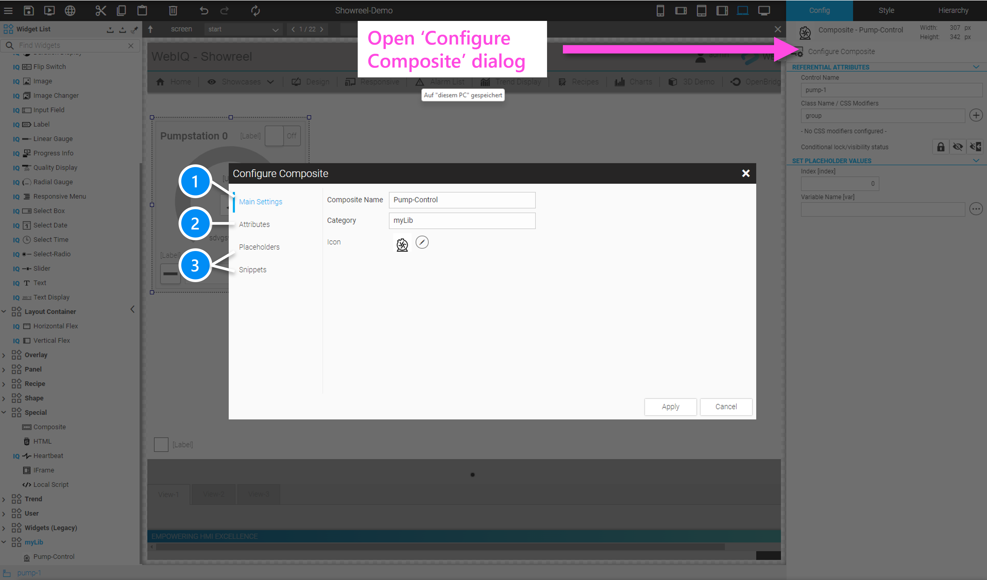
The 'Configure Composite' dialog contains the following tabs:
-
Main Settings: Define Composites name and category and optionally choose an icon to be displayed in the Widget List Naming and Saving Composite Widgets.
-
Attributes: Link single configuration settings for subordinate widgets to the configuration interface of the Composite (see Configuring Composites Through Attributes).
-
Placeholders and Snippets: More complex configuration rules can be defined. These are based on placeholders, e.g. an array index etc, which can be defined under 'Placeholder' and assigned as a so-called 'snippet' in the configuration of the widgets within the Composite.
For example, if "placeholder" is the index in an array variable, the snippet could have a configuration like "myArray[<% = placeholder%>]". The placeholder is identified by the syntax <%= placeholder%>. The placeholder appears as a configuration parameter of the widget and can therefore be specified by the user of the "Composite" widget.
Multiple 'placeholders' can also be used in a 'snippet', e.g. the name of an array instance name plus the index.
For more information see Configuring Composites Through Placeholders and Snippets.
9.4.1. Configuring Composites Through Attributes
The easiest way to define a configuration for Composites is with the configuration attributes. The internal hierarchy, i.e. all widgets contained, is displayed and on the right side the desired configuration attributes can be selected using a checkbox. These selected configuration attributes are then displayed to the user in the Configuration Cockpit of a Composite instance.
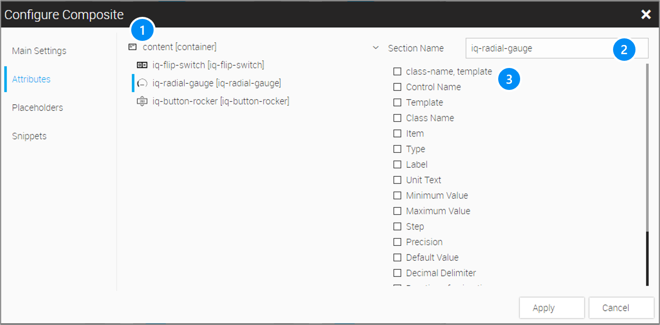
LEGEND
-
Tree with the hierarchy of widgets comprising the Composite
-
Section name for the selected configuration, which is displayed in the Configuration Cockpit of the Composite instance.
-
List of configuration attributes to be shown in the Configuration Cockpit of the Composite instance.
In this way, configuration options can be selected for all embedded elements and given a label, which are displayed when the "Composite" widget is instantiated in the Configuration Cockpit
Example: Simple Configuration interface with the 'Attributes' function
In the example the labelling of the flip switch should be made configurable. For this purpose open the configurations panel and select the option 'Attributes' (1). Select the 'iq-flip-switch' in the hierarchy (2) and check the configuration option 'label' (3). Field (4) can be used to assign a label name to the configuration option, which is displayed in the Configuration Cockpit of the 'Composite'.
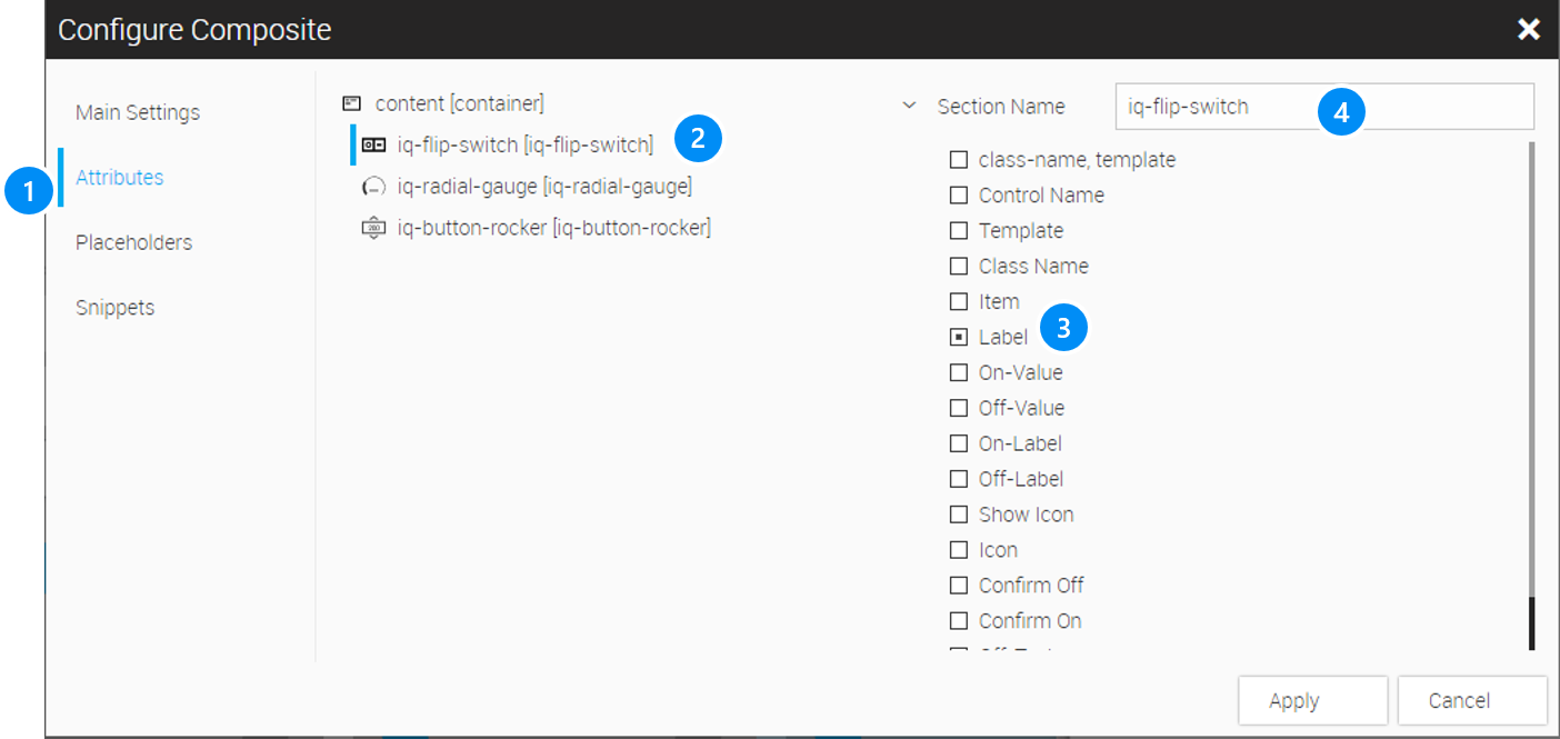
9.4.2. Configuring Composites Through Placeholders and Snippets
The configuration of Composites with placeholders and snippets is more complex, but offers more diverse possibilities and is the recommended method for configuring Composites. It allows an individual labelling of the placeholders, which will be displayed in the Composite’s configuration cockpit, as well as the combination of several placeholders in one configuration, e.g. instance name and array index.
Placeholders are variables for string expressions, numeric values, structures or process data variables that can be used for inserting their corresponding values into widget attributes through "snippets".
It is also possible to configure more complex configuration dialogs or to handle configuration in nested Composites.
9.4.3. Defining Placeholders
LEGEND
-
Add a placeholder
-
List of configured placeholders
-
Edit placeholder
-
Delete placeholder
After clicking on the Add or Edit button, the dialog for editing the corresponding placeholder will be displayed:
LEGEND
-
Logical name of the placeholder (identifier: only letters, numbers and the underscores can be used. The identifier may not start with a number).
-
Type of the placeholder (String, localizable String, Item (tag), Structure, Bool, Integer or Float)
-
Any label of the placeholder, which will be used to display the placeholder in the Configuration Cockpit of the Composite.
-
Any default value
Example:
9.4.4. Defining Snippets
Snippets are used to insert placeholders into a Composite configuration. They are based on the internal JSON encoding of the parameters inside WebIQ.
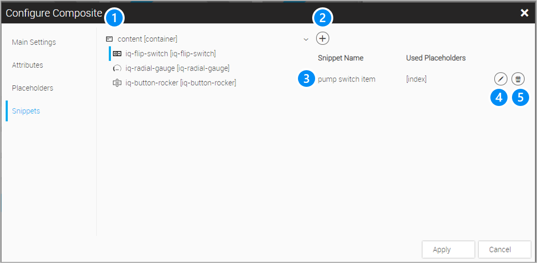
LEGEND
-
Composite structure tree hierarchy
-
Add a snippet
-
List of configured snippets
-
Edit selected snippet
-
Delete selected snippet
Please note that this is based on an internal JSON configuration inside WebIQ. A "Key" for the configuration can be selected on the left hand side and then the "Value", i.e. the configuration parameter, on the right hand side. Shortcuts of the defined placeholders are shown on the far right, which can be inserted anywhere inside the 'Value' of a configuration snippet.
Snippet configuration dialog
Adding or editing of a snippet opens the Snippet Configuration dialog. To connect e.g. the flip-switch item to the pump structure, a snippet is added as follows: Select the 'iq-flip-switch' in the hierarchy (1) and add the snippet with the add button (2). The Edit Snippet dialog appears as follows:
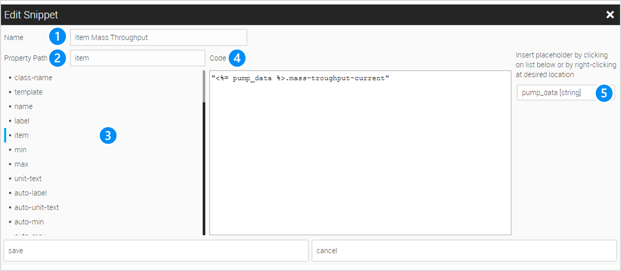
LEGEND
-
Label of the snippet
-
Selected attribute (property)
-
List of available attributes (Keys) of the selected widget
-
Configuration Value (Literal with built-in placeholders)
-
Shortcuts to insert defined placeholders
Some complex configurations, e.g. opening a dialog, configuring a CSS modifier with conditions, etc. must be entered here directly in JSON notation.
|
Please note that only one attribute can be set per snippet. If several attributes are to be set for a configuration, several snippets must be defined. |
|
Because the snippet must be defined in the form <Key>:<Value> of JSON notation, note that string expressions must be quoted. For more detailed descriptions of what JSON is and what it can be used for, you can find numerous references on the internet. |
9.4.5. Snippet/Placeholder Configuration Examples
Example Open Dialog Box snippet
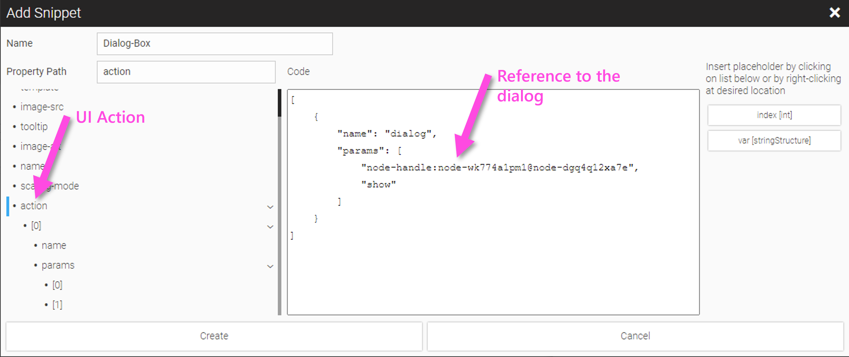
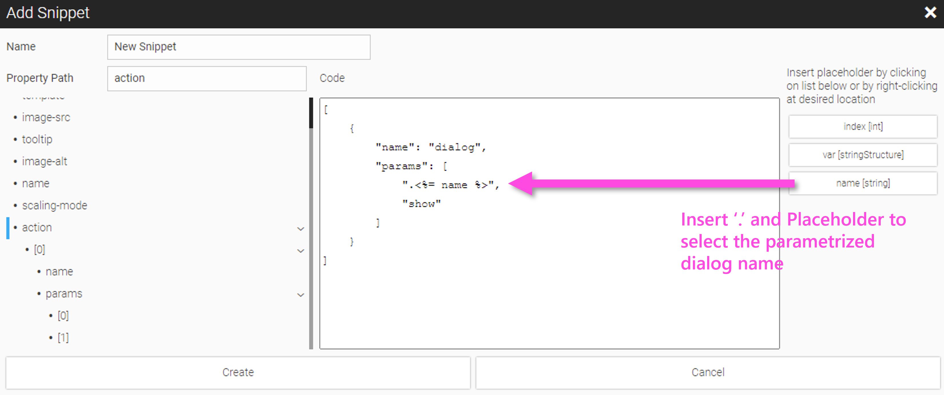
|
WebIQ selects elements internally using randomly generated, unique identifiers, in this example 'node-wk774a1pm1@node-dgq4q12xa7e', which is introduced by the prefix 'node-handle:'. This method cannot be used for configuration via snippets because the user does not know the internal identifiers. Alternatively, the name of the element related to the base node 'root' can be specified here, which consists of the identifiers of all nodes and subnodes of the hierarchy (e.g. 'root.element1.element2), which are separated by '.'. The abbreviated version of the relative name addressing in the form '. + <name>' can also be used, which is much easier to handle. For more information about widget naming and addressing see the 'HowTo' documentation 'WebIQ Visuals: Widget Naming' in the 'WebIQ Developer Manuals (Frontend) category of the documentation area on our website (https://www.smart-hmi.com/user/docs). |
Example Dialog Box within a Composite
Since the Composite can be instantiated multiple times and therefore the name of the dialog, if it is inside the Composite, appears multiple times in the hierarchy, the dialog name must be made unique, e.g. by adding a running index through a snippet.
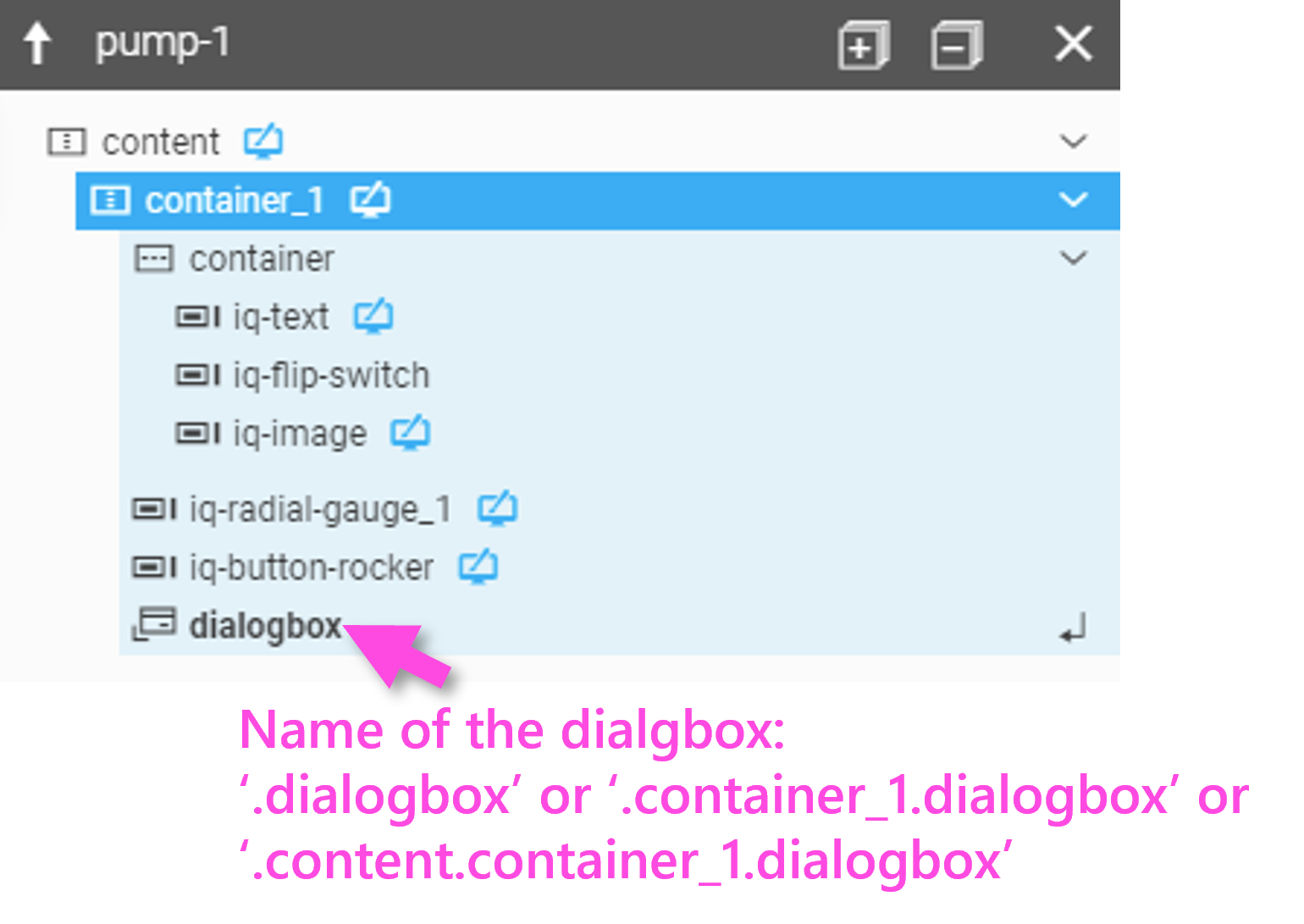
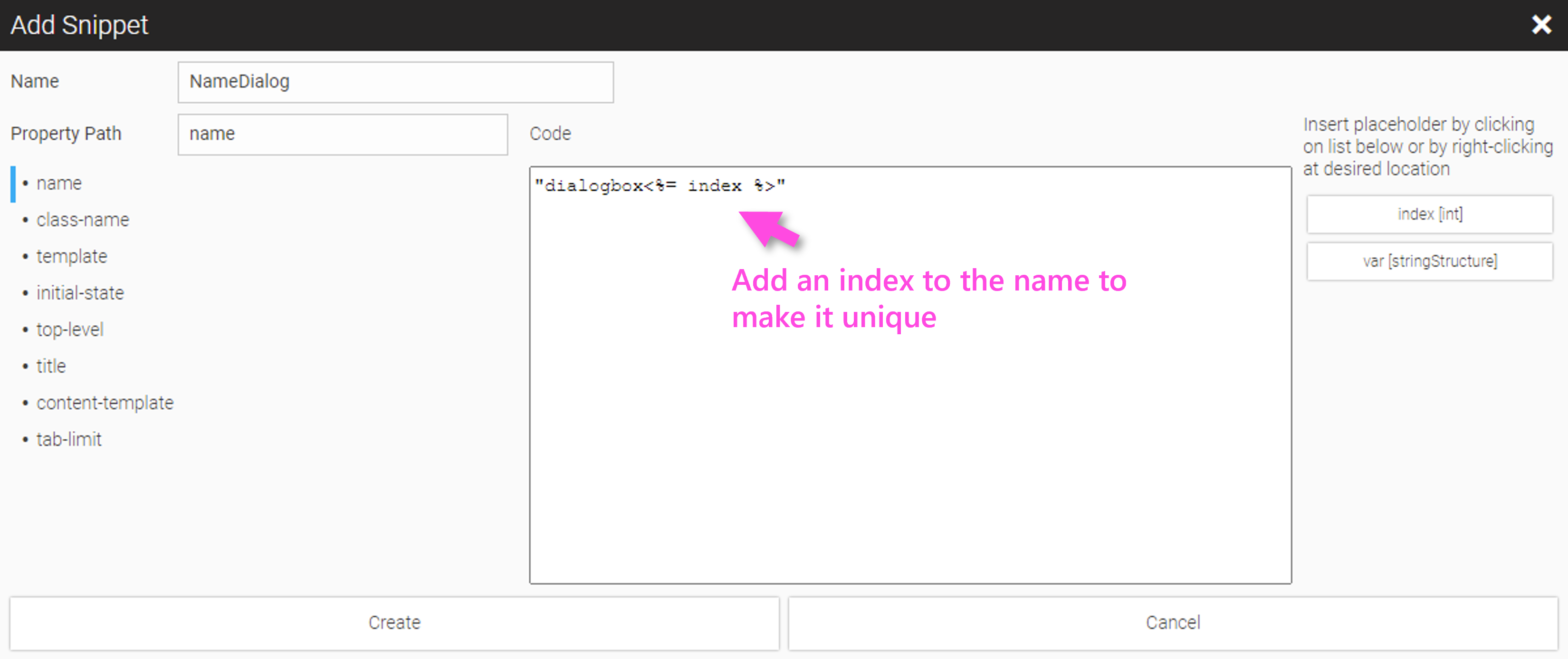
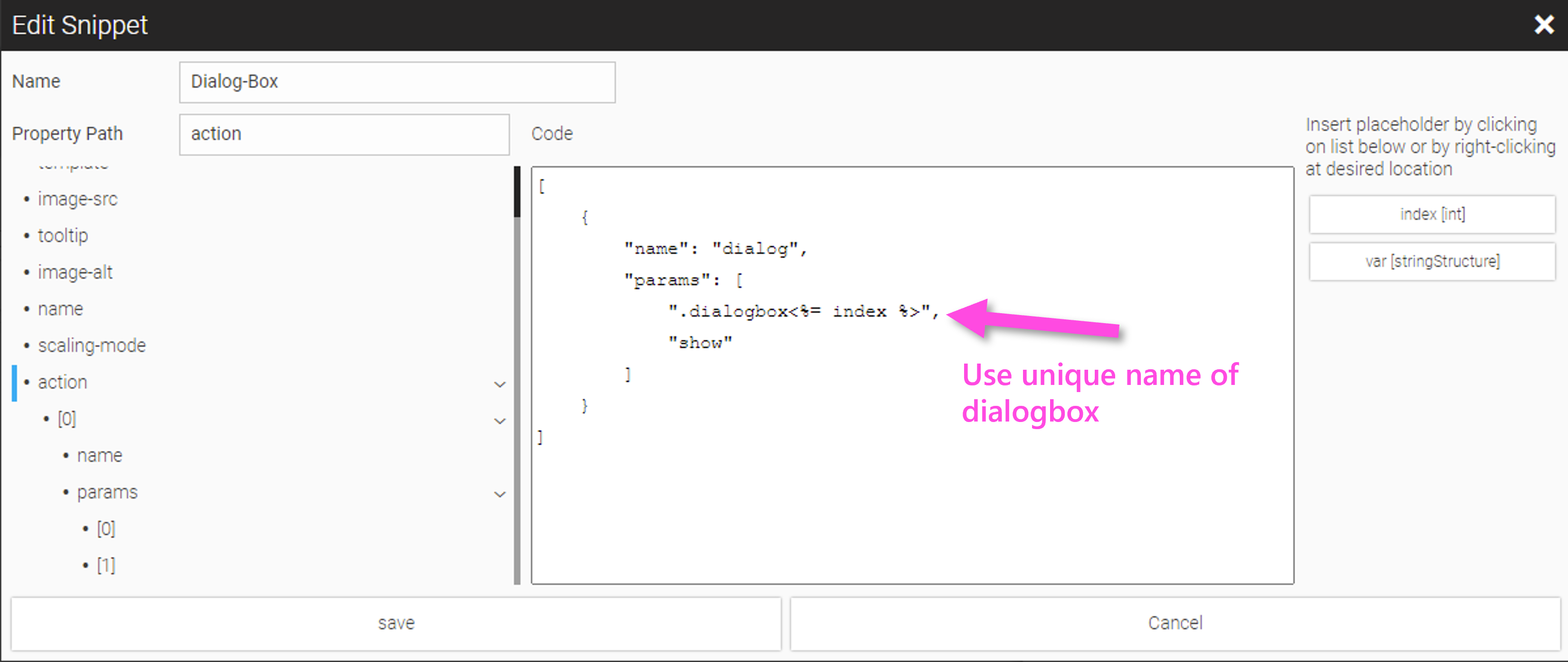
Example Pump Composite Widget
With the placeholder index and var we define Snippets to assign the items/tags of array instance in the right manner to the elements inside the 'Composite'. For each widget one Snippet is necessary. Fill in the Snippet code as follows:
-
Flip-switch item: "<%= var %>[<%= index %>].switch"
-
Radial-gauge item: "<%= var %>[<%= index %>].throughput"
-
Button-rocker item: "<%= var %>[<%= index %>].torque-set"
Example: Configuring a Conditional CSS Modifier
The Pump Control example is to be expanded to include a warning status of the radial gauge, e.g. the warning status should be set for a throughput> 90. For this purpose we go to the 'Composite', select the 'iq-radial-gauge' and in the Configuration Cockpit select the dialog with the button behind Class name:
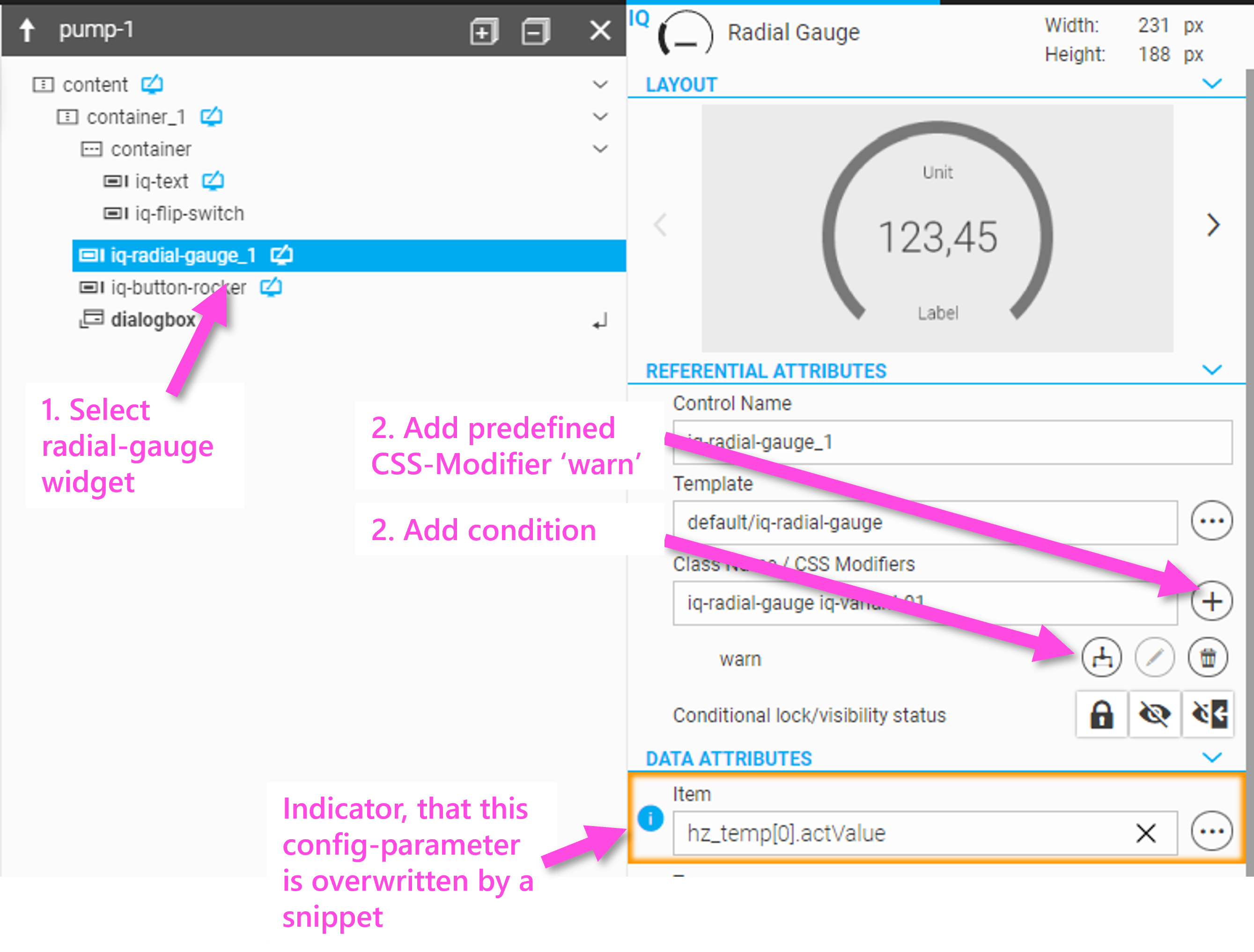
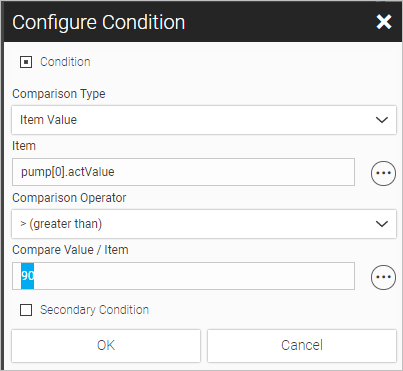
Further information about styling and condition styling can be found here: Conditional Styling Based on Variables or User Roles.
If you now open again the Snippet dialog and add a new Snippet, you will find the attribute '_appearances_' which contains a whole JSON structure of the configuration within the code area.
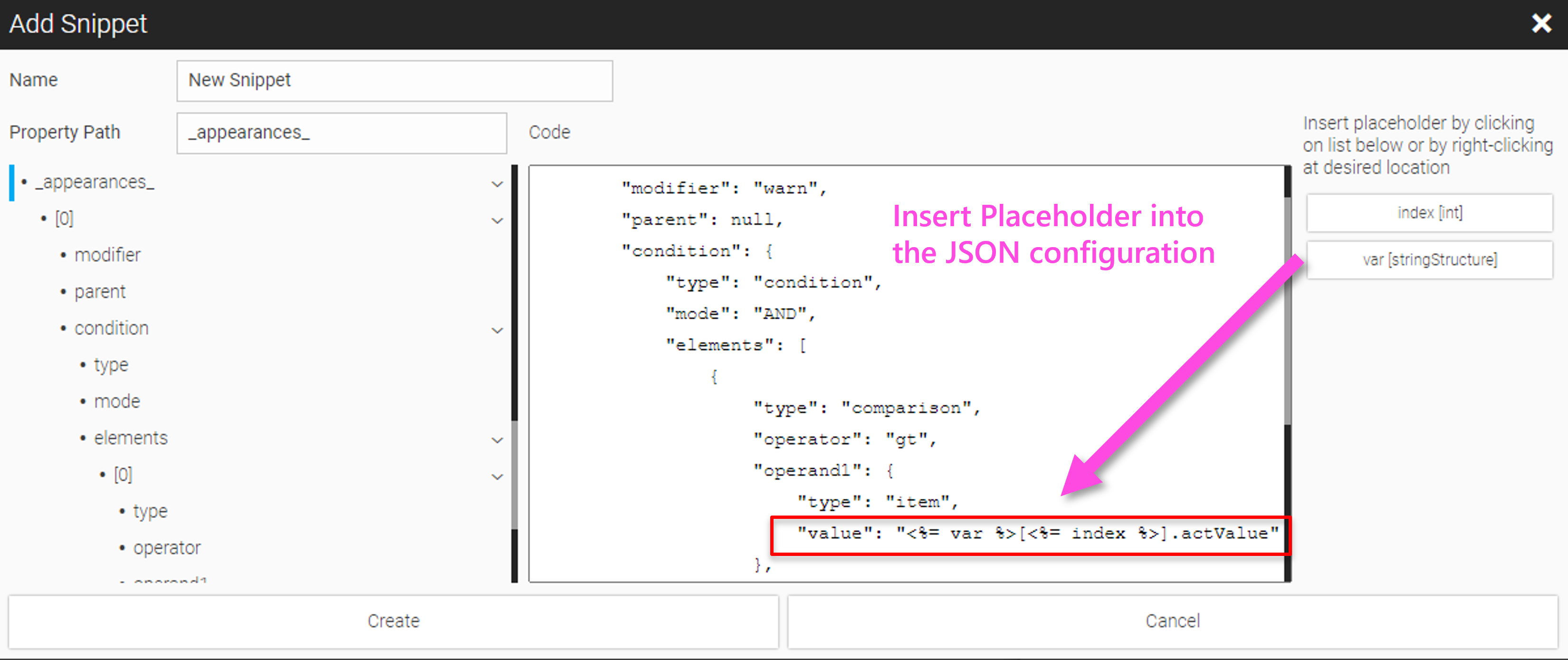
This example shows configuration with a 'snippet' and 'placeholders' using the example of a conditional CSS Modifier configuration. In the same way configuration of nested Composites from 'inside' to 'outside' is possible, i.e. you always have to forward the value to the inner Composite recursively.
9.5. Setting Dynamic Configuration Parameters
We showed how to make Composites configurable and how to set parameters statically by the user in WebIQ Designer’s configuration cockpit. In addition, Composites can also be dynamically configured through a UI action or a script.
To parameterize the Composite using a UI action, create a widget with a UI action, e.g. a button, and select 'composite-placeholders' as the UI action. Enter the name of the Composite instance (the drop-down list will show all available Composite instances) and then choose which placeholders you want to assign which values.
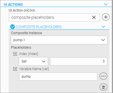
For further information about UI Actions see chapter Using UI-Actions.
It is also possible to use JavaScript to adjust the parameters of a Composite dynamically at runtime. This results in extensive possibilities to create HMIs for modular machines dynamically, e.g. via a configurator.
You can find detailed description and code examples in the 'WebIQ Visuals Reference' developer manual, Methods 'shmi.setCompositePlaceholders' and 'shmi.getCompositePlaceholders'.
 const updatedComposite = shmi.setCompositePlaceholders(".myComposite", {
    placeholder_1: "Text",
    placeholder_2: 55,
    placeholder_3: false
});
9.6. Scripting Examples With Composites
Example: Cloning and setting placeholders for multiple Composites through a script
The script example shows a LocalScript which clones the Composite 'pump' n times into the parent container of the reference Composite 'pump-1'.
Placeholder 'var' is the variable name of the underlying array and is defined in the script ('pump'), placeholder 'index' starts with 1 and increments for each instance.
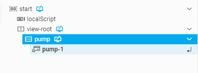
module.run = function(self) {
        //Place your Code here
        const compName = ".pump-1", // name of reference composite which should be cloned
            count = 4; // number of instances to clone
        let varName = "pump", // variable name for placeholder 'var'
            token = [];
        fLog("module run");

        //Place your Code here
        shmi.onReady({ /// wait until the composite widget is ready
            controls: {
                "compControl": compName
            }
        }, (resolved) => { // retuns the reference to the composite widget
            const compControl = resolved.controls.compControl;
            fLog("element found");
            if (compControl) {
                let compConfig = compControl.getConfig(); // read the config of the composite widget
                for (let i = 1; i <= count; i++) { // instantiate clones of reference composite
                    let newConf = shmi.cloneObject(compConfig); // necessary to clone the config object!
                    let newCtrl = shmi.createControl("group", compControl.element.parentElement, newConf, 'div', null); // see documentation WebIQ Visuals Reference
                    shmi.setCompositePlaceholders(newCtrl, { // set the placeholders
                        "var": varName,
                        "index": i
                    });
                    token.push(newCtrl);
                }
            }
            /* called when this local-script is disabled */
            self.onDisable = function () {
                token.forEach(function (control) {
                    shmi.deleteControl(control, true);
                });
                self.run = false; /* from original .onDisable function of LocalScript control */
            };
        });
    };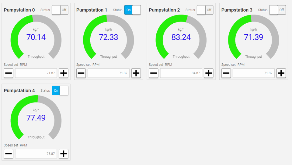
9.7. Composites as Objects
If a change has been made inside a Composite, this will be applied automatically to all existing instances of the this Composite according to its object structure.
9.8. Reusing Widget Templates and Composites in Other HMI Projects
With the "Import" (1) and "Export" (2) buttons, Widget Templates and Composites can be exported and imported as libraries from one project to an other. This results in optimal reusability, since a widget library maintained in one project can be imported and used in many other projects. With the assembled widgets - since they are objects of the instances - there is also the option of subsequently expanding these libraries and updating the associated projects by re-importing them.
With the import/export, all resources used in these elements, such as images, CSS, code, etc. are also saved and included in the exported libraries.
9.8.1. Exporting Composites And Widget Templates
If you click the export button (2) the following dialog will be shown
Legend
-
Select one or multiple Composites or Widget Template
-
Press Export for opening the file saving dialog and for saving the selected items with a specified filename
9.8.2. Importing Composites And Widget Templates
By clicking the import icon you can choose the filename in the file open dialog, then get the list with included Composites and Widget Templates and can select one or several out of the list:
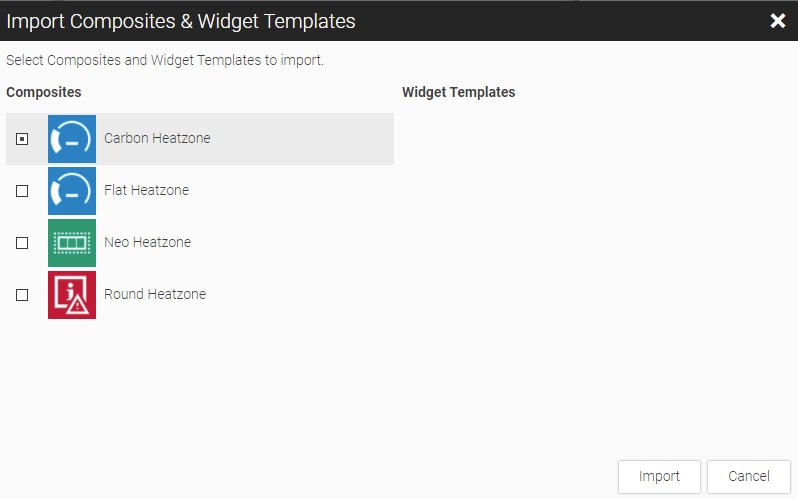
Legend
-
Select one or multiple elements to import
-
Press Apply to import the elements
If it is determined during the import process that one or more Composites or Widget Templates or one or more resource elements are already included in the HMI projecta dialog will be shown which allows the user to decide whether the existing code should be overwritten ("replace"d") or not ("keep"). This is ideal for updating all Composites in existing HMI projects.
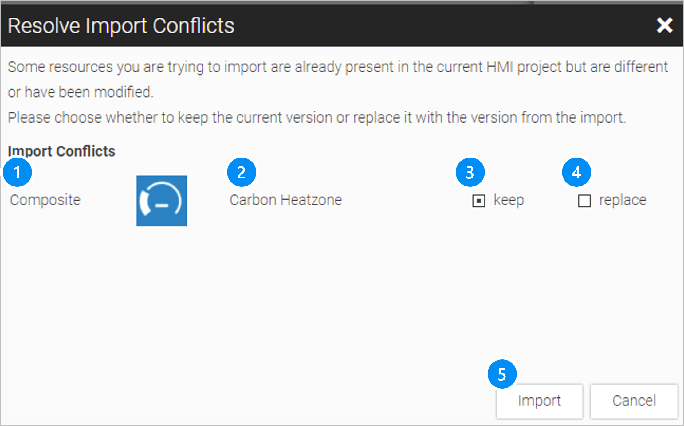
Legend
-
Type of Widget (Composite or Widget Template)
-
Name of the element
-
Checkbox: keep existing code in the project
-
Checkbox: Replace the code in the project by the imported resource.
-
Apply and continue Import
10. OPC-UA Interface, Variables, Structures and OPC-UA Methods
This chapter describes in detail how you can set up the connection interface to your data source, usually a PLC or machine controller, and WebIQ. The data connection is used to display and edit online process variables, record values to historical data and trigger events for the WebIQ message and alarm system.
10.1. How It works
WebIQ receives its process variables (items) over a scalable interface that is called “IO Handler”. An “IO Handler” is a client interface which receives its data from the server through a subscribe/push procedure. That means, that the client “subscribes” to the required data and the server “pushes” values on every change.
This subscribe/push method is very efficient, as the data has to be subscribed only once by the client while they are updated (pushed) by the server. WebIQ can be used to display large volumes of values online or store them as historical data. In the HMI/SCADA Toolbox WebIQ any number of data sources, i.e. IO Handlers, can be used, thus the system can communicate with many field devices or PLC’s simultaneously.
The number of IO Handlers is not limited, if you use it with the Designer License of WebIQ Designer. In runtime systems the number of usable IO Handlers is limited by the runtime license of the HMI/SCADA Toolbox WebIQ. Please ask for runtime licenses (“IO Handler Packs”) with 10, 100 or an unlimited number of IO Handlers if your application needs more than one.
| A special feature of WebIQ is that - in addition to the data values - the process data tags or items can optionally also contain attributes that defines the behaviour of widgets in the HMI, which uses these items. Attributes include e.g. min. and max. values for input, unit, display of decimal places, label text, and many more. This has the advantage that each process value is centrally defined and brings its properties to the HMI. The engineering and maintenance of the HMI application is thus clearer and faster. |
10.1.1. IO Handler (OPC-UA)
IO Handlers are dynamically loadable libraries (.DDL in Windows or .so in LINUX systems) and can be loaded by WebIQ.
One or more IO Handlers can be defined in order to connect several data sources or controllers. The IO Handler 'internal' is always available and provides a variable server for internal variables that can be used for testing purposes or for internal, persistent variables for an HMI application.
As described above, the number of IO Handlers that can be defined is unlimited on the development system WebIQ Designer; on the runtime system these depend on the license.
|
The standard scope of delivery of the HMI/SCADA Toolbox WebIQ includes OPC-UA as standard interface. Others, such as direct driver interfaces to certain PLC systems are available on request. |
10.1.2. Custom IO Handler: Write Your Own Driver
To develop an individual IO Handler, such as connecting to a proprietary device or protocol, a custom IO Handler can be implemented using the IO Handler SDK to develop and test individual IO Handlers with C++ programming language.
|
Refer to the "Developer" section of our WebIQ Documentation area Requires login |
10.2. Setup Connection To Data Source
The “IO Manager” is the part of WebIQ Designer and allows the user to add IO Handler for the data access and to edit the required parameters.
Click on the icon  on the launch bar.
There you will see the list of the existing IO Handler connections, and you can add, delete or edit entries.
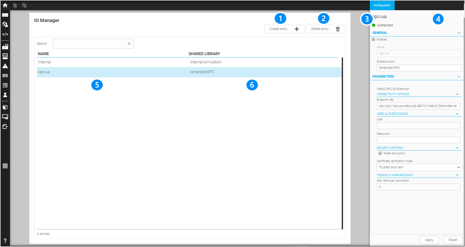
LEGEND 1 Button to create a new entry (new connection) 2 Button to delete the selected entry 3 Status of the connection 4 Configuration Cockpit to modify the selected entry 5 Column with the name of the connection 6 Column with the name of the shared library (used IO Handler) |
10.2.1. OPA-UA Interface Setup
The following example shows the configuration and settings of an OPC-UA connection. The parameters are editable in the configuration cockpit on the right side of the screen:
GENERAL
Enabled: Checkbox to activate and deactivate the IO Handler
Name: Name of the connection (arbitrary and unique name of the connection)
Shared Library: The shared IO Handler library to be used. For OPC-UA use the default value ioHandlerOPC here. The file ./ioHandlerOPC.dll is loaded on Windows systems and accordingly on Linux systems ./ioHandlerOPC.so instead.
For Windows: you should not add the file extension .dll to the shared library.
|
PARAMETERS
Endpoint URL: URL pointing to the OPC UA server to connect to. This url is usually of form opc.tcp://xxxxxx:yyyy.
Insert the OPC UA server endpoint URL here.
|
WebIQ Demo Server Smart HMI provides an online OPC-UA server implementation for testing.
|
User: Optional user name for authentication with the OPC UA server. If no authentication is required, this parameter can be omitted. If the OPC UA server requires user authentication, enter the corresponding user name here.
Password: Optional password used for authentication with the OPC UA server. If no authentication is required, this parameter can be omitted. Likewise, add the corresponding password here if required.
The following parameters should normally be left in their default states:
Prefer encryption (default): Prioritizes encrypted endpoints over unencrypted ones.
Server certificate verification mode: Mode to be used for server certificate validation. May be one of the following: all, new, trusted_only
-
all: Trust all certificates. If a host’s certificate changed, the old certificate is replaced.
-
new: Only accept trusted certificates and certificates from previously unknown hosts.
-
trusted_only: Only accept trusted certificates.
Max Items Per Command: Maximum number of items to subscribe/unsubscribe with a single call to the OPC-UA Server. Limiting this number may help with a large number of subscriptions timing out on some devices. Can be omitted to disable this limitation. Leave this field blank unless instructed otherwise.
Service Call Timeout: Timeout for the response time of the OPC UA server to requests. This parameter should normally be left unchanged and may only need to be increased if the data connections are extremely slow.
After configuring the connection to your OPC UA server (or the demo server provided by Smart HMI) you can click on button "Apply". WebIQ will immediately connect to the specified server.
10.2.2. Connection status
After confirming the information via the 'Apply' button, the IO Handler tries to establish a connection or to re-establish it. The status is displayed in the top right corner of the Configuration Cockpit:
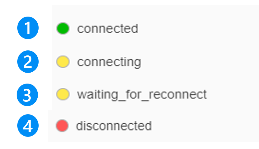
LEGEND 1 Connected 2 Connecting 3 Trying to recover a connection 4 Disconnected, e.g. when the IOHandler has been disabled |
10.2.3. ‘Internal’ variable server
By default an internal variable server is predefined, which provides the application with local items. This ‘Internal’ variable server is targeted to:
-
Provide application wide items as status variables (valid for all users/clients which are connected to the HMI)
-
Persist variables into the SQLite database of WebIQ backend
-
Provide simulation functions to test the HMI during development like e.g. sin/cos values, random, ramp, …
The variables of the ‘Internal’ server can be of the types: boolean, integer, float and string.
Refer to Chapter 'Simulation' for more details.
| Variables of the ‘Internal’ server are seen application wide, i.e. accessible by all HMI clients at a time. They can be persisted to the internal database if required! |
10.3. Process Data Manager
After setting up the OPC-UA connection, open the Process Data Manager to define or browse the process variables which you want to access from within your HMI app.
Click the icon  on the launch bar (left side of the Layout Manager).
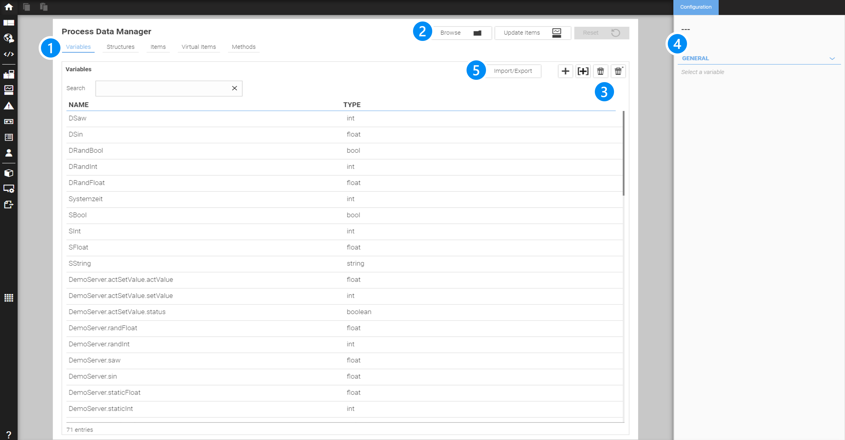
LEGEND 1 Tabs to select the different sections 2 Buttons to Browse, Update or Reset Items (Process Data must be explicitly updated to become valid), or optionally browse through the variable tree of the OPC-UA server
3 Add Single- or Array variable/delete selected variable 4 Configuration of Process Data settings 5 Import/Export of Variables |
10.3.1. Browse to select OPC-UA variables
Clicking on the 'Browse' button opens the browse overlay panel:
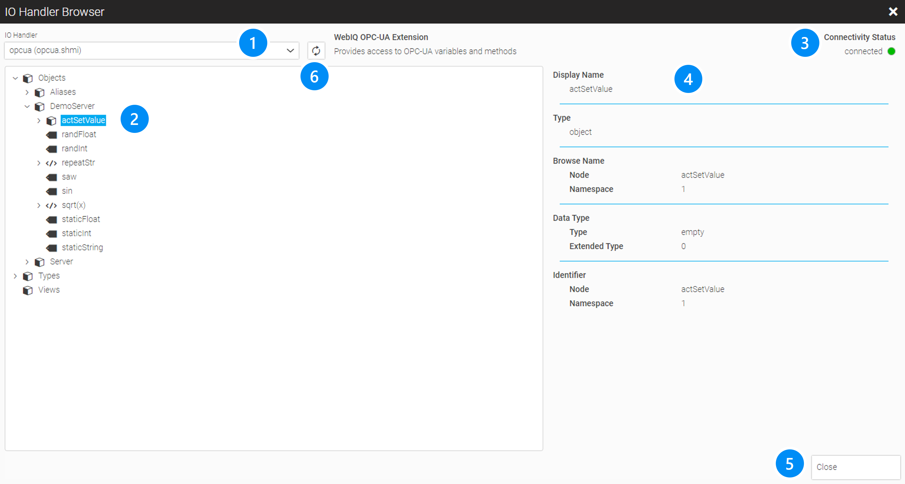
LEGEND 1 Select box to select the OPC-UA IO Handler 2 Tree to browse the OPC-UA server’s structure and to select the desired variables 3 Status of the connection (see also connection status) 4 OPC-UA attributes of the selected node in the tree browser 5 Close this window 6 Reload the PLC data, e.g. if items or methods on the PLC have been changed, added or deleted |
You can browse through the tree of the OPC-UA structure and open the context menu by right-clicking on a node or leaf of the tree. Using the function "Create Child Variables" or "Create Variable", respectively, depending on whether you clicked on a node or an end node, these variable definitions can be imported into WebIQ.
Importing a variable or method from an end node (leaf node)
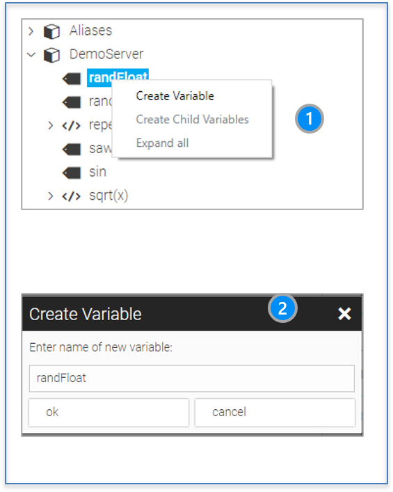
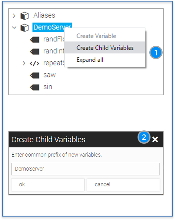
After closing the browser window you can see the imported variables in the Process Data Manager in the tab "Variables" and any methods that you imported in the tab "Methods".
10.4. Selection Tabs: Variables, Structures, Items, Virtual Items, Methods
When you open the Process Data Manager it offers different types of Process Data sections. You will see four tabs:
-
Variables
-
Structures
-
Items
-
Virtual Items
-
Methods
Each of these will be explained in detail in the following chapters.
10.4.1. Variables Tab (Process Data Variables/Tags)
The Variables tab lists all variables that can be used in the HMI app. You can use the search bar to find specific variables.
To create a new basic variable, click on the  button. To create a new array, click on the
  button.
The configuration cockpit on the right now shows the parameters you can configure. For more information see section variables.
10.4.2. 'Structures Tab'
After opening the Structures tab you will see a screen with two areas. On the left side the list of defined structures is shown. Once you select one of these structure definitions, the members of that structure are shown on the right side. To create a new structure, click on the button. In the Configuration Cockpit on the right you now have to enter the following parameters:
a) Name
This is an arbitrary name to use for the structure
b) Description
This is an optional description that might be useful to understand that structure later.
On the right side you see the so-called members of the selected structure. A new member is created by clicking on the button, or by clicking on the button which will then create a member as array variable.
Structures do not define variables but are only definitions of extended data types.
Any structure needs to have a unique name (alias) whereas each member can itself be a structure. Two structures can have members with the same name but within a structure member names must be unique.
With structures, which you may know from other programming languages, process data models can be presented more easily and clearly.
10.4.3. 'Items tab'
-
Items are the legacy way of defining process data in WebIQ. They are still supported for backwards compatibility with apps created with older versions of WebIQ. They represent a plain list of process data variables (items) and do not support hierarchies like the new structures and variable definitions.*
Process variables that are defined on the 'variables' and 'structures' tabs are expanded into the item list, which is then displayed in the 'items' tab. Changes to these variables in the 'items' tab will be therefore overwritten by the changes in the 'variables' and 'structures' tabs.
|
The 'Items tab' functionality is deprecated and should not be used for new projects! Process variable definitions in the Items tab' are only available for compatibility with older HMI apps prior to V2.6. |
10.4.4. 'Virtual Items tab'
These are local variables which are available in the local scope of an WebIQ HMI application and therefore cannot be used as general HMI states. Each virtual item can have a different value in each running WebIQ app instance, i.e. browser windows e.g. in multi-client or multi-user applications.
They are mainly used for local values, for example for setting the localization (language) of the current app instance. So, one app instance could be displayed in German whereas another instance could be displayed in English.
10.4.5. 'Methods Tab'
These are methods from the server that have been imported through the browser interfaces or created manually. To create a new method click on the Create entry button and enter the following data:
-
Alias An arbitrary alias to identify the method from within the HMI
-
PLC Identifier The name of the method on the PLC
-
Namespace The namespace for the PLC identifier
-
PLC Identifier (Reference Object) defines the reference object PLC identifier
-
Namespace The namespace for the reference object
-
Description An arbitrary description
-
Source: IO Handler The IOHandler where the method is available
-
Access: Accessgroup The accessgroup that defines access to this method
10.4.6. HMI attributes in process data definition
As mentioned above, the process data variable definitions can optionally contain attributes which define the default behaviour of widgets in the HMI.This is very handy and makes the engineering and maintenance of most HMI applications clearer and faster.
By specifying min and max input attributes for example, a label and the unit for a process variable, these are the default widget settings when I select this variable as item in the widget configuration.
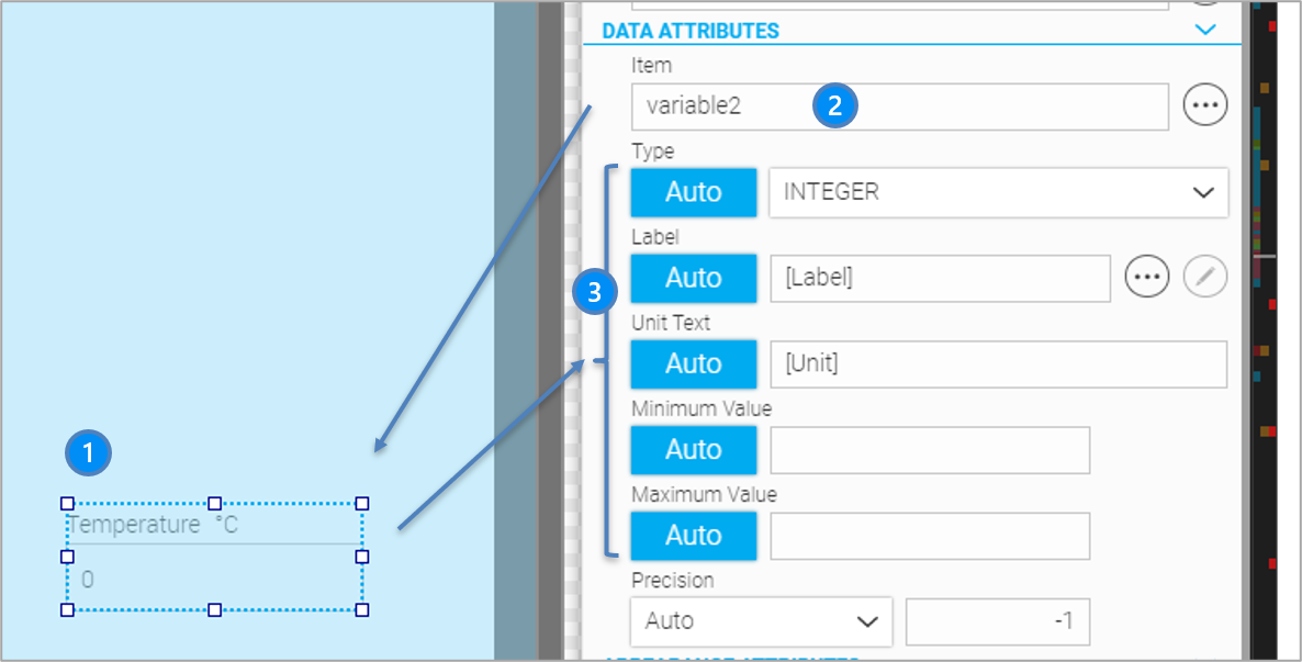
LEGEND 1 Widget with label, unit and input min/max properties set to auto 2 process variable assigned to the widget 3 properties set to 'auto' |
The following list gives a short overview of these optional attributes. For further information see section process data attributes.
DATA:
-
Label (label text, localisation text)
-
Unit, localisable unit text or unit class
-
Input/Display Limits (min-/max. input values)
-
Decimal places (decimal places to be displayed)
-
Step (increment/decrement, e.g. for using in a rocker button)
LIMITS:
-
Warn Limits (warning limits)
-
Prewarn Limits (pre-warn limits)
-
Trend Display Limits (display limits if this variable is displayed in a trend diagram)
ACCESS:
-
Access Group see Access-Groups, access rights of the user to this variable
SIMULATION:
Only for process variables of the internal variable server, see see chapter Simulation:
-
Function: simulation function e.g. sinus, random, ramp etc.
-
Parameter: optional parameter for the function
-
Persistent: decides if the value should be stored
10.5. Configuration of Variables/Structure members
In addition to importing the variables via the OPC-UA browser, variables and structure members can be defined within the 'Variable' and 'Structure' tabs of the Process Data Manager. The meaning of the individual settings in the Configuration Cockpit on the right side of the screen are described as follows:
10.5.1. GENERAL Area
Definition of the core settings for the process variable or the structure member.
-
Name (Alias) Unique alias- name for the process data item.
-
Type Type of the variable/member, either basic type (int, bool, float, string) or reference to a structure.
-
PLC-Name Name of the identifier, e.g. Node-ID in the OPC-UA namespace.
-
AUTO: Set the alias to the same name as the PLC identifier
-
SET: Define the name manually
-
APPEND:
For variables: same behaviour as with SET
For structures: appends the given value to the PLC item name
-
-
Index Prefix/Index Suffix (only available for arrays): Set the prefix and suffix for the array in the data source namespace (or OPC-UA). This defaults to „[“ and „]“ and results in names like „temperatures[2]“. If you set this for example to „{“ and „}“ names like „temperatures{2}“ will be used/expected.
-
Description Optional description. This is only shown inside WebIQ Designer.
-
INHERIT:
For variables: description will be empty
For structures: inherits the description from the parent -
SET: Sets the description
-
10.5.2. ARRAY Area
This area is only displayed if the corresponding variable or structure member in an array:
-
Size Define the size of the array (i.e. number of elements). An array index in WebIQ always starts with 0, e.g. if the size is set to 3, the array has the elements var[0], var[1] and var[2].
-
Index Overrides Index overrides allow you to override the default array elements for specific offsets so that you can i.e.
a) Specify a different IO Handler for each array element
b) Specify a different PLC name for array elements, i.e. make an array in WebIQ, where the PLC data consists of single data items
| The feature "Index Overrides" allows you to assign different single process data or process data from different PLCs to one single array variable in the HMI. The PLC offset index can be used to specify an offset to the array index in the PLC, e.g. offset=1, array will start with offset 1. |
10.5.3. SOURCE Area
This section defines how to retrieve the item.
-
IO-Handler Assigns a specific IO Handler to this variable or structure.
-
INHERIT:
For variables: uses the first entry (=Internal)
For structures: inherits the description from the parent -
SET: Selection of an IO Handler
-
-
Update Interval Minimum interval in milliseconds (ms) to use for observing item changes (similar to the OPC UA subscription interval). Define the lowest interval here to use for receiving item changes.
-
INHERIT:
For variables: uses the default update interval (100ms)
For structures: inherits the definition from the parent -
SET: Sets the minimum update interval in [ms]
-
READ ONCE: The process value is updated only once at the beginning (corresponds to setting the interval to -1)
-
10.5.4. DATA Area
Definition of optional HMI attributes, see also attributes
-
Label Label text:
-
NONE: Do not set a label
-
SET: Create any label IDs by adding new rules one at a time. Each rule has the following options:
-
APPEND:
For variables: sets the value
For structures: appends the value to the label text -
INHERIT:
For variables: uses the default value (empty string)
For structures: inherits the label from the parent -
IDENTIFIER: Uses the process variable name/identifier as the label
-
INDEX: (Only for arrays) Sets the index of the array element. When selecting this option you can enter an offset for the given index.
-
-
-
PROPAGATE: When this is enabled the value will be inherited (default = true)
Example concatenating of inherited label elements for structures
| Variable/Member | Type | Label |
|---|---|---|
drives[0…2] |
drive |
APPEND: „Drive “ INDEX: Offset 1 |
drive |
Structure Definition |
INHERIT |
drive.speed |
float |
APPEND: „Speed“ |
drive.pos |
float |
APPEND: „Position“ |
This will create the following labels:
drives[0].speed:	„Drive 1 Speed“ +
drives[0].pos:     	„Drive 1 Position“ +
drives[1].speed:	„Drive 2 Speed“
etc.
|
Use the button |
-
Unit Definition of the unit or unit class respectively. Choose from these options:
-
INHERIT:
For variables: uses the default value (none)
For structures: inherits the definition from the parent -
SET: Use this to set the unit. These options are available:
-
a text like “°C”
-
a localization text like “${celsius}”
-
a unit class (numerical value)
-
-
-
Input-/ Display Limits Depending on the context of usage this parameter either defines the input or the display (output) limits. When using a Radial Gauge widget for example, this defines the minimum and maximum values to use for drawing the gauge. If this is used with an input widget, it defines the min and max input values. The following options are available:
-
INHERIT:
For variables: no limits set (default)
For structures: inherits the definition from the parent -
SET: Sets the min and max values either as a number (i.e. 0, 100,…) or as a reference to another process variable by typing the variable name. For structure member definitions: This variable can also refer to another member variable in the same structure. This could be expressed by the “$.” mark (i.e. $.min, refers to the member 'min' in the current structure). Its also possible to refer to any ancestors (i.e. by $..min, $…min etc) to the parent of parent element etc.
-
Example: Input limits are part of a structure
Let us assume we have this structure:
 struct limitedValue = {
	„value“: real,
	„min“: real,
	„max“: real
}
For the member „value“ we can set the min/max limits using “$.min” and “$.max”.
| For nested structures the references can also refer to higher structure levels, e.g. “$..min” and “$..max” refer to the members of the parent (=inherited) “min”/”max” structure. If you would enter „min” or “max” instead it would refer to a plain process variable with the name “min” or “max”. |
-
Decimal Places This defines the number of decimal places.
-
INHERIT:
For variables: no decimal places set (default). The value will be displayed with all decimal places available
For structures: inherits the definition from the parent -
SET: Sets the number of decimal places to the given value
-
UNMODIFIED: The value will be displayed with all decimal places available
-
-
STEP Some WebIQ widgets like the Rocker Button require a step value (increment/decrement value).
-
INHERIT:
For variables: no step set (default, 0)
For structures: inherits the definition from the parent -
SET: Sets the step value explicitly as integer
-
10.5.5. LIMITS Area
Define limits for the displaying process variables within the HMI.
-
Warn Limits/Prewarn Limits Several widgets like the Text Display, Radial Gauge and other widgets as well as the Alarm Manager (Level Alarm) can display warn states using special states (red=warn, yellow=pre-warn). This setting is used to define these limits. These options are available:
-
INHERIT:
For variables: no limits set (default)
For structures: inherits the definition from the parent -
SET: Sets the min and max values here either as a number (i.e. 0, 100,…) or as a reference to another process variable by typing the variable name. For structure member definitions: This variable can also refer to another member in the same structure, this could be expressed by the “$.” mark (i.e. $.min, refers to the member 'min' of the current structure). Its also possible to refer to any ancestors (i.e. by $..min, $…min etc) to the parent of parent element etc.
-
-
Trend-Limits The trend limits are used for the Trend Display widget to define the display limits used for scaling the trend graph (optional).
-
INHERIT:
For variables: no trend limits set (default)
For structures: inherits the definition from the parent -
SET: Sets the min and max values here either as a number (i.e. 0, 100,…) or as a reference to another process variable by typing the variable name. For structure member definitions: This variable can also refer to another member in the same structure, this could be expressed by the “$.” mark (i.e. $.min, refers to the member 'min' of the current structure). Its also possible to refer to any ancestors (i.e. by $..min, $…min etc) to the parent of parent element etc.
-
|
If the trend limits are not explicitly set, the input/display limits are used automatically. Normally you only need to set the trend limits explicitly if the value range for the Trend Display shall be different from the input limits. |
10.5.6. ACCESS Area
Define access permissions using WebIQ access groups for the process variable.
-
Accessgroup. These options are available:
-
INHERIT:
For variables: no access group set (default)
For structures: inherits the definition from the parent -
SET: Shows access group selection dialog with all predefined AccessGroups allowing to select a group.
-
10.5.7. ADVANCED Area
This area is used to define more advanced process value properties.
-
Recording Threshold Defines the threshold for value changes of these variables before they are recorded in a recorder. For example, if this value is set to 0.5, a possible value change will only be recorded if it has exceeded the threshold of 0.5. Example:
| Temp. value (Rec. Threshold=0.5) | Recorded |
|---|---|
21°C |
Recorded |
21.2°C |
Not Recorded |
21.4°C |
Not Recorded |
21.6°C |
Recorded |
… |
… |
-
Tolerances: see next chapter
-
Attributes Definition of custom key/value attributes for usage in custom scripts. Right now these attributes can only be accessed using Local Scripts in the Code Manager.
-
Update Function Copies the value of this tag into the specified target variable. The target variable can also be part of a structure or a parent element. You can use the placeholders „$.“ and „$..“ as described before to achieve this. Following options are available:
-
NONE: Do not update anything else (default).
-
Min/Max: Stores the value into the target variable if it is smaller or larger, to get the min or max values.
-
COPY: Copies the current value.
-
10.5.8. Configuring Tolerances
Absolute or relative tolerance values can be defined here, which can then optionally be displayed in the Trend widget. For more information, see here. These can be both absolute numerical values and references to other tags/items. If you select 'Set' in the select box field of tolerances you will get the following configuration:
LEGEND
-
Reference value for the lower tolerance, either numeric value or reference to a process data tag/item
-
reference offset to lower tolerance, numeric or reference
-
dito. relative offset to lower tolerance
-
Reference value for the higher tolerance, either numeric value or reference to a process data tag/item
-
reference offset to higher tolerance, numeric or reference
-
dito relative offset to higher tolerance
|
For structure member definitions: The reference to tolerance tags/items can also refer to another member in the same structure, this could be expressed by the “$.” mark (i.e. $.min, refers to the member 'min' of the current structure). It is also possible to refer to any ancestors (i.e. by $..min, $…min etc) to the parent of parent element etc. |
10.5.9. SIMULATION Area
This section is only accessible when the IO Handler has been set to 'Internal' (see also simulation) and the type is any of the intrinsic types int, float, boolean or string.
-
Function Specify the simulation function to use here – see the table in the chapter "Simulation Server" for a reference.
-
Value This defines the initial/current values. Caution: this value is not updated when displayed!
-
Parameter Optional parameter – see simulation
-
Persistent Determines whether value is to be persisted so that it is retained over the session
| From WebIQ V2.11 it is also possible to use the notation $.<member> as a simulation parameter. This makes it possible, for example, to parameterize the 'ramdomramp' simulation as follows: '$.setValue,1,2'. I.e. the reference to the neighboring element setValue of the same structure |
10.6. Import/Export of Variables and Structures
Variables and structures can be imported or exported using the Import/Export button in the Variables tab or Structures tab of the Process Data Manager. When exporting, you can choose between:
-
Export all variables/structures
-
Export selected variables/structures
|
In the variable or structure list, individual lines or ranges of lines can be selected using the Shift key (ranges) or Ctrl key (single). |
When importing from a selected import file, all entries are always imported. If variables/structures already exist, you will be asked whether they should be overwritten.
The variables/structures are saved in readable JSON format. threshold
11. Localization
This chapter describes in detail how you can localize your HMI inside WebIQ Designer.
WebIQ Designer allows you to adapt your HMI for any international market (country or region). This adaptation is called localization (L10N). Currently you can set the following properties centrally:
-
Languages
-
Units (not yet supported with the current version of WebIQ)
-
Date formats (not yet supported with the current version of WebIQ)
-
Time formats (not yet supported with the current version of WebIQ)
-
Decimal delimiter (not yet supported with the current version of WebIQ)
-
Fonts (not yet supported with the current version of WebIQ)
These settings are made in the Localization Manager, which manages the different languages, or rather localizations, i.e.
-
de-DE (german localization for Germany)
-
de-CH (german localization for Switzerland)
-
en-GB (english localization for Great Britain)
-
en-US (english localization for the United States)
-
fr-FR (french localization for France)
-
es-ES (spanish localization for Spain)
-
zh-CN (chinese localization (Zhōngwén) for the People’s Republic of China)
-
etc.
|
The naming of the localizations is based on ISO 639-1 to classify the language and on ISO 3166-1 to designate the country. <language-code according ISO639-1>-<country-code according ISO 3166-1>, i.e de-DE By default WebIQ Designer comes with two localizations: de-DE and en-GB. |
|
The distinction between different idioms of a language, e.g. English for GB and USA or German for Germany and Switzerland is not mandatory, but may be useful. You should take it into account in case of politically sensitive situations between two countries (for example, between China and Taiwan) or in case of respect for an important target market. Here you have to define your own policy. |
11.1. Use Different Languages
Click the icon  on the launch bar in order to open the Localization Manager. On the tab "Localization" you will find a list of localization variables with the corresponding translation in different languages. There you can
-
Add a new localization (language)
-
Add a new localization variable
-
Delete an localization variable
-
Edit the localized text of localization variable
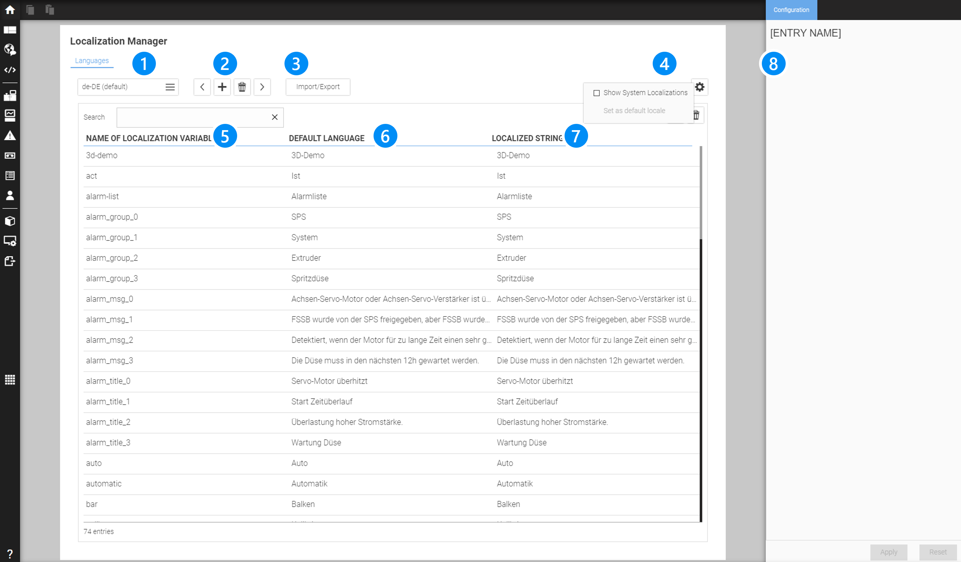
LEGEND 1 Selection Of The Localization File 2 Buttons to switch backward/forward through the files Localization Files, add new one or delete existing Localization File 3 Button import/export Localization Files in csv or json 4 Button to show Options to select System Localization Variables 5 Column with Localization Variables 6 Column naming the Localization Variable in the reference language 7 Column naming the Localization Variable in the selected language 8 Configuration Cockpit to modify the selected entry |
11.2. Use Localization Variables
You can use variables for the configuration of text parameters, such as labels, units, messages, etc., in order to display them in different languages. These so-called localization variables can be filled with a localized text, depending on the selected language. The localization variables are adminstrated in the Localization Manager.
There you can
-
Add a new localization variable (Button "Create New Entry")
-
Delete a localization variable (Button "Delete Selected Entry")
-
Edit the localization of a localization variable (Configuration Cockpit)
-
Import/export Localization variables
Example
-
Localization variable: ${produced-packages}
-
English localization: Produced Packages
-
German localization: Produzierte Pakete
-
French localization: Paquets Produits
-
Spanish localization: Paquetes Producidos
-
Chinese localization: 生產的包裝
-
etc.
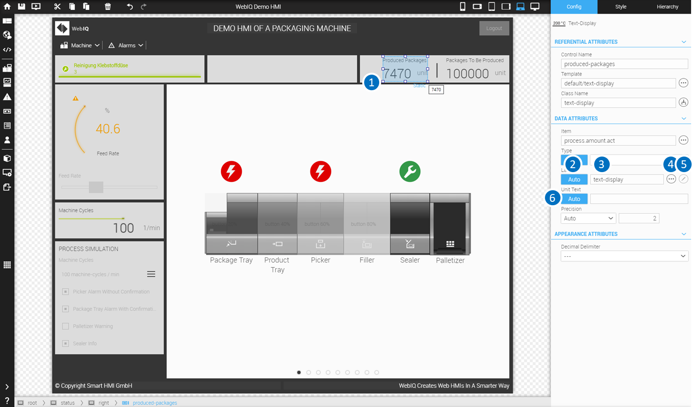
LEGEND 1 Selected Widget 2 Lable - button "Auto": on = inherits the settings from the item definition / off = take the settings from the input field 3 Lable - input field: contains the localization variable for the label 4 Lable - button "localization": displays the dialog for the selection of the localization variable 5 Lable - button "edit localization": displays the dialog for direct editing the localization 6 Unit - input field: contains the localization variable for the unit |
You must enter a variable identifier there, if you want to use the localization variable for a label or for a unit of a widget. The variable is entered in the notation $\{<variable>}. You can also select the variable by pressing the localization icon and selecting the variable in the dialog, that appears.
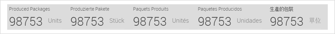
|
Even the use of multiple localization variables in combination with direct text input is possible in the definition of text parameters, e.g.
returns the following:
|
|
You can use nested localization variables, e.g.
|
11.3. Direct Editing Of Localization
If you’re working in the layout manager, you can edit the localization variables, as well as the localizations for the different languages directly, without having to go to the localization manager. For this you have to proceed as follows:
-
Enter the localization variable in the input field or select a variable from the dialog
-
If you enter an unknown variable, this variable will be set up as soon as you leave the input field
-
Press on the pen icon next to the input field
-
It appears the dialog for entering the localizations for the languages, which aredefined up to this moment
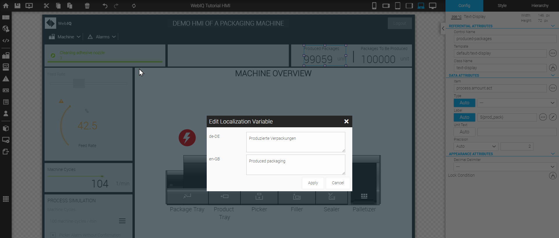
|
You can also use multi-line texts for localization. |
11.4. Set Up A language
In order to set up a new language just open the Localization Manager and click the button "Add New Locale". A dialogbox appears where you can insert the name of the localization. We recommend to use the naming according ISO 639-1 / ISO 3166-1 as desribed above.
WebIQ Designer will create a new localization file. As long as there is no localized text, the name of the localization variable is automatically used as localized text but set within square brackets, i.e. [annual yield], [wind speed] or [weekly unit yield]. This ensures that a text, that has not yet been translated, immediately stands out in the HMI.
11.5. Switch Languages
Switching between different languages is very easy. For switching to a specific language, you can use a button or a menu entry. Insert a button, select it and go into the Configuration Cockpit. Here you will find the parameter "Action". There you have to select the UI-Action "setlocale (final)", click the plus-button and enter the name of the specific localization, i.e.
-
Switch to english localization:
en-GB -
Switch to german localization:
de-DE -
Switch to french localization:
fr-FR -
Switch to spanish localization:
es-ES -
Switch to chinese localization:
zh-CN
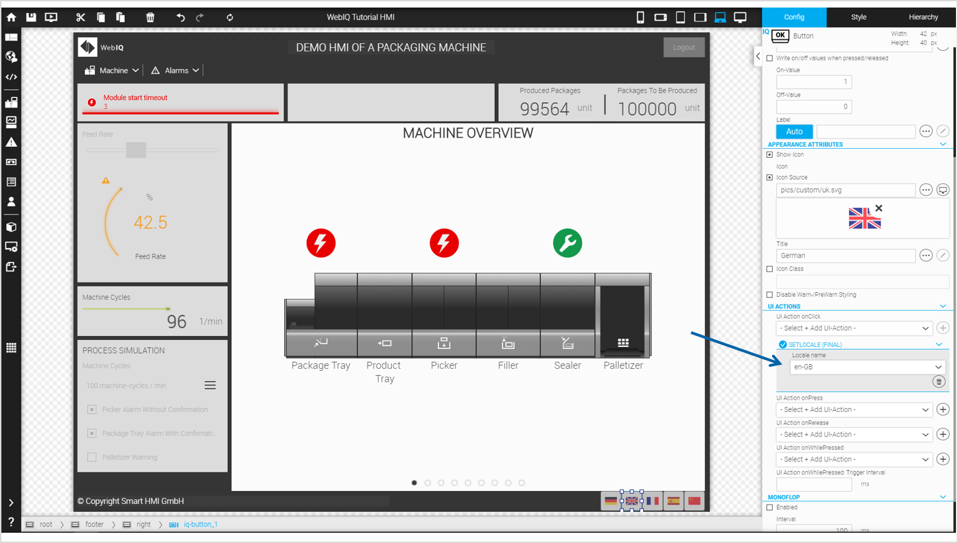
11.6. Importing/Exporting Localization Variables
The localizations can be exported for further processing with external tools and imported back using the Import/Export button.
JSON or CSV files are available as file formats.
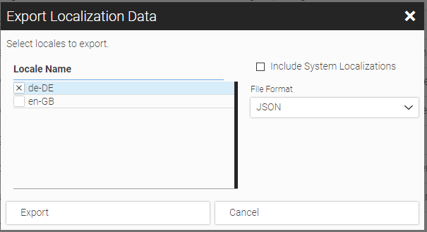
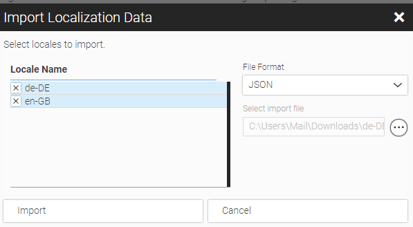
11.7. Edit Localication Outside
The localization file is created in JSON format (JavaScript Object Notation, a compact data format in an easy-to-read text form). You can edit the JSON file with any (text) editor (we recommend Notepad ++) or in any development environment (IDE). There are also many ways to convert the JSON file into various formats, such as CSV or EXCEL, for example to make it accessible for the technical documentation or for the translation service.
WebIQ allows you to export or import the localizations for the different languages either as a JSON or as a CSV file. Go to the localization manager, click on the button "Import/Export" and select the corresponding option within the pop-up menu.
{
  "alarm_group_0": "System",
  "alarm_group_1": "Paketspeicher",
  "alarm_group_2": "Produktspeicher",
  "alarm_group_3": "Kommissionierer",
  "alarm_group_4": "Auffüller",
  "alarm_group_5": "Versiegler",
  "alarm_group_6": "Palletierer",
  "alarm_title_151": "Zeitüberschreitung Modulstart",
  "alarm_msg_151": "FSSB wurde von der SPS freigegeben, aber FSSB wurde nicht initialisiert.",
  "alarm_title_321": "Überhitzung Servo-Achse",
  "alarm_msg_321": "Achs-Servomotor oder Servoverstärker ist überhitzt.",
  "alarm_title_572": "Reinigung Klebstoffdüse",
  "alarm_msg_572": "Die regelmäßige Reinigung der Klebedüse ist fällig.",
  "alarm_title_619": "Maximale Stapelhöhe überschritten",
  "alarm_msg_619": "Das ausgewählte Programm überschreitet die konfigurierte maximale Stapelhöhe.",
  "packages-to-be-produced": "Zu produzierende Pakete",
  "produced-packages": "Produzierte Pakete",
  "feed-rate": "Vorschub",
  "machine-cycles": "Maschinenzyklen",
  "unit": "Stück"
}{
"alarm_group_0": "System",
"alarm_group_1": "Package Tray",
"alarm_group_2": "Product Tray",
"alarm_group_3": "Picker",
"alarm_group_4": "Filler",
"alarm_group_5": "Sealer",
"alarm_group_6": "Palletizer",
"alarm_title_151": "Module start timeout",
"alarm_msg_151": "FSSB was released by the PLC, but FSSB has not been initialized.",
"alarm_title_321": "Axis SV-Motor overheated",
"alarm_msg_321": "Axis servo motor oder servo amplifier is overheated.",
"alarm_title_572": "Cleaning adhesive nozzle",
"alarm_msg_572": "The regular cleaning of the adhesive nozzle is due.",
"alarm_title_619": "Maximum stack height exceeded",
"alarm_msg_619": "The selected programm exceeds the configured maximum stack height.",
"packages-to-be-produced": "Packages To Be Produced",
"produced-packages": "Produced Packages",
"feed-rate": "Feedrate",
"machine-cycles": "Machine Cycles",
"unit": "Units"
}|
The notation must be kept very precisely in order to avoid malfunction. |
12. Using UI-Actions
This chapter describes in detail how you can use UI-Actions to implement user-triggered actions, e.g. select views, write items, set CSS classes etc. UI-Actions are configurable actions that may be used in widgets, such as Button or Responsive Menu to offer interaction with other widgets via configurable options.
WebIQ comes with a number of standard UI actions but you can also write your own custom UI actions with JavaScript (see chapter Integrated Code Editor for JavaScript and CSS3). UI-Actions are available e.g. for the following widgets:
-
Button
-
Image
-
Image Changer
-
Alarm Info
-
Toggle Button
-
Menu Entries of Responsive Menu
You find the UI-Actions dialog in the UI ACTIONS or BEHAVIOUR ATTRIBUTES areas of the configuration cockpit of the corresponding widgets.
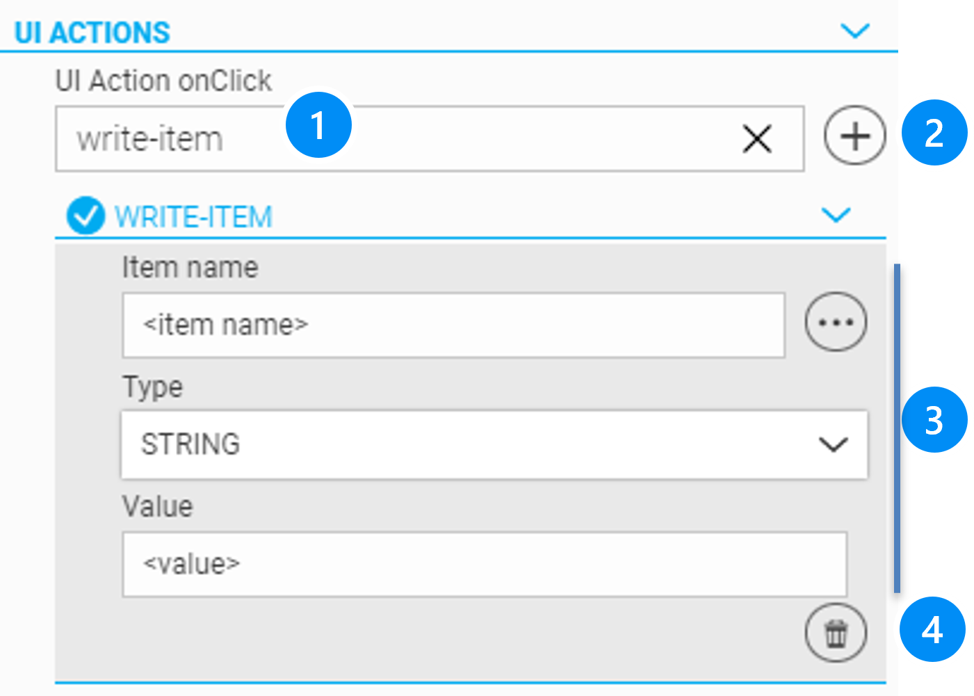
LEGEND
-
Search bar to select the UI-action
-
Button to add the UI-action
-
Fields for parameter 1 to 3, depending of the selected action
-
Button to delete UI-action
|
As you type, the search bar filters all UI actions that contain the specified string. The following wildcard characters can also be used:
|
Follow these steps to activate a UI-Action:
-
Select an UI-Action within the search bar UI-Actions
-
Push the + button to add it to the widget
-
Define the parameters
|
You can add several UI-Actions to one widget. All UI-Actions are executed in the order they are listed except UI-Actions marked "final" such as "Logout" will end the execution list. All following UI actions will be ignored. |
| Name | Parameter 1 | Parameter 2 | Parameter 3 | Description |
|---|---|---|---|---|
Show or hide Overlay Panels |
||||
dialog |
Name of the dialog-box widget |
Show or Hide |
- none - |
Shows or hides a dialog-box specified by its name. |
notify |
Notification text (localizable) |
Notification title (localizable) |
- none - |
Displays a notification dialog |
popup-menu |
Name of the popup-menu widget )* |
Open, Close or Toggle |
- none - |
Opens, closes or toggles the state of a |
slide-in |
Open, Close or Toggle )* |
Name of the slide-in widget |
- none - |
Opens, closes or toggles the state of a |
Set Views (Screen, Panel or Tab-Panel) |
||||
setview |
Name of the panel, tab or screen widget )* |
Name and index of a view within the selected panel |
- none - |
Changes the active view of a |
Logout user |
||||
logout |
- none - |
- none - |
- none - |
Logs off the current user. |
logout-confirm |
- none - |
- none - |
- none - |
Asks for confirmation and logs off the current user. |
change-password |
- none - |
- none - |
- none - |
Opens the dialog to change login password |
Set a language or a theme |
||||
setlocale |
Name of the locale |
- none - |
- none - |
Changes the locale of the current user. |
set-theme |
_Name of the theme (e.g. ‘xenon-acapulco-theme’, ‘xenon-emerald-theme’, etc.) If omitted the default theme is activated. |
- none - |
- none - |
Changes the currently active color-theme. |
Modify CSS classes |
||||
add-class |
Name of the widget |
Name of the CSS class |
- none - |
Adds a CSS class to the base element of a widget, which is specified by the name. |
toggle-class |
Name of the widget |
Name of the CSS class |
- none - |
Toggles a CSS class of the base element of a widget, which is specified by the name. |
remove-class |
Name of the widget |
Name of the CSS class |
- none - |
Removes a given CSS class from the base element of a widget, which is specified by the name. |
Write a value to an item |
||||
write-item |
Name of the item |
Type of the item (i.e. STRING, BOOL, INTEGER, FLOAT) |
Value of the item |
Writes a value to an item. |
write-item-bitmask |
Name of the item |
set, clear or toggle |
Bitmask decimal (e.g.3), hex (e.g. 0x03) or binary (e.g. 0b101) |
Logical Bitmask operation: Set: (Or), Clear (AND NOT Bitmask), Toggle: (XOR) |
increment-item-value |
Name of the item |
_inc/ dec value _ |
none |
Increments or decrements the item by the specified value. |
Example This UI action e.g. can be used in conjunction with the IQ Button widget to enable tip operation (jog function). If this is inserted in the ONWHILEPRESSED field, the item value is changed as long as the user keeps the button pressed and the PLC can evaluate this. |
||||
Recipes |
||||
recipe-add |
Reference to Select-Recipe widget )** widet |
none |
none |
Add a new recipe to the recipe list. |
recipe-apply |
Reference to Select-Recipe widget )** |
Skip Confirmation (true or false) |
none |
Applies the selected recipe to the process. |
recipe-capture |
Reference to Select-Recipe widget )** |
none |
none |
Captures actual process items to the recipe. |
recipe-export |
Reference to Select-Recipe widget )** |
Export All Recipes (true or false) |
none |
Exports the selected recipe to the file system. |
recipe-import |
Reference to Select-Recipe widget )** |
none |
none |
Imports a recipe from the file system into the recipe list. |
Trends UI Action to trend-export or to handle trend sets (see trend-set-select widget) |
||||
trend-export |
Reference to trend-display widget |
none |
none |
Opens a dialog where the user can specify a start and end time. Then the content of the historical trend data for that period is written in JSON format. |
trend-set-create |
Reference to trend-set selection widget |
none |
none |
Creates a new trend set to store trend curves. |
trend-set-delete |
Reference to trend-set-selection widget |
none |
none |
Delete a trend-set |
trend-set-rename |
Reference to trend-set-selection widget |
none |
none |
FRename a trend set. |
trend-set-save |
Reference to trend-display widget |
none |
none |
Save changes to a trend-set. |
trend-set-values |
Reference to trend-display widget |
Select multiple trend tags/items |
none |
Implicitly selects the specified tags/items for the trend display. |
Confirm alarms |
||||
acknowledge-all-alarms |
none |
none |
none |
acknowledges all current alarms |
Data Recorder |
||||
data-recorder-start-stop |
ref to Data Recorder |
Start_or _Stop |
none |
starts or stops the recording of the corresponding Data Recorder |
data-recorder-record-now |
ref to Data Recorder |
Start_or _Stop |
none |
Manual trigger to store the current values into the Data Recorder, if the option 'Record on Trigger' is set. (see Data Recorder record on trigger |
Composite Widgets |
||||
composite_placeholder |
Reference to Composite Widget |
none |
none |
Allows the changing of 'Composite Placeholder' during runtime |
Example 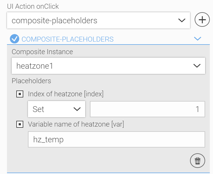
Figure 127. Parameterize Composite Widget with UI-Action during runtime
|
||||
)* Here you can choose between the displayed options. Only the possible overlay panels or views that are on a higher or the same level of the Template Hierarchy are offered!
)** Recipe UI-actions have to refer to a corresponding Select-Recipe widget, where the reference to a recipe template and the selected recipe is defined. The Select-Recipe widget has to be on the same or higher level of the Template Hierarchy.
13. Integrated Code Editor for JavaScript and CSS3
WebIQ is a toolbox with ready-made widgets and style formats (themes). Own widgets or code libraries can be installed as “packages” and are accessible as custom widgets in the widget area of WebIQ Designer. However the code of these widgets or modules has to be developed outside of WebIQ with standard development tools and must be installed as packages (see Manage Packages).
In addition, there is often a need to easily edit custom application logic in the form of program code (scripts) with an integrated editor. Also it’s often desired to customize the appearance of the HMI by editing CSS style sheets to suit to individual needs or corporate designs..
For this reason, WebIQ has an integrated editor, to insert and edit JavaScript program code or CSS style sheets into a HMI project. This chapter describes in detail how you can create scripts, such as JavaScript or custom CSS classes with the build-in editor.
13.1. Script Module Types
For the organization and storage of the JavaScript program code or the CSS style sheets the "Code Manager" is provided. It has three different areas according to the module types:
LocalScripts: Code Modules in JavaScript that run in the context of the application - Invoked by a LocalScript widget
UI Actions: Code Modules in JavaScript as Custom UI Actions. These are executed in the context of user interactions - Invoked by applying an UI action to a control, e.g. button etc.
CSS Stylesheets: Code modules with CSS styles and classes - Applied by setting the style class of a control (see chapter Configuration Cockpit, applying CSS-Modifier)
| LocalScripts and UI action program code is only executed in the preview window of WebIQ Designer. CSS-Styles are directly visible in the layout area. |
13.2. Using The WebIQ API
All API functions of WebIQ framework can be used in the code of the LocalScript – or UI action modules. Refer to the developer manual “WebIQ Visuals Reference ”, which is available in the documentation area of MyWebIQ.
Name |
Description |
ItemManager |
Access to items and their attributes e.g. subscribe items and invoke update listeners, read and write items etc. |
TrendManager |
Get trend data from data recorder |
File Manager |
Read and write files |
Query Manager |
Get query data of SQLite databases |
User Manager |
Access to User and Userdata |
Recipe Manager |
Recipes and recipe templates etc. |
In addition, many useful functions for accessing and working with WebIQ Visuals, including functions for dynamic widget manipulation at runtime, are included. Also functionality of external frameworks, e.g. jQuery, chart.js,… can be used, if the appropriate libraries are included, e.g. as a package in the Manage Packages.
| Refer to our website documentation with how-to’s and examples. |
13.3. Code Manager
Click the icon on the launch in order to open the Code Manager.
On the tab "Local-Scripts" you will have the possibility to create a JavaScript script (JS script) or - if you have already defined one or more JS scripts - to see the list of defined JS scripts.
There you can
-
Create a JS script
-
Edit a JS script
-
Delete a JS script
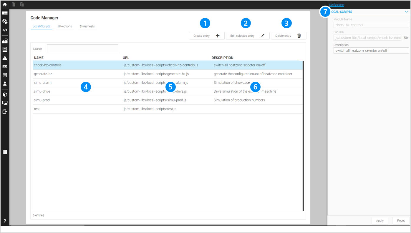
LEGEND 1 Button to create a new JavaScript code module 2 Button to edit the selected module 3 Button to delete the selected module 4 Column with name of the module (filterable) 5 Column with file path to the module (filterable) 6 Column with description (filterable) 7 Configuration Cockpit to edit data of the selected module |
13.4. LocalScripts
13.4.1. LocalScript Widget
The HMI / SCADA Toolbox WebIQ offers the LocalScript widgets , which allows to apply a defined JavaScript module to run in the context of the HMI. You can find the LocalScript widget, like any other standard widgets, in the widget overlay of the Layout Manager”. However, they are invisible and the sole purpose is to instantiate the JavaScript code.
If the viewing area, e.g. a view or a dialog-box with the LocalScript is activated, the script starts with the function "module.run". If the view or dialog-box area is closed, ‘onDisable' will be called and the module is stopped.
For example:
-
The Local Script is located in a view
-
The script is called, when this view is opened
-
The onDisable function is called, before the view is closed.
-
Place alert statements in the functions of the module to explore the behaviour.
| To invoke a global script, which starts and ends with the application, it should be placed in the root of the hmi layout hierarchy. |
The Configuration Cockpit allows to define the following settings for a localscript:
REFERENTIAL ATTRIBUTES
Widget Name: Internal name of the localscript-widget
DATA ATTRIBUTE
Script Module Name: Name of the JS module, which should be carried out
13.4.2. Create A LocalScript Code Module
Select the Code Manager and the LocalScript tab. Follow these steps to create a LocalScript JS code module:
-
Click the button Create entry
-
Enter a module name for the JS module in the configuration cockpit
-
Define the path and the file name for saving the JS module (optional) or leave it empty (in this case, the file is created under the module name)
-
Press the button Apply
-
Press the button Edit entry to edit the JS module in the built-in code editor
The Configuration Cockpit allows defining the following settings for a JS script:
LOCAL-SCRIPTS
Module Name: Unique name of the JavaScript module
URL: Define the path and the file name for saving the JS module (optional) or leave it empty.
Leave the file URL field blank, WebIQ generates automatically the URL on the base of the module name with an appended .js file ending.
The modules are always placed in the section \js\custom-libs\local-scripts\ of the project directory (see <<project-directory<<)
|
Description: Arbitrary description (optional)
13.4.3. Edit The Code Module
After you confirmed the creation of the JS module with the Apply-button, you can click to the button Edit selected entry in order to open the build-in code editor. You see the JavaScript module ‘skeleton’ with the code of an empty JS module in the code editor, which should not be changed in its structure. Add code by editing it in the designated places, which are indicated by the inline comments, such as
-
Private variable area
(starts with comment/* private variables */) -
Private function area
(starts with comment/* private functions */) -
Code area (starts with the comment
/**)-
Run function area
(starts with the comment//Place your Code here) -
Disable event to close and free resources
(starts with/* called when this local-script is disabled */)
-
The function module.run is called, when the Local Script is instantiated (see LocalScript Widget). onDisable is called before the module is deleted.
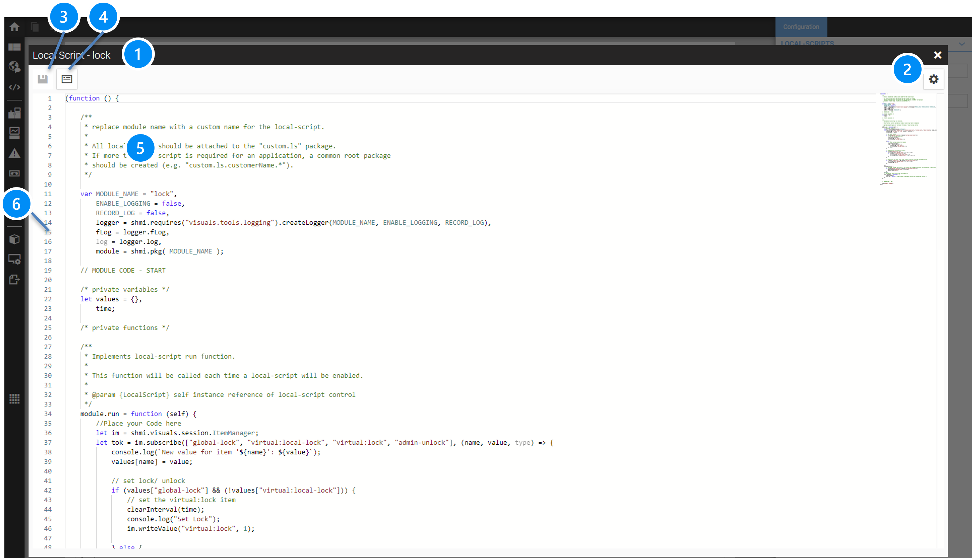
LEGEND 1 Name of the JS script module 2 Settings menu to select font-size and theme 3 Button to save the code module 4 Button to show and hide the syntax check output field 5 Code area 6 Bar with line numbers |
13.4.4. LocalScript Code Example
The following code example shows the use of the JS framework WebIQ Visuals. In this example, 1 item is subscribed and a random offset is added on its value (like a random noise on a measured value).
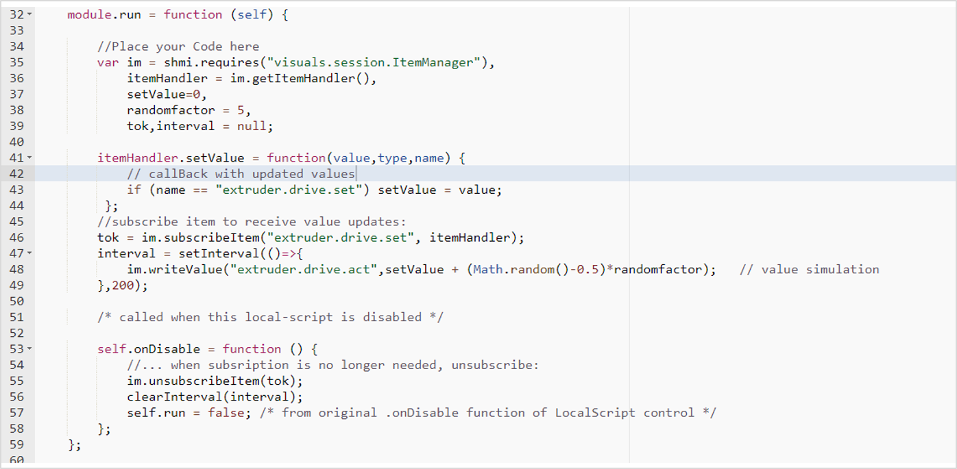
13.5. UI-Actions
13.5.1. Create A Custom UI action
Select the Code Manager and the “UI action” tab. Follow these steps to create a UI action code module:
-
Click the button Create entry
-
Enter a name for the UI action in the configuration cockpit
-
Define the path and the file name for saving the JS module (optional) or leave it empty (in this case, the file is created under the module name)
-
Press the button Apply
-
Press the button Edit entry to edit the JS module in the built-in code editor
The Configuration Cockpit allows to define the following settings:
UI actions
Module name: Unique name of the JavaScript module
URL: Path to the file URL of the JS script
Leave the file URL field blank, WebIQ generates automatically the URL on the base of the module name with an appended .js file ending.
The modules are always placed in the section \js\custom-libs\ui-actions\ of the project directory (see Project repository)
|
Description: Arbitrary description (optional)
13.5.2. Edit The Code Module
After you confirmed the creation of the UI action code module with the Apply-button, you can click to the button Edit selected entry in order to open the build-in code editor.
|
Multiple UI actions can be defined in one module |
13.6. CSS Style Sheets (Cascading StyleSheets)
13.6.1. Create A CSS File
On the tab "Stylesheets" you will have the possibility to create a CSS file, or - if you have already defined one or more CSS files - to see the list of defined CSS files.
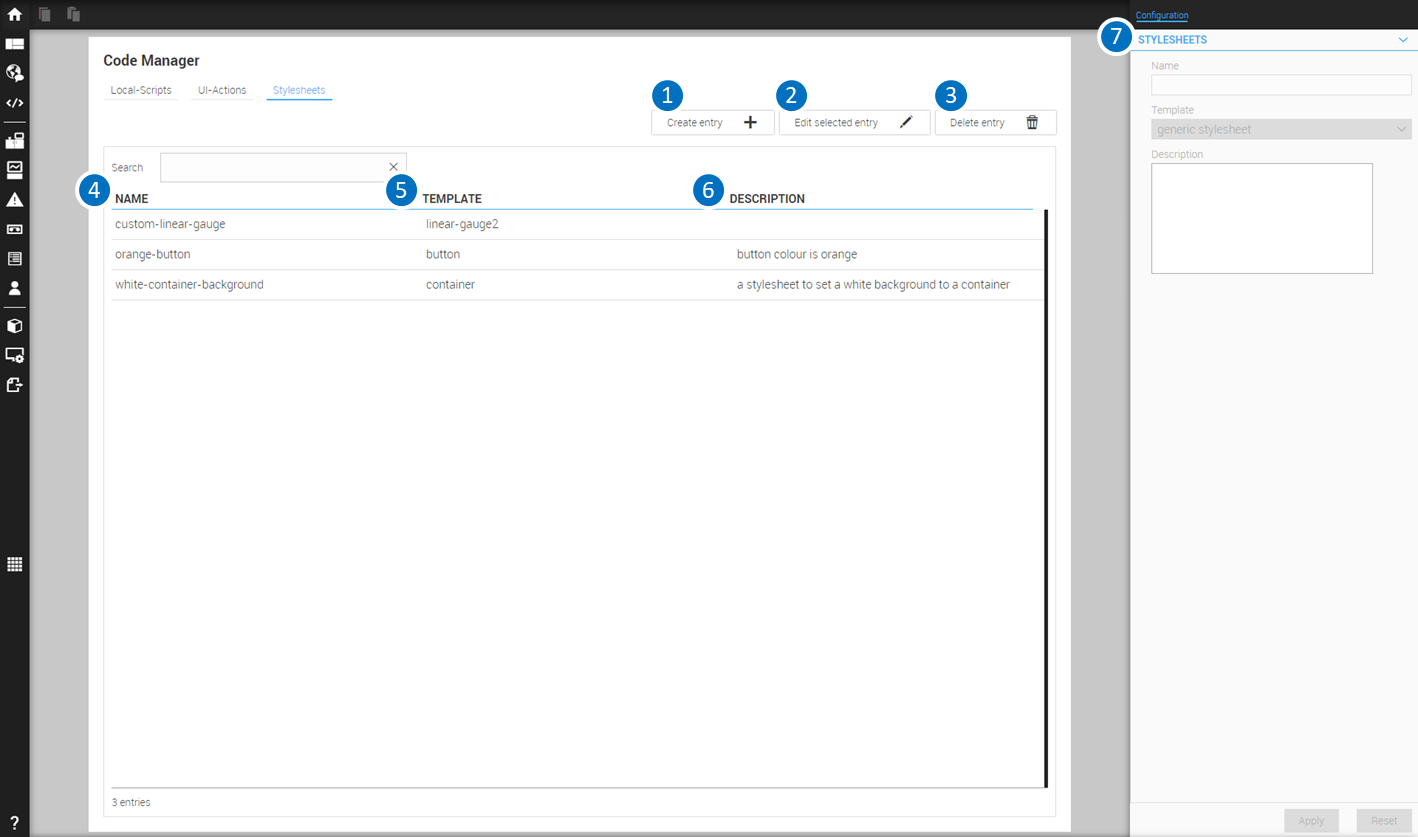
LEGEND 1 Button to create a new entry (New CSS file) 2 Button to edit the selected entry (Edit CSS file) 3 Button to delete the selected entry (Delete CSS file) 4 Column with the names of the CSS file 5 Column with the Widget Templates to wich the CSS file refers 6 Column with the description of the CSS file 7 Configuration Cockpit to modify the configuration data of the selected CSS file |
The Configuration Cockpit allows to define the following settings for a CSS file:
STYLESHEETS
Name: Unique name of the CSS class
Template: Name of the widget template to which the CSS class refers
Description: Arbitrary description (optional)
Follow these steps to create a CSS file:
-
Click the button Create entry
-
Enter a name for the CSS file in the configuration cockpit
-
Choose the widget template, to which the CSS file should be applied
-
Press the button Apply
-
Press the button Edit entry to edit the CSS file in the built-in code editor
13.6.2. Edit A CSS File
After you confirmed the creation of a CSS file with the Apply-button, you can click to the button Edit selected entry in order to open the build-in code editor.
You see the CSS class ‘skeleton’ of the widget template. This skeleton represents the inner structure of the widget and contains the elements that make up the widget, such as
-
the widget itself
-
the wrapper element, which contains label & icons
-
the label itself
-
the icon itself
-
etc.
WebIQ Designer creates automatically a CSS file with the CSS selectors of the elements of the selected widget template. This gives you the ability to define CSS styles directly to elements of the widget, e.g. set the colour of the label-element, etc.
|
Due to the cascading characteristic of the CSS instructions, your styles could be overwritten (cascaded) by higher specific settings of the standard-themes, which aŕe delivered with WebIQ. We recommend to use the ‘!important’ appendix in order to force your instructions with higher priority. |
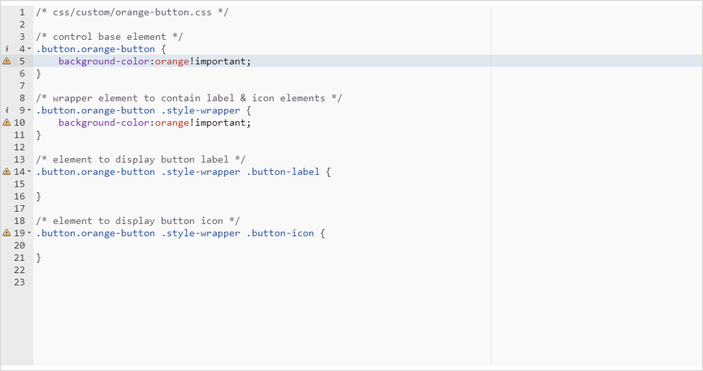
For some widgets the skeleton contains no further sub-elements. This is the case, when the widget is very complex and consists of a large number of elements, such as the Trend Display or the Alarm List. In this case, the desired elements can be determined by using the developer tools of the web browser or Preview window (see Debug Your Code With Chrome Developer Tools).
13.6.3. Apply A CSS File
You can apply a CSS file by entering the name of the CSS class into the input field Class Name of the corresponding widget or just choose from the CSS Modifiers Menu by using  . All available modifiers for the class will be listed.
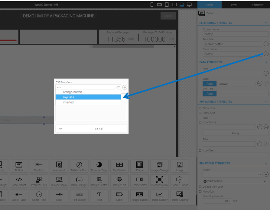
Add the appropriate style to your variable by clicking  . Here, you can also switch to the code and make changes.
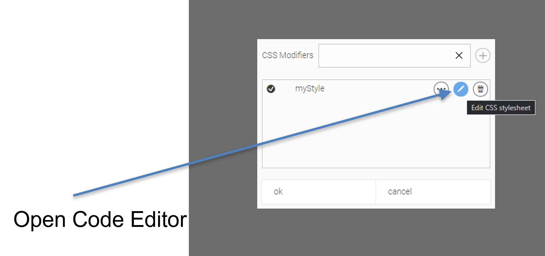
|
Do not overwrite the name of the standard CSS class of the widget, which already exists in the input field. Rather, add your CSS class separated by a space behind the standard CSS class. Take into consideration that the names of the CSS classes are case-sensitive. You can enter multiple CSS classes, each separated by a space. |
13.7. Debug Your Code
-
To test your JavaScript code or CSS style sheets, you can use the Chrome Developer Tools included with the Preview window.
-
Open the preview window by clicking the symbol
 in the header of the Layout Manager
 -
Press F12 key to open the Chrome Developer Tools
Further information and documentation on how to use the Chrome Developer Tools can be found on the Internet.
14. Managing Users And Access Groups
The User Manager is used to specify users and user settings, user groups and access groups for items (access groups). Within the User Manager there are three tabs to select the functions
To select the User Manager click the icon  on the launch bar.
14.1. User
Select the Tab "Users" to select the Users Menu within the User Manager:
LEGEND 1 Button to create a new user 2 Button to delete the selected user 3 User name 4 Column listing the first name of the users 5 Column listing the last name of the users 6 Configuration Cockpit to edit data of the selected user |
The Configuration Cockpit allows to define the following settings for a user:
Deactivated: If checked, user is deactivated and is not able to login
Username: Unique login. Once set, the login cannot be changed.
Description: Arbitrary description
First Name, Last Name: Complete name of the user
Locale: Currently selected locale (language) of the user. When the user logs in, the locale is automatically set to this setting
Group Name: Name of the User Group, the user belongs to. User Groups control the granting of access rights to items.
User Password: Initial user password
Password Validity: Validity period in days for the password. At the end of this time, the user will be prompted to set a new password upon login. It is not checked if the old and the new password are the same.
Auto Logout Timeout: Time in seconds after an auto logout occurs during inactivity.
14.2. User Groups
Select the Tab "Groups" to select the Menu with the user group settings within the User Manager:
LEGEND 1 Button to create a new group 2 Button to delete the selected group 3 Column listing the names of the already created groups 4 Column with further information about the respective group 5 Configuration Cockpit to edit member groups |
The Configuration Cockpit allows to define the following settings for a group:
Groupname: Unique user group name. Once set, the group name cannot be changed.
Description: Arbitrary description
Administrative Privileges: If checked, users belonging to this group are allowed to create e.g. users and usergroups
14.2.1. User Levels
A user can be a member of multiple groups at the same time by creating hierarchical structures of groups. A user can only be a member of a single immediate group, however each group can have other member groups so you can create group hierarchies to match your specific requirements.
To achieve that you would create different access groups with different permissions and assign them to groups to group permissions together.
14.3. Access Groups
Access Groups are groups that are assigned to items to set the access rights for specific user groups. Select the Tab "Access Groups" to select the Menu with the access group settings within the User Manager.
LEGEND 1 Button to create a new access group 2 Button to delete the selected access group 3 Column listing the names of the already created access groups 4 Column with further information about the respective group 5 Configuration Cockpit to edit access group data |
The Configuration Cockpit allows to define the following settings for an access group:
Name: Unique access group name. Once set, the access group name cannot be changed.
Description: Arbitrary description
Access Rights: Pattern to configure the access rights for each usergroup.
15. Use Alarms And Alarm Lists
This chapter describes in detail how you can define alarms within the HMI/SCADA Toolbox WebIQ.
The monitoring of events and the display of alarms due to events is a central functionality of any web HMI. Therefore WebIQ allows you to create and manage alarms that are issued in response to specific events or conditions.
There are different alarm types to choose from:
-
Conditional Calculates a logical condition, e.g. a bit mask over a data word. If the result is 'true', an 'Alarm Coming' event is triggered. If the result is "false", the event "Alarm goes off" is triggered.
-
Value Compares the value of a tag/item with the warning limits specified in the definition. If the value is exceeded or not reached, 'Alarm comes' is triggered. If the current value is within the warning limits, 'Alarm goes' is triggered.
-
User An alarm can be triggered via a UI action (deprecated)
-
Watchdog Watchdog alarm monitor the update of a tag/ item
You can set the parameter Historic for each alarm. In this case the alarm is stored in the database for later evaluation and for the display in the alarm history. Furthermore, you can set the parameter Has To Be Acknowledged, in order to force the user to confirm the display of the alarm.
|
The retention time for historic alarms is 30 days by default but can modified in the Alarm-Manager settings menu. |
Alarms are monitored and stored, regardless of displaying of the web HMI, as soon as WebIQ Server is started and the corresponding HMI project is loaded. The HMI project is loaded:
-
if you open it in WebIQ Designer
-
if you start WebIQ Server and load the HMI project with the Autoload Function
In addition, you can define as many context items for each alarm as you want. These are process values, that are recorded and saved with the timestamp Alarm Comes. Likewise, you can set up Attributes for each alarm, which are also recorded and saved. Context items and attributes can be displayed within the alarm texts, e.g. you can insert the name, value and unit of a process variable, which led to an alarm, into the alarm text and display it.
WebIQ also allows the very detailed output of localized alarm texts, which you can enrich with additional information (i.e. alarm context). Once the alarms and alarm texts have been defined, the displaying of the current and historical alarms is very simple. By default, WebIQ offers some ready-to-use alarm widgets, which you can initialize with a few clicks for your web HMI.
The best way to manage alarms within the HMI/SCADA Toolbox WebIQ is as follows
15.1. Define An Alarm
Click the icon  on the launch bar in order to open the Alarm Manager.
There you will have the possibility to define alarms or - if you have already defined one or more alarms - to see the list of defined alarms. There you can
-
Add a new alarm
-
Delete an alarm
-
Edit the parameters of an alarm
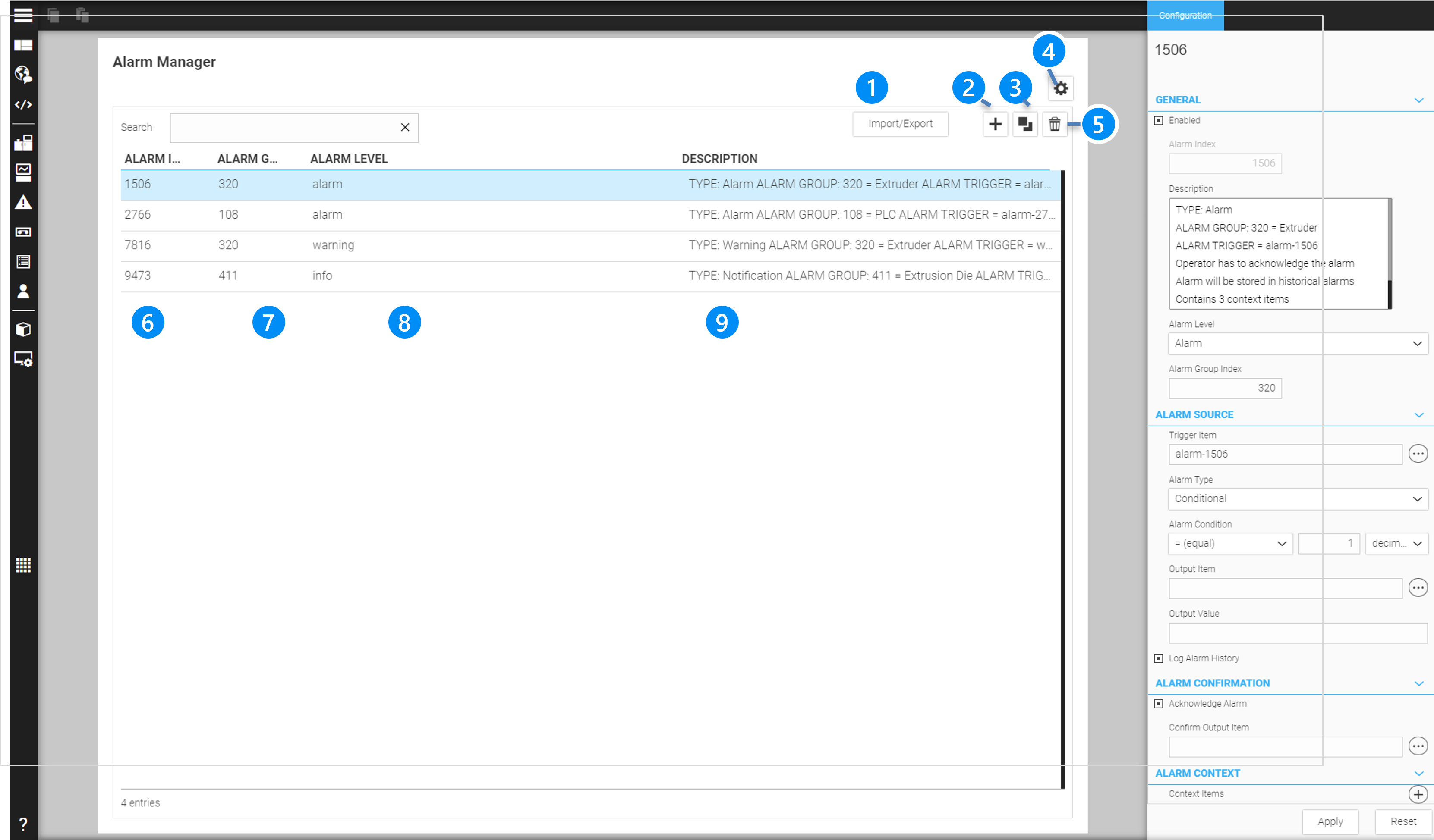
LEGEND
|
The Configuration Cockpit of the Alarm Manager allows to define the following settings:
GENERAL
Enabled: Enable alarm (you can disable the alarm for test purposes)
Alarm Index: Unique alarm index starting at 0
Description: Arbitrary description (optional)
Alarm Level: Level of the alarm (the alarm can be Alarm (=2), Warning(=1) or Info(=0))
Alarm Group Index: Arbitrary numeric alarm group to categorize alarms (optional)
|
You can create alarm groups, such as groups according to the machine components, priority, service level, etc. Alarm groups are defined as numbers (0,1,….) and can be displayed as localized texts in the alarm-list (see Create Alarm Texts) |
ALARM SOURCE
Trigger Item: Process item which is monitored and which triggers the alarm
Alarm Type: Type of alarm (see below)
| TYPE | DESCRIPTION |
|---|---|
Conditional |
Triggers the alarm if the alarm condition which is applied to the trigger item becomes true |
Value |
Triggers the alarm if the trigger item reaches or exceeds the prewarn or warn level, which are set as process data attribute (see also (LIMITS Area) |
User (deprecated) |
Triggers the alarm via the API (deprecated) |
Watchdog |
Triggers if a process data item does not change for more than twice its update interval (see also [update-interval]).This can be used to monitor the communication between the PLC and HMI if the PLC changes a monitoring reference variable cyclically, e.g. counts up. The update interval of this monitoring variable then corresponds to the monitoring cycle time. If the value does not change within two intervals, the alarm is triggered. |
Alarm Condition: Defines the alarm condition (only for Alarm Type Conditional)
If the alarm type is "Conditional", you can define an alarm condition, which will be evaluated in order to trigger the alarm (condition = true). The alarm will be displayed as long as the condition is true and - in the case of an alarm which has to be acknowledged - as long as the user did not confirm the alarm.
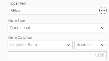
The argument of the alarm condition can be specified either decimal, hexadecimal (i.e. 0x03) or binary (i.b. 0b011). The number format must be chosen in the intended select-box (right to the Alarm Condition) and using the appropriate number format.
Examples of alarm condition
| CONDITION | TERM | DESCRIPTION |
|---|---|---|
Equal |
=99 |
Condition is true if the value of the trigger item is 99 |
Not Equal |
!=99 |
Condition is true as long as the value of the trigger item is not 99 |
Greater Than |
>99 |
Condition is true as long as the value of the trigger item is greater than 99 |
Greater Or Equal Than |
>=99 |
Condition is true if the value of the trigger item is 99 or as long as the value of the trigger item is greater than 99 |
Less Than |
<99 |
Condition is true as long as the value of the trigger item is less than 99 |
Less Or Equal Than |
<=99 |
Condition is true if the value of the trigger item is 99 or as long as the value of the trigger item is less than 99 |
Bitwise And |
& 0b011 |
Condition is true as long as bit 0 and 1 are true or as long as the binary bitmask of the trigger LSB of the item is 0011 |
Bitwise Or |
| 0x03 |
Condition is true as long as bit 0 or bit 1 is true or as long as the binary bitmask of the trigger LSB of the item is either 00011 (=3) or 000001 (=1) or 000010 (=2) |
Bitwise Xor |
^ |
Condition is true if |
Bitwise Negation |
~ |
Condition is true as long as |
True |
Condition is always true |
|
False |
Condition is always false |
Output Item: Sets output if the alarm is activated (optional)
Output Value: Value of the output item (optional)
|
The output item and the output value allows you to define a reaction to the alarm, i.e. enable an external alarm light, buzzer, etc. The output will be reset to |
Log Alarm History: Alarm will be persisted as Historic Alarm and will be displayed within the Alarm History
ALARM CONFIRMATION
Acknowledge Alarm: Alarm must be acknowledged by the user if this checkbox is set
Confirm Output Item: Writes a bitmask to output the alarm status to a process variable (optional)
| BIT | DESCRIPTION |
|---|---|
0 |
Alarm is active |
1 |
Alarm needs to be confirmed (acknowledged) by the user |
2 |
Alarm is confirmed by the user |
ALARM CONTEXT
Context Items: Array of context process variables, which are sampled with the alarm trigger and can be displayed in the alarm texts, i.e. "Temperature too high, T = 233°C"(optional). Context items are also stored with the historical alarms.
(see also section Define Alarm Context and Create Alarm Texts)
Context Attributes: Array of context attributes, which can be recorded an evaluated, e.g. URLs to help resources, alarm categories for evaluation, etc. (optional) (see also section Define Alarm Context and Create Alarm Texts)
15.2. Duplicates Alarms
With the 'Duplicates Alarms' function, many alarms can be inserted based on a selected reference alarm. Either a bit mask can be shifted step by step, e.g. to evaluate the individual bits in an alarm trigger word, or a placeholder with a counter can be used.
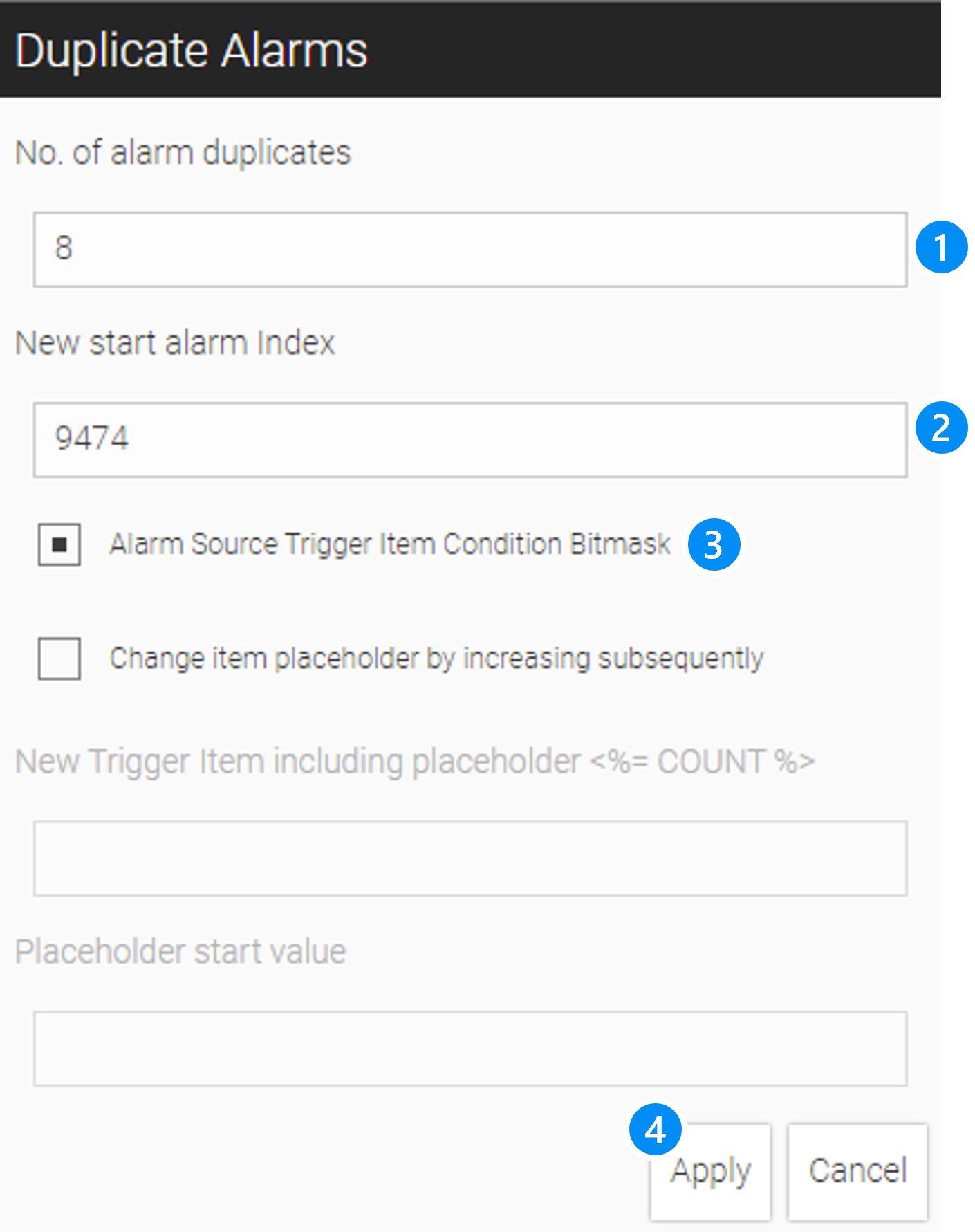
LEGEND
-
Number of how many alarms should be duplicated
-
Start index (Index values must be unique, so make sure there is no overlap with existing alarms)
-
Option shift bitmask subsequently to left
-
Apply, create new alarms
|
Since WebIQ is based on JavaScript, a maximum of 52-bit integer values can be used as bit masks. This means that if you have 64-bit alarm trigger words, only the first 5t2 bits can be used. |
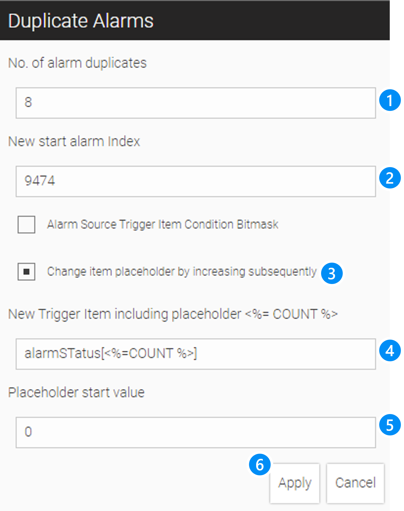
LEGEND
-
Number of how many alarms should be duplicated
-
Start index (index values must be unique, so make sure there is no overlap with existing alarms)
-
Option increase a placeholder
-
Trigger item containing the counting placeholder
-
Start value of the count placeholder
-
Apply, create new alarms
In this example, 8 alarms are generated, starting with index 9474, whose trigger items refer to the array alarmStatus[0] to alarmStatus[7].
15.3. Define Alarm Context
15.3.1. Context Items
You can assign one or more context items to each alarm (see Define An Alarm). These are process values, whose values are stored at the Alarm Comes event and which can be displayed in the alarm texts. In addition to the value of the context item (value), the units (unit), the variable name (name) and the label (label) are also available for the alarm message (see Create Alarm Texts).
| ATTRIBUTE | DESCRIPTION |
|---|---|
|
|
|
Item value |
|
Item value formatted with Number of decimal places, which are defined in the variable declaration in the Process Data Manager |
|
Item label |
|
Item unit |
|
Item name (alias) |
15.3.2. Context Attributes
You can also assign one or more custom attributes to each alarm. You can also use them in the alarm text (see Create Alarm Texts).
The following tables give you an overview which information is available for the alarm context by default:
| ATTRIBUTE | VALUE | DESCRIPTION |
|---|---|---|
|
|
Alarm has been acknowledged by the user |
|
|
The user has to acknowledge this alarm |
|
|
This alarm is active |
|
numeric |
Numeric value according to the defined user groups |
|
numeric |
Numeric value: 2=Alarm, 1=Warning, 0=Info |
|
numeric |
UNIX timestamp for Alarm Comes |
|
Numeric value |
UNIX timestamp for Alarm Goes |
|
Array |
Array of context items |
|
Array |
Array of custom attributes |
15.3.3. Media References
Additionally, you can make links to media files in the alarm context. This gives you the possibility to link to further information about an alarm message, such as a pdf document of a manual or a video file.
| ATTRIBUTE | VALUE | DESCRIPTION |
|---|---|---|
|
|
Creates a link to the pdf document 'User-manual-part-1-2083077.pdf'. The link is preceded by "Help". |
|
|
Creates a link to the video file 'WebIQ 2.8 OPC UA Browser.mp4'. The link is preceded by "Video". |
|
Please note that the link must be created relative to the project directory. |
The media references are automatically displayed as links to the relevant media files. If the user activates this link, the media file in question will be displayed with the default application linked in the operating system. The above example creates the following links in the alarm details.
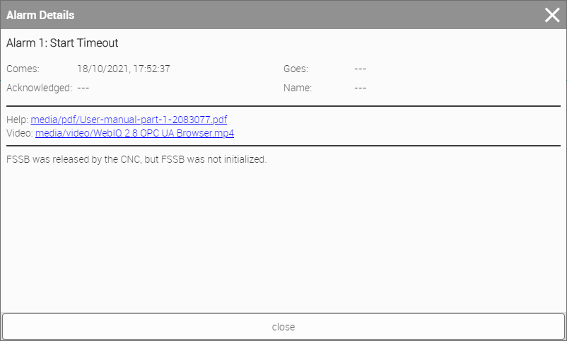
15.3.4. Custom Context Attributes
Furthermore, you can create your very own context attributes and save them with the alarm in question.
| ATTRIBUTE | DESCRIPTION |
|---|---|
|
<value1> (value of the custom attribute "key1") |
|
<value2> (value of the custom attribute "key2") |
etc. |
All this information is stored with the alarm, and can be used to display it in the definition of alarm texts (see Create Alarm Texts).
15.4. Create Alarm Texts
You can identify every alarm due to its unique ID (= alarm index). You can use this ID to define alarm texts in the Localization Manager. The following notation is used to to assign the alarm text to the corresponding alarm:
-
$\{alarm_title_<id>}: Alarm title (used in the tables of the alarm list widget, the alarm history widget, as well as in the alarm info)
-
$\{alarm_msg_<id>}: Alarm message (used in the dialogbox Detail of the alarm list or alarm history widgets)
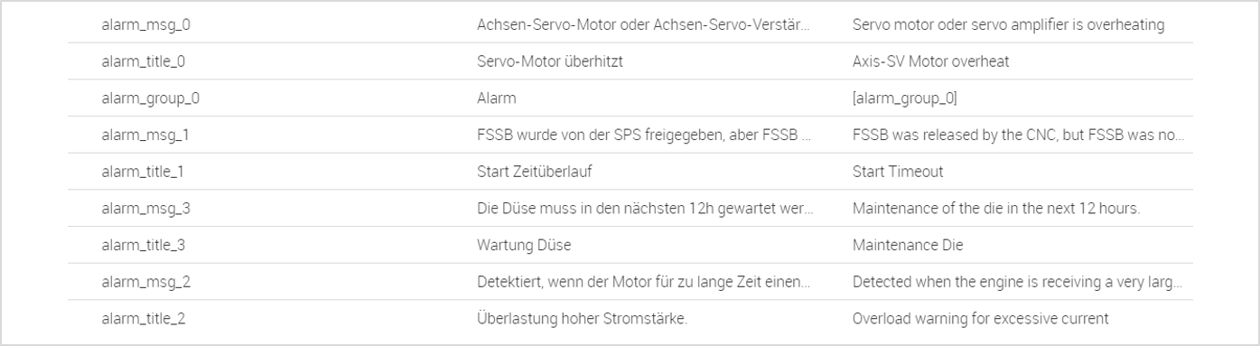
You can define the localized labels of the alarm groups in the similar way.
-
$\{alarm_group_<group-id>}: group-id is the number of the corresponding alarm group
15.4.1. Use Alarm Attributes In Alarm Texts
Besides the custom attributes, which may be optionally defined (see Define Alarm Context), each alarm has several standard attributes, which can be used with the alarm text messages followed:
<%=attrib %>
| NOTATION | DESCRIPTION |
|---|---|
|
= Alarm group |
|
= Alarm Class (2 = Alarm, 1=Warn, 0 = Info) |
|
= Value of the 1. context item |
|
= Unit of the 2. context item |
|
= Shows 'value' of the custom attribute key |
etc. |
This alarm text uses the item F2 as context item. The localization variable $\{alarm_msg_<id>} for the alarm text is defined as follows:
Speed regulation, reference value: <%= items[0].label %> = <%= items[0].value %> <%= items[0].unit %> out of range! Please check frequency inverter settings.
15.4.2. Use Timestamps In Alarm Texts
You can use the DATE function in order to format timestamps and use them for alarm texts. The DATE function has the following three parameters:
<%=DATE(tt,ff,utc) %>
| NOTATION | FORMAT | DESCRIPTION | |||||||||||||||||||||||||||||||||||||||||||||||||||||||||||||||||||||||||||||||||||||||||||||
|---|---|---|---|---|---|---|---|---|---|---|---|---|---|---|---|---|---|---|---|---|---|---|---|---|---|---|---|---|---|---|---|---|---|---|---|---|---|---|---|---|---|---|---|---|---|---|---|---|---|---|---|---|---|---|---|---|---|---|---|---|---|---|---|---|---|---|---|---|---|---|---|---|---|---|---|---|---|---|---|---|---|---|---|---|---|---|---|---|---|---|---|---|---|---|---|
|
{number} |
Input UNIX Timestamp |
|||||||||||||||||||||||||||||||||||||||||||||||||||||||||||||||||||||||||||||||||||||||||||||
|
{string} |
Formatting template that can contain the following strings
|
|||||||||||||||||||||||||||||||||||||||||||||||||||||||||||||||||||||||||||||||||||||||||||||
|
{boolean} |
true, if input value should be interpreted as UTC |
Example: The notation <%=DATE(timestamp_in, '$YYYY-$MM-$DD $hh:$mm:$ss') %> leads to the alarm text 2018-04-20 13:10:05
15.4.3. Use Of Numeric Status Info In Alarm Texts
You can also display numeric status values as localizable text using the MAP function.
To do this you have to define a suitable text for each numeric value. Therefore, you have to create a
separate localization variable which defines the texts in the form of an enumeration.
<%=MAP(state, enum) %>
| NOTATION | FORMAT | DESCRIPTION |
|---|---|---|
|
{number} |
Numeric status |
|
{string} |
Enumeration with the notation |
|
You can write the text directly in the enumeration or - as in example below - use localization variables. |
15.4.4. Example
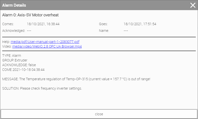
Make the following settings in order to achieve the alarm message as shown above.
TYPE: <%=MAP(severity, 'alarm_states') %>
GROUP: <%=MAP(group, 'group_states') %>
ACKNOWLEDGE: <%=acknowledgeable %>
COME <%=DATE(timestamp_in, '$YYYY-$MM-$DD $hh:$mm:$ss') %>

MESSAGE: The Temperature regulation of <%=items[0].label %> (current value = <%=items[0].formattedValue %> <%=items[0].unit %>)
is out of range!

SOLUTION: <%=attributes.solution %>{0:'$\{alarmlist_level_info}',
1:'$\{alarmlist_level_warning}',
2:'$\{alarmlist_level_alarm}'}{0:'$\{alarm_group_0}',
1:'$\{alarm_group_1}',
2:'$\{alarm_group_2}',
3:'$\{alarm_group_3}'}|
'alarmlist_level_[type]' and 'alarm_group_[idx]' refers to the corresponding localization variables. |
Solution is a custom context attribute with the key 'solution'.
The media link to the help manual (pdf) and the video are created as media references in the context attribute.
15.5. Use An Alarm Widget
The HMI/SCADA Toolbox WebIQ offers the following widgets to display alarm information:
-
 The Alarm List: displays the alarms in a list. It comes with the following
three display modes
The Alarm List: displays the alarms in a list. It comes with the following
three display modes-
All alarms displays the current and the historical alarms in one alarm list
-
Only live displays only the current alarms in the alarm list
-
Only historic displays only the historical alarms in the alarm list
-
-
 The Alarm Info: displays in a compact form the last alarm and the number of
current alarms
The Alarm Info: displays in a compact form the last alarm and the number of
current alarms
15.5.1. IQ Alarm List
The central widget of the alarm management in WebIQ is the IQ Alarm List, which displays both the current and the historical alarms (you can set whether you want to see only the current, the historical or all alarms). It clearly displays the alarms and their status in a list. The columns of the alarm list can be sorted by clicking on the heading of the corresponding column. By default, the alarm list has filters for selecting alarm classes such as Alarm, Warning and Info.
Drag the icon from the see chapter Use Widgets into the
Layout Editor or into the Hierarchy Cockpit in order to initialize an Alarm List.
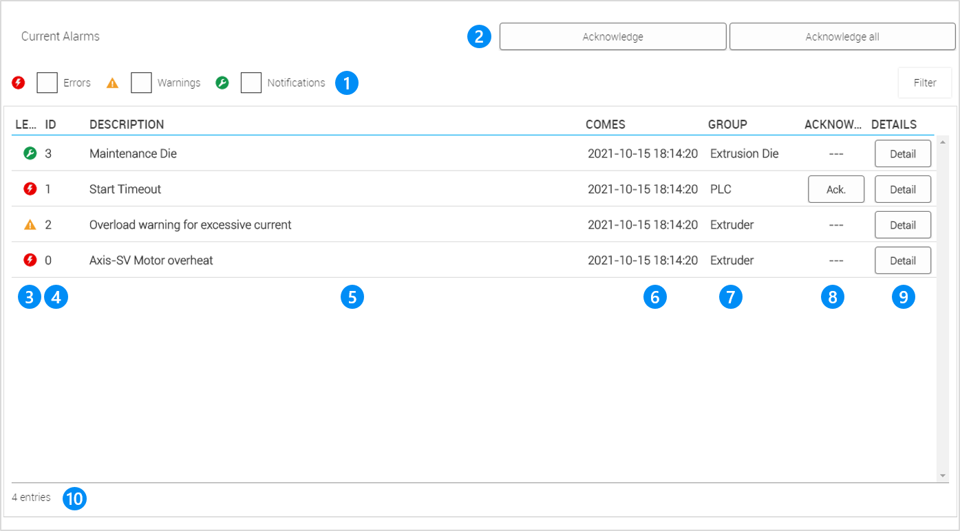
LEGEND 1 Quick filter according to alarm level 2 Acknowledge buttons 3 Indicator icons for the alarm level 4 Unique alarm index 5 Title of the alarm 6 Timestamp "Alarm Comes" 7 Alarm Group 8 Button to acknowledge this specific alarm 9 Button to display detailed alarm messages 10 Number of alarms in total |
|
This is the standard layout of the alarm list with the display mode "Only live". The presentation of the alarm list may vary, depending on which columns you set for the alarm list and how you have configured them. |
There are different layout variants for the alarm list.
| Layout Variant | Description | Image |
|---|---|---|
Full List, Single-Line |
In the alarm list, the alarms are displayed in an overview. The alarm is displayed on one line. If the user clicks on "Detail", he gets the alarm details in an overlay from the type "dialogbox" above. |
|
Full List, Two Lines |
In the alarm list, the alarms are displayed in an overview. The alarm is displayed on two lines. If the user clicks on "Detail", he gets the alarm details in an overlay from the type "dialogbox" above. |
|
List with Detail View, Single-Line |
The alarm list shows an overview of the alarms on the left and the details of the selected alarm on the right. The alarm is displayed on one line. |
|
List with Detail View, Two Lines |
The alarm list shows an overview of the alarms on the left and the details of the selected alarm on the right. The alarm is displayed on two lines. |
|
Details about the configuration and styling of the alarm list can be found in the overview of the widgets
15.5.2. IQ Alarm Info
The IQ Alarm Info widget displays tightly arranged the current alarm status of the web HMI. The widget will be colored according to the highest alarm level within the pending alarms, i.e. red (alarm), yellow (warning) or green (info). Further, the widget shows the number of total pending alarms and the alarm title of the last pending alarm of the highest level.
Drag the icon from the Widget Bar (see Using Widgets
into the Layout Editor or into the Hierarchy Cockpit in order to initialize an Alarm Info.

LEGEND 1 Highest Alarm Level 2 Alarm Title Of The Alarm With The Highest Alarm Level 3 Total Number Of Pending Alarms |
| Layout Variant | Description | Image |
|---|---|---|
Full Alarm Info |
The alarm info displays the alarm icon, alarm text and the number of current alarms. |
|
Icon Only |
The alarm info displays only the alarm icon. |
|
Number Only |
The alarm info displays only the number of current alarms. |
|
Text Only |
The alarm info displays only the alarm text |
|
Details about the configuration and styling of the alarm list can be found in the overview of the widgets
16. Data Recorder And Trend Display
This chapter describes how to record process data tags and define 'Trend' group objects and displaying it in a curve diagram (time-series diagram).
16.1. Data Recorder
16.1.1. Description
WebIQ has an integrated data recorder (data logger) that can be used for recording process variables from OPC-UA and storing them in a database. The minimum sampling cycle of the data recorder is 1ms and the process values are stored in the integrated SQLite database whenever the value has changed and are available there for later usage:
-
Representation as a trend display (online and historical)
-
Export of data to a file for external archiving or evaluation (through a custom script)
-
Online connection to database/cloud system (requires that the data is read utilizing WebIQ’s WebSocket interface and transferred by a customer-side process)
If the sampling cycle is longer than the update time of the process values, these are aggregated using one of the following selectable methods:
-
avg: average
-
median: rolling average
-
min: minimum value within the interval
-
max: maximum value within the interval
-
last: last value
Any number of data recorders can be created, e.g. with small intervals and short storage times (retention) or larger intervals and longer storage times, or with different data and aggregations.
A logical "Trend" group object can be assigned to each data tag of the data recorder, via which the data to be displayed are grouped for the Trend widget. For example, you can store the data in different data recorders and then add these values in a common 'Trend' group object and display them in a Trend widget.
In order to optimize access to the database and to reduce frequent accesses, e.g. to a flash disk, the recording intervals can be set independently of the cycle time on the data recorder.
The storage duration (retention time) can be set as desired and is only limited by the available storage space and performance of the target system’s hard disk and by the maximum database size of 281 TB per SQLite database. After this time has expired, e.g. 2 hours, 30 days or 2 years, all older data is deleted in order to release and limit the storage space.
A recorder can be marked as 'optional' to indicate that database access may be temporarily unavailable, e.g. if you use a removable storage disk or remote access to an external drive. In this case, the data is discarded without an error message and saved again as soon as the storage medium is available again.
16.1.2. Trigger and Qualifier
It is optionally possible to start or stop the data recorder via a linked condition (trigger). This can be a UI action, which can be started as a user action via a button, for example, or linked directly to a condition via a process variable.
Likewise, the data transfer can be controlled via a condition instead of a continuous time interval. In this case, whenever the condition is met, the data is sampled once and stored. This can be used, for example, to count events in a process, e.g. roll log, piece log, etc., in order to then be evaluated later in some form.
16.1.3. Open Data Recorder Manager
When you have an HMI project open, select the Recorder Manager to open the manager dialog:
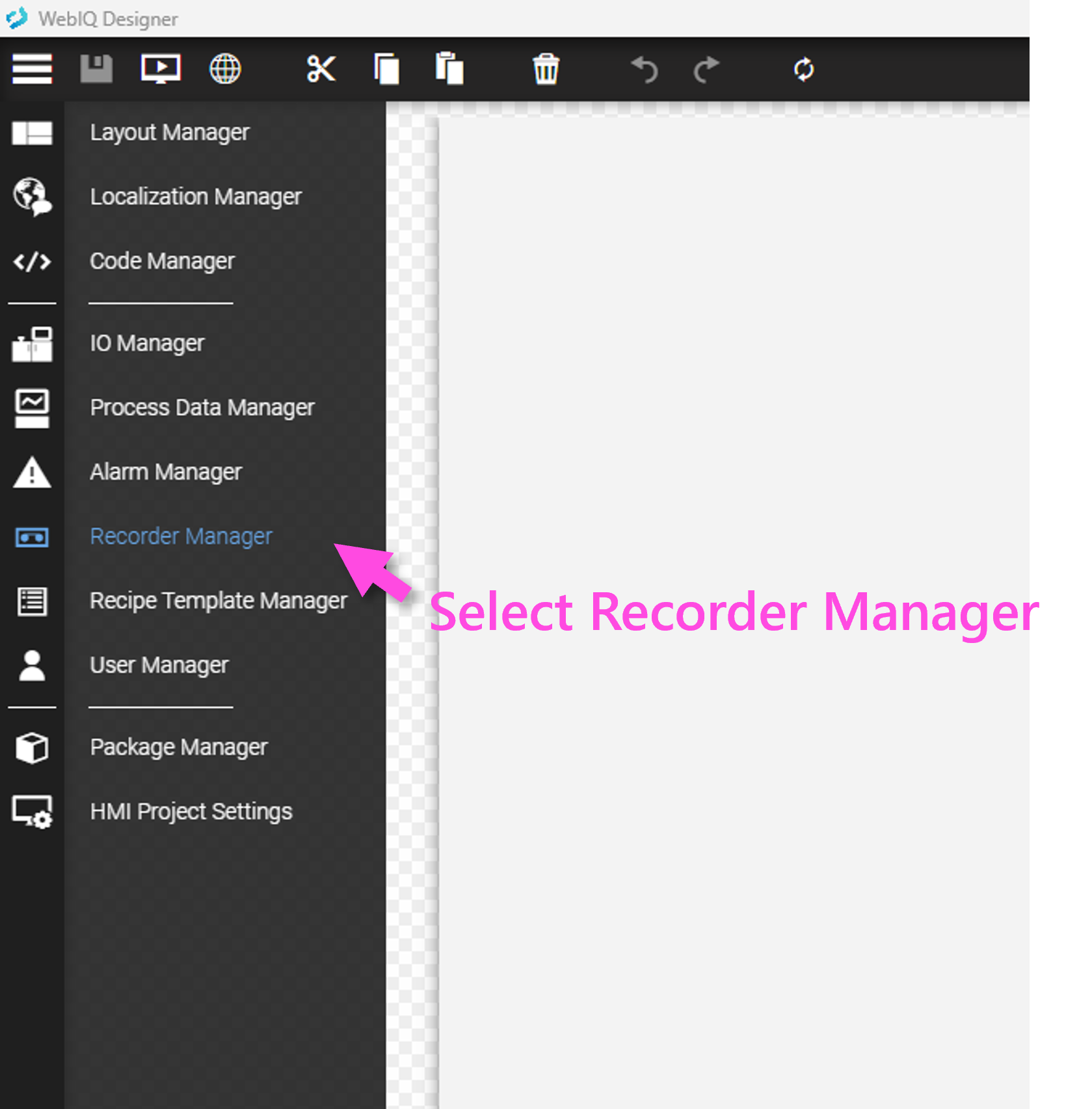
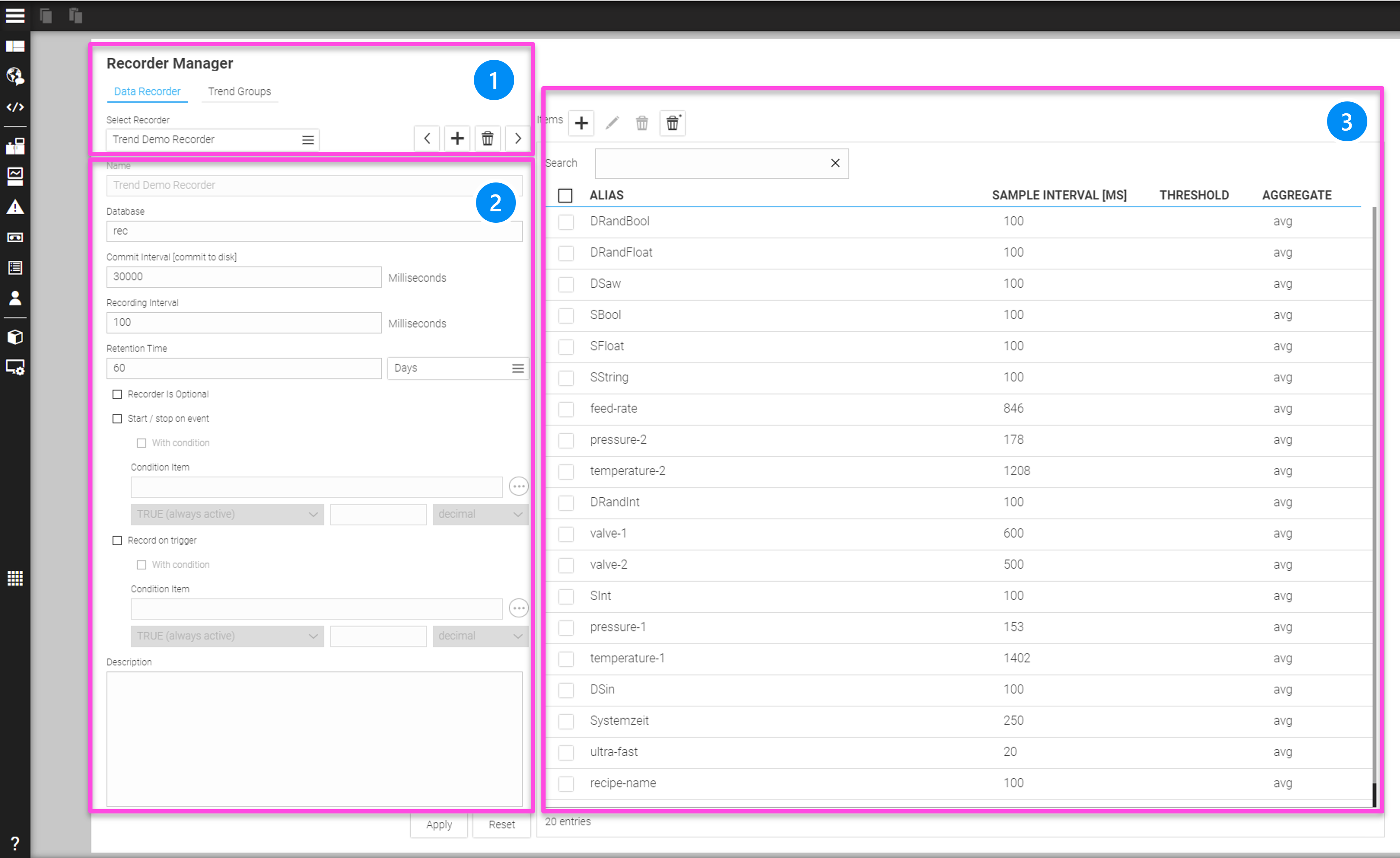
As soon as the recorder manager is open, you can configure the settings in the different areas.
LEGEND
1 Area to select and edit data recorders and 'Trend' groups)*
2 Area for data recorder parameters
3 Display, select and edit process data tags for the data recorder
)* 'Trend' groups are optional logical objects to group values from different data recorders into specific trend views.
16.1.4. Selecting and Editing Data Recorder and 'Trend' Group Objects
In this first area of the Recorder Manager, data recorders can be created, selected and deleted. You can also switch to the view for 'Trend' group objects.
Let’s first see the data recorder section:
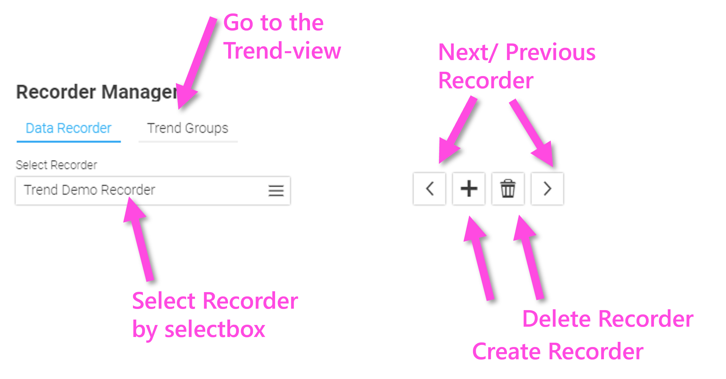
16.1.5. Data Recorder Parameterization
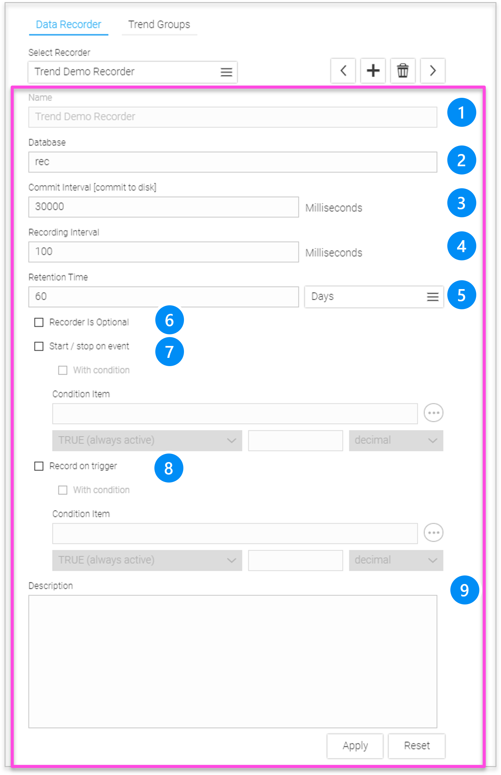
LEGEND
-
Name: Unique name of the recorder, UTF-8 characters are allowed.
-
Database: Database file name relative)* (e.g.'rec1') or absolute)* ('c:\xyz\databasename.sqlite'), must contain valid characters for filenames and path.
|
For relative paths: the system adds the ending '.sqlite' to the filename automatically |
-
Commit Interval: Interval with which the data is written to the disk. The commit interval should be selected in such a way that - as a rule - 100 to 200 data updates are always written to the database. It should also not be too small for flash memory to keep the write rate as low as possible.
-
Recording interval: Interval with which the data is saved. The data is only written if the value has changed and this change is greater than the optionally adjustable threshold (see chapter threshold).
-
Retention Time: Time period for how long the data is stored in the recorder database. All data older than this retention time will be deleted. This time can be specified in seconds, hours or days.
-
Recorder is Optional: If this parameter is set, WebIQ Server will not issue an error message if the attempt to write to the database fails. This is e.g. useful for exchangeable storage media or remote connections.
-
Start/stop:
-
The recording can be started or stopped with the UI action 'data-recorder-start-stop'.
-
If the 'With condition' option is set, a condition consisting of a process value ('Condition item'), a Boolean condition and a reference value can be entered. (E.g. variable 'status' & hex 0x2 ⇒ recorder will be started as soon as bit1 of the variable 'status' has been set).
-
-
Record on trigger: Values are recorded via a trigger instead of a time series. If this option has been selected, the parameters 'Recording Interval' and 'Commit Interval' are not evaluated, but must still contain valid numerical values for the syntax check.
-
The values will be recorded when the UI action 'data-recorder-now' is called, e.g. when the user presses a button or something similar.
-
If the 'With condition' option is set, a condition consisting of a process value ('Condition item'), a Boolean condition and a reference value can be entered. (e.g. variable 'status' > dec 1 ⇒ values are recorded once, when the variable 'status' goes form 0 ⇒ 1. See also chapter ui-actionss, Data Recorder ui-actions
-
-
Description:Optionally, a multi-line descriptive text can be stored here. All UTF-8 characters can be used.
As soon as you confirm the parameters with "Apply", the recorder will be initialized and the database will be created.
16.1.6. Assigning Process Data Tags to The Recorder
You can choose an existing data recorder on the left with the selection field and then choose process values from the process variable list (Select Process Item):
If you click on the "+" Button to add process data tags, you will see the selection dialog:
LEGEND
-
Search filter for the name (alias) of the process data tags. Use '_' as wildcard for single character and '%' as wildcard for multiple characters.
-
Checkbox to select/deselect all shown (filtered) process data tags
-
Display total number of process data in the current filtered selection
-
Click "Apply" to confirm your selection and add process data tags to the data recorder
|
You can select multiple items either by pressing the 'Ctrl' key or by pressing the 'Shift' key to select ranges of items. Use '_' as wildcard for single character and '%' as wildcard for multiple characters in the filter field. |
After clicking on 'Apply' an overlay window to select trend and aggregates will be shown.
-
Number of selected recorder items
-
List of available 'Trend' group objects. 'Trends' groups are logical objects to group values from different data recorders to specific trend widgets. In standard use cases, you can simply select the default 'Trend' group 'Trend', which is available by default for every data recorder. To create more trend objects which you can then select here, see the chapter on 'Trend' groups.
-
Aggregate Function to aggregate values when multiple value updates have occurred within a single recording interval
-
average
-
median (rolled)
-
last value
-
minimum
-
maximum
-
Choose "Apply" to confirm.
|
Strings and booleans can only be recorded using the |
Your process data tags are now listed in the Recorder Manager and the data recorder starts to record immediately. You can repeat this process as many times as needed and add more values or remove them from the list.
LEGEND
-
Search filter for the name (alias) of the process data tags. Use '_' as wildcard for single character and '%' as wildcard for multiple characters.
-
Select/deselect all filtered Process Data Tags. Use 'ctrl' key to select multiple items and use 'shift' key to select ranges of items.
-
Display name (alias) of the Process Data Tag
-
Display sample interval of the tag (see Configuration of Variables/Structure members)
-
Display optional threshold value (see Configuration of Variables/Structure members)
-
Display aggregation of the Process Data Tag (see above)
-
Select/ deselect single row, use 'ctrl' key to select multiple items and use 'shift' key to select ranges of items.
|
You can record the same process data in different data recorders with different sampling rates and different storage times, e.g. as a high-speed recorder with interval = 100ms, age = 2h, and at the same time as a long-time recorder with interval = 60000ms and Retention Time = 365 days. |
16.2. Trends Group Panel To Assign Tags/Items From A Data Recorder To Logical 'Trend Groups'
If you select the 'Trend' tab inside the Recorder Manager this will open the Trend Manager, which manages all trend objects and shows the contained process values.
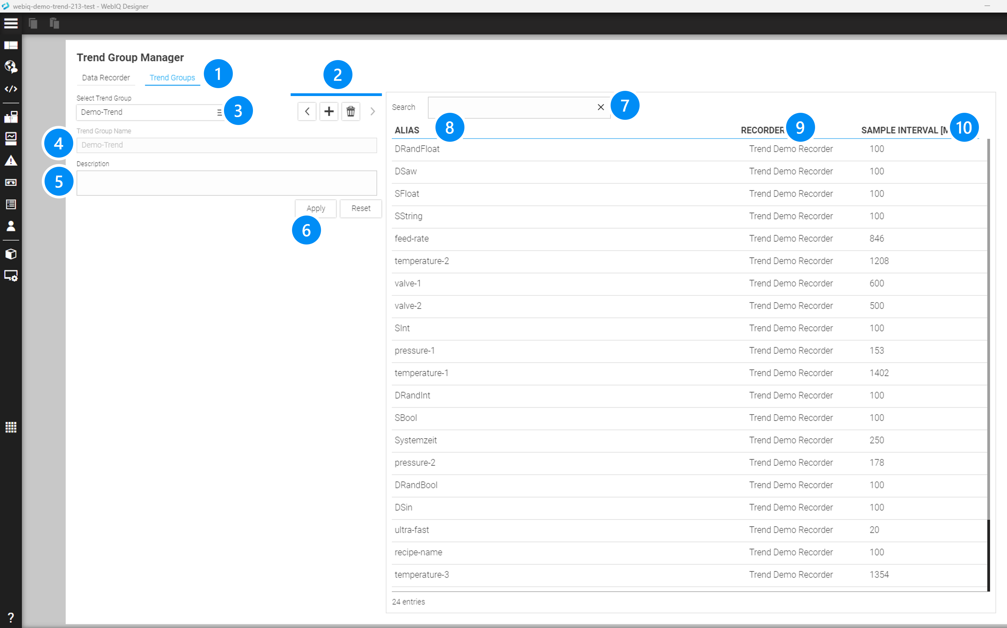
LEGEND
-
Select 'Trend' tab to open the Trend Manager
-
Buttons to add, delete and navigate through the 'Trend' groups
-
Select box to select 'Trend'
-
Name of 'Trend' group object, all UTF-8 characters can be used
-
Multi-line descriptive text can be stored here. All UTF-8 characters can be used.
-
Apply button to submit parameters above
-
Search filter for the name (alias) of the process data tags. Use '_' as wildcard for single character and '%' as wildcard for multiple characters.
-
Display name (alias) of the process data tag
-
Display data recorder name
-
Display sample interval of the tag (see Configuration of Variables/Structure members)
16.3. Using Trend Widgets
WebIQ provides a powerful trend widget to display the process data historically and live as a time-series trend chart. The data is based on the recordings of the data recorder and the grouping of different recorders, the so-called 'Trend' groups, which are also defined in the Recorder Manager. In addition, some accompanying widgets for control and operation are included, which are connected to each other through a configuration option.
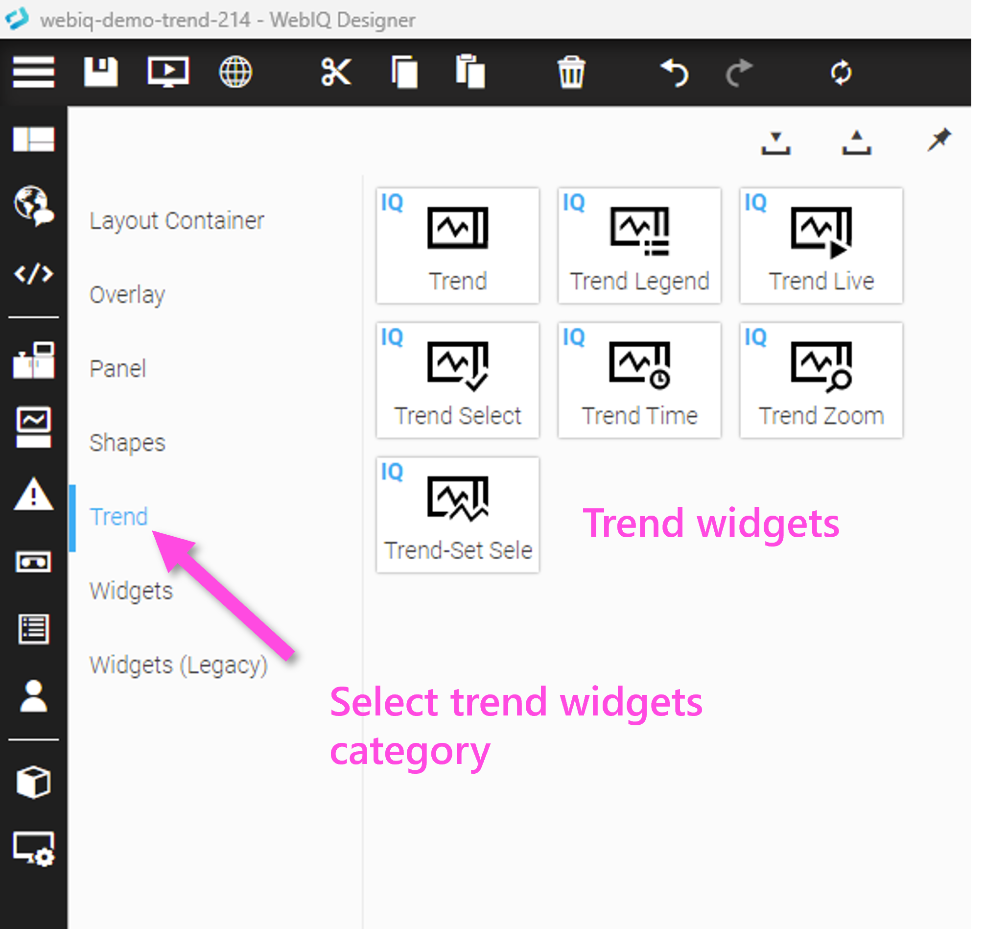
WebIQ offers the following widgets to display trend values:
-
 Trend: displays process variables as time-series in a line chart
 -
 Trend Legend: shows details for each trend curve
 -
 Trend Live: toggles between live and historical mode
 -
 Trend Select: selects process values to be displayed in the trend
 -
 Trend Time: selects the time period for the trend
 -
 Trend Zoom: zooms the trend curve
The core widget is the Trend. The other trend widgets provide additional features for the trend display, if necessary. The trend widgets will be described in detail below.
16.4. 'Trend' Widget
The central widget is the "Trend" widget, which displays the stored process values in a time-series diagram as a curve on the time axis.
It is possible to display any trend curves in the Trend widget to compare them. The trend curves can have different units and value ranges, but it is also possible to combine several values into a single scale group or to hide the scales completely. The scale can also be displayed on the left or right side of the curve diagram.
The Trend widget can display the data as a historical trend curve or alternatively in live mode. In live mode, the data is displayed in real time and the trend curve runs continuously, like a data plotter.
You can use the pinch gesture to change the scaling in the y direction in the trend display. For scaling in the x-direction, i.e. along the timeline, use the "Trend Zoom" and "Trend Time" widgets. You can also zoom with the scroll wheel of your mouse on the y axis and while holding down the Shift key also on the x axis.
Depending on the configuration of the widget, one or two Trend Handles can be displayed and moved along the time axis. The current values are displayed at the position of the handle. There is also the possibility, if this has been enabled in the widget configuration, to enter any user information (comments) on the time axis. These consist of a title and any text. This feature can be used e.g. to comment on the machine status and to point out any irregularities, which are then also stored in the data recorder for documentation.
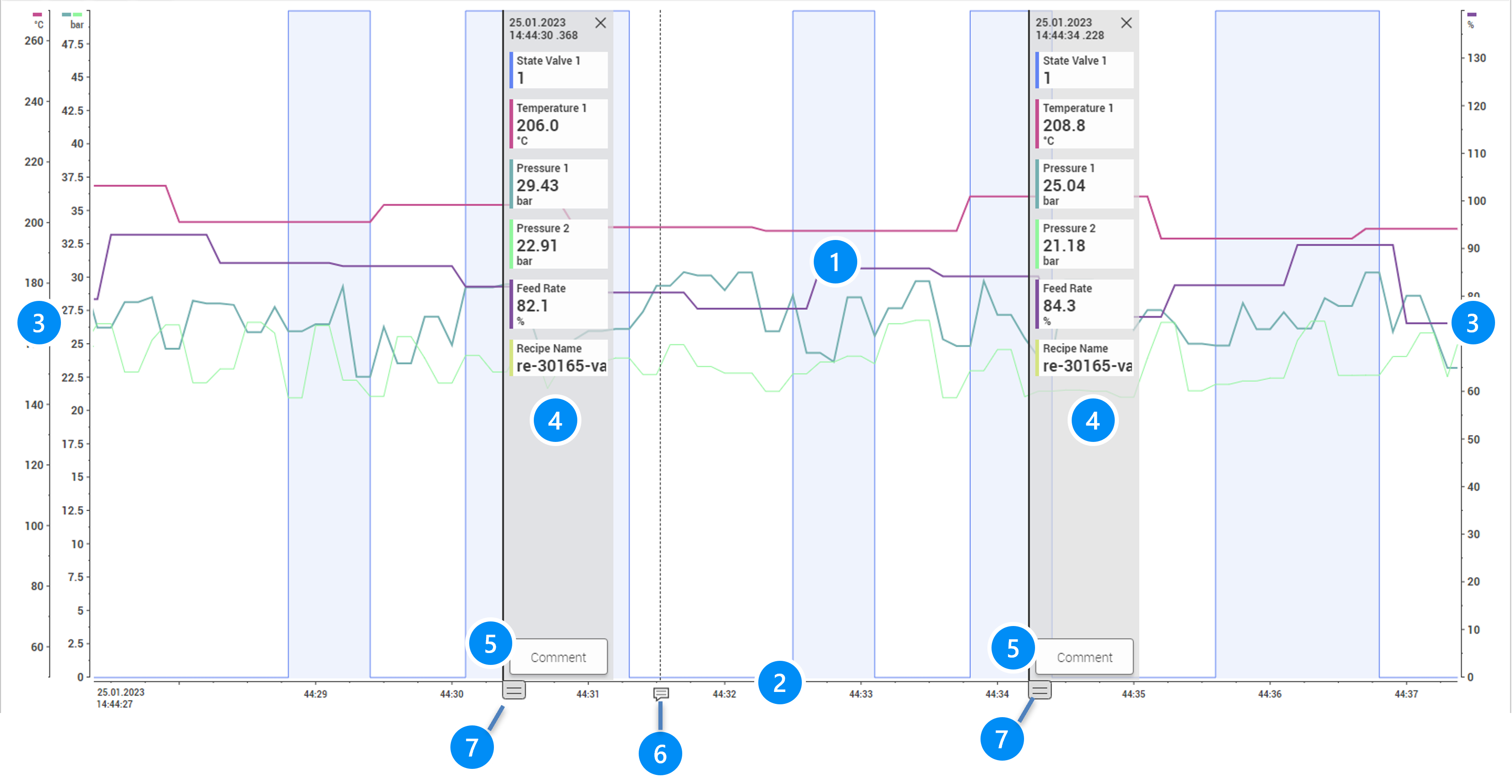
LEGEND
-
Trend Curves
-
Timeline (x-Axis)
-
Value Scales for the Trend Curve (y-Axis) on the left and right side
-
Trend Handle 1 and 2 display the values for the corresponding point in time
-
Comment button for the trend handle
-
Marker for an existing comment for this point in time (click on the icon or touch to open and display it)
-
Handle bar to drag trend handles
16.4.1. Basic Usage of the Trend Widget
Click on graph area
-
if "Enable Trend Handle" is enabled, positions a trend handle on the graph
-
if "Enable Secondary Trend Handle" is enabled, another click will position the second handle on the graph
-
if handles are already present, another click will move the nearest handle to the clicked location
-
active trend handles can be moved by dragging on the rectangular handle bar of the trend handle, displayed on the timeline (below the trend handle)
-
Dragging on graph area
-
will move displayed duration (horizontal) or
-
will move displayed scale area (if y-axis is zoomed in)
-
-
Shift+Click or touch with two fingers on graph area
-
Starts/stops live mode if enabled
-
-
Mouse-wheel or vertical scale-gesture
-
controls y-axis zoom (zoom stage change)
-
-
Shift+Mouse-wheel or horizontal scale-gesture
-
controls x-axis zoom (duration change)
-
16.4.2. Trend Widget Configuration
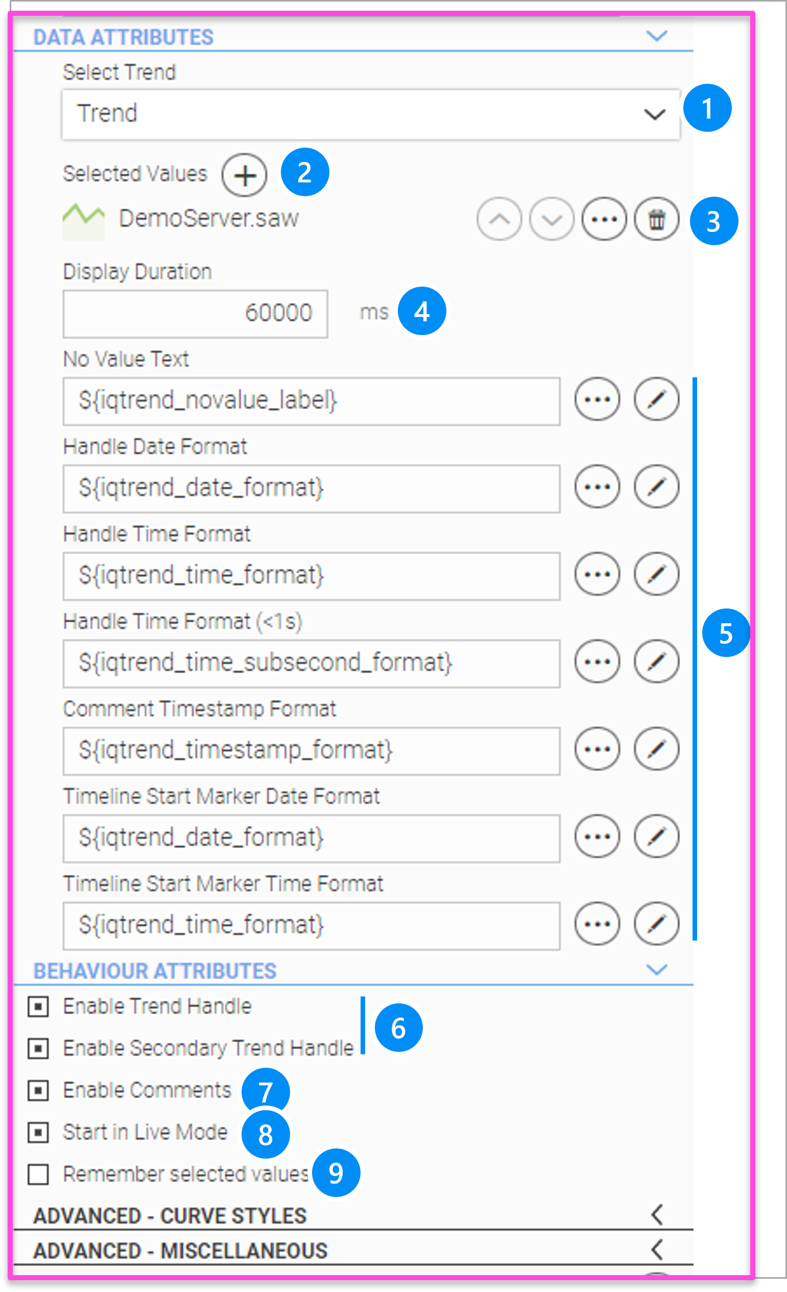
LEGEND
-
Select 'Trend' group object as defined within the data recorder (see chapter Trends Group Panel To Assign Tags/Items From A Data Recorder To Logical 'Trend Groups')
-
Add one or more curves (initial display, curves can be added or hidden at runtime via the Trend Select widget)
-
Edit selected curve, delete or shift order (can also be changed at runtime). If you click on the edit button (3 dots), the curve setting popup is opened, see chapter Curve Group Settings
-
Initially displayed time period (can be changed by zoom at runtime)
-
Reference to various localization variables with texts and time formats
-
Enables 1 or 2 trend handles to be displayed
-
Allows the user to enter comments at each handle position
-
Initially starts the trend widget in live mode (can be changed at runtime by the trend live widget or 'Shift' click)
-
All settings made during runtime are stored in the internal device memory (i.e. web browser)
|
Absolute or relative tolerances can also be displayed with the trend widget. To do this, this must be activated in the Curve Group setting dialog. The tolerance values are defined in the Process Data Manager area see chapter Process Data Manager advanced area |
16.4.3. Advanced Trend Configuration
The lower area of the Configuration Cockpit also contains the areas for 'Advanced Curve Styles' and 'Advanced Miscellaneous', which can be used to configure further settings in the form of JSON objects. These areas usually do not have to be modified, but it is possible for advanced users who are familiar with JSON notation to make additional settings.
When the user clicks the pencil icon, a full-screen editor opens, which includes syntax support for JSON syntax. Nevertheless, incorrect entries, e.g. incorrect or unknown keys within the JSON objects are not recognized and can therefore lead to incorrect behavior. Therefore, check all entries that you make here very carefully.
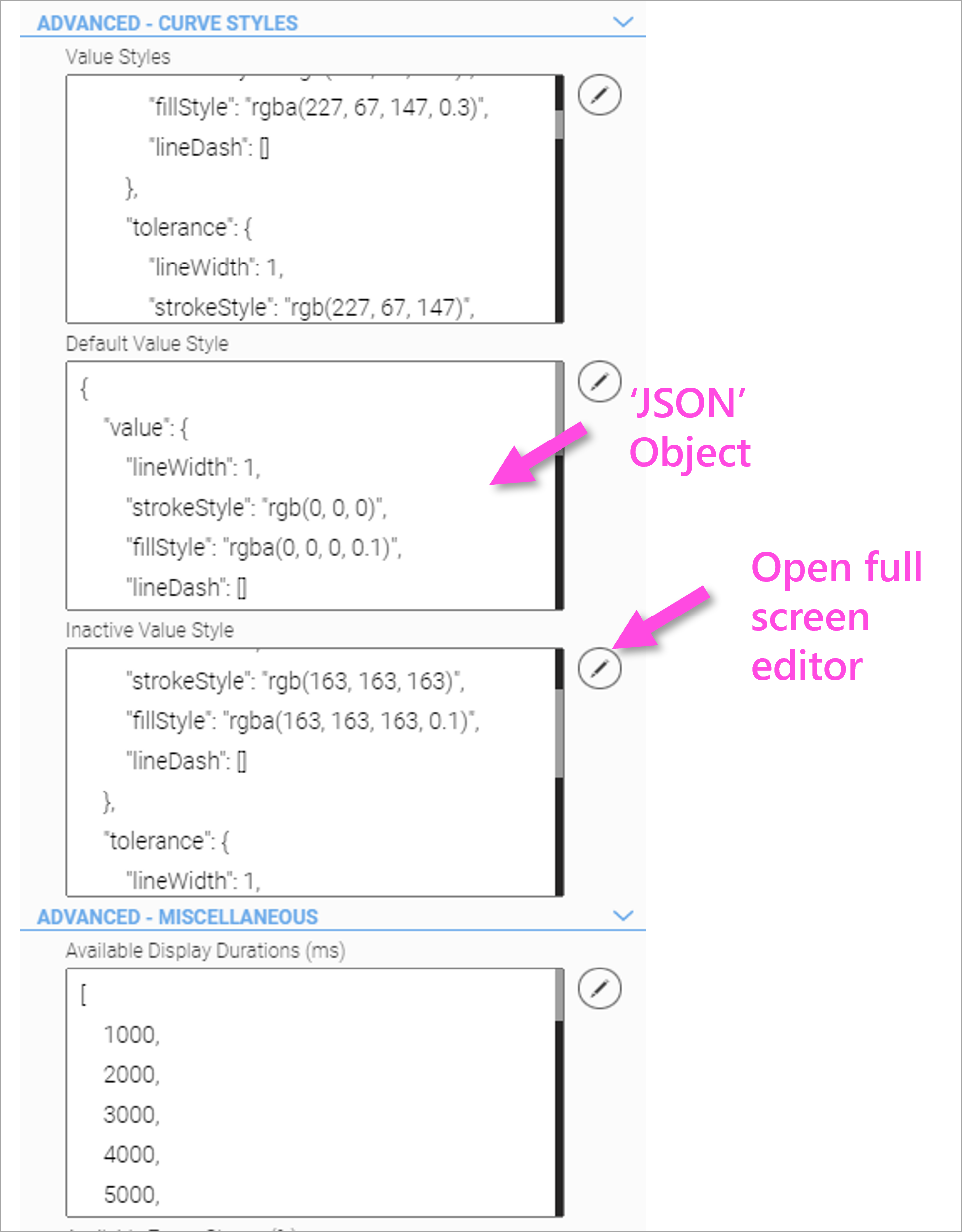
Value Styles
Array of possible selectable value styles; this option configures available styles for the displayed value graphs.
-
Type \{object[]}
-
Element Properties:
-
value - {object} - settings for "value" line displaying item value
-
lineWidth - {number} - line width in pixels
-
strokeStyle - {string} - line color
-
fillStyle - {string} - fill color below graph line (if fillCurve is enabled)
-
lineDash - \{number[]} - line dash steps (empty array to disable line dashes)
-
-
tolerance - {object} - settings for "tolerance" line displaying item tolerances (if drawTolerance is enabled)
-
lineWidth - {number} - line width in pixels
-
strokeStyle - {string} - line color
-
lineDash - \{number[]} - line dash steps (empty array to disable line dashes)
-
-
Default Value Styles
This option defines the line style used if none (or no existing) is configured for a displayed value graph.
-
Type {object}
-
Element Properties:
-
value - {object} - settings for "value" line displaying item value
-
lineWidth - {number} - line width in pixels
-
strokeStyle - {string} - line color
-
fillStyle - {string} - fill color below graph line (if fillCurve is enabled)
-
lineDash - \{number[]} - line dash steps (empty array to disable line dashes)
-
-
tolerance - {object} - settings for "tolerance" line displaying item tolerances (if drawTolerance is enabled)
-
lineWidth - {number} - line width in pixels
-
strokeStyle - {string} - line color
-
lineDash - \{number[]} - line dash steps (empty array to disable line dashes)
-
-
Inactive Value Style
This option has the same object structure as above (Default Value Style) and defines the curve style the 'grayed out' curve style when a curve is selected via the 'Trend Legend' widget. All other curves then get this style, which can be changed here (see greyed out curves).
{
    "value": {
        "lineWidth": 1,
        "strokeStyle": "rgb(163, 163, 163)",
        "fillStyle": "rgba(163, 163, 163, 0.1)",
        "lineDash": []
    },
    "tolerance": {
        "lineWidth": 1,
        "strokeStyle": "rgb(163, 163, 163)",
        "lineDash": [
            5,
            5
        ]
    }
}
Available Display Durations
This option configures display durations available for x-axis zoom. Values are in ms and represent the time from left to right of graph.
Available Zoom Stages
This option configures zoom stages available for y-axis zoom. Values are in percent and must be greater than or equal to 100.
Timeline Marker Formats
This option configures timeline marker formats available for different durations. A matching format is chosen based on the displayed duration.
-
Type
\{object[]} -
Element properties:
-
unit - {number} - marker distance unit in ms.
-
format - {string} - date-/time-format for marker label
-
Comment Button Configuration
This option contains the complete configuration of the IQ Button widget created in the trend handle to create comments if Show Trend Comments has been enabled. Change class name and template to use a customized button layout here.
16.5. 'Trend Legend' Widget
The 'Trend Legend' widget is a companion widget and can only be used together with a Trend widget instance. To establish a link between the two, an instance of the associated Trend widget must be selected in the configuration of the Trend Legend.
The Trend Legend widget is used to display a colored symbol, label text and unit for each process data tag. Furthermore, individual curves can be highlighted if the user clicks or touches on them. The remaining curves are greyed out for better clarity. By clicking on the symbol again the original display will be restored.
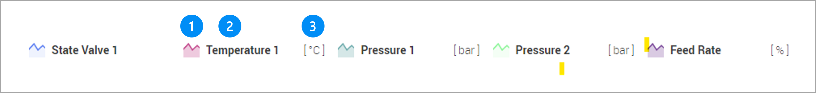
LEGEND
-
Line segment according to the color of the Trend Curve
-
Localized name or alias of the Trend Curve
-
Unit of the Trend Curve
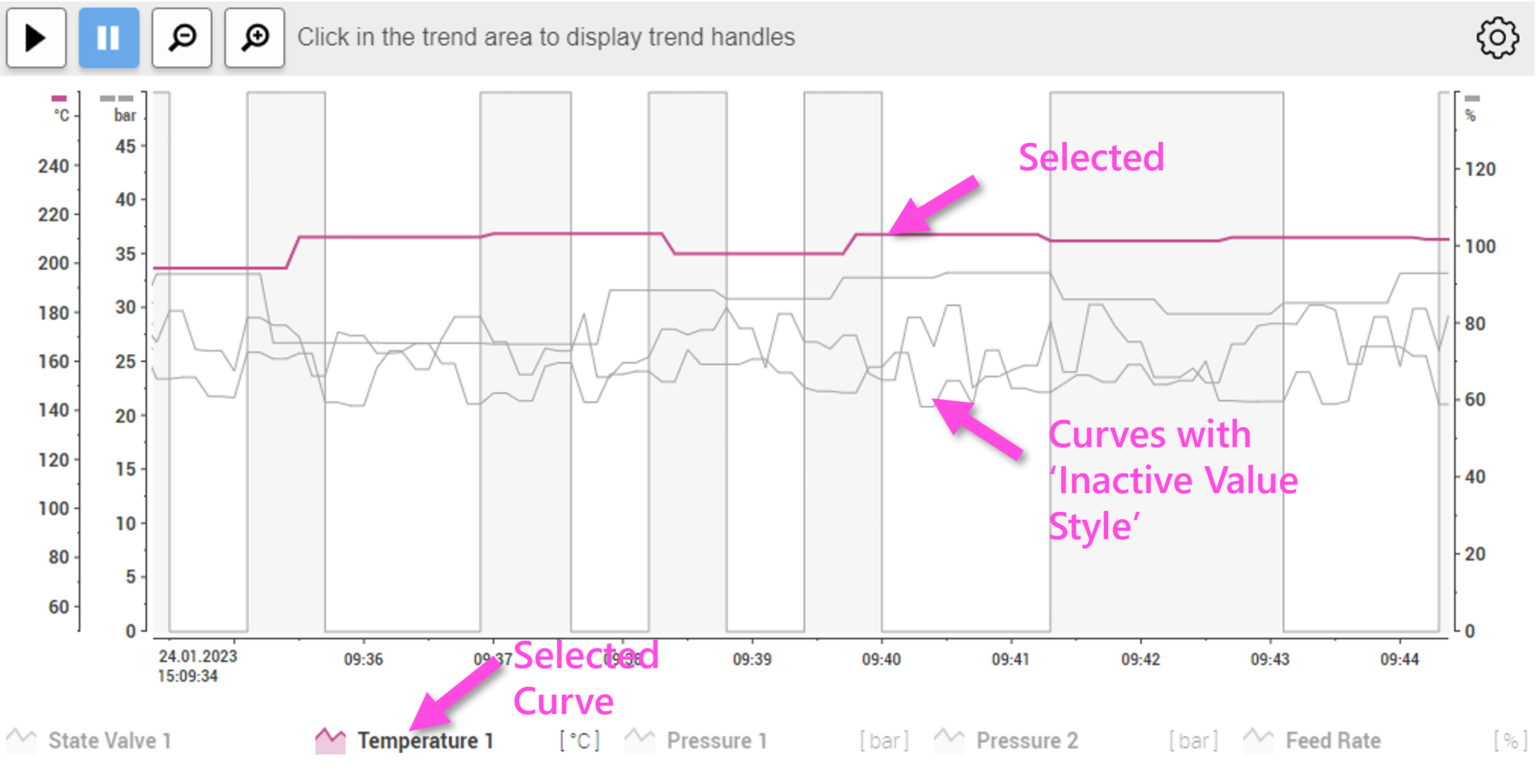
Trend Legend' Configuration
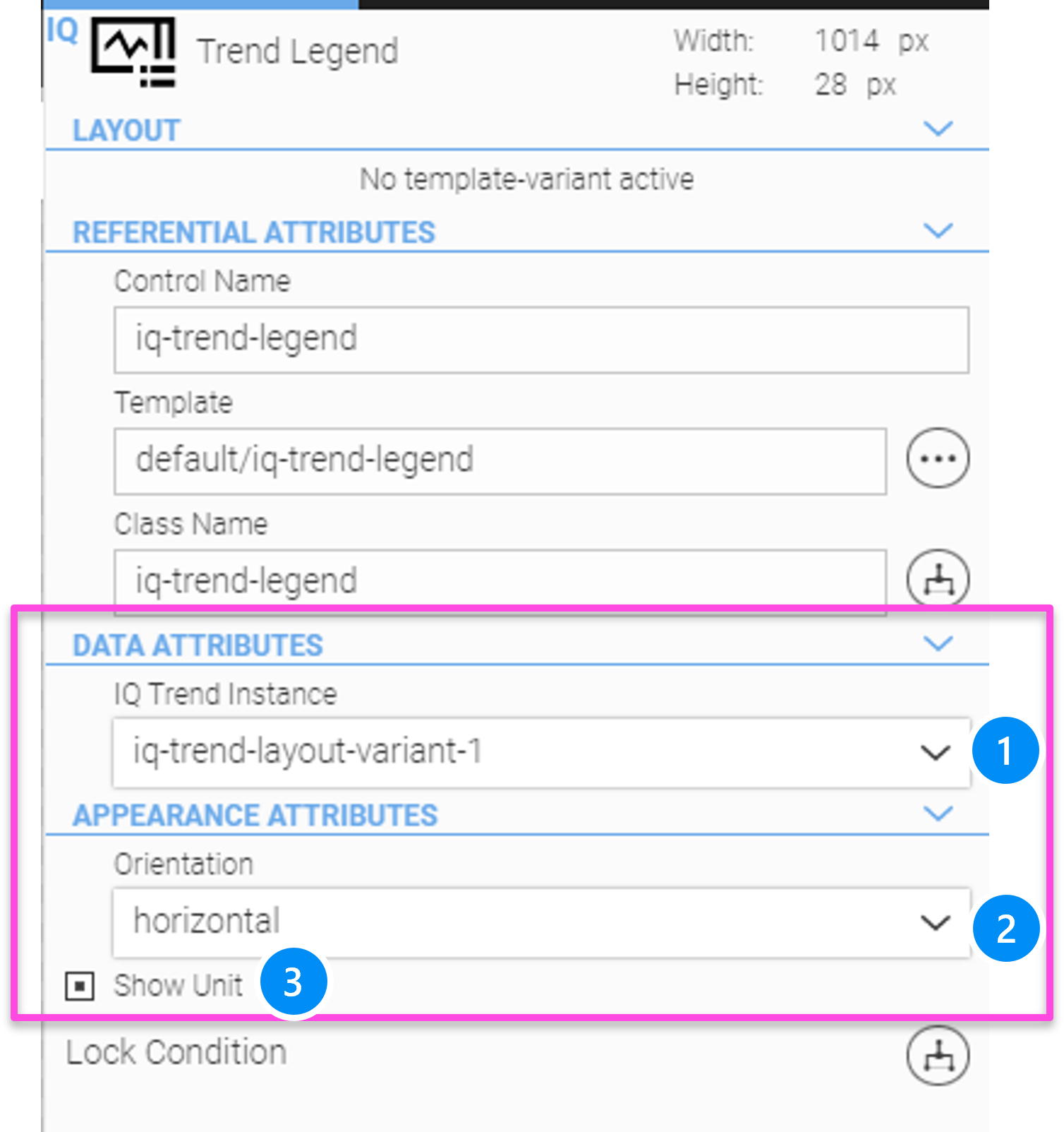
LEGEND
-
Select the corresponding Trend widget
-
Orientation horizontal or vertical
-
Display units
16.6. 'Trend Live' Widget
The 'Trend Live' widget is a companion widget and can only be used together with a Trend widget instance. To establish a link between the two, an instance of the associated Trend widget must be selected in the configuration of the Trend Live.
The Trend Live is used to toggle between pause and live data display.
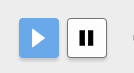
-
 : switches the Trend into the live mode
 -
 : stops the Trend on the current position (disabled live mode)
Trend Live Configuration
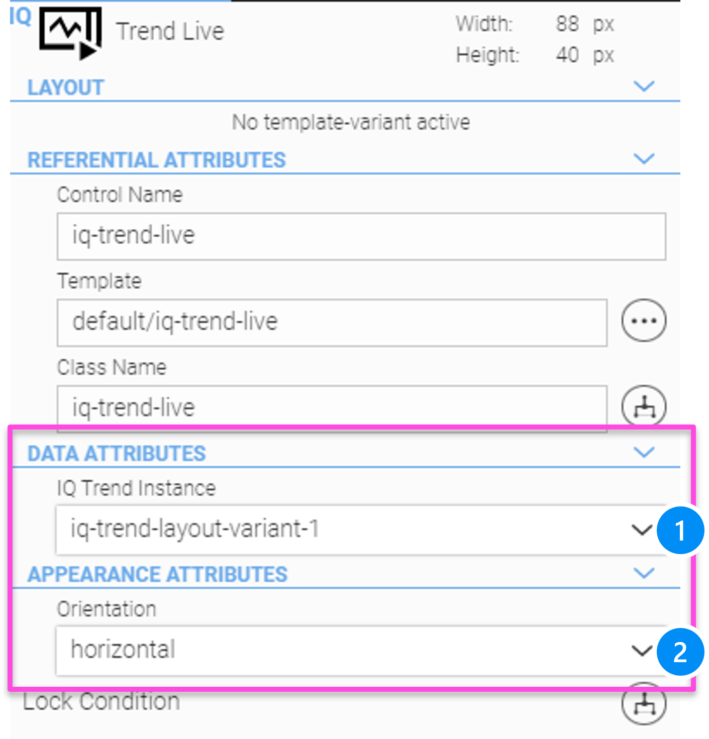
LEGEND
-
Select the corresponding Trend Widget
-
Choose the orientation horizontal/vertical
|
Shift+Click or touch with two fingers on graph area starts/stops live mode if enabled |
16.7. Trend Time Widget
The 'Trend Time' widget is a companion widget and can only be used together with a Trend widget instance. To establish a link between the two, an instance of the associated Trend widget must be selected in the configuration of the Trend Time widget.
Trend Time allows the HMI user to enter a time period for displaying trend data. Depending on the configuration setting, the start time and duration can be specified, or alternatively start time and end time.
If a time period has been entered, the live mode will be stopped at the same time.
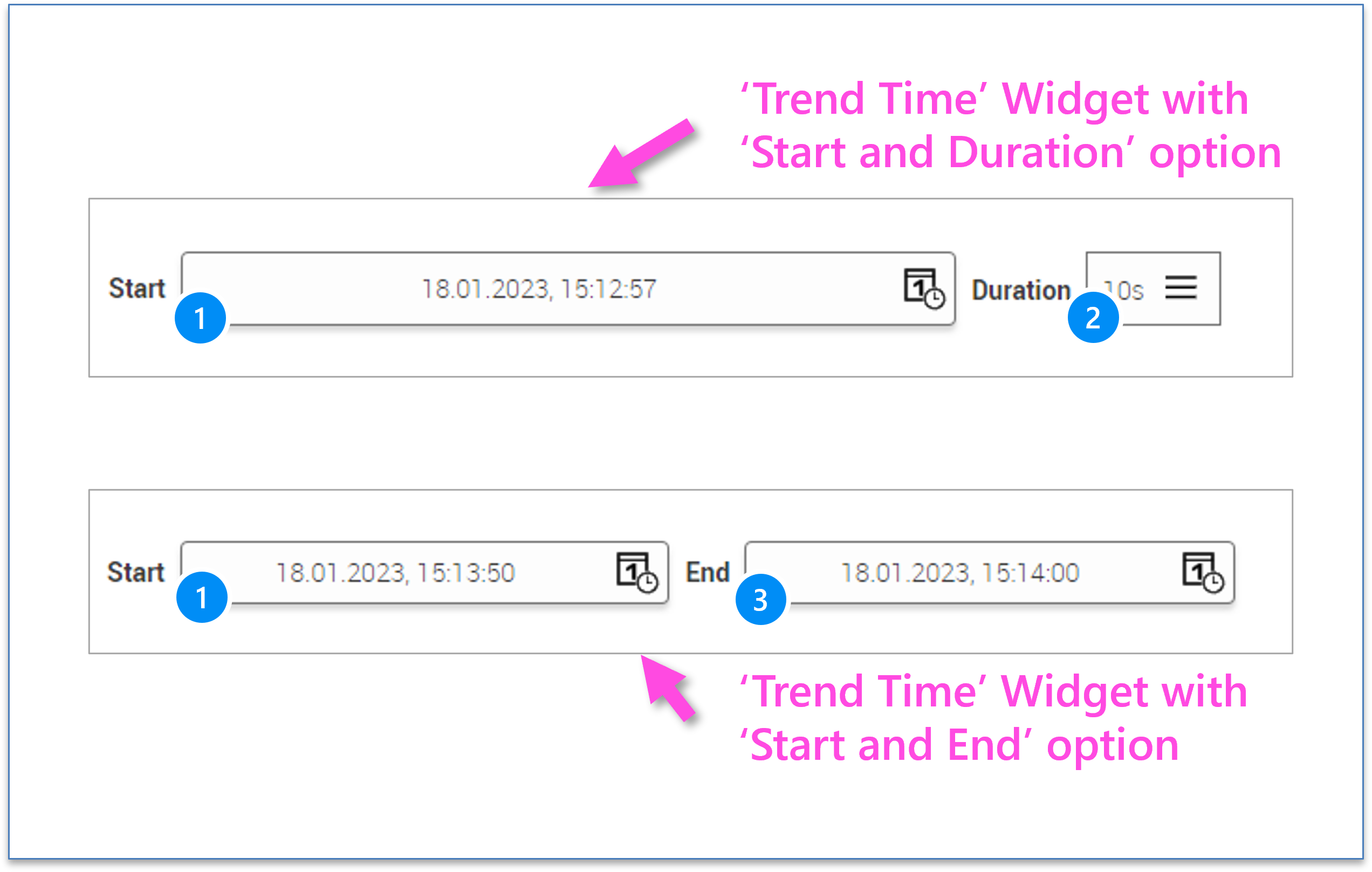
LEGEND
-
Start Time for trend display (defined by a date and a time)
-
Dropdown for seleting the duration of the timeline to specific value like 1s, 5s, 10s, 1m, 10m 1h, 2h, 4h, 8h, 12h, 1d, 1w etc.
-
Alternatively, enter the end time (time and date)
Trend Time Configuration
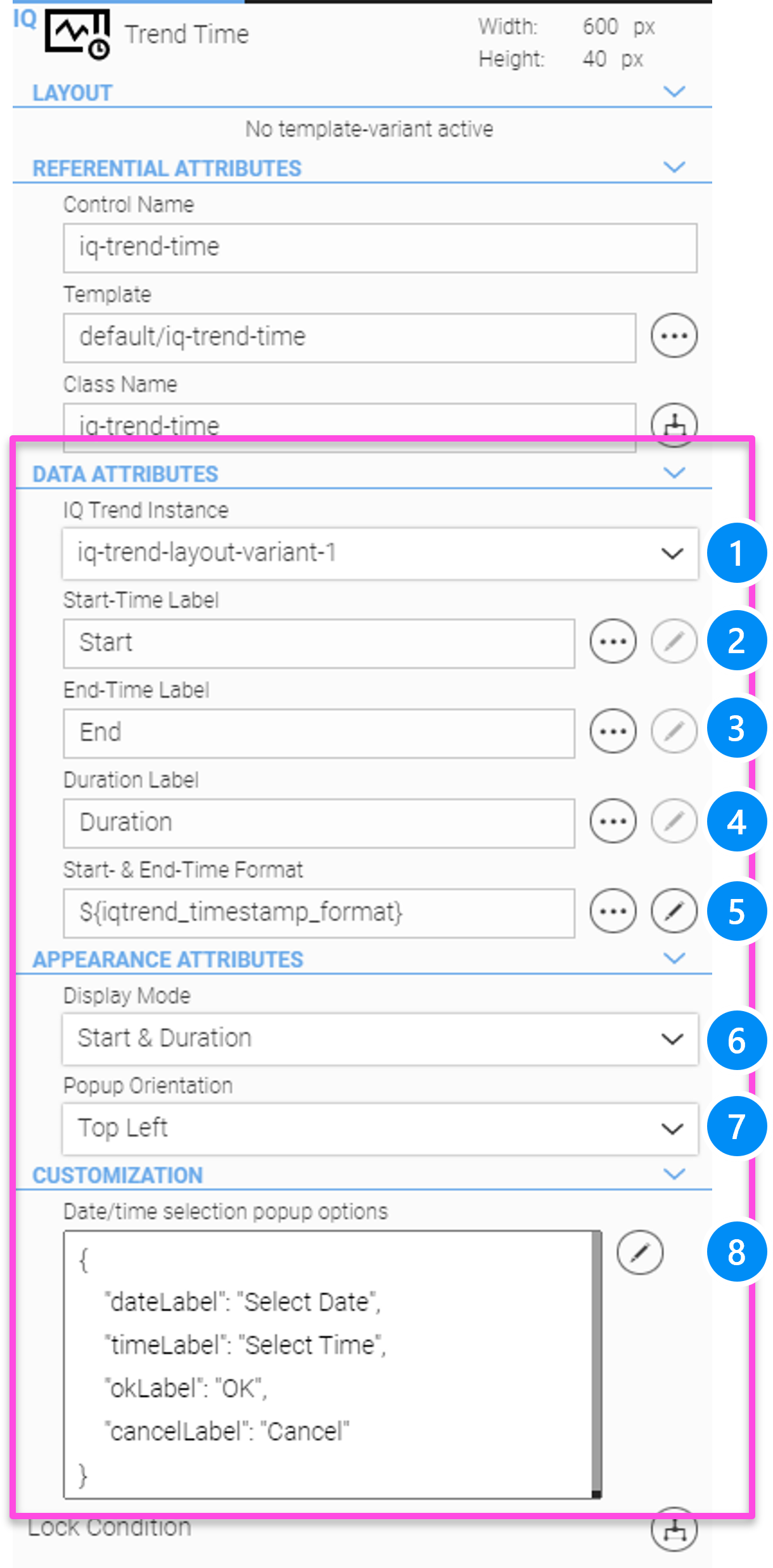
LEGEND
-
Select the corresponding Trend Widget
-
Label of the start button
-
Label of the end button (if display mode start & end)
-
Label of the duration button (if display mode start & duration)
-
Localizable time format of start and stop button
-
Display Mode 'Start & Duration' or 'Start & Stop'
-
Orientation of the time & date overlay
-
JSON configuration for all text labels of the time & date overlay
16.8. Trend Zoom Widget
The 'Trend Zoom' widget is a companion widget and can only be used together with a Trend widget instance. To establish a link between the two, an instance of the associated Trend widget must be selected in the configuration of the Trend Zoom.
With the Trend Zoom you can scale both the timeline and the value scale. The available zoom levels can be modified in the configuration of the trend widget (Advanced Miscellaneous). It offers the following features:
-
 : zooms in
 -
 : zooms out
Trend Zoom Configuration
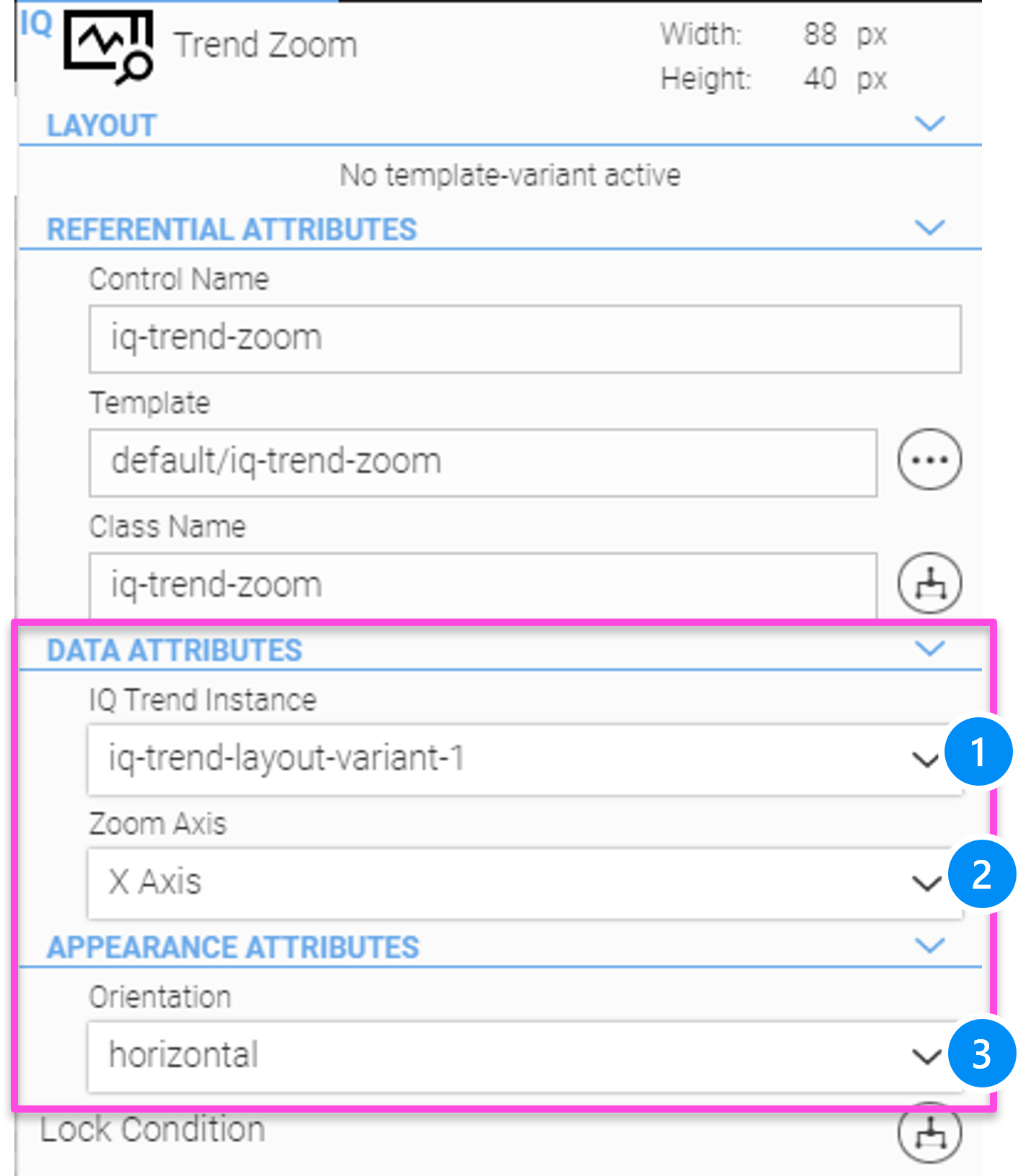
LEGEND
-
Select the corresponding Trend widget
-
Choose zoom for x- or y-axis
-
Choose the orientation horizontal/vertical
16.9. Trend Select Widget
The 'Trend Select' widget is a companion widget and can only be used together with a Trend widget instance. To establish a link between the two, an instance of the associated Trend widget must be selected in the configuration of the Trend Select.
The Trend Select widget allows the user to show and hide trend curves or to change their style, scaling and value axes at runtime.
All process data variables that have been defined in the data recorder definition in the 'Trend' grouping will be displayed in a list. The process data can be selected and unselected here and the settings can be modified using the edit button, which opens the curve settings popup menu.
All settings made by the operator during operation can be stored on the current device (i.e. web browser), if this option has been selected in the Trend widget configuration.
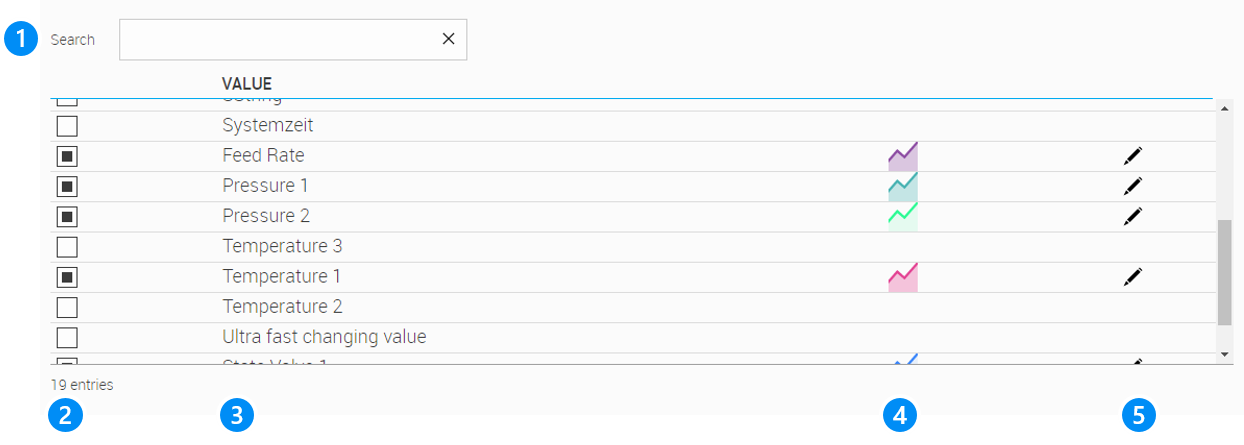
LEGEND
-
Search filter for the name (alias) of the process data tags. Use '_' as wildcard for single character and '%' as wildcard for multiple characters.
-
Show/hide a trend curve for displaying
-
Localized name or alias of the trend curve
-
Display color icon of the trend curve
-
Opens the curve settings of the trend curve: See Configuration of Curve Group see next paragraph
|
The curve settings such as colour etc. are saved, even if the curve in the trend select widget has been deactivated in the meantime and then activated again. |
Trend Select Configuration
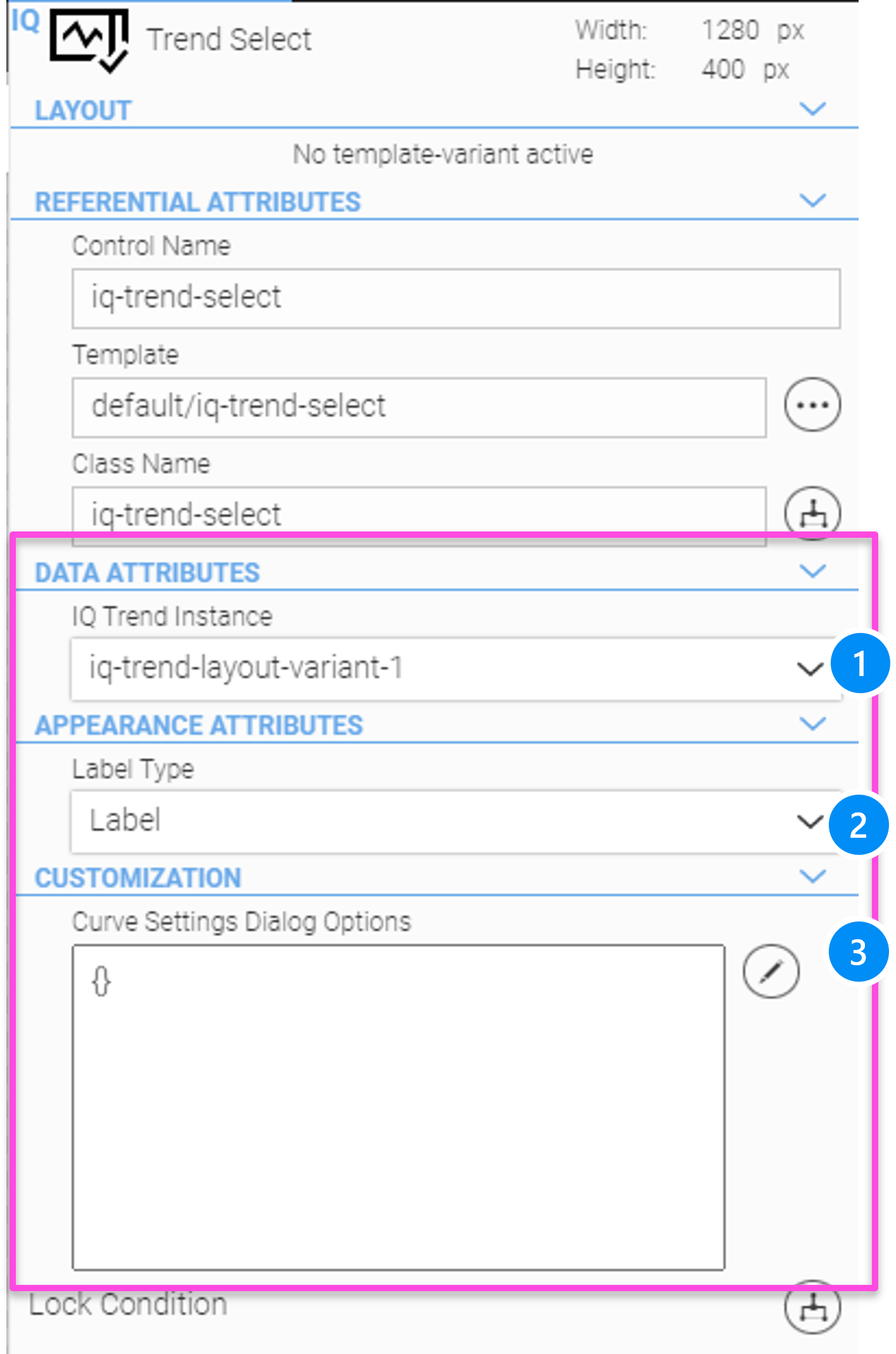
LEGEND
-
Select the corresponding Trend widget
-
Label Type: 'Alias' or label attribute of the process data tag
-
Curve Settings dialog options (templates and CSS classes for curve group dialog)
16.10. Trend Set Select Widget
The 'Trend-Set-Select' widget is used to define curve groups as sets, to save and select them easily. There are default curve sets that can be defined in WebIQ Designer during configuration, and curve sets that can be defined by the user at runtime.
The 'Trend-Set-Select' widget provides the following functions:
-
Select a curve set to be displayed easily
-
Add and edit system curve sets as defaults
-
Add, save, rename, delete of user defined curve sets
-
Store user defined curve sets in the device storage or user specific
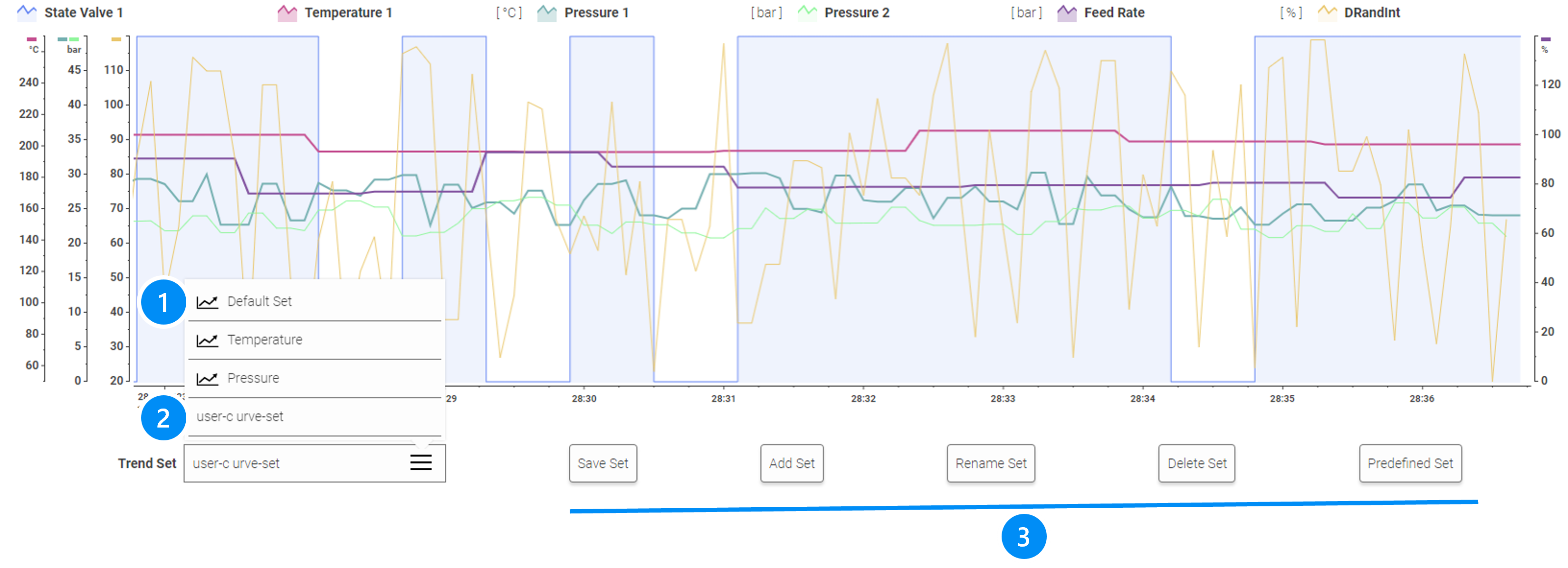
LEGEND
-
Fixed curve sets marked by the icon
-
User-defined curve sets (without icon)
-
Example of buttons with UI Actions for 'Save', 'Add', 'Rename', 'Delete', Predefined (Curve set specified within UI Action)
|
Fixed sets cannot be deleted, renamed or saved from inside the HMI, only from inside WebIQ Designer |
Trend Set Select Configuration
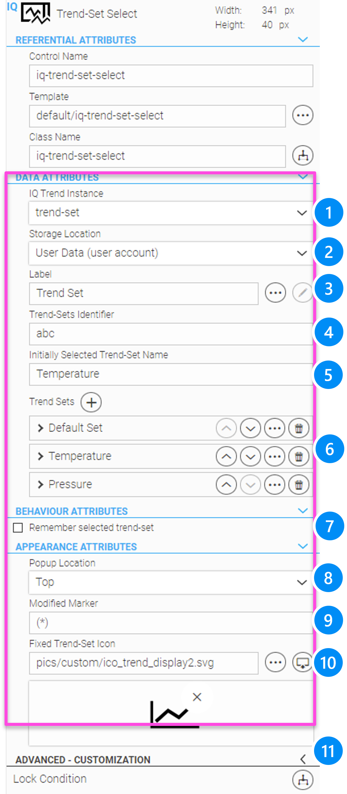
LEGEND
-
Select the corresponding Trend widget
-
Choose the storage location for user trend sets: Device storage or user data
-
Label
-
Identifier used to save trend set (e.g. if you have multiple trend-set-select instances)
-
Name of the trend set which will be initially selected
-
Predefined (fixed) trend sets
-
Save & Restore selected trend set, if the user changes the screen view and returns later
-
Popup location Top or Bottom, where to open the select-box of the widget
-
Text prefix in user trend sets, when modified but not saved yet
-
Icon displayed in front of fixed trend-sets
-
Optional for advanced users: Change the class name and template for the select-box widget. This is used for customized solutions, but requires programming skills.
A detailed description of the associated UI actions, as contained in the above example, can be found in the Using UI-Actions chapter.
16.11. Curve Group Settings
This popup menu is called when configuring trend curves in the trend configuration panel, as well as at runtime when you configure curves in the trend select widget.
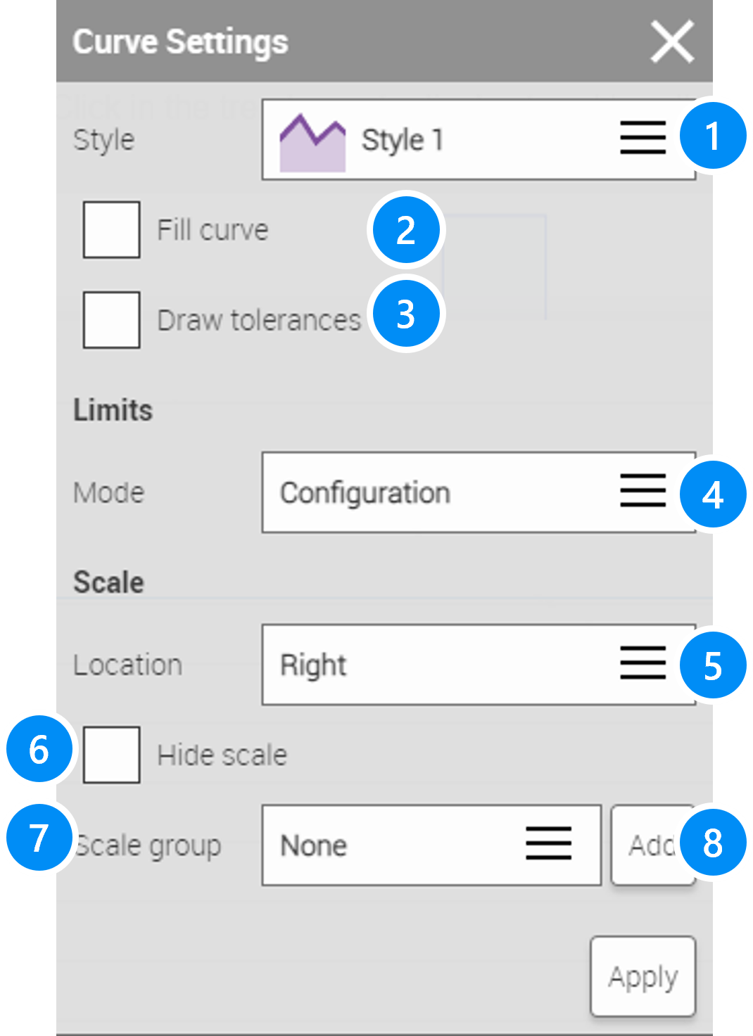
LEGEND
-
Dropdown list to select the style (color and line type) of the curve
-
Enable fill curve option
-
Show tolerances (must be defined in the Process Data Manager area see chapter Process Data Manager advanced area
-
Configure Limits configuration either:
-
Manual values
-
Automatically through the displayed values
-
In Process Data Manager configured limits. This could be absolute or relative limits in %, either value numbers or variables (see chapter Process Data Manager advanced area
-
-
Display scale on the left or right side
-
Hide scale
-
Select a scale group for this trend curve, for example, several curves with temperatures, pressures, etc., which all have the same unit and value range, can be combined into a single scale group.
-
Add new scale group
16.12. Exporting Historian Trend Data
A UI Action can be used to export historian trend data from a reference Trend widget into a JSON file. You can add this UI action to a button for example, so that when you click on it, the dialog for selecting the start and time point will be opened.
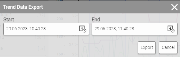
A detailed description of the associated UI actions, as contained in the above example, can be found in the Using UI-Actions chapter.
16.13. Advanced CSS Styling Options
All styling options of the trend widgets are defined as CSS variables. The following list shows all of these variables:
Trend Widget
--loading-indicator-color: #4C4848;
--scale-width: 44px;
--scale-marker-width: 6px;
--scale-color: rgb(22, 25, 32);
--timeline-height: 44px;
--timeline-marker-height: 6px;
--timeline-color: rgb(22, 25, 32);
--trend-marker-line-color: rgb(22, 25, 32);
--trend-marker-line-active-color: #0078CA;
--trend-marker-line-width: 1px;
--trend-marker-icon-color: rgb(22, 25, 32);
--trend-marker-icon-active-color: #0078CA;
--trend-marker-icon-background-color: rgb(255, 255, 255);
--trend-marker-info-background-color: #ECF0F4;
--trend-marker-info-height: 138px;
--trend-marker-info-width: 400px;
--trend-marker-info-close-color: #00325A;
--trend-marker-info-close-size: 16px;
--trend-marker-title-font-size: 14px;
--trend-marker-title-font-family: RobotoLight;
--trend-marker-title-line-height: initial;
--trend-marker-title-font-weight: bold;
--trend-marker-title-color: #000F1A;
--trend-marker-text-font-size: 14px;
--trend-marker-text-font-family: RobotoLight;
--trend-marker-text-line-height: initial;
--trend-marker-text-font-weight: initial;
--trend-marker-text-color: #000F1A;
--trend-marker-user-font-size: 14px;
--trend-marker-user-font-family: RobotoBold;
--trend-marker-user-line-height: initial;
--trend-marker-user-font-weight: initial;
--trend-marker-user-color: #51697F;
--trend-marker-timestamp-font-size: 14px;
--trend-marker-timestamp-font-family: RobotoLight;
--trend-marker-timestamp-line-height: initial;
--trend-marker-timestamp-font-weight: bold;
--trend-marker-timestamp-color: #899BAB;
--line-color: rgb(0, 0, 0);
--scale-label-font-size: 12px;
--scale-label-font-family: RobotoBold;
--scale-label-color: #3C3C3C;
--unit-info-font-size: 10px;
--unit-info-font-color: rgb(134, 155, 172);
--unit-info-font-family: RobotoBold;
--timeline-start-font-size: 10px;
--timeline-start-time-line-height: 12px;
--timeline-start-time-font-color: rgb(0, 15, 26);
--timeline-start-time-font-family: RobotoBold;
--timeline-start-date-line-height: 14px;
--timeline-start-date-font-color: rgb(255, 255, 255);
--timeline-start-date-font-family: RobotoLight;
--timeline-start-date-background-color: rgb(0, 15, 26);
--timeline-label-font-size: 10px;
--timeline-label-font-family: RobotoBold;
--timeline-label-color: #3C3C3C;
--handle-width: 120px;
--handle-background-color: rgba(134, 155, 172, 0.5);
--handle-focused-background-color: rgba(134, 155, 172, 0.9);
--handle-close-button-color: #00325A;
--handle-close-button-size: 16px;
--handle-marker-width: 2px;
--handle-marker-color: rgb(0, 15, 26);
--handle-drag-background-color: rgb(0, 15, 26);
--handle-drag-marker-color: rgb(255, 255, 255);
--handle-data-box-background-color: rgb(245, 247, 249);
--handle-data-label-background-color: rgb(226, 232, 237);
--handle-date-font-size: 12px;
--handle-date-font-family: RobotoBold;
--handle-date-color: #3C3C3C;
--handle-date-line-height: 14px;
--handle-time-font-size: 12px;
--handle-time-color: #3C3C3C;
--handle-time-font-family: RobotoBold;
--handle-time-line-height: 14px;
--handle-label-font-size: 12px;
--handle-label-line-height: 14px;
--handle-label-font-family: RobotoBold;
--handle-label-color: #3C3C3C;
--handle-value-font-size: 18px;
--handle-value-line-height: 20px;
--handle-value-font-family: RobotoBold;
--handle-value-color: #3C3C3C;
--handle-unit-font-size: 12px;
--handle-unit-line-height: 14px;
--handle-unit-font-family: RobotoBold;
--handle-unit-color: #3C3C3C;
Trend Select
--table-row-height: 28px;
--table-header-font-size: 16px;
--table-header-font-family: RobotoMedium;
--table-header-color: #3C3C3C;
--table-search-label-font-size: 14px;
--table-search-label-font-family: RobotoLight;
--table-search-label-color: #3C3C3C;
--table-search-value-font-size: 14px;
--table-search-value-font-family: RobotoLight;
--table-search-value-color: #3C3C3C;
--table-text-font-size: 18px;
--table-text-font-family: RobotoLight;
--table-text-color: #3C3C3C;
--table-checkbox-size: 20px;
--table-checkbox-handle-size: 10px;
--table-sort-icon-url: url(../pics/system/controls/complex-table2/arrow_up_black.svg);
--table-config-icon-url: url(../pics/system/controls/iq-trend-select/edit-dark.svg);
Trend Legend
--icon-size: 20px;
--icon-margin: 8px;
--element-gap: 8px;
--element-padding: 4px;
--label-font-size: 14px;
--label-font-family: RobotoBold;
--label-font-weight: initial;
--label-color: #3c3c3c;
--label-margin: 8px;
--unit-font-size: 14px;
--unit-font-family: RobotoLight;
--unit-font-weight: initial;
--unit-color: #3c3c3c;
--inactive-opacity: 0.5;
Trend Live
--button-background-color: #fdfdfd;
--button-border-color: rgba(60, 60, 60, 0.7);
--button-border-width: 1px;
--button-border-radius: 4px;
--button-shadow-color: rgba(60, 60, 60, 0.2);
--button-icon-color: #000000;
--button-hover-border-color: #00ABF0;
--button-active-background-color: #00ABF0;
--button-active-border-color: #00ABF0;
--button-active-icon-color: #ffffff;
--button-active-hover-border-color: #ffffff;
--button-margin: 8px;
--button-initial-size: 40px;
--icon-size: 24px;
--locked-opacity: var(--iq-locked-opacity);
Trend Time
--button-background-color: #fdfdfd; --button-border-color: rgba(60, 60, 60, 0.7); --button-border-width: 1px; --button-border-radius: 4px; --button-shadow-color: rgba(60, 60, 60, 0.2); --button-icon-color: #000000; --button-margin: 8px;
--button-label-font-size: 14px;
--button-label-font-family: RobotoLight;
--button-label-color: #3C3C3C;
--button-label-font-weight: initial;
--button-label-hover-color: #ffffff;
--button-hover-background-color: #00ABF0;
--button-hover-icon-color: #ffffff;
--button-hover-border-color: #00ABF0;
--icon-size: 24px;
--locked-opacity: var(--iq-locked-opacity);
--label-font-size: 14px;
--label-font-family: RobotoBold;
--label-color: #3C3C3C;
--label-font-weight: initial;
--popup-label-font-size: 14px;
--popup-label-height: 20px;
--popup-label-font-family: RobotoBold;
--popup-label-color: #3C3C3C;
--popup-label-font-weight: initial;
--popup-background-color: #ffffff;
--date-button-color: #3C3C3C;
--date-header-font-family: RobotoLight;
--date-header-font-size: 16px;
--date-header-font-weight: initial;
--date-header-color: #3C3C3C;
--date-days-font-family: RobotoLight;
--date-days-font-size: 16px;
--date-days-font-weight: initial;
--date-days-color: #B1B1B1;
--date-calendar-font-family: RobotoLight;
--date-calendar-font-size: 16px;
--date-calendar-font-weight: initial;
--date-calendar-color: #3C3C3C;
--date-separator-color: #000000;
--date-calendar-inactive-color: #CACACA;
--date-calendar-highlight-background-color: #00ABF0;
--date-calendar-highlight-color: #ffffff;
--input-background-color: #fdfdfd;
--input-color: #3C3C3C;
--input-font-size: 14px;
--input-font-family: RobotoLight;
--input-font-weight: 400;
--input-selection-color: #ffffff;
--input-selection-background-color: #00ABF0;
--time-icon-up: url(../pics/system/controls/iq-select-time/arrow_up_black.svg);
--time-icon-up-highlight: url(../pics/system/controls/iq-select-time/arrow_up_white.svg);
--time-icon-down: url(../pics/system/controls/iq-select-time/arrow_down_black.svg);
--time-icon-down-highlight: url(../pics/system/controls/iq-select-time/arrow_down_white.svg);
--duration-select-box-icon: url(../pics/system/controls/iq-select-box/menu_icon.svg);
Trend Zoom
--button-background-color: #fdfdfd;
 --button-border-color: rgba(60, 60, 60, 0.7);
 --button-border-width: 1px;
 --button-border-radius: 4px;
 --button-shadow-color: rgba(60, 60, 60, 0.2);
 --button-icon-color: #000000;
--button-hover-background-color: #00ABF0;
--button-hover-icon-color: #ffffff;
--button-hover-border-color: #00ABF0;
--button-margin: 8px;
--button-initial-size: 40px;
--icon-size: 24px;
--locked-opacity: var(--iq-locked-opacity);
17. Recipes Manager And Recipe Widgets
This chapter describes how to use the recipe manager to define recipe templates and the recipe widgets: recipe select or recipe list, recipe controller and recipe edit.
The recipe system is used to store machine- or production relevant setting parameters for the later reuse. For this purpose, current process- and status values (items) can be saved from the PLC in a recipe ("capture") or later written back from the recipe to the PLC ("apply").
The recipe system is based on templates which define the PLC variables to be saved and restored back by the recipe and additional metadata.
Template |
Designation |
Description |
Template 1 |
Machine configuration |
Saves all values of a machine configuration |
Template 2 |
Article |
Saves all values of machine setting to produce a specific product |
Template 3 |
Palletizer |
Saves all values of machine setting for a device or part of the machine |
The use of recipes in the WebIQ system consists of the following components:
Recipe Template Manager:
Define Recipe Templates, i.e. Items to be saved and freely definable meta information.
The meta information contains additional information to describe the recipe, e.g. to identify a particular article
like art.no., production notes etc.
Recipe Widgets:
within the HMI application:
Recipe-Select: The user can select a recipe by name, e.g. for the production of a particular article.
Recipe-Controller: The user can select certain actions for the selected recipe set:
-
Capture (read values from the PLC)
-
Apply (write values to the PLC)
-
Edit (edit values in the recipe-edit widget)
-
New (create new recipe and capture values)
-
Duplicate (duplicate existing recipe with new name)
Recipe-Edit: Automatically generated table form for displaying and editing recipe items and metadata.
Any number of recipe templates can be used in a HMI application and each template is able to store any number of data records as recipes.
17.1. Define Recipe Templates
Recipe Templates consists of a unique name and definable metadata, which are used to document and describe the product represented by the recipe, as well as a list of items which are exchanged with the PLC when loading or saving a recipe.
To define a recipe template click the icon  on the launch bar.
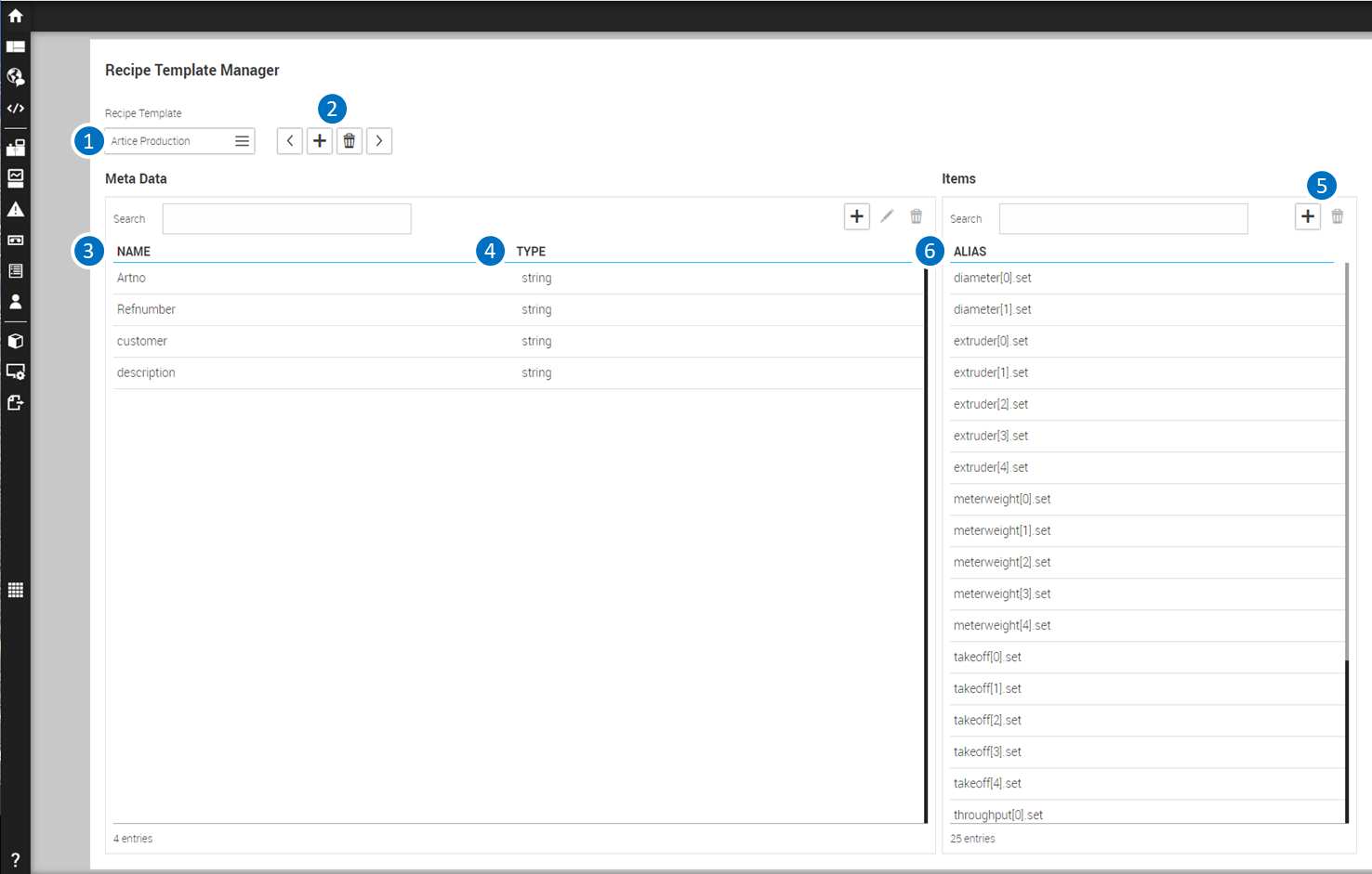
Legend
1 Selected Recipe template 2 Navigate through Recipe templates, add a new template or delete a template 3 Name of Meta Data item 4 Type of Meta Data item 5 Add, edit or delete Meta Data item 6 Add or delete item 7 List of used items of the selected recipe
17.2. Recipe widgets
Once a recipe template has been defined, recipes based on this template can be used in the HMI by applying the appropriate recipe widgets:
17.2.1. Recipe Select Widget and Recipe Table Widget
Serves to select a recipe. The recipe-select widget works as a select box with auto-complete, so the recipe you want can be easily found.
As an alternative the Recipe Table widget can be used for recipe selection from V2.11. The functionality is similar, but all existing recipes are displayed in a scrollable list. The Recipe-Table Widget has a search field for quick search of recipe names with wildcards ('_' single character, '%' multiple characters).
The other widgets, Recipe Controller and Recipe Edit, require a reference to the Recipe Select widget within the application, as their function has to refer to a selected recipe. The configuration settings of the Recipe Select widgets are done like as for all controls within the Configuration Cockpit on the right side.
Details about the configuration and styling of the recipe widgets can be found in the overview of the widgets
17.2.2. Recipe Controller Widget
This widget provides functionality for editing, loading and saving recipes. The Recipe Controller widget consists of buttons with individual functions for the operation of the HMI:
Add: Creates a new recipe and saves the current process variables (capture)
Duplicate: Duplicates an already saved recipe to a new name
Remove: Deletes the selected recipe
Edit: Edit mode of a referenced Recipe Edit widget, the recipe values and meta data can be edited and saved into the recipe. They will not be applied to the PLC!
Capture: Saves the current process image as a new version of the recipe. If no recipe is selected, Capture creates a new recipe. In this case the user is prompted to insert the new name.
Apply: Loads the selected recipe into the process image of the PLC.
Each of these buttons can be shown or hidden via the configuration. The Recipe Controller widget requires a reference to a Recipe Select widget because a recipe must be selected before applying a function. The configuration settings of the Recipe Select widgets are done like as for all controls within the Configuration Cockpit on the right side.
Details about the configuration and styling of the recipe widgets can be found in the overview of the widgets
17.2.3. Recipe Edit Widget
This widget provides functions for editing recipes. The widget displays all metadata as well as process values (items) in tabular form. Via the button "Edit" (of a corresponding recipe-controller widget), all values within the table grid can be edited and the modifications are stored by pressing the „apply”- button at the end of the edit table. By pressing the “cancel” button the modifications are discarded.
|
The reference for the Recipe Edit widget to the Recipe Select and Recipe Controller: is given by the configuration settings of the _Recipe Controller! |
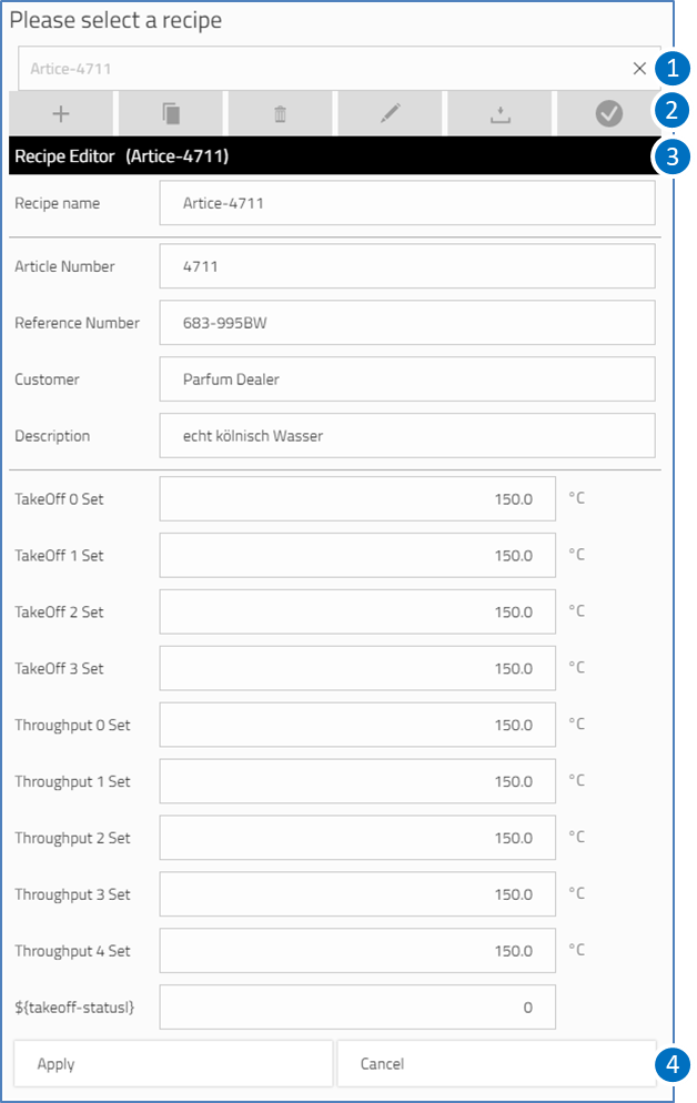
LEGEND
1 Recipe-Select widget to select a recipe
2 Recipe-Controller to select options
3 Recipe-Edit widget table editor
4 Apply/ Cancel buttons
Details about the configuration and styling of the recipe widgets can be found in the overview of the widgets
17.2.4. UI Actions For Recipes
Some actions of the Recipe Controller widget are also available as UI actions, so you can use them alternatively with buttons:
recipe-add
recipe-apply
recipe-capture
(see also Use UI-Actions)
18. Package Manager
This chapter describes in detail how you can extend and manage WebIQ Designer with additional features like widgets, themes and starter HMI projects (project templates).
18.1. Function of the Package Manager
WebIQ has an integrated package manager that can be used to add features and custom elements. The Package Manager has an integrated version control and is very well suited to add and update customer-specific features such as widgets, themes, templates and starter HMI projects (project templates) to your HMI project.
The 'Visual' package, which is installed by default for all HMI projects, contains the web framework from WebIQ (visuals.js or visuals.min.js) and the library with the WebIQ standard widgets (controls-bundle.js or controls-bundle.min.js). The update mechanism of the Package Manager also makes it possible to update any HMI project to a new version.
The Packages can contain any of the following types:
-
Widgets or Widgets libraries (package type "widgets")
-
Tthemes (package type "themes")
-
Custom stylings, custom templates (package type "templates")
-
Scripts and JavaScript modules (package type "scripts")
-
Images and Resources, e.g. Symbol and/ or icon libraries (package type "images")
18.2. View And Update Packages
Click the icon  in the 'Layout Manager'. Functions are:
-
See the installed packages, install-/ uninstall packages
-
Update the installed packages
-
Upload additional and/or custom packages
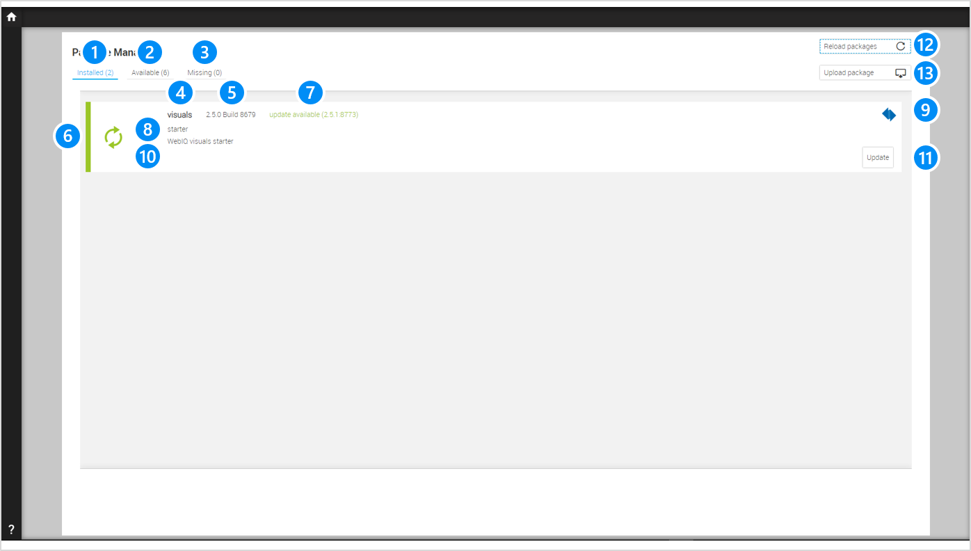
LEGEND 1 Tab With Installed Packages 2 Tab With Available Packages 3 Tab With Missing Packages 4 Name Of The Package 5 Version Of The Package 6 Status Of The Package (see below) 7 Status Message (only visible if the status is "Has-To-Be-Updated" or "Error") 8 Type Of The Package 9 Icon Of The Distributor Of The Package 10 Description Of The Package 11 Button "Update" (only visible if the status is "Has-To-Be-Updated") 12 Button "Reload packages" in order to reload the list of packages 13 Button "Upload packages" in order to upload additional / custom packages |
The package can have the following status
-
 The package is up-to-date
 -
 The package has to be updated
 -
 The package isn’t compatible or has an error, e.g. contains an element that is already contained in the HMI project
18.3. WebIQ Version update
If you have updated WebIQ to a newer version, your existing HMI projects must also be updated. This is done by updating the standard pre-installed "visuals" package.
When loading an HMI project based on an older WebIQ version, you will always be prompted to update it to the installed version. Editing projects created with a previous version of WebIQ is not possible with a later version of WebIQ Designer without updating them.
|
If you want to maintain HMI projects with different versions on your development system, you must have the different WebIQ Designer versions installed on your computer. You can find information about this in the MyWebIQ documentation area on our website under: 'Multiple Parallel Instances of WebIQ Designer'. |
18.4. Upload, Install and Uninstall Packages
On the tab "Available" or "Missing" you can upload and install additional packages. There you can
-
See the available or missing packages
-
Upload and install additional / custom packages
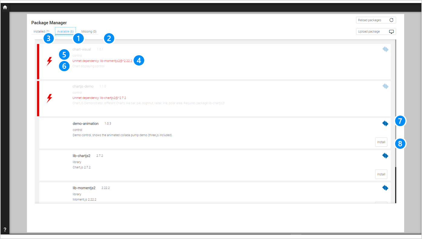
LEGEND 1 Name Of The Package 2 Version Of The Package 3 Status Of The Package (see below) 4 Status Message (only visible if the status is "Has-To-Be-Updated" or "Error") 5 Type Of The Package 6 Description Of The Package 7 Icon Of The Distributor Of The Package 8 Button "Install" (only visible if the status isn’t "Error"), Button "Uninstall", if the package is already installed. |
|
Uninstalling packages is only available from WebIQ version V2.11.1. Therefore, the "Uninstall" button only appears for packages installed with this or a later version of WebIQ. |
The package can have the following status
-
The package is up-to-date
-
The package isn’t compatible or has an error, e.g. contains an element that is already contained in the HMI project
Before you can add a package to your HMI project, you have to upload it first. Please proceed as follows if you want to upload and install an additional or a custom package:
-
Go to the Package Manager
-
Open tab "Available" or "Missing"
-
Press the button "Upload packages"
-
The file dialog appears
-
Select the additional/custom package (zip file)
-
Upload the desired package to the list of available packages
-
Press the button "Install" to install the corresponding package (WebIQ will install the package automatically if the package is missing).
|
Packages always come as a zip-file. The zip file may not be unpacked and/or changed. |
19. Simulate Process Values
This chapter describes in detail how you can simulate process values within the HMI/SCADA Toolbox WebIQ in order to evaluate or to demonstrate your web HMI without a connected PLC.
19.1. Simulation Server
WebIQ Server has a integrated internal variable server by default in order to simulate any process variables. You can use the functionality of the internal variable server in the Process Data Manager (see chapter simulation area) if you select internal as data source in the field IO Handler. In this case all parameters of the section SIMULATION can be used.
|
The content of the field IO Handler is case sensitive. As soon as you define an item with the internal variable server as data source, an internal variable is created in the server WebIQ Server. |
19.2. Functions And Parameters
WebIQ offers the following simulation functions
| FUNCTION | FORMULA | TYPE | PARAMETER | DESCRIPTION |
|---|---|---|---|---|
storage |
none |
All |
none |
Creates an internal variable that is used exclusively for storing a value (no simulation functionality) |
increment |
i=i+1 |
boolean |
none |
Generates an internal variable that is continuously incremented by the value 1 within a defined interval until the maximum value is reached. When the maximum value is reached, the variable returns to the minimum value. |
decrement |
i=i-1 |
boolean |
Generates an internal variable that is continuously decremented by the value 1 within a defined interval until the minimal value is reached. When the minimal value is reached, the variable returns to the maximum value. |
|
random |
i=random(min,max) |
boolean |
none |
Genrates an internal variable with a random value between minimum and maximun |
sine |
i=sin(t) |
double |
none |
Generates an internal variable that represents a sine between minimal and maximum value |
cosine |
i=cos(t) |
double |
none |
Generates an internal variable that represents a cosine between minimal and maximum value |
triangle |
i=triangle(t) |
boolean |
x = step width |
Generates an internal variable that represents a triangle function between minimal and maximum using x as increment/decrement for each step |
time |
i=system-time |
int |
none |
Generates an internal variable that contains the current system time (UNIX timestamp) |
lastalarm |
i=index(last-alarm) |
boolean |
none |
Generates an internal variable that contains the index of the latest active alarm. The boolean version of this function is true if an alarm is active. |
alarmcount |
i=#(current-alarms-with-group(g)) |
boolean |
p = g |
Generates an internal variable that contains the number of active alarms within one alarm group. The boolean version of this function is true if such an alarm is active. |
usercount |
i=#(current-clients) |
boolean |
none |
Generates an internal variable that contains the number of current clients. The boolean version of this function is true if a user is logged in. |
version |
i=version(WebIQ Server) |
string |
none |
Generates an internal variable that contains the version of WebIQ Server as a string |
alarmclass |
i=class(last-alarm-of-group(g)) |
boolean |
p = g |
Generates an internal variable that contains the class of the latest active alarm as a number (2 = alarm, 1 = warning, 0 = info) for group g. The boolean version of this function is true if such an alarm is active. |
monoflop |
i=monoflop(t) |
boolean |
none |
Generates an internal variable with a monoflop function. The value of the variable is reset (false/0/empty string) if it is not written to within its interval. |
alarmclasshigh |
i=highest-class(current-alarms-of-group(g)) |
boolean |
p = g |
Generates an internal variable that contains the highest alarm class of the current alarms of group p as a number. The boolean version of this function is true if such an alarm is active. |
randomact |
i=random(i-x,i+x) |
boolean |
p = x |
Generates an internal variable with the value i and a random perturbation between i-x and i+x |
ramp |
distance(t) = k(t) - i(t-1) i(t)=i(t-1) + min(x, abs(distance(t))) * sign(distance(t)) |
int |
p = k,x |
Generates an internal variable which follows the value of process item k with a step size of x |
randomramp |
distance(t) = k(t) - i(t-1) i(t)=i(t-1) + min(x1, abs(distance(t))) * sign(distance(t)) + random(-x2, x2) |
int |
p = k,x1,x2 |
Generates an internal variable which follows the value of process item k with step size of x1 and which has a random perturbation between -x2 and x2 |
saw |
i=saw(t) |
boolean |
p = x |
Generates an internal variable that represents a saw-function with the step size x |
alarmclass2 |
i=has-class(current-alarms-with-group(g), warning) |
boolean |
p = g |
Generates an internal variable that verifies if the current alarms contains an alarm with class warning or higher |
randomact2 |
i(t)=k(t) + random(-x,x) |
boolean |
p = k,x |
Generates an internal variable which follows the value of process item k with a random perturbation between i-x and i+x |
20. WebIQ Runtime Manager
This chapter describes the WebIQ Runtime Manager, which is part of the WebIQ runtime installation. The following tasks can be solved with WebIQ Runtime Manager:
-
Uploading/downloading HMI projects for installation or updating
-
Activating and displaying licenses
-
Creating and editing of "System Users"
-
Creating and editing listeners and ports
-
Managing and downloading log files
-
Other settings
|
WebIQ Runtime Manager is an independent configuration and deployment tool that allows for configuration of the runtime target system without WebIQ Designer. WebIQ Runtime Manager replaces the (deprecated) 'Remote Runtime Manager'Shortcut to Remote Runtime Systems On The Local Network, which could only be used via the WebIQ Designer |
In addition to the WebIQ Designer, which is used to develop and test HMI projects, WebIQ Server has a Runtime Manager that can be opened directly via the browser’s URL. WebIQ Runtime Manager is used to configure the HMI system on the runtime target device.
After installing the WebIQ runtime environment, WebIQ Runtime Manager can be accessed in the browser using the following URL:
)* HTTPS connectivity is only available after setting up TLS certificates and corresponding listeners
20.1. WebIQ Runtime Manager Login
For security reasons, since access can also take place remotely via a network, access to WebIQ Runtime Manager is secured via a user login.
When accessing WebIQ Runtime Manager for the first time after a fresh installation, you will be prompted to define both a username and a password. Choose a username you like. You might want to use "admin" which is possible, but you can and should choose a different one for security reasons and a password that is as secure as possible should then be used. The password must be at least 8 characters long and contain at least one digit.
| If possible, the password should contain a combination of uppercase and lowercase letters, and at least 1 special character. We have refrained from making this mandatory, as some embedded devices only have limited keyboards or touch keyboards. |
After you have logged in for the first time, you can add other system users or change the passwords, among other settings.
-
WebIQ Runtime Manager login page image::runtime-manager-login.png[]
|
Please do not forget this password! Since WebIQ Runtime does not have an online connection to the internet, resetting a forgotten password has to be done via the command line on the server and is documented in the FAQ of the Smart HMI website (https://www.smart-hmi.com/faq/). |
20.2. Activating a License
Before you can use the system, activation of a license is required. The license is delivered in the form of license keys, which you receive after purchase on the delivery note or, for example, by email.
|
Further information to activate WebIQ Designer licenses can be found here. |
20.2.1. Online Activation
If the computer on which the license is to be installed is connected to the internet, select "Online Activation", enter your license key in the input field and click on the Confirm button.
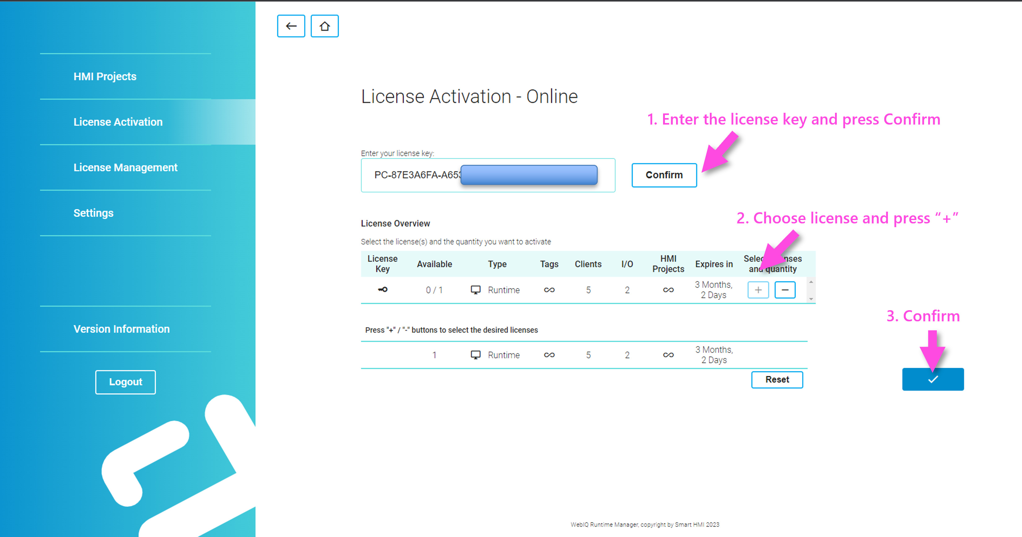
Use the +/- buttons to add/remove the corresponding licenses, for multi-user licenses you can increment the number of licenses up to the maximum limit (see column 'Available'). Then click on the button with the checkbox sign on the right to activate the license.
|
The WebIQ licensing system allows the installation of multi-user licenses for WebIQ Designer, i.e. a certain number of concurrent sessions, which is intended for organizing development team collaboration. |
Confirm the dialog to enable this license.
20.2.2. Offline Activation
If the computer on which the license is to be installed is not connected to the internet, choose "Offline Activation" and follow the three steps.
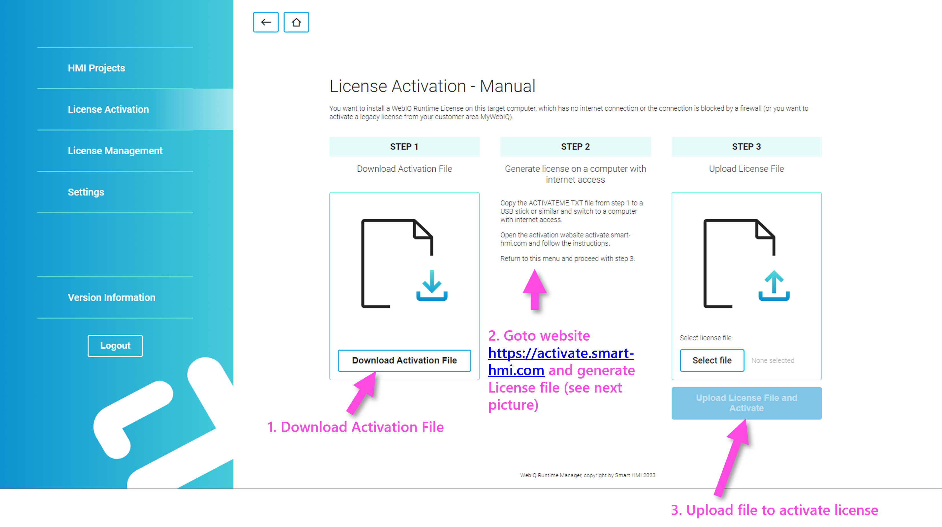
-
Click on the "Download Activation File" button to download the hardware information file (ACTIVATEME.TXT). Copy this file onto a USB stick and transfer it to a computer with internet access.
-
Enter the URL https://activate.smart-hmi.com/ in a browser and choose to create the license by entering your license key in the corresponding form. Then follow the instructions on that page to activate and download your license file.
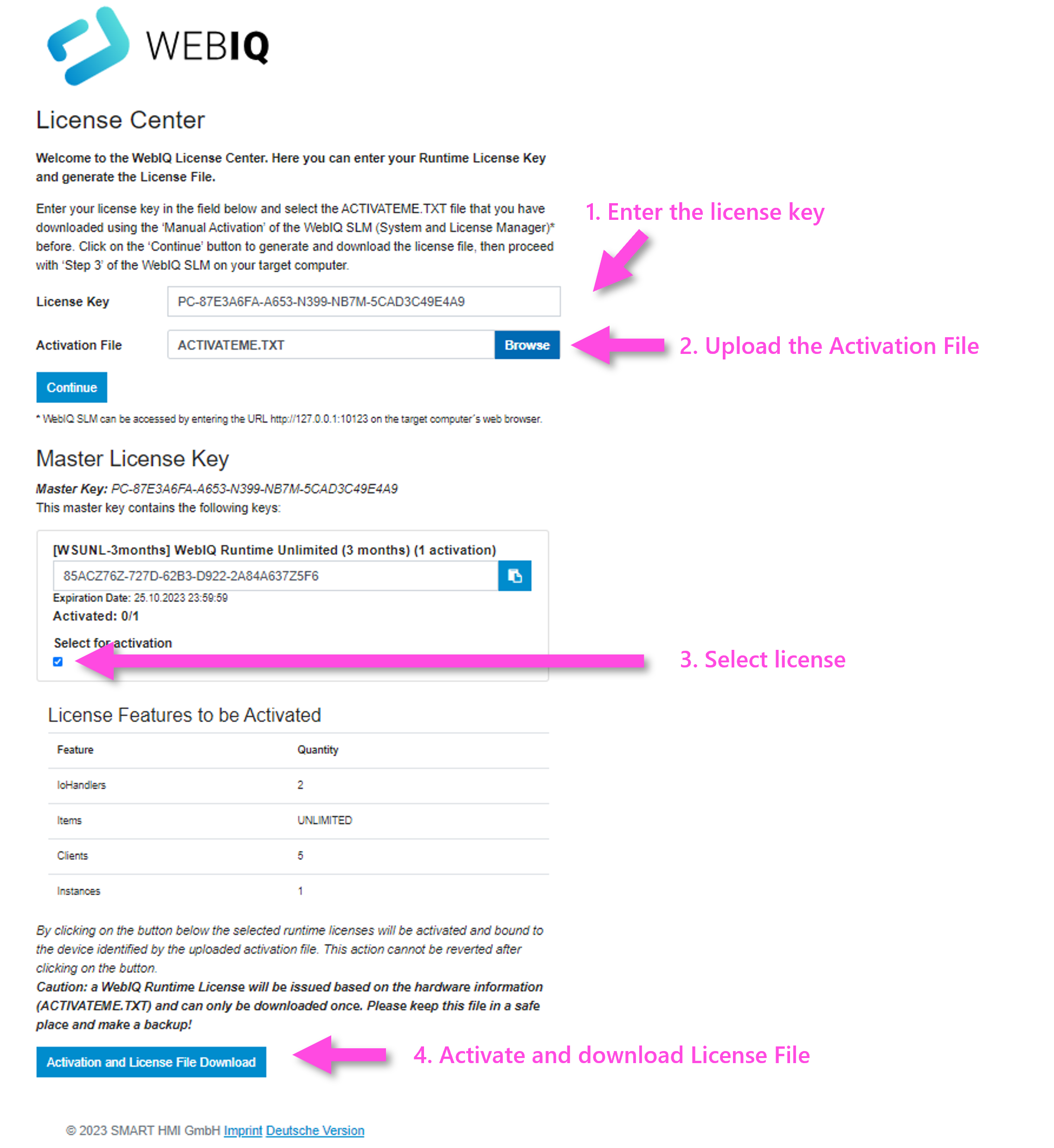
-
The license will be enabled immediately after you have uploaded the license file in step 3.
20.2.3. Displaying License Information
To view the licenses activated on the device, select the 'License Management' tab
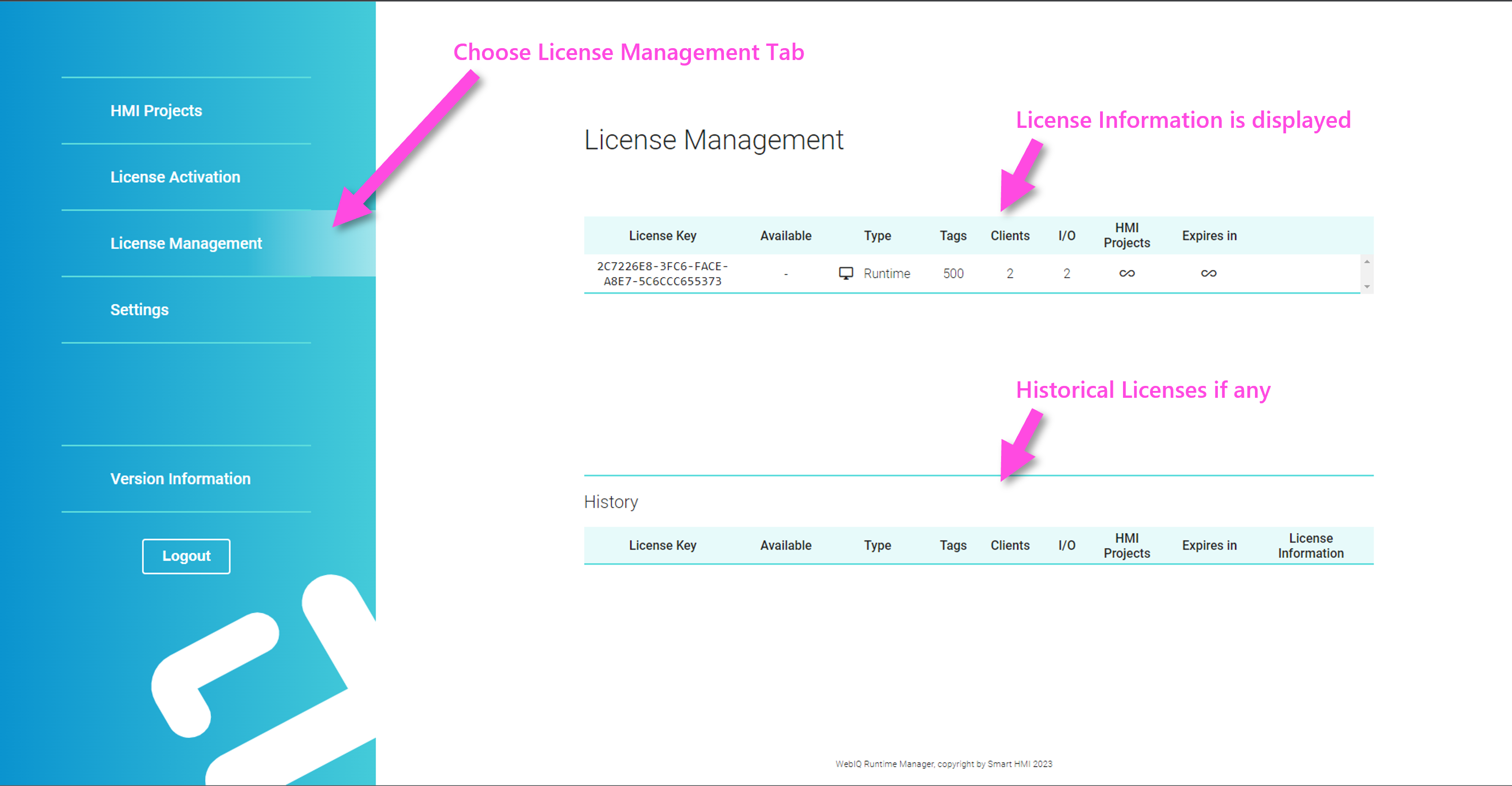
|
The WebIQ license management supports an unlimited number of licenses which simply accumulate. For example, if you have activated a runtime license (RT) with 1,000 tags/items and another one with 500 tags/items, a total of 1,500 tags/items can be used on that system. |
20.3. Deploying HMI Projects to A Runtime System
The default workflow for deploying an HMI project that has been created with WebIQ Designer to a runtime target platform is as follows:
-
Export the HMI project as ZIP file from the WebIQ Designer Project List
-
Copy the project and transfer it to the target system using a suitable data carrier
-
Launch WebIQ Runtime Manager from the browser
-
Import the HMI ZIP file via the "Upload" button in the 'HMI Projects' tab
-
Select 'Start' of the project via the context menu (3 dots)
-
Now the HMI project can be displayed by entering a corresponding url from any browser on the same network.
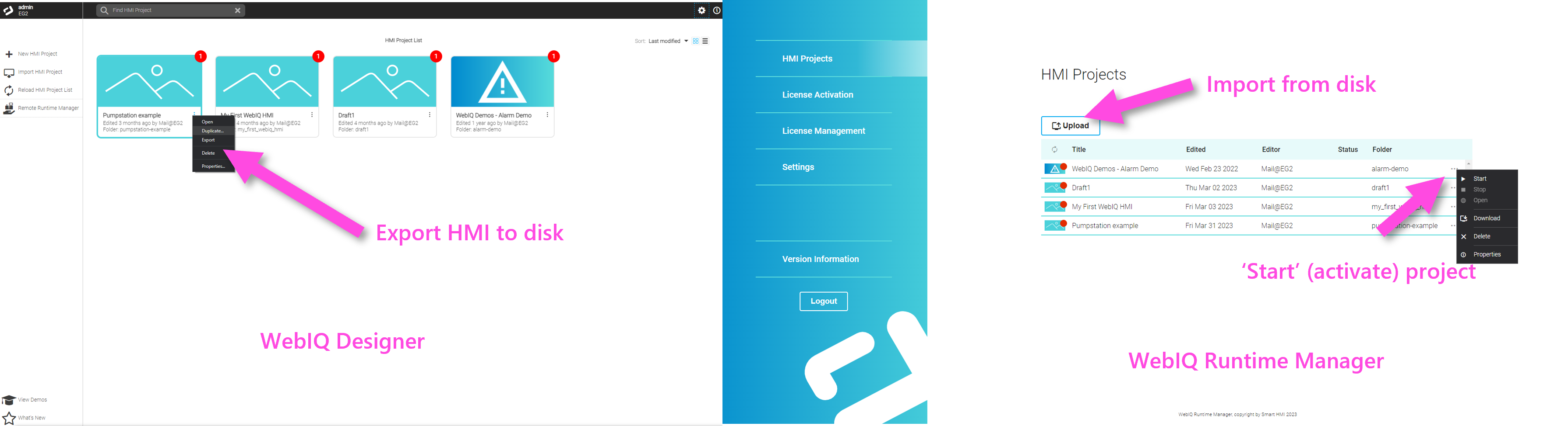
20.3.1. Context Menu And Starting HMI Projects
By clicking on the three dots you open the context menu:
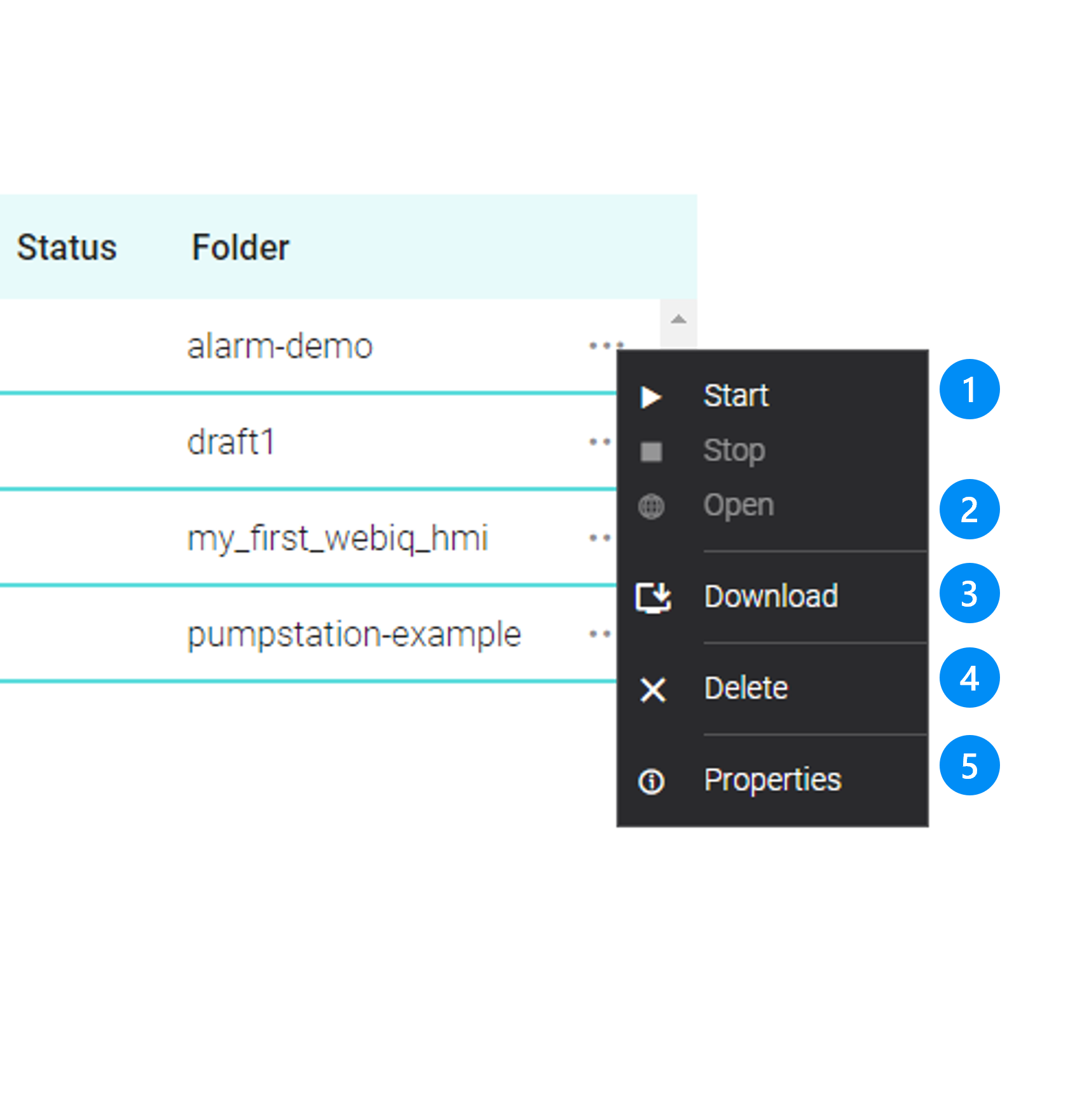
Legend
-
Starting/Stopping of the HMI project. When you start the project, the data recorder, alarm functionality and all other features will be activated.
-
Open the HMI in a browser on the system (the HMI must have been started beforehand)
-
Download the HMI Project as a ZIP file
-
Delete the HMI project on the Runtime System
-
Show project properties
20.3.2. Running The HMI Project In A Browser
The HMI project can only be accessed in a browser after it has been started before ([start-project]). The URL is:
http://<ip-v4-addr>:10123/<project-folder>/ or
https://<ip-v4-addr>:10123/<project-folder>/
|
'project-folder' is the project folder of the HMI project and not the project name |
20.4. WebIQ Runtime Manager Settings
20.4.1. Log Settings
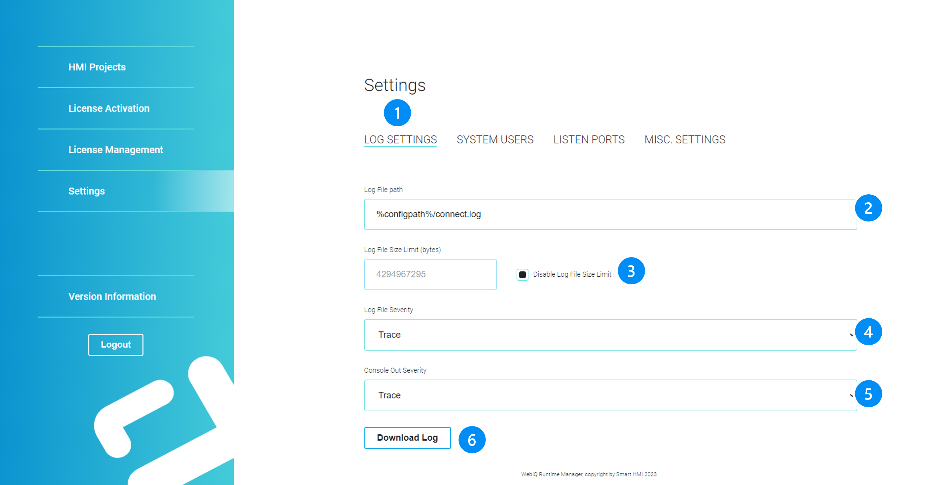
LEGEND
-
Settings Tab
-
Log file folder
-
Enable and set a maximum logfile size. When the logfile exceeds this limits, a new log file will be created and the previous one renamed.
-
Log file severity: Trace, Debug, Information (recommended), Notification, Warning, Error, Critical, Fatal
-
Trace: A lot of logging. Basically intended to be able to trace processes and problems.
-
Debug: Information is displayed that can be helpful for troubleshooting, but not every little thing.
-
Information: Only informational messages are displayed. So something like "Project XYZ has been loaded".
-
Notification: Something has occurred that may require action.
-
Warning: A condition has occurred that may cause problems.
-
Error: An error has occurred. Something didn’t work.
-
Critical: An error has occurred which will result in further problems.
-
Fatal: A problem has occurred and the program must be closed.
-
-
dito Log-Level for Console output
-
Download Log-file
|
If you start WebIQ Server |
20.4.2. System User
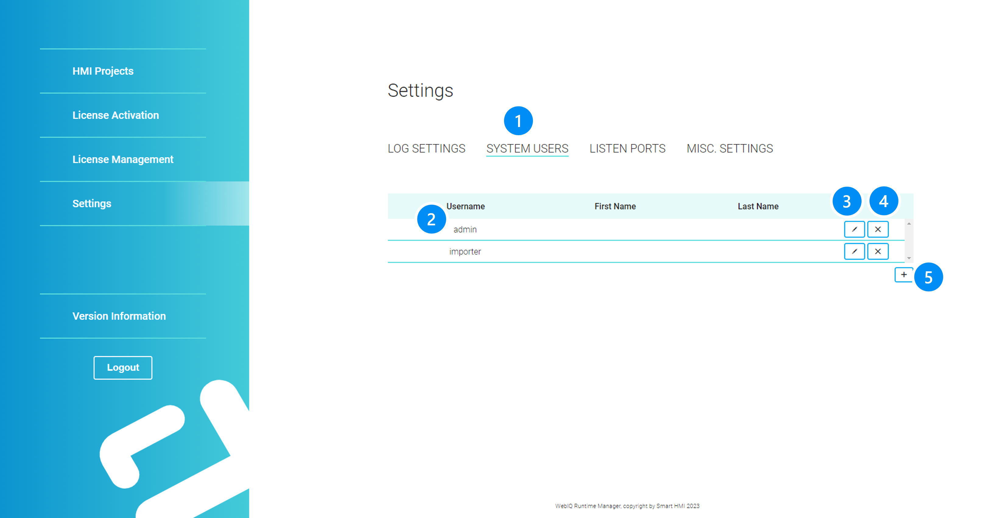
LEGEND
-
System User Tab
-
List with system user names
-
Edit user data
-
Delete system user
-
Add a new system user
System users are user accounts for logging into WebIQ Runtime Manager (WebIQ Runtime Manager Login).
|
Although WebIQ Runtime Manager has been created for setting up runtime systems, it can also be used on development systems with WebIQ Designer. When starting WebIQ Designer for the first time, a system user 'admin' with a random password will be created automatically and saved internally on the development computer. So the user does not know this password. Therefore, if you want to log in to WebIQ Runtime Manager on a development computer with WebIQ Designer, you must first create a system user via WebIQ Designer’s settings menu, which you can use to log in (see System User). |
20.4.3. Listener
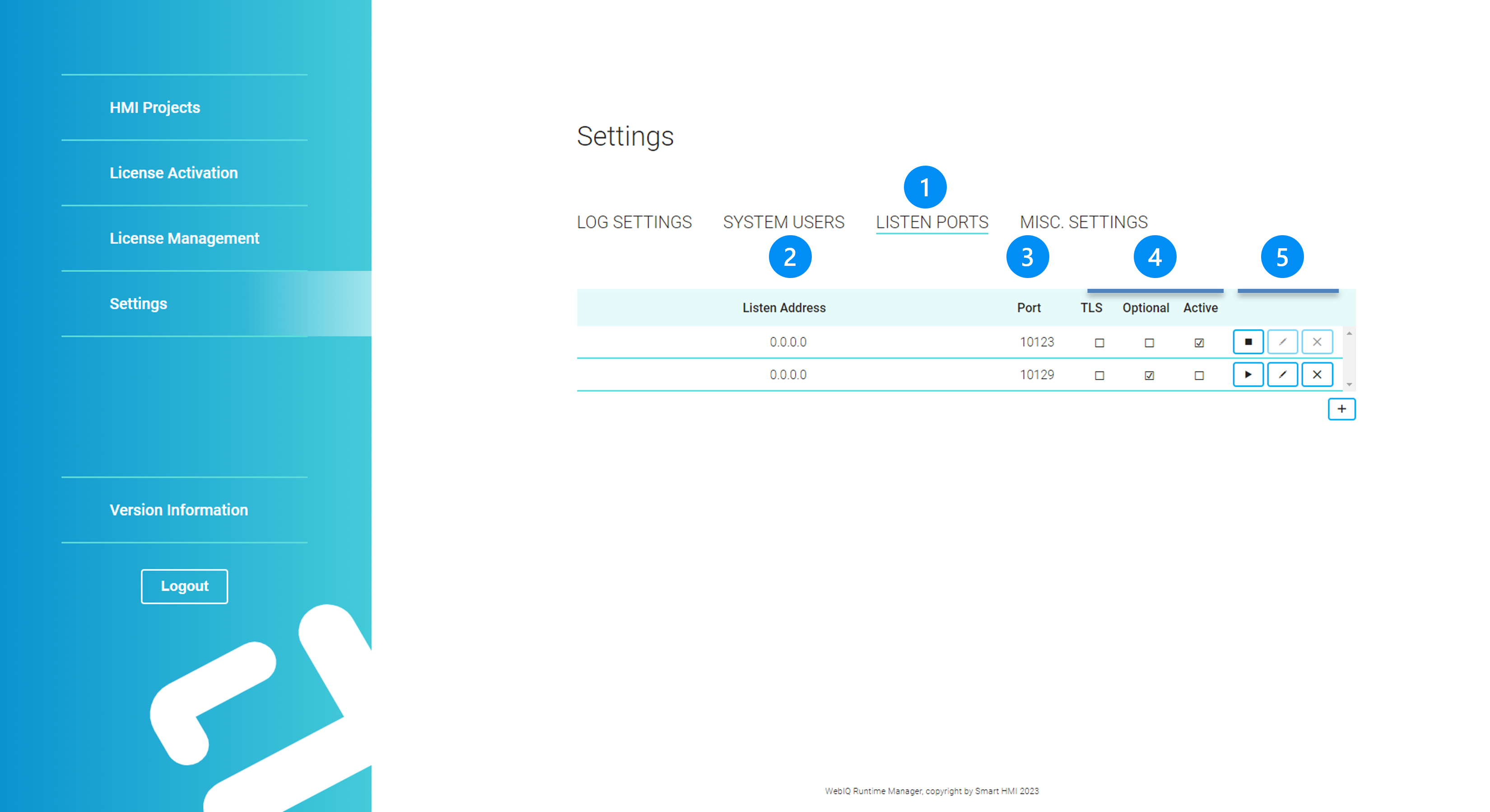
LEGEND
-
Listener tab
-
Display listen address: IP address or IP mask to listen to incoming connections (default = 0.0.0.0 = any)
-
Listen Port, default: 10123
-
Display for:
-
TLS Encryption enabled
-
Listener is 'optional' i.e. the system can also be started if the listener is not available or cannot be reached. This should be the default when setting up the listener, otherwise WebIQ Server might not start in case you misconfigured a listener and you cannot fix it through WebIQ Designer as WebIQ Server would not start at all.
-
Status checked, when listener is activated
-
-
Buttons to activate:
-
Starting/stopping of the listener
-
Edit listener parameter (see chapter below)
-
Delete listener
-
|
The edit button for the listener is greyed out when activated. To edit the listener, it must first be stopped. |
20.4.4. Edit Listener
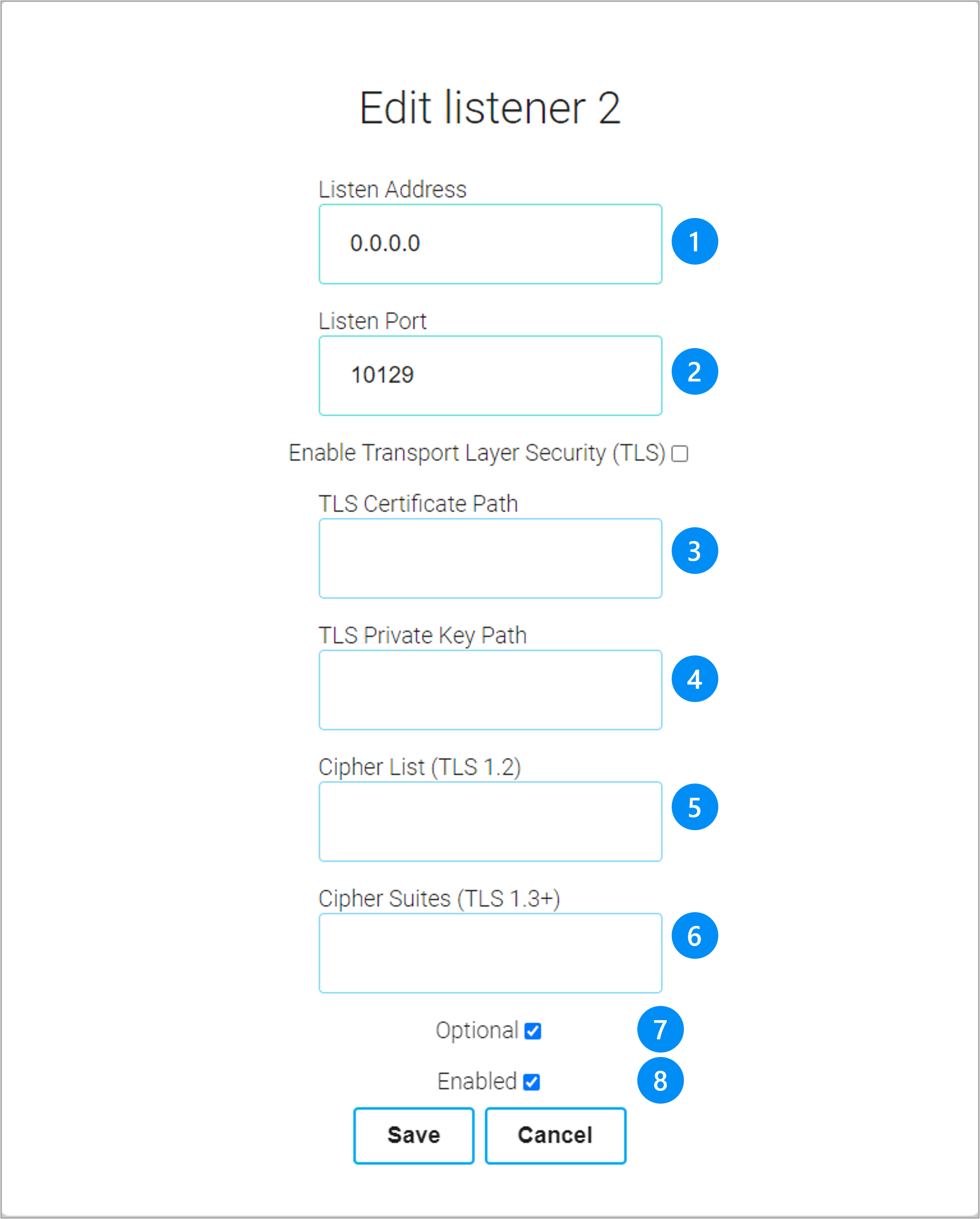
LEGEND
-
Listen Address: IP address or IP mask to listen to incoming connections (default = 0.0.0.0 = any)
-
Listen Port, default: 10123
-
Enabling TLS Encryption: since WebIQ uses standard TLS certificates for its built-in webserver, existing certificates can be installed.
-
Absolute or relative)* path to the TLS certificate file
-
Absolute or relative)* path to the TLS private key file
-
cipher list, string with negotiation security settings (optional)
-
Checkbox 'Optional': Listen Port is optional, it will be ignored if it could not be initialised during start
-
Checkbox 'Enabled': Enable this listener
)* from the installation directory '%PROGRAMFILES%\WebIQ\Server' for 64 Bit resp. '%PROGRAMFILES(X86)\WebIQ\Server' for 32 Bit installations
20.4.5. Miscellaneous
Here the browser cache timeout can be set. A shorter cache time allows better updating, as soon as a new HMI project has been updated, it will only be reloaded after the browser cache time has expired. On the other hand, a long cache time accelerates the loading behavior, since reloading is only carried out after this long time has elapsed. This may be advisable for slow data connections. The default and recommended value is 60s.
20.5. Shortcut to Remote Runtime Systems On The Local Network
WebIQ Runtime Manager of a runtime system on the local network can be found and opened directly from the project list of WebIQ Designer:
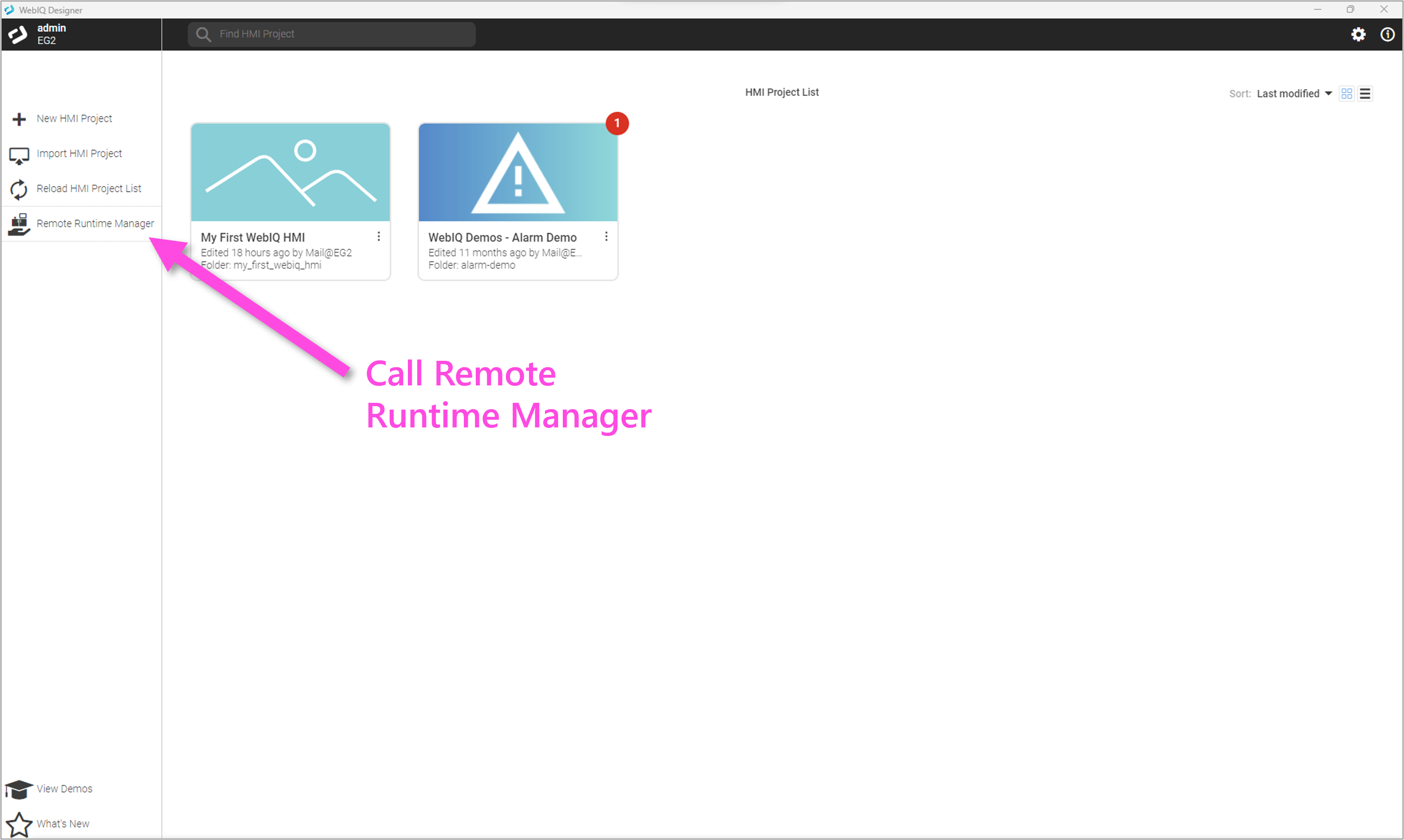
This is a shortcut and can be used as an alternative for accessing the corresponding URL directly through a browser see chapter WebIQ Runtime Manager. The dialog has a search routine for finding remote WebIQ systems through the Windows UPNP service. The prerequisite for this is that the UPNP service has been enabled on the corresponding Windows installation, as is the case by default if the network is marked as 'private'. If the network has been defined as 'public', the service will be disabled by default.
|
To enable the UPNP discovery service on Windows select: Settings-→Network&Internet-→Advanced Network Settings-→ Advanced Sharing Settings and then turn on the 'Network discovery'. |
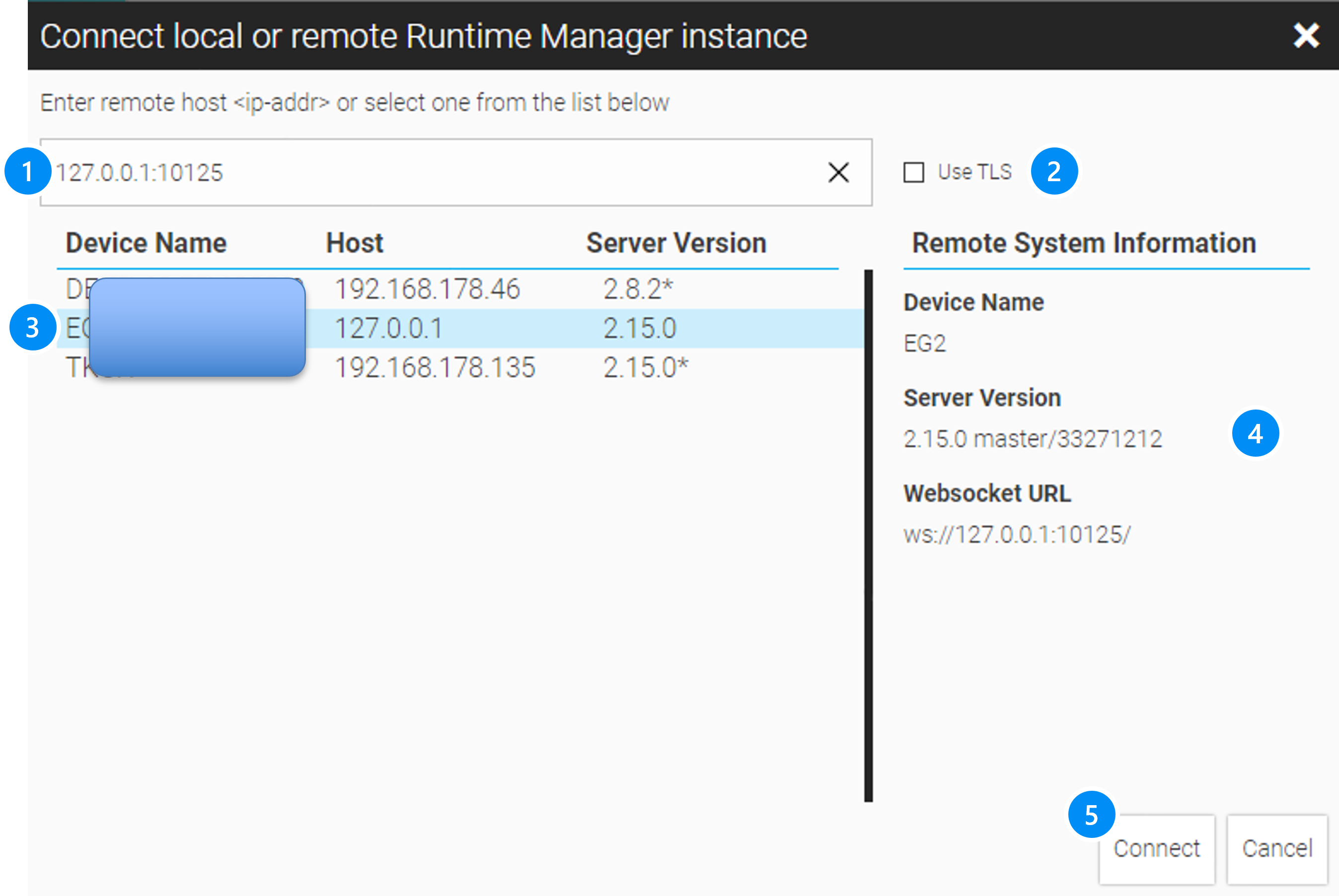
LEGEND
-
Checkbox to enable TLS, if it has been enabled on the remote system.
-
List of discovered remote devices with WebIQ. Double-click to connect directly to the device.
-
Properties of the selected instance
-
Connect to the device
-
Connect to the remote Runtime Manager
21. WebIQ Designer Settings
Describes how to configure WebIQ Designer System Settings and how to activate/manage license keys
To manage all preferences of your WebIQ Designer installation you can click on the 'gear' icon in the top bar of the project list or in the hamburger menu in the layout mode.
|
For runtime systems you can find the preferences in the WebIQ Runtime Manager, which you can open by using localhost:10123 or by_<ip-addr>:10123_ on the same network. |
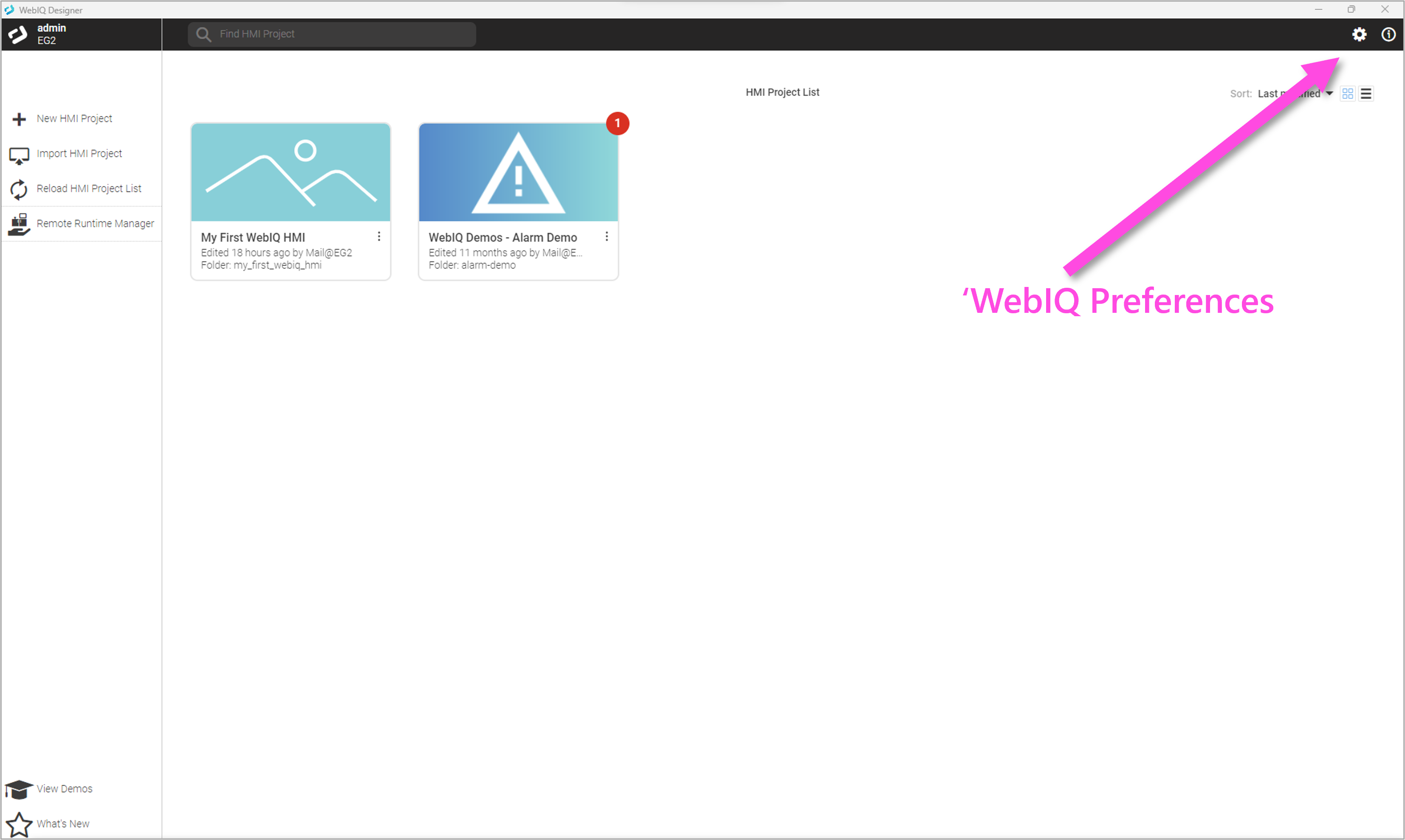
21.1. System User
System users are user accounts for logging into WebIQ Designer or the WebIQ Runtime Manager. After installation, the user "admin" is pre-set here with an automatically generated password that is stored on the local system. Therefore, no login is required when working locally with WebIQ Designer. If you want to access remotely via a network, a login via a system user is necessary.
A login as a system user is required in the following cases:
-
Access via the Remote System Manager of another WebIQ instance
-
Access via the WebIQ WebSocket API by an external program, e.g. S/-Variable Importer, Alarm-List Importer, etc
-
Accessed by the WebIQ Runtime Manager via a web browser
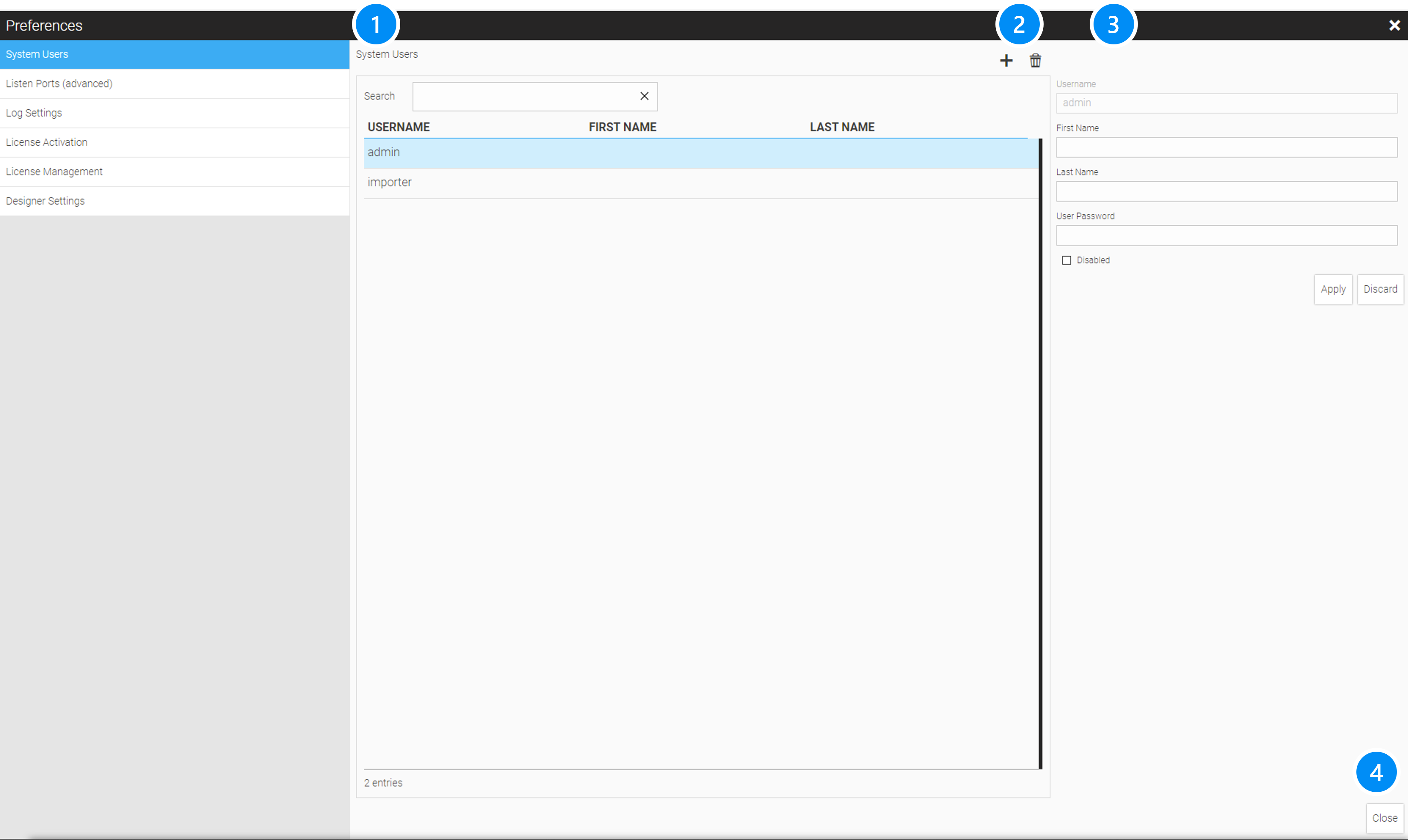
LEGEND
-
List with all available system users. The first entry 'admin' is default and shouldn’t be deleted
-
Function Buttons add/delete system user
-
Configuration parameters
-
Close and apply entries
21.2. Port, Listener and Encryption
With this setting, different listeners can be set for the WebIQ server. Multiple entries for different networks and with different ports can be used. The TLS encryption can also be selected per listener and thus use different certificates and encryptions on different networks.
LEGEND
-
List with all different listeners
-
Function Buttons Start/Stop listener, Add, Delete
-
Configuration parameters
-
Listen Address: IP address or IP mask to listen to incoming connections (default = 0.0.0.0 = any)
-
Listen Port, default: 10123
-
Enabling TLS Encryption: since WebIQ uses standard TLS certificates for its built-in webserver, existing certificates can be installed.
-
Absolute or relative)* path to the TLS certificate file
-
Absolute or relative)* path to the TLS private key file
-
cipher list, string with negotiation security settings (optional)
-
Checkbox 'Optional': Listen Port is optional, it will be ignored if it could not be initialised during start
-
Checkbox 'Enabled': Enable this listener
-
|
To edit an existing listener, it must first be stopped. To enable a listener you have to click on  to enable it. to enable it.
|
-
Close and accept entries
)* from the installation directory '%PROGRAMFILES%\WebIQ\Server' for 64 Bit resp. '%PROGRAMFILES(X86)\WebIQ\Server' for 32 Bit installations
|
This product includes software developed by the OpenSSL Project for use in the OpenSSL Toolkit (http://www.openssl.org/). For more information about TLS encryption and TLS certificates, refer to the Runtime Configuration manual. |
21.3. Log Settings
LEGEND
-
Log Setting selection
-
Log File Path: This defines the absolute or relative path to the log file on the system where the server is located (normally
%PROGRAMDATA%\WebIQon Windows). %configpath% is the synonym of the configuration path -
Log File Size: Here you can set a maximum log file size in bytes
-
Log File Severity: This defines the minimum severity that will be logged. Trace is the lowest level: everything will be logged (including internal messages), Fatal is the highest: only fatal errors will be logged
-
Console Out Severity: This defines the minimum severity that will be written to the console. Levels are the same as above
-
Apply entries
Log File Information
After the configured log file size has been reached the current log file will be renamed to ".old" at the end and a previously existing log file with an ".old" extension will be deleted before. Then a new log file will be written with the configured name.
The selected severity defines the minimum severity, i.e. when selecting a severity entry in the list all entries with a severity above will also be included.
The recommended severity setting is "Information" as it has a good balance of information and error output. To see or log all output - which might be helpful for debugging any specific errors relating to items - temporarily setting the severity to "trace" might be helpful, but will generate a lot more output.
21.4. Activation of WebIQ Designer Licenses (Including 30-Days-Free-Trial License)
|
WebIQ Designer floating licenses require online activation. If online activation is not possible because you either have no internet connection or your IT provider has blocked it, ask us for an offline (non-floating) license. However, please keep in mind that a non-floating license will be bound to your local device and cannot be shared with other users. |
After downloading and starting WebIQ Designer for the first time you are automatically taken to the license activation form:
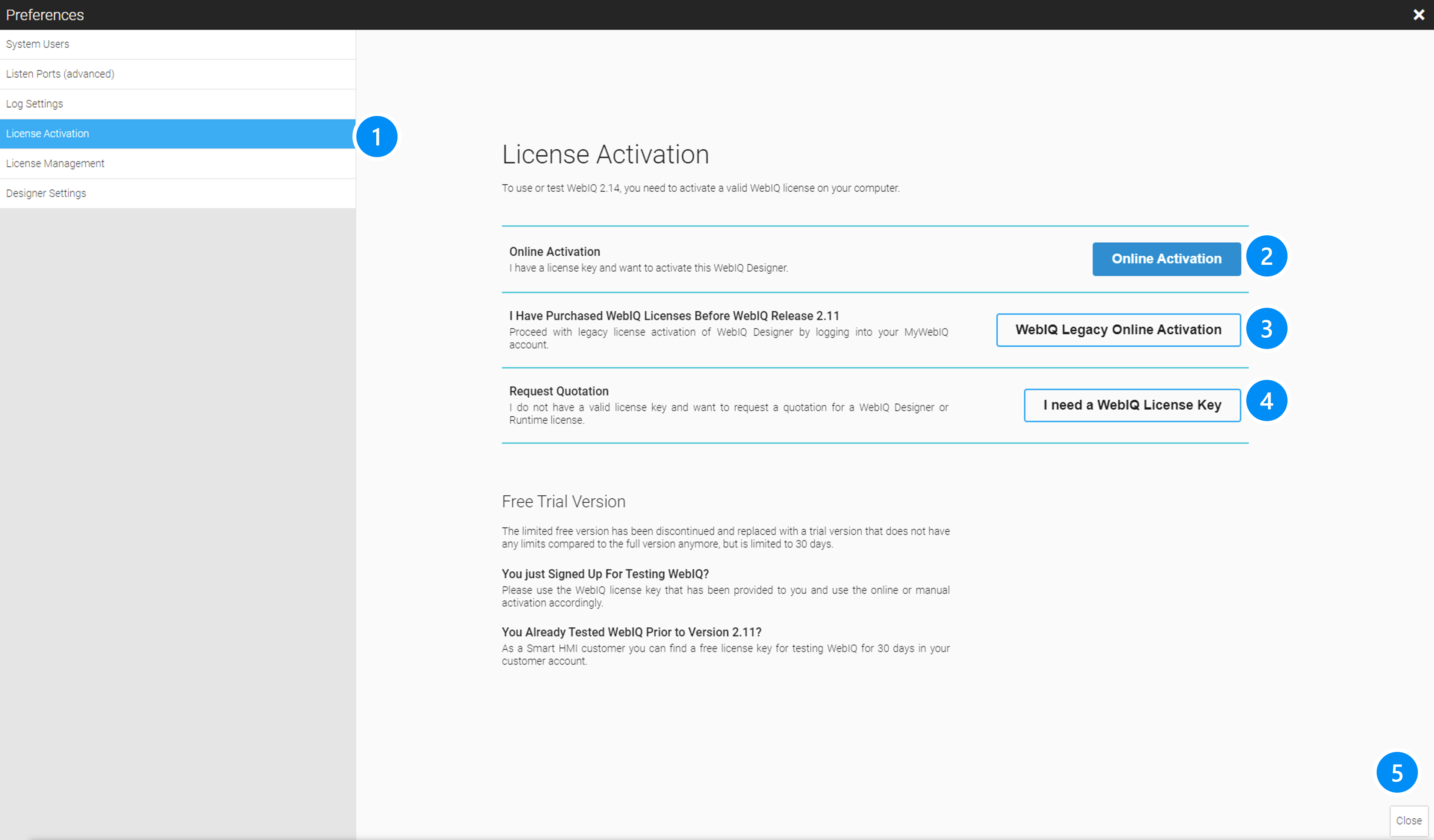
LEGEND*
-
Online Activation: This is the default way for activating a WebIQ Designer license or a free trial license with a 'license key' which you have received via e-mail or in a delivery document. WebIQ has been using these license keys since WebIQ V2.11.
-
WebIQ Legacy Online Activation (license in MyWebIQ, WebIQ version 2.10 and below issued before March 2022).
-
Contact form to request a license
21.5. Online Activation
Now proceed by clicking on the "Online Activation" button, enter your license key in the input field and click on the Confirm button. This will retrieve license key information from the WebIQ licensing system on the internet and will display the license information:
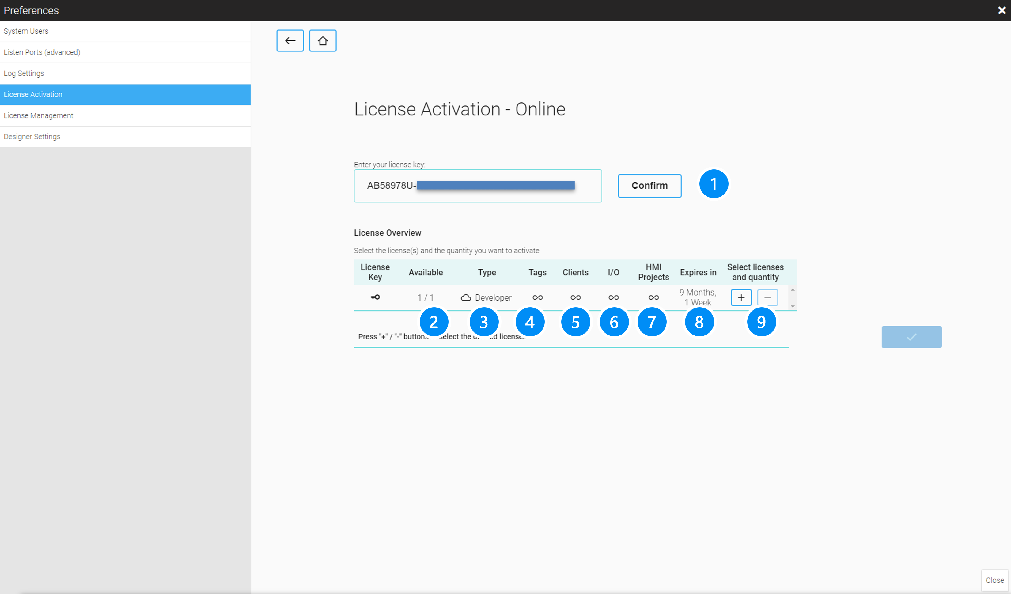 .Picture: License information.
Use the +/- buttons to add/remove the corresponding licenses, for multi-user licenses you can increment the number of licenses up to the maximum limit (see column 'Available'). Then click on the button with the checkbox sign on the right to activate the license.
|
The WebIQ licensing system allows the installation of multi-user licenses , i.e. a certain number of concurrent sessions, which is intended for organizing development team collaboration. |
Confirm the dialog if you wish to enable this license, it will be enabled immediately. After the successful activation the list of current licenses will be shown.
LEGEND
-
License Key field
-
Available, shows the number of possible instances (only for online/floating licenses!)
-
License type:
-
 Online License, can be exchanged between computers
 -
 Offline License fixed bound to a computer
-
-
Type: Developer/Runtime
-
Number of tags limit
-
Number of client (browser) windows which can be shown concurrently
-
Number of IO Handlers (i.e. PLC interfaces)
-
Validity Period of the license )*
-
+/- buttons to select license/increase number of instances )**
)* Online Designer License is usually a subscription that is automatically renewed every year for another year. Only the time until the end of the current year is displayed here.
)** Normally one instance is always selected. In certain cases, however, it is possible to allow multiple instances of a license on one PC, e.g. if several parallel WebIQ instances are installed, e.g. in a Docker container or something similar.
21.6. Online Activation of Legacy Licenses
If you are a Smart HMI customer and already have licenses available in your customer account MyWebIQ, or you have purchased your license before WebIQ V2.11 (March 2022), you have to choose this activation option.
Click on the 'WebIQ Legacy Online Activation' button and you will be able to login to the customer area MyWebIQ. After logging in the any available WebIQ Designer license of your customer area MyWebIQ will be automatically installed. If you have more than one license available in your customer area a dialog will be shown allowing you to select the license you wish to use.
21.7. Multi-User Licenses
When using a WebIQ Designer floating license, your computer must be online during activation as well as during normal work. When startin WebIQ Designer, the online access marks the license as "in use" and releases it again after the program has been closed. Then it can be used on another computer.
WebIQ Designer licenses can also be issued for multi-user operation, e.g. quantity = 3, i.e. up to 3 computers can use WebIQ Designer at the same time. A possible 4th user would be rejected and can only use WebIQ Designer when one of the other users has ended their session.
21.8. Floating Licenses For Offline Use
However, there are times when you know that you will be offline for X days and for those times you can checkout a floating license for offline use.
To do that click on the checkout button:
This will show a dialog that allows you to specify for how long the license should be checked out:
|
The checkout time is limited to up to 30 days. Please note that checked out licenses can neither be transferred to another system nor can the checkout time be reduced or the checkout revoked. |
A checked out license will be shown with an ICON in the License Type column. This means the license has been irrevocably bound to the hardware and cannot be changed. On the right side the remaining time ("expires in") is shown. After the checked out license has expired, it will be automatically available as an Online License again with the symbol .
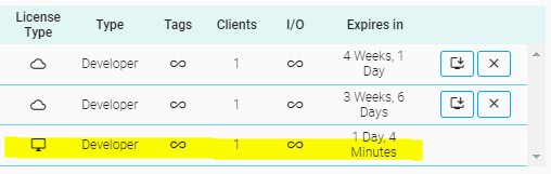
21.9. Setting Port for Browser Preview
Configuration page to set the port of the designer for the preview in the browser. Default value is 10124,..
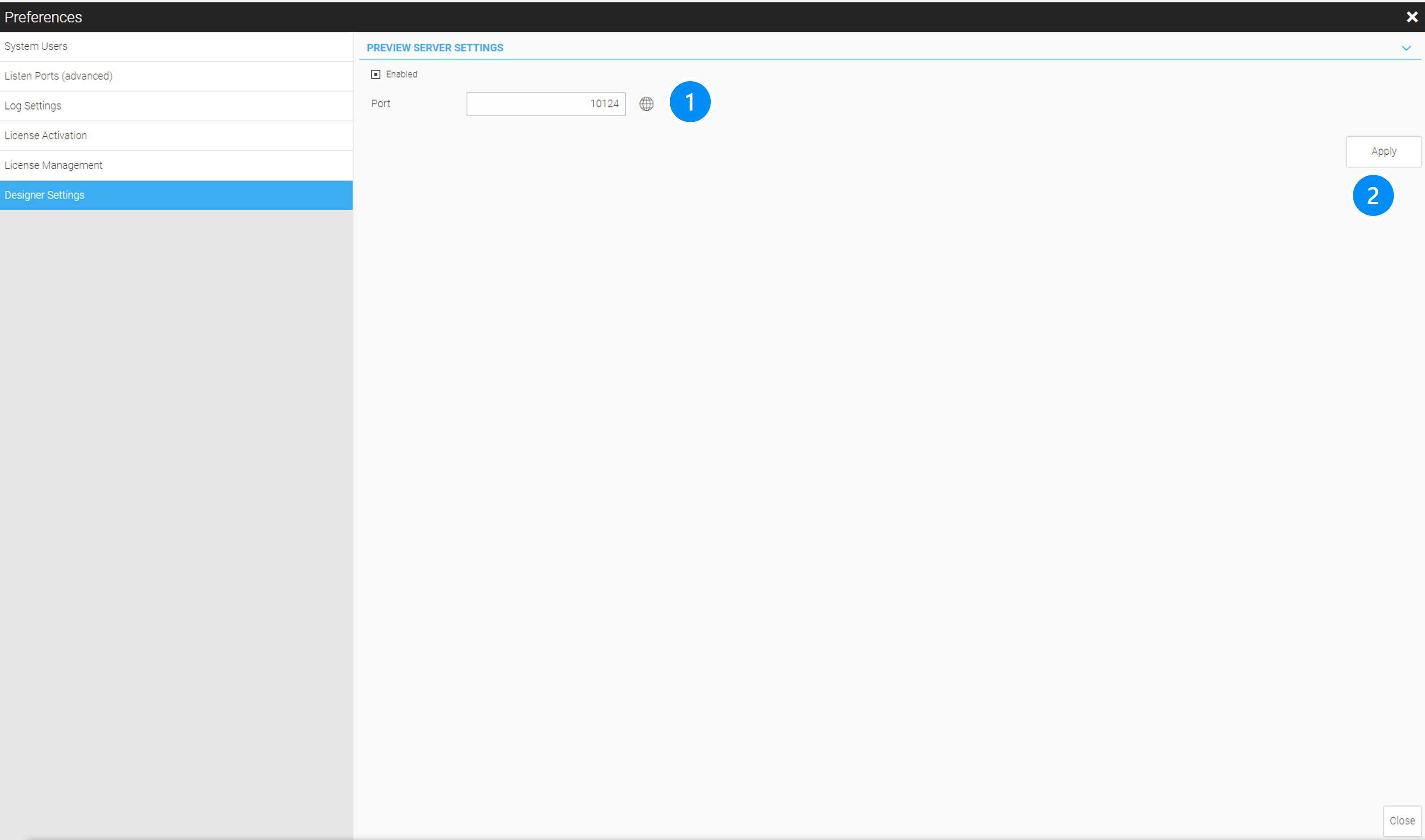 .Config Port for Designer Browser Preview
LEGEND . Port number and Link to the Browser for testing . Apply Changes
22. Copyright
The HMI system WebIQ, the manuals and the video tutorials are protected by copyright. Utilization beyond the limits of copyright without consent of Smart HMI is prohibited and liable to prosecution. This includes copies, translations, microfilms, its input and its edition in electronical systems.
Technical data are used for product description and are not guaranteed properties in the legal sense.
Modifications - also in technical terms - reserved.
Copyright © 2023 Smart HMI GmbH, Grünstraße 36, 40667 Meerbusch, Germany
23. Feedback
Your opinion is important. We write our manuals in order to give you the best guidance using the HMI system WebIQ. If you want to send us a suggestion for improvement or if you want to report a bug please use the support form.

24. How To Use This Manual
This manual is one pager HTML document.
Use the table of contents on the left to discover the manual or to navigate directly to a topic.
Search For A Keyword
Search the entire handbook for a keyword by using the search function of your browser (for example, use the shortcut Ctrl + F).
Notes
|
I am a note. Notes contain additional information or background information about the current section. |
Tips
|
I am a tip. Tips are useful information or hints that will help you to make the HMI system WebIQ easier to use. |
Warnings
|
I am a warning. Warnings are very important information that helps to avoid mistakes or problems. Read the warnings carefully! |